figureone
0.15.10- Introduction
- Geometry
- Point ▸
-
Line
▸
- Instance members
- #theta
- #phi
- #setP1
- #setP2
- #unitVector
- #vector
- #getPoint
- #reverse
- #angle
- #round
- #length
- #midPoint
- #pointAtPercent
- #pointAtLength
- #hasPointAlong
- #hasPointOn
- #distanceToPoint
- #isParallelTo
- #isEqualTo
- #hasLineWithin
- #isAlongLine
- #isWithinLine
- #offset
- #offset2D
- #distanceToLine
- #pointProjection
- #intersectsWith
- #clipPoint
-
Plane
▸
-
Rect
▸
- Instance members
- #left
- #width
- #height
- #bottom
- #top
- #right
- #_dup
- #isPointInside
- #round
- #intersectsWith
- #intersectsWithLine
- #center
-
Transform
▸
- Instance members
- #hasComponent
- #setComponent
- #addComponent
- #translate
- #rotate
- #direction
- #basis
- #basisToBasis
- #custom
- #scale
- #getComponentIndex
- #clipRotation
- #updateTranslation
- #toDelta
- #t
- #s
- #r
- #ra
- #d
- #c
- #b
- #bb
- #updateScale
- #updateRotation
- #updateDirection
- #updateCustom
- #updateBasis
- #updateBasisToBasis
- #m
- #matrix
- #isEqualShapeTo
- #isEqualTo
- #isWithinDelta
- #sub
- #add
- #mul
- #transform
- #transformBy
- #round
- #isZero
- #_dup
- #identity
- TypeParsablePoint
- TypeParsableLine
- TypeParsablePlane
- TypeParsableRect
- TypeParsableTransform
-
Figure
▸
- Instance members
- #addSlideNavigator
- #getSlideNavigator
- #addCursor
- #getCursor
- #add
- #getElement
- #getElements
- #get
- #recreateAtlases
- #spaceTransformMatrix
- #transformPoint
- #getRemainingAnimationTime
- #show
- #hide
- #showOnly
- #setScenarios
- #stop
- #showTouchable
- #showTouchBorders
- #showBorders
- #animateNextFrame
- #isAnimating
- #setManualFrames
- #endManualFrames
- #frame
- #addFrameRate
- OBJ_Figure
- Figure Elements
-
FigureElement
▸
- Instance members
- #setScene
- #setPosition
- #setRotation
- #setScale
- #setTransform
- #setColor
- #dim
- #setDimColor
- #undim
- #setScenario
- #saveScenario
- #getPath
- #pulse
- #transformPoint
- #spaceTransformMatrix
- #getBorder
- #getScale
- #getRotation
- #getPosition
- #setFigurePosition
- #setPositionToElement
- #show
- #setTouchable
- #setMove
- #setMovable
- #hide
- #toggleShow
- #getTransform
- #isMoving
- #isAnimating
-
FigureElementPrimitive
▸
- Instance members
- #setAngleToDraw
- FigureElementCollection ▸
- 2D Shape Primitives
- OBJ_FigurePrimitive
- OBJ_Generic
- OBJ_Line
- OBJ_Polyline
- OBJ_Arrow
- OBJ_Triangle
- OBJ_Rectangle
- OBJ_Ellipse
- OBJ_Arc
- OBJ_Polygon
- OBJ_Star
- OBJ_Grid
- Text
- OBJ_Text
- OBJ_FormattedText
- OBJ_Font
-
FontManager
▸
- Instance members
- #isAvailable
- #areWeightsAvailable
- #getWeights
- #getStyles
- #watch
- 3D Shape Primitives
- OBJ_Generic3All
- OBJ_Generic3
- OBJ_Cube
- OBJ_Sphere
- OBJ_Cylinder
- OBJ_Cone
- OBJ_Prism
- OBJ_Line3
- OBJ_Revolve
- OBJ_Surface
- 2D Shape Collections
- OBJ_Collection
- CollectionsLine ▸
- COL_Line
- CollectionsAngle ▸
- COL_Angle
- CollectionsPolyline ▸
- COL_Polyline
- CollectionsRectangle ▸
- COL_Rectangle
-
CollectionsButton
▸
- Instance members
- #setStateIndex
- #getStateIndex
- COL_Button
- CollectionsToggle ▸
- COL_Toggle
- CollectionsSlider ▸
- COL_Slider
-
CollectionsAxis
▸
- Instance members
- #pan
- #panDeltaValue
- #panDeltaDraw
- #zoom
- #zoomValue
- #zoomDelta
- #valueToDraw
- #drawToValue
- #inAxis
- COL_Axis
-
CollectionsPlot
▸
- Instance members
- #pointToDraw
- #drawToPoint
- #setElementTo
- #getPointAtElement
- #getZoom
- #getPan
- COL_Plot
- 3D Shape Collections
- CollectionsAxis3
- COL_Axis3
- Interactivity
- OBJ_ElementMove
- OBJ_ElementMoveFreely
- OBJ_CameraControl
- OBJ_Gesture
- FigureElementPrimitiveGesture ▸
- OBJ_Touch
- OBJ_RangeBounds
- OBJ_LineBounds
- OBJ_RectBounds
- TypeParsableBounds
- Animation
- AnimationManager ▸
- AnimationBuilder ▸
- PositionAnimationStep
- RotationAnimationStep
- ScaleAnimationStep
- TransformAnimationStep
- ScenarioAnimationStep
- PulseAnimationStep
- ColorAnimationStep
- DimAnimationStep
- UndimAnimationStep
- OpacityAnimationStep
- DissolveInAnimationStep
- DissolveOutAnimationStep
- TriggerAnimationStep
- CustomAnimationStep
- SerialAnimationStep
- ParallelAnimationStep
- DelayAnimationStep
- Equations
- Equation ▸
- EQN_Equation
- EQN_EquationElements
- TypeEquationElement
- EQN_TextElement
- EQN_Forms
- TypeEquationForm
- EQN_FormObjectDefinition
- TypeEquationPhrase
- EQN_FormAlignment
- EQN_FromForms
- EQN_FromForm
- EQN_TranslationStyle
- EQN_FormDefaults
- EQN_FormRestart
- Equation Layout
- EQN_Fraction
- EQN_Root
- EQN_Subscript
- EQN_Superscript
- EQN_SuperscriptSubscript
- EQN_Matrix
- EQN_Integral
- EQN_SumOf
- EQN_ProdOf
- EQN_Bar
- EQN_Bracket
- EQN_Lines
- EQN_Box
- EQN_Strike
- EQN_StrikeComment
- EQN_Comment
- EQN_Pad
- EQN_Scale
- EQN_Container
- EQN_TouchBox
- EQN_Offset
- EQN_Color
- EQN_Annotate
- Equation Symbols
- EQN_Symbol
- EQN_VinculumSymbol
- EQN_BoxSymbol
- EQN_ArrowSymbol
- EQN_SumSymbol
- EQN_ProdSymbol
- EQN_IntegralSymbol
- EQN_StrikeSymbol
- EQN_BracketSymbol
- EQN_AngleBracketSymbol
- EQN_BraceSymbol
- EQN_BarSymbol
- EQN_SquareBracketSymbol
- EQN_RadicalSymbol
- EQN_DivisionSymbol
- EQN_LineSymbol
- Morphing
-
FigureElementPrimitiveMorph
▸
- Instance members
- #setPointsBetween
- #setPoints
- OBJ_Morph
- pointsToShapes
- OBJ_PointsToShapes
- polylineToShapes
- OBJ_PolylineToShapes
- imageToShapes
- OBJ_ImageToShapes
- polygonCloudShapes
- OBJ_PolygonCloudShapes
- circleCloudShapes
- OBJ_CircleCloudShapes
- rectangleCloudShapes
- OBJ_RectangleCloudShapes
- Slide Navigator
-
SlideNavigator
▸
- Instance members
- #load
- #loadSlides
- #goToSlide
- #nextSlide
- #prevSlide
- OBJ_SlideNavigator
- OBJ_SlideNavigatorSlide
-
CollectionsSlideNavigator
▸
- Instance members
- #loadSlides
- #goToSlide
- #nextSlide
- #prevSlide
- COL_SlideNavigator
- TypeSlideFrom
- TypeSlideLeaveStateCallback
- TypeSlideStateCallback
- TypeSlideTransitionCallback
- OBJ_EquationDefaults
- TypeTransitionDefinition
- Interactive Video
- Recorder ▸
- FunctionMap ▸
- TypeRecorderTime
- Shaders
- OBJ_GenericGL
- OBJ_GLAttribute
- OBJ_GLVertexBuffer
- OBJ_GLUniform
- TypeGLBufferType
- TypeGLBufferUsage
- TypeGLUniform
- TypeGLPrimitive
- TypeFragmentShader
- TypeVertexShader
- OBJ_VertexShader
- OBJ_FragmentShader
- OBJ_GLColorData
- 2D Geometry Tools
- minAngleDiff
- getTriangleCenter
- polarToRect
- rectToPolar
- threePointAngle
- threePointAngleMin
- clipAngle
- normAngle
- getDeltaAngle
- getDeltaAngle3D
- Geometry Creation
- polygon
- polygonLine
- cone
- cube
- sphere
- prism
- revolve
- surface
- line3
- Math tools
- round
- range
- randSign
- randInt
- randBool
- rand
- randElement
- randElements
- removeRandElement
- Misc Figure Element
- ElementMovementState
- ElementPulseState
- ElementState
- DrawingObject
-
GLObject
▸
- Instance members
- #addTexture
- #getUniform
- #addUniform
- FigurePrimitives ▸
- TypeElementPath
- TimeKeeper ▸
- OBJ_Subscriber
- OBJ_Subscribers
- Notification ▸
- OBJ_Notifications
- NotificationManager ▸
- FigureElement#setTransform
- OBJ_ElementPropertyMod
- OBJ_ElementMods
- OBJ_Scenarios
- TypeCoordinateSpace
- Misc Geometry
- isParsablePoint
- isParsablePlane
- isParsableTransform
- getPoint
- getPoints
- getScale
- getLine
- getRect
- getTransform
- getPlane
- getNormal
- angleFromVectors
- OBJ_QuadraticBezier
- OBJ_LineIntersect
- OBJ_Buffer
- TypeParsableBuffer
- getBuffer
- TypeParsableBorder
- TypeF1DefPlane
- TypeF1DefLine
- TypeF1DefTransform
- TypeF1DefRect
- TypeBorder
- TypeBasisObjectDefinition
- TypeTransformRotation
- TypeTransformDirection
- TypeTransformTranslation
- TypeTransformScale
- TypeTransformCustom
- TypeTransformBasis
- TypeTransformBasisToBasis
- TypeTransformBasisUserDefinition
- TypeTransformBasisToBasisUserDefinition
- TypeTransformComponent
- TypeTransformComponentUserDefinition
- TypeTransformDefinition
- TypeTransformUserDefinition
- Misc Shapes
- OBJ_Texture
- OBJ_TextLineDefinition
- OBJ_TextModifierDefinition
- OBJ_TextModifiersDefinition
- OBJ_TextModifiersDefinition
- OBJ_PulseScale
- OBJ_CurvedCorner
- OBJ_LineStyle
- CPY_Step
- TypeDash
- TypeArrowHead
- OBJ_LineArrow
- OBJ_LineArrows
- OBJ_Scenario
- OBJ_MovableAngle
- TypeAngleLabelOptions
- OBJ_AngleCurve
- OBJ_AngleArrows
- TypeAngleArrows
- OBJ_AngleCorner
- OBJ_PulseAngle
- OBJ_AngleSet
- OBJ_AngleAnimationStep
- OBJ_PulseAngleAnimationStep
- OBJ_LineLabel
- OBJ_PulseWidth
- OBJ_MovableLine
- OBJ_LengthAnimationStep
- OBJ_PulseWidthAnimationStep
- OBJ_PolylinePad
- OBJ_PolylineCustomization
- TypeLabelOrientation
- TypeLabelLocation
- TypeLabelLocation
- TypeLabelSubLocation
- OBJ_ValidShapeHideThresholds
- OBJ_ValidShape
- SUB_PolylineUpdatePoints
- OBJ_PolylineAngle
- OBJ_PolylineSide
- OBJ_PolylinePadSingle
- COL_Trace
- CollectionsPlotLegend
- COL_PlotLegend
- OBJ_TranslationPath
- OBJ_SpaceTransforms
- OBJ_LineStyleSimple
- OBJ_AxisTicks
- OBJ_AxisLabels
-
CollectionsTrace
▸
- Instance members
- #update
- TypeTickLocation
- OBJ_LabelsCallbackParams
- OBJ_AxisLineStyle
- OBJ_ValuesOffset
- OBJ_AxisTitle
- OBJ_PlotLegendCustomTrace
- OBJ_PlotLegendCustom
- OBJ_GestureArea
- OBJ_PlotFrame
- OBJ_PlotZoomOptions
- OBJ_PlotPanOptions
- OBJ_PlotAxis
- OBJ_PlotTitle
- OBJ_PlotAreaLabelBuffer
- OBJ_SurroundAnimationStep
- TypeColor
- OBJ_AddElement
- OBJ_FigureElementCollection
- OBJ_TriangleSideRotationAlignment
-
FigureCollections
▸
- Instance members
- #collection
- #line
- #angle
- #polyline
- #rectangle
- #slideNavigator
- #axis
- #axis3
- #toggle
- #slider
- #button
- #trace
- #plot
- #plotLegend
- #equation
- OBJ_ButtonColor
- OBJ_ButtonLabel
- OBJ_ButtonColorState
- OBJ_ButtonState
- OBJ_SliderBorder
- OBJ_SliderMarker
- OBJ_ToggleLabel
- OBJ_ToggleBorder
- OBJ_LineMove
- TypeHAlign
- TypeVAlign
- OBJ_Scene
-
Scene
▸
- Instance members
- #setPanZoom
- #setPan
- #setCamera
- #setProjection
- #set2D
- #setOrthographic
- #setPerspective
- #setLight
- TypeRotationDirection
- OBJ_LineDefinition
- BoundsIntersect
- BoundsPointIntersect
- BoundsValueIntersect
-
Bounds
▸
- Instance members
- #_dup
- #contains
- #intersect
- #clip
- TypeF1DefRangeBounds
-
RangeBounds
▸
- Instance members
- #contains
- #intersect
- #clip
- TypeF1DefRectBounds
-
RectBounds
▸
- Instance members
- #round
- #contains
- #clip
- #intersect
- TypeF1DefLineBounds
-
LineBounds
▸
- Instance members
- #contains
- #clip
- #intersect
- getBounds
- OBJ_SurfaceGrid
- surfaceGrid
- OBJ_ZoomOptions
- OBJ_ManualZoom
- OBJ_ZoomValues
- OBJ_CurrentZoom
- OBJ_PanOptions
- OBJ_ZoomInstant
- OBJ_Zoom
- OBJ_Projection
- OBJ_Camera
- OBJ_Light
- OBJ_2DScene
- OBJ_OrthographicScene
- OBJ_PerspectiveScene
- Misc Geometry Creation
- OBJ_PolygonPoints
- OBJ_PolygonLinePoints
- OBJ_ConePoints
- OBJ_CubePoints
- OBJ_CylinderPoints
- OBJ_Line3Arrow
- OBJ_Line3Points
- OBJ_PrismPoints
- OBJ_RevolvePoints
- OBJ_SpherePoints
- OBJ_SurfacePoints
- Misc Text
- FigureElementPrimitive2DText ▸
- OBJ_TextAdjustments
- OBJ_SetText
- FigureElementPrimitiveGLText ▸
- TypeText
- OBJ_Outline
- OBJ_Underline
- OBJ_GlyphModifiers
- TypeFontWeight
- Misc Animation
-
AnimationStep
▸
- Instance members
- #getRemainingTime
- #start
- ElementAnimationStep
- OBJ_PositionAnimationStep
- OBJ_RotationAnimationStep
- OBJ_ElementAnimationStep
- OBJ_ScenarioVelocity
- OBJ_AnimationBuilder
- OBJ_AnimationStep
- OBJ_AnimationStart
- OBJ_SerialAnimationStep
- OBJ_ParallelAnimationStep
- OBJ_ScaleAnimationStep
- OBJ_CustomAnimationStep
- OBJ_TransformAnimationStep
- OBJ_ScenarioAnimationStep
- OBJ_TriggerAnimationStep
- OBJ_Pulse
- OBJ_PulseAnimationStep
- OBJ_ColorAnimationStep
- OBJ_OpacityAnimationStep
- OBJ_ScenariosAnimationStep
- AnimationProgression
- TypeWhen
- AnimationStartTime
- Misc Equation
- EquationFunctions ▸
- EQN_Annotation
- EQN_EncompassGlyph
- EQN_LeftRightGlyph
- EQN_TopBottomGlyph
- EQN_LineGlyph
- EQN_Glyphs
- EQN_EquationGoToForm
- EquationLabel
- OBJ_NextFormAnimationStep
- OBJ_GoToFormAnimationStep
- NextFormAnimationStep
- GoToFormAnimationStep
- EQN_TranslationStyles
- EQN_Line
- EQN_LineGlyphAlign
- EQN_UpdateElementText
- Misc Morphing
- polyline
- OBJ_MorphPolyline
- getPolygonCorners
- OBJ_GetPolygonCorners
- squareFill
- hexFill
- polygonFill
- makeColors
- Misc SlideNavigator
- COL_SlideNavigatorButton
- COL_SlideNavigatorEqnDefaults
- OBJ_AnimationDefinition
Introduction
Introduction
FigureOne is a JavaScript library that makes it easy to create, animate and interact with shapes, text and equations in a browser. FigureOne can be used to create animated and interactive diagrams, slide shows and video like experiences.
Shape
In FigureOne, shapes are typically formed from multiple triangles.
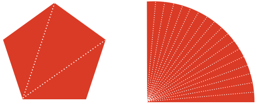
Thus, in FigureOne a shape is a collection points that describe the vertices each triangle in a shape.
Transform
A transform describes a spatial change, for example a translation or rotation.
Mathematically, a transform is a 4x4 matrix that when mulitiplied with a point creates a new point that undergoes the transform. For example:
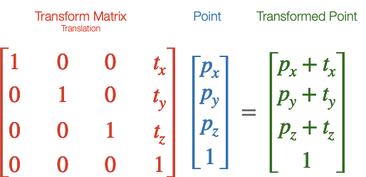
All transforms in FigureOne create such a matrix, and can be used to transform points.
Transforms can be chained together, so a rotation transform can be chained with a translation transform to both rotate and translate. Transform chains can be arbitrarily long, and include multiple transforms of the same type.
In the language of FigureOne, a Transform is made up of a series of transform components where each component is a single transform step (like a rotation or translation).
The Transform class makes creating transforms easy.
// Create a transform
const transform = new Fig.Transform().scale(2).rotate(Math.PI / 2).translate(0, 1);
// Get the transform matrix
const matrix = transform.matrix();
// Define a point
const p = new Fig.Point(2, 3);
// Transform the point
const transformedPoint = p.transformBy(matrix);
WebGL
FigureOne uses WebGL for drawing shapes. As of September 2021, WebGL is supported by 97.72% of browsers (with Opera Mini at 1.15%, Android Browser before 2014 at 0.35% and Internet Explorer before 2013 at 0.19% being the main browsers without support).
WebGL leverages GPU hardware to accelerate rendering. As such very complex shapes (with millions of vertices) can be rendered efficiently on low end clients. WebGL does this by limiting the amount of data transferred between the CPU and GPU on each draw frame, and moving as much of the the per vertex calculations into the GPU (where there are many parallel cores) as possible. A standard WebGL work flow is:
- Define the vertices of a shape once, and load them into a GPU memory buffer
- On each draw frame, pass a transform matrix from the CPU to GPU that will transform all the points in the shape
- The GPU then transforms each vertex in its memory buffer with the transform for final screen rendering
WebGL is very powerful, but can be hard to get started with due to its low-level nature relative to JavaScript. While FigureOne hides the complexity of WebGL from the user, it is still useful to understand the above workflow as FigureOne is organized with this work flow in mind, and the more such a work flow can be followed, then the more performant the end result will be.
FigureOne also supports the cases where this work flow is not adequate, for example when vertices of a shape are morphing into a different shape. In such cases care needs to be taken to ensure a good end user experience. See morphing for more information.
Figures, Primitives and Collections
A figure is composed of one or more figure elements. A figure element is a shape, some text, or it may be a collection of other elements. These elements combine to create a complex drawing, graph or equation.
In the language of FigureOne, there are two types of FigureElement:
- FigureElementPrimitive - an element that will draw something to the screen, such as a line, shape or text
- FigureElementCollection - collections of elements that will move or be operated on together
Each FigureElement has a Transform that transforms an element in space (e.g. rotates, translates, scales etc) when it is time to draw the element. In the case of a FigureElementPrimitive, the shape or text will be transformed. In the case of a FigureElementCollection, all the figure elements it contains will have their transforms cascaded with the collection's transform.
This means there is a heierachy of FigureElement objects, where the parent transform is combined with (cascaded with) the child transform. Therefore collections can be thought of as modular building blocks of a more complex figure.
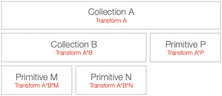
Example
As an example, let's say we want to create a labeled line where the line and label both rotate together.
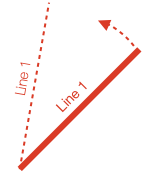
To create this, we could use a line and text primitive within a collection:
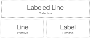
To rotate both label and line in tandem, we simply need to rotate the collection.
Code
Let's see the code for the example above. Two files, index.html and index.js should be in the same folder.
<!-- index.html -->
<!doctype html>
<html>
<body>
    <div id="figureOneContainer" style="width: 1200px; height: 800px; background-color: white;">
    </div>
    <script type="text/javascript" src='https://cdn.jsdelivr.net/npm/figureone@0.15.10/figureone.min.js'></script>
    <script type="text/javascript" src='./index.js'></script>
</body>
</html>
// Note: the `position` property is a short hand way of defining a transform with a
// translation component.

// Set the figure limits to be 0 ≤ x ≤ 6 and 0 ≤ y ≤ 4
const figure = new Fig.Figure({ scene: [0, 0, 6, 4] });
figure.add(
  {
    name: 'labeledLine',
    make: 'collection',
    elements: [
      {
        make: 'line',
        p1: [0, 0],
        p2: [2, 0],
        width: 0.01,
        color: [1, 0, 0, 1],
      },
      {
        make: 'text',
        text: 'Line 1',
        // Set the label position to be at the middle point of the line
        // And slightly above it
        position: [1, 0.1],
        font: { color: [1, 0, 0, 1] },
        xAlign: 'center',
      },
    ],
    // Set the position of the collection such that the end of the line is
    // in the middle of the figure
    position: [3, 2],
    touchBorder: 0.3,
    move: {
      type: 'rotation',
    },
  },
);
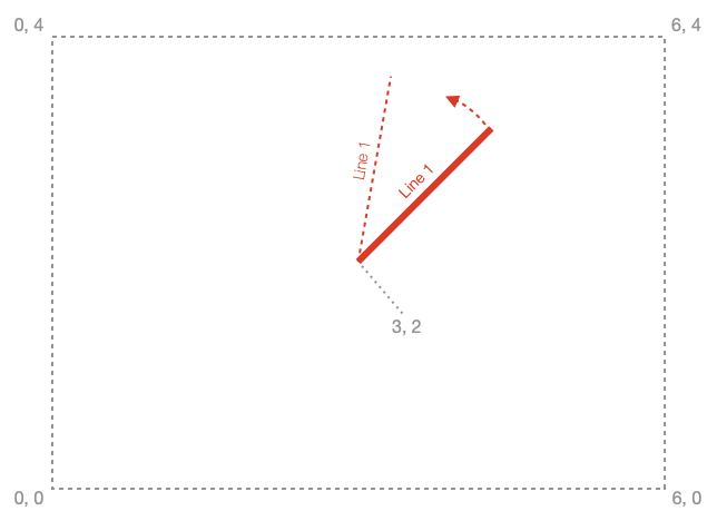
This code positions text relative to the middle of a line of length 2.

It then positions the collection so the line end is in the middle of the figure.
Coordinate spaces
FigureOne renders shapes in WebGL, text with the HTML Canvas API and can even manipulate html elements as figure elements. As WebGL is used most in FigureOne, it will be used as an example to introduce coorindate spaces and why they matter.
WebGL is rendered in a html canvas element.
The canvas element is defined in screen pixels. WebGL re-maps the canvas pixels to -1 to +1 coordinates in both the vertical and horizontal directions, independent on the aspect ratio of the canvas.
When the canvas aspect ratio is not a square, or it is more convenient to create a figure in a coordinate space not mapped between -1 to +1, then it is useful to have a separate figure space. In the example above, the figure space re-maps the GL space to 0 to 6 in the horizontal and 0 to 4 in the vertical.
These are three examples of different coordinate spaces - pixel space, GL space (also called clip space in WebGL nomenclature) and figure space.
If you want to move or modify an element, you need to think about what you want to modify it relative to. Do you want to move it relative to other elements in the figure? In other words, do you want to move it in figure space? Or do you want to move it relative to other elements within the parent collection - local space. Alternately, you might want to modify the vertices of the shape, in draw space.
In simple figures, where no collections are used, or collections don't transform their child elements you don't really need to think about what space you are working in. Figure space will be the same as local space, if you aren't changing vertices of primitives then draw space won't be used, and GL and pixel spaces are rarely needed for most figures as FigureOne handles touch events.
But if you are using collections you may need to convert points between the different spaces. In addition, it is useful to know about these different spaces as sometimes they are referred to in the documentation.
One way to think about what space you are modifying is:
- Elements that are direct children of the figure: element transforms move the element in figure space
- Elements that are direct children of a collection: element transforms move the element in local space (the space of the parent colleciton)
- Vertex or text definitions in element primitives: draw space
- A collection's children are in the collection's draw space
For example, a square's vertices are defined in draw space.
The transform of the figure element primitive that draws the square will move the square in local space - the space relative to all other elements that are the children of the same parent collection.
If the parent collection's parent is the figure itself, then its transform will move the collection in figure space.
Converting between spaces is relatively straight forward. Figure elements have methods to find their position or bounds in figure, local or draw space. The figure has transforms that allow conversion between figure, GL and pixel spaces. For example see:
- FigureElement.spaceTransformMatrix()
- FigureElement.getPosition()
- FigureElement.setPositionToElement()
- Figure.spaceTransformMatrix()
An example of where this is useful is if two FigureElements have different parents, and you want to move one to be in the same position as the other. To do this you would convert the target FigureElement position to figure space, and then to the local space of the FigureElement to move.
Drawing
When it is time to draw the scene, the figure will pass an initial transform to the first element in the hierarchy. In the example above, the "Labeled Line" collection. This transform will include any translations and scaling needed to convert from figure space to GL space for actual rendering.
The "Labeled Line" collection will then cascade this transform with it's own rotation and translation transform, and pass this to its children, the "Label" and "Line" primitives.
The "Label" primitive has it's own transform that translates it to the middle of the horizontal line in local space. The transform will be combined with the one from its parent, creating a final transform to draw the label with.
The primitive's shape or text definition never needs to change. At draw time, it is simply transformed by it's own transform and all the ancestors directly above it in the hierarchy. This is the same method used by WebGL as it reduces the amount of data that needs to be loaded into the graphics memory each draw frame. All the vertices of a shape are loaded into the graphics memory just once, and for each frame just a transform is passed to inform the graphics processor how to orient the vertices.
If you have a dynamic shape whose vertices do change every frame (like a morphing animation), you can choose to load the vertices every frame. However, depending on the performance of the browser's host machine, and the number of vertices being adjusted, you might see a performance impact compared to a shape with a similar amount of vertices that do not change. That said, for shapes of reasonable size, this will not be a problem.
Creating Shapes
There are several ways to define a shape that a FigureElementPrimitive will draw. FigureOne comes with:
- Built-in shapes
- Generic (custom) shapes
- Low level GL shapes through which WebGL concepts such as shaders, attributes, uniforms and textures can be defined allowing for complete customization and performance optimization
Built-In Shapes
FigureOne comes with a number of common, customizable shapes. For example, to add a polygon to a figure (see OBJ_Polygon for all possible polygon options):
figure.add({
  make: 'polygon',
  sides: 6,
  radius: 0.5,
});
When adding an element to the figure, the most important property (and only one that is required to be defined) is make which tells FigureOne which built-in shape to use. The remaining properties are optional.
For a complete list of built in shapes see:
Generic Shapes
If you need to create a shape that is very different from the built-in shapes then the generic or generic3 primitive can be used. Most commonly, the points used to define the shape actually define a series of triangles that create a fill. The example below creates two triangles.
figure.add({
  make: 'generic',
  points: [
    [-1, -1], [0, -1], [0, 1],
    [0, -1], [1, -1], [1, 1],
  ],
});
For more information on drawing generic shapes see:
Low Level GL Shapes
FigureElements are optimized for both performance and convenience. To fully optimize for performance, a lower level GL primitive can be used (see OBJ_GenericGL).
Using this primitive requires some familiarity with the concepts of WebGL. It provides an easy way to create custom shaders with custom attributes and uniforms.
This primitive still handles all calls to the WebGL API, and so it is a relatively easy way to get started with WebGL shaders.
The OBJ_GenericGL has example code on how to use this primitive.
It is not in the scope of this documentation to explain what WebGL is, and how to use it. There are many good resources on the web that already do this - for example WebGLFundamentals gives an excellent introduction to WebGL and this quick reference guid is useful to refer to especially when writing shaders.
Using FigureOne
The example above shows how a figure can be defined with simple javascript objects, that are able to be encoded in JSON. This means complex figures or modules can be shared and reused easily.
For many uses, it is fine to fully define a figure and all its elements before a user interacts with it.
Figures can also be defined more dynamically, such as in the example below which has exactly the same function as the example above.
// index.js
const figure = new Fig.Figure({ scene: [0, 0, 6, 4 ]});

const label = figure.primitives.text({
  text: 'Line 1',
  position: [1, 0.1],
  font: { color: [0, 0, 1, 1] },
  xAlign: 'center',
});
const line = figure.primitives.line({
  p1: [0, 0],
  p2: [2, 0],
  width: 0.01,
  color: [0, 0, 1, 1],
});

const labeledLine = figure.collections.collection({
  position: [3, 2],
  touchBorder: 0.3,
});
figure.elements.add('labeledLine', labeledLine);
labeledLine.add('line', line);
labeledLine.add('label', label);
labeledLine.move.type = 'rotation';
labeledLine.setMovable();
Boilerplate Code
To test examples within the API reference create an index.html file and index.js file. All examples are snippets which can be appended to the end of the index.js file.
The index.html file is the same for all examples:
<!-- index.html -->
<!doctype html>
<html>
<body>
    <div id="figureOneContainer" style="width: 800px; height: 800px; background-color: white;">
    </div>
    <script type="text/javascript" src='https://cdn.jsdelivr.net/npm/figureone@0.15.10/figureone.min.js'></script>
    <script type="text/javascript" src='./index.js'></script>
</body>
</html>
The index.js file is different depending on the example.
2D Boilerplate
// index.js
const figure = new Fig.Figure({ scene: [-3, -3, 3, 3], color: [1, 0, 0, 1], lineWidth: 0.01, font: { size: 0.1 } });
3D Boilerplate
// Create the figure and set the scene
const figure = new Fig.Figure({
  scene: {
    style: 'orthographic',
    camera: { position: [2, 1, 1], up: [0, 1, 0] },
    light: { directional: [0.7, 0.5, 0.2] } },
  },
});

// Add x, y, z axis
figure.add(
  {
    make: 'collections.axis3',
    start: -1,
    width: 0.01,
    length: 2,
  },
);
Text Boilerplate
// index.js
const figure = new Fig.Figure({ scene: [-3, -3, 3, 3], color: [1, 0, 0, 1], lineWidth: 0.01, font: { size: 0.1 } });
figure.add([
  {
    name: 'origin',
    make: 'polygon',
    radius: 0.01,
    line: { width: 0.01 },
    sides: 10,
    color: [0.7, 0.7, 0.7, 1]
  },
  {
    name: 'gridMinor',
    make: 'grid',
    bounds: [-3, -3, 6, 6],
    step: 0.1,
    color: [0.7, 0.7, 0.7, 1],
    line: { width: 0.001 },
  },
  {
    name: 'gridMajor',
    make: 'grid',
    bounds: [-3, -3, 6, 6],
    step: 0.5,
    color: [0.8, 0.8, 0.8, 1],
    line: { width: 0.004 },
  },
]);
Animation Boilerplate
// index.js
const figure = new Fig.Figure({ scene: [-3, -3, 3, 3], color: [1, 0, 0, 1], lineWidth: 0.01, font: { size: 0.1 } });

// grid
figure.add([
  {
    name: 'origin',
    make: 'polygon',
    radius: 0.01,
    line: { width: 0.01 },
    sides: 10,
    color: [0.7, 0.7, 0.7, 1]
  },
  {
    name: 'grid',
    make: 'grid',
    bounds: [-3, -3, 6, 6],
    step: 0.1,
    color: [0.7, 0.7, 0.7, 1],
    line: { width: 0.001 },
  },
  {
    name: 'gridMajor',
    make: 'grid',
    bounds: [-3, -3, 6, 6],
    step: 0.5,
    color: [0.8, 0.8, 0.8, 1],
    line: { width: 0.004 }
  },
]);

// shape to animate
const p = figure.add(
  {
    name: 'p',
    make: 'polygon',
    sides: 4,
    radius: 0.5,
    position: [0, 0],
  },
);
Geometry
To define many shapes, geometric concepts such as points and lines need to be used.
FigureOne includes classes that define a:
Each of these classes have convenience methods that make it easy to to work with them such as
- Checking if two points are equal or within some delta
- Adding, subtracting and multiplying points
- Checking if a point is on a line, or inside a rectangle
- Finding the intersection between two lines
- Transforming a point with a transform
- Chaining transforms together
There are many more methods in each class and it is recommended you quickly review them so you know what is available and don't need to reimplement existing logic.
Many of these classes are used by each other. For instance, Line makes a lot of use of Point. Therefore instead of defining a point by instantiating a class each time, short hand, parsable equivalents for Points, Lines, Rectangles and Transforms are available. For more information refer to:
Point
Object representing a point or vector.
Contains methods that makes it convenient to work with points and vectors.
// get Point from Fig
const { Point } = Fig;
// define a point at (0, 2)
const p = new Point(0, 2);
// find the distance to another point (0, 1) which will be 1
const d = p.distance([0, 1]);
// add to another point (3, 1) which will result in (3, 3)
const q = p.add(3, 1);
Return a point with the negative of each component.
Point:
p = new Point(1, 2, 3);
q = p.neg();
// q = Point{x: -1, y: -2, z: -3}
Multiply each corresponding component of two points.
Point:
p = new Point(2, 3, 4);
q = new Point(3, 4, 5);
m = p.mul(q);
// m = Point{x: 6, y: 12, z: 20}
Complex multiplication.
Multiply two 2D points such that x is the real value and y is the imaginary value of a complex number. z is ignored.
(TypeParsablePoint)
Point:
p = new Point(1, 2); // represents 1 + 2i
q = new Point(2, 3); // represents 2 + 3i
m = p.cmul(q);
// m = Point{x: -4, y: 7, z: 0}
// which represents the complex value -4 + 7i
Complex division.
Divide this point by complexPoint. Each point represents a complex
number where x is the real value and y is the imaginary value.
z is ignored.
(TypeParsablePoint)
Point:
p = new Point(-4, 7); // represents -4 + 7i
q = new Point(1, 2); // represents 1 + 2i
m = p.cdiv(q);
// m = Point{x: 2, y: 3, z: 0}
// which represents the complex value 2 + 3i
Return the distance between two points (or point and origin if no input supplied)
((TypeParsablePoint | null)
= null)
number:
p = new Point(1, 1, 1);
q = new Point(0, 0, 0);
d = q.distance(p);
// d = 1.7320508075688772
Return the distance between (0, 0, 0) and the point. If the point represents a vector, then it is the length of the vector.
number:
Scalar projection of this vector in direction of vector v.
number:
Return a vector with magnitude of the scalar projection of this vector on v and direction +/- v (depending on the sign of the scalar projection).
Point:
Return a new point that is clipped to min and max values from the origin.
Use a point as a parameter to define different (x, y) min/max values, a number to define the same (x, y) min/max values, or null to have no min/max values.
Point:
p = new Point(2, 2);
q = p.clip(1, 1);
// q = Point{x: 1, y: 1}
p = new Point(2, 2);
q = p.clip(1, null);
// q = Point{x: 1, y: 2}
p = new Point(-2, -2);
minClip = new Point(-1, -1.5);
q = p.clip(minClip, null);
// q = Point{x: -1, y: -1.5}
Transform the point with a 4x4 matrix (3 dimensional transform in homogenous coordinates)
(Type3DMatrix)
Point:
// Transform a point with a (2, 2, 0) translation then 90º z rotation
p = new Point(1, 1);
m = new Transform3().translate(2, 2, 0).rotate(0, 0, Math.PI / 2).matrix();
// m = [0, -1, 0, -2, 1, 0, 0, 2, 0, 0, 0, 1]
q = p.transformBy(m)
// q = Point{x: -3, y: 3, 0}
Rotate a point some angle around a point
(number)
in radians
(TypeParsablePoint
= new Point(0,0,0))
in radians
(TypeParsablePoint
= new Point(0,0,1))
Point:
// Rotate a point around the origin
p = new Point(1, 0);
q = p.rotate(Math.PI)
// q = Point{x: -1, y: 0}
// Rotate a point around (1, 1)
p = new Point(2, 1);
q = p.rotate(Math.PI, new Point(1, 1))
// q = Point{x: 0, y: 1}
Return the unit vector of the point (the direction vector of length 1 from the origin to the point).
Point:
Compare two points for equality to some precision or delta
(TypeParsablePoint)
point to compare
(boolean
= false)
if
true
then precision is the delta value the two
points must be within to be equal
boolean:
p = new Point(1.123, 1.123);
q = new Point(1.124, 1.124);
p.isEqualTo(q)
// false
p.isEqualTo(q, 2)
// true
Line
Object representing a Line.
Contains methods that makes it conventient to use lines in calculations.
((TypeParsablePoint | OBJ_LineDefinition))
(TypeParsablePoint
= [0,0])
((0 | 1 | 2)
= 2)
number of ends the line has.
2
ends is a finite
line.
1
end is an infinite line that terminates at the first point, and
goes through the second point to infinity.
0
ends is an infinite line
that goes through both first and second points to infinity.
// get Line from Fig
const { Line } = Fig;
// define a line from [0, 0] to [1, 0]
const l = new Line([0, 0], [1, 0]);
// find the length of the line
const len = l.length();
// get the point at length 0.2 along the line
const p = l.pointAtLength(0.2);
// find the intersect with another line
const i = l.intersectsWith([[0.5, 0.5], [0.5, -0.5]]);
Change p1 of the line
(TypeParsablePoint)
Change p2 of the line
(TypeParsablePoint)
Get the unit vector of the line ((p2 - p1) / length).
Return the distance between p1 and p2. Note, for infinite lines this will still return the distance between p1 and p2 that defines the line.
number:
true if point is along the line extended to infinity on both ends
(TypeParsablePoint)
(number
= 8)
boolean:
true if point is on the line.
If the line has 2 or 1 finite ends, point must be on or between the
defined ends.
(TypeParsablePoint)
(number
= 8)
boolean:
Perpendicular distance from point to line
(TypeParsablePoint)
number:
true if line is parrallel to this line.
(TypeParsableLine)
(number
= 8)
boolean:
true if two lines are equal to within some rounding precision.
boolean:
true if this line is within line2
(TypeParsableLine)
(number
= 8)
boolean:
true if this line is along the infinite length of line2
(TypeParsableLine)
(number
= 8)
boolean:
true if this line is contained within line2
(TypeParsableLine)
(number
= 8)
boolean:
Create a line that is offset by some distance from this line.
'left', 'right', 'top' and 'bottom' are relative to cartesian
coordinates.
'positive' to the right of a vertical line defined from bottom to top and
above a horizontal line defined from right to left. Another way to think of
it is if lines are used to create a polygon in the positive rotation
direction (CCW), the the 'positive' side will be on the outside of the
polygon.
'negative' is then the inside of the same polygon.
((TypeParsablePoint | "left" | "right" | "top" | "bottom" | "positive" | "negative"))
((number | null)
= null)
(boolean
= true)
Line:
Create a line that is offset by some distance from this line.
'left', 'right', 'top' and 'bottom' are relative to cartesian
coordinates.
'positive' to the right of a vertical line defined from bottom to top and
above a horizontal line defined from right to left. Another way to think of
it is if lines are used to create a polygon in the positive rotation
direction (CCW), the the 'positive' side will be on the outside of the
polygon.
'negative' is then the inside of the same polygon.
(("left" | "right" | "top" | "bottom" | "positive" | "negative"))
(number)
Line:
Perpendicular distance between two lines extended to infinity
(TypeParsableLine)
(number
= 8)
number
Return the point projected onto the line by some point off the line. The line from the projected point to the offline point will be perpendicular to the line.
Point
The intersection between this line and line2.
The returned result is an Intersect object with the keys
intersect, offLine and colinear.
If no intersect exists, then intersect will be undefined.
If an intersect exists, and the intersect is within both lines, then
offLine will be true. If at least one of the lines needs to be extended
to reach the intersect point, then offLine will be false.
If the lines are collinear but do not overlap, then the intersect point
will be the midpoint between the two closest ends. offLine will be true
and collinear will be true.
If the lines are collinear and overlap fully (or are equal), then the
intersect will be p1 of the calling line, offLine will be false and
collinear will be true.
If either line has zero length, then an exception will be thrown.
(TypeParsableLine)
(number
= 8)
Intersect:
Clip a point to be on a line.
If point is not along line, then it will be projected onto it.
If point is not on line, then the closest line end will be returned.
(TypeParsablePoint)
point to clip
Point:
clipped point
Plane
Object representing a plane.
Contains methods that makes it convenient to operate on planes, points and lines.
A plane can either be created with:
- a point on the plane and a normal
- 3 points on the plane
If defined with 3 points P1, P2, and P3, then the normal will be in the direction of the cross product of vectors P1P2 and P1P3.
((TypeParsablePlane | TypeParsablePoint)
= [[0,0,0],[0,0,1]])
position of plane
or parsable plane definition
((TypeParsablePoint | null)
= null)
if
p1OrDef
is a point and
p3
is
null
, then
this parameter will define the plane normal (
null
)
((TypeParsablePoint | null)
= null)
if defined, then
p1OrDef
and
normalOrP2
will define the first two points of a three point plane
definition
// define a plane at the origin in the XZ plane
const p = new Plane([0, 0, 0], [0, 1, 0]);
// see if a point is on the plane
const result = p.hasPointOn([1, 0, 1]);
// find the intersect with a line
const i = lineIntersect([[0, -0.5, 0], [0, 0.5, 0]])
Two planes are considered equal if they are parallel, and the same point exists on both planes.
If the plane normal direction also needs to be compared, then use includeNormal = true.
boolean:
true if two planes are parallel to each other.
(TypeParsablePlane)
(number
= 8)
boolean:
Returns intersect line of two planes. Returns null if planes are parallel
and have no intersect.
(TypeParsablePlane)
(number
= 8)
(null | Line):
intersect line
true if line is parallel to plane.
(TypeParsableLine)
(number
= 8)
boolean:
Returns the intersect point for a line (extended to infinity) with a plane.
(TypeParsableLine)
(number
= 8)
(Point | null):
intersect point.
null
if the line does not
intersect
true if a line lies within the plane
(TypeParsableLine)
(number
= 8)
(Point | null):
intersect point.
null
if the line does not
intersect
Rect
An object representing a rectangle.
(number)
left location
(number)
bottom location
(number)
rectangle width
(number)
rectangle height
// get Rect from Fig
const { Rect } = Fig;
// define a rect centered at origin with width 4 and height 2
const r = new Rect(-2, -1, 4, 2);
Left side x coordinate
Rectange width
Rectangle height
Bottom side y coordinate
Top side y coordinate
Right side x coordinate
Returns true if point is within or on the border of the rectangle
(TypeParsablePoint)
point to test
(number
= 8)
precision to test
boolean:
const r = new Rect(-2, -1, 4, 2);
// check if point is within the rectangle (will return `true`)
const result = r.isPointInside([0, 1]);
Find the intersect of the line from the center of the rectangle to the point, with the rectangle border.
(TypeParsablePoint)
(Point | null):
intersect
Find the intersect(s) between a line and rectangle
(TypeParsableLine)
Array<Point>:
Transform
A Transform is a chain or cascade of transform components, such as rotations and translations.
The transform components cascade to form a single 3D transform matrix in homogenous coordinates - meaning the result is a 4x4 matrix. This matrix can be used to transform a point in space.
There are several built in transform components:
- Translation
- Scale
- Rotation
- Direction transform
- Custom (where a specific matrix can be defined)
- Change of basis from standard basis
- Change of basis from an initial basis
Matrix multiplication is not commutative, and so chaining transforms is not commutative. This means the order of components is important.
For example, if a point (1, 0) is first translated by (1, 0) and then rotated by π / 2, then it will start at (1, 0), then move to (2, 0), then rotate to (0, 2).
In comparison if the same point is first rotated by π / 2 then translated by (1, 0) it will start at (1, 0), then rotate to (0, 1), then move to (1, 1).
In this Transform object, the order that components are defined, is the order the resulting transform will represent.
A transform can be created by either chaining transform component methods on an instantiated Transform object, or using an array definition of components. For example the following two transforms are the same:
const t1 = new Transform().scale(1).translate(1, 0);
const t2 = new Transform([['s', 1], ['t', 1, 0]]);
(TypeParsableTransform
= [])
chain of transform components.
Query if transform has a specific component.
(TypeTransformComponentName)
boolean:
true
if component name exists
Set a component at a speicific index of the transform definition.
(number)
index to set component
(TypeTransformComponent)
component definition
Transform:
this transform
Add a transform component to the chain
(TypeTransformComponent)
component definition
Transform:
this transform
Return a duplicate transform with an added translation component.
The translation can either be defined as:
- A point
- x, y values (z will be automatically set to 0)
- x, y, and z values
Transform:
Return a duplicate transform with an added direction transform component.
Transform:
Return a duplicate transform with an added change of basis from the standard basis transform component.
(TypeBasisObjectDefinition)
Transform:
Return a duplicate transform with an added change of basis transform component.
(TypeBasisObjectDefinition)
(TypeBasisObjectDefinition)
(TypeBasisObjectDefinition)
Transform:
Return a duplicate transform with an added custom transform component.
(Type3DMatrix)
Transform:
Return a duplicate transform with an added scale transform component
Transform:
Clip all rotation (2D, axis, x, y, z rotations) transform components
within this transform chain angles between 0º-360º, -180º-180º, or not at
all (null)
Only angle values are clipped. The axis values of the axis rotation is not changed.
(("0to360" | "-180to180" | null))
Update the nth translation transform component with a new translation.
(TypeParsablePoint)
(number
            = 0)
Transform:
Return a linearly interpolated transform between this transform and
delta at some percent between the two.
For translation transform components, interpolation can either be
'linear' or 'curved'.
(Transform)
delta transform
(number)
percent to interpolate where 0 is this transform
and 1 is delta transform
(("linear" | "curved" | "curve")
= 'linear')
(OBJ_TranslationPath
= {})
Transform:
Update the nth scale transform component with a new scale.
(TypeParsablePoint)
(number
            = 0)
Transform:
Update the nth rotation transform component.
Transform:
Update the nth change of basis transform component.
Transform:
Return the matrix that respresents the cascaded transform chain
Type3DMatrix:
Return the matrix that respresents the cascaded transform chain
((number | null)
= null)
round the matrix to some precision or
null
for no rounding (
null
)
Type3DMatrix:
true if transformToCompare has the same order of transform components.
(TypeParsableTransform)
boolean:
true if transformToCompare is equal to this transform within some
precision.
(TypeParsableTransform)
(number
= 8)
boolean:
true if transformToCompare is wihtin some delta of this transform.
isEqualTo rounds the values to some precision to compare values. In
comparison this will directly compare the delta between values. This may
be more useful than rounding when values are close to rounding thresholds.
(TypeParsableTransform)
(number
= 0.00000001)
boolean:
Subtract each corresponding transform component. Both transforms must have the same shape.
(TypeParsableTransform
= new Transform())
Transform
Subtract each corresponding transform component. Both transforms must have the same shape.
(TypeParsableTransform
= new Transform())
Transform
Multiply each corresponding transform component. Both transforms must have the same shape.
(TypeParsableTransform
= new Transform())
Transform
Cascade two transforms together such that this transform transforms the input transform. In other words, the transform components of the input transform will performed first before this transform.
(TypeParsableTransform)
Transform:
Cascade two transforms together such that this transform is transformed by the input transform. In other words, the this transform's components of will performed first before the input transform transform.
(TypeParsableTransform)
Transform:
Transform
Animations are simply interpolating each value within a rotation definition
independently (either between a start and target or from a start with
velocity). Therefore, animating any values that belong to vectors
(direction ('dir' or 'rd'), change of basis ('rbasis' or 'rb'), or the axis
of axis/angle) may result in unexpected animations. For example, if animating
a rotation direction from [1, 0, 0] to [-1, 0, 0] it might be expected that
a π radians rotation would occur. Instead, it will look like no rotation
will have started, then a π rotation will happen in a single frame, and then
it will look stationary again. This is because only the x component of the
direction vector will change each animation frame. As a rotation direciton
that is [0.5, 0, 0] is the same as [1, 0, 0], then for half the animation it
will look like nothing is changing. When the x component cross from the 0
point, the element's rotation will instantly flip. Then for the second have
of the rotation as the x component gets more negative it will once again
look stationary.
If wanting to animate a direction vector, use directionToAxisAngle or angleFromVectors and then use a axis/angle rotation keeping the axis constant. If wanting to animate a change of basis rotation, then use a CustomAnimationStep to manage how to change the basis vectors over time.
Query if transform has a specific component.
(TypeTransformComponentName)
boolean:
true
if component name exists
Set a component at a speicific index of the transform definition.
(number)
index to set component
(TypeTransformComponent)
component definition
Transform:
this transform
Add a transform component to the chain
(TypeTransformComponent)
component definition
Transform:
this transform
Return a duplicate transform with an added translation component.
The translation can either be defined as:
- A point
- x, y values (z will be automatically set to 0)
- x, y, and z values
Transform:
Return a duplicate transform with an added direction transform component.
Transform:
Return a duplicate transform with an added change of basis from the standard basis transform component.
(TypeBasisObjectDefinition)
Transform:
Return a duplicate transform with an added change of basis transform component.
(TypeBasisObjectDefinition)
(TypeBasisObjectDefinition)
(TypeBasisObjectDefinition)
Transform:
Return a duplicate transform with an added custom transform component.
(Type3DMatrix)
Transform:
Return a duplicate transform with an added scale transform component
Transform:
Clip all rotation (2D, axis, x, y, z rotations) transform components
within this transform chain angles between 0º-360º, -180º-180º, or not at
all (null)
Only angle values are clipped. The axis values of the axis rotation is not changed.
(("0to360" | "-180to180" | null))
Update the nth translation transform component with a new translation.
(TypeParsablePoint)
(number
            = 0)
Transform:
Return a linearly interpolated transform between this transform and
delta at some percent between the two.
For translation transform components, interpolation can either be
'linear' or 'curved'.
(Transform)
delta transform
(number)
percent to interpolate where 0 is this transform
and 1 is delta transform
(("linear" | "curved" | "curve")
= 'linear')
(OBJ_TranslationPath
= {})
Transform:
Update the nth scale transform component with a new scale.
(TypeParsablePoint)
(number
            = 0)
Transform:
Update the nth rotation transform component.
Transform:
Update the nth change of basis transform component.
Transform:
Return the matrix that respresents the cascaded transform chain
Type3DMatrix:
Return the matrix that respresents the cascaded transform chain
((number | null)
= null)
round the matrix to some precision or
null
for no rounding (
null
)
Type3DMatrix:
true if transformToCompare has the same order of transform components.
(TypeParsableTransform)
boolean:
true if transformToCompare is equal to this transform within some
precision.
(TypeParsableTransform)
(number
= 8)
boolean:
true if transformToCompare is wihtin some delta of this transform.
isEqualTo rounds the values to some precision to compare values. In
comparison this will directly compare the delta between values. This may
be more useful than rounding when values are close to rounding thresholds.
(TypeParsableTransform)
(number
= 0.00000001)
boolean:
Subtract each corresponding transform component. Both transforms must have the same shape.
(TypeParsableTransform
= new Transform())
Transform
Subtract each corresponding transform component. Both transforms must have the same shape.
(TypeParsableTransform
= new Transform())
Transform
Multiply each corresponding transform component. Both transforms must have the same shape.
(TypeParsableTransform
= new Transform())
Transform
Cascade two transforms together such that this transform transforms the input transform. In other words, the transform components of the input transform will performed first before this transform.
(TypeParsableTransform)
Transform:
Cascade two transforms together such that this transform is transformed by the input transform. In other words, the this transform's components of will performed first before the input transform transform.
(TypeParsableTransform)
Transform:
TypeParsablePoint
A Point can be defined in several ways
- As an instantiated Point
- As an x, y tuple: [number, number]
- As an x, y, z tuple: [number, number, number]
- As an x, y string: '[number, number]'
- As an x, y, z string: '[number, number, number]'
- As a recorder state definition: { f1Type: 'p', state: [number, number, number] } }
- A string representation of all options except the first
If points are defined with only a x and y component, then z will be
set to 0 automatically.
Type: (Type2Components | Type3Components | Point | string | TypeF1DefPoint)
// p1, p2, p3 and p4 are all the same when parsed by `getPoint`
p1 = new Fig.Point(2, 3);
p2 = [2, 3];
p3 = '[2, 3]';
p4 = { f1Type: 'p', state: [2, 3] };
p5 = [2, 3, 0];
TypeParsableLine
A Line is defined with either:
- an instantiated Line
- two points [{@link TypeParsablePoint}, {@link TypeParsablePoint}]
- two points and the number of ends
[{@link TypeParsablePoint}, {@link TypeParsablePoint},
1 | 2 | 0] - a line definition object OBJ_LineDefinition
- A recorder state definition TypeF1DefLine
- A string representation of all options except the first
The ends defines whether a line is finite (a line segment between two
points - ends = 2), a ray (a line extending to infinity in one direction
from a point - ends = 1), or a infinite line (a line extending to infinity
in both directions - ends = 0).
Type:
([TypeParsablePoint, TypeParsablePoint, (2 | 1 | 0)] | [TypeParsablePoint, TypeParsablePoint] | OBJ_LineDefinition | TypeF1DefLine | Line)
// l1, l2, l3, l4, l5, and l6 are all the same
l1 = new Fig.Line([0, 0], [2, 0]);
l2 = Fig.getLine([[0, 0], [2, 0]]);
l3 = Fig.getLine({ p1: [0, 0], length: 2, direction: [1, 0] });
l4 = Fig.getLine({ p1: [0, 0], length: 2, angle: 0 });
l5 = Fig.getLine({ p1: [0, 0], length: 2, theta: Math.PI / 2, phi: 0 });
l6 = Fig.getLine({ p1: [0, 0], p2: [2, 0] });
TypeParsablePlane
A Plane is defined with either:
- an instantiated Plane
- a position and normal vector [{@link TypeParsablePoint}, {@link TypeParsablePoint}]
- three points [{@link TypeParsablePoint}, {@link TypeParsablePoint}, {@link TypeParsablePoint}]
- A recorder state definition TypeF1DefPlane
- A string representation of all options except the first
When defining 3 points p1, p2 and p3, the normal will be in the direction of the cross product of p12 with p13.
Type: ([TypeParsablePoint, TypeParsablePoint] | [TypeParsablePoint, TypeParsablePoint, TypeParsablePoint] | Plane | string)
// p1, p2, and p3 are all equal planes
p1 = new Fig.Plane([0, 0, 0], [0, 1, 0]);
p2 = Fig.getPlane([[0, 0, 0], [0, 1, 0]]);
p3 = Fig.getPlane([[0, 0, 0], [1, 0, 0], [0, 0, 1]]);
TypeParsableRect
A Rect can be defined with either
- an instantiated Rect
- an array of left, bottom, width, height values
[number, number, number, number] - a recorder state definition TypeF1DefRect
- a string representation of all options except the first
Type: ([number, number, number, number] | Rect | TypeF1DefRect | string)
// All rectangles are the same when parsed by `getRect` and have a lower
left corner of `(-2, -1)`, a width of `4`, and a height of `2`
const r1 = Fig.getRect([-2, -1, 4, 2]);
const r2 = new Fig.Rect(-2, -1, 4, 2);
const r3 = Fig.getRect('[-2, -1, 4, 2]');
TypeParsableTransform
A transform is defined with either:
- an instantiated Transform
- an array of transform components TypeTransformUserDefinition
- a single transform component TypeTransformComponentUserDefinition
- a recorder state definition TypeF1DefTransform
- A string representation of all options except the first
Type: (TypeTransformUserDefinition | TypeTransformComponentUserDefinition | Transform | TypeF1DefTransform)
// t1, t2 and t3 are all equal transforms
const t1 = new Fig.Transform().scale(2).rotate(Math.PI / 2).translate(1, 1);
const t2 = new Fig.Transform([['s', 2], ['r', Math.PI / 2], ['t', 1, 1]]);
const t3 = Fig.getTransform([['s', 2], ['r', Math.PI / 2], ['t', 1, 1]]);
Figure
Figure Setup
To attach a figure to a HTML document:
- The HTML document needs a
divelement to which FigureOne will attach the drawing canvas to. By default FigureOne will look for adivwith ID'figureOneContainer'. A custom ID can be specificed if desired or more than one figure in the document will be created. - The FigureOne library
figureone.min.jsneeds to be loaded either from a public CDN (like below), or from a local source - A JavaScript file (in this case
index.js) that creates the figure, and adds elements to it needs to be loaded and executed.
<!-- index.html -->
<!doctype html>
<html>
<body>
<div id="figureOneContainer" style="width: 1200px; height: 800px; background-color: white;">
</div>
<script type="text/javascript" src='https://cdn.jsdelivr.net/npm/figureone@0.15.10/figureone.min.js'></script>
<script type="text/javascript" src='./index.js'></script>
</body>
</html>
In index.js, the figure can be created using the OBJ_Figure options object as a parameter to Figure. One of the most commonly used properties sets the figure's scene (the expanse of space to show).
const figure = new Fig.Figure({
scene: [0, 0, 6, 4],
});
For 2D figures, a simple array containing the left, bottom, right and top limits can be used. In three dimensions, the scene also defines from where the visible space is viewed (camera) and lighting (see 3D Shape Primitives for a detailed explanation).
Now the figure is setup, shapes can be added to it.
Figure
Primary Figure class.
A figure will attach a WebGL canvas and 2D canvas
to the html div element with id "figureOneContainer".
The figure creates and manages all drawing elements, renders the drawing elements on a browser's animation frames and listens for guestures from the user.
The figure also has a recorder, allowing it to record and playback states, and gestures.
To attach to a different div, use the htmlId property in the class
constructor.
If a figure is paused, then all drawing element animations will also be paused.
Figure has a number of convenience methods for creating drawing elements
and useful transforms for converting between the different spaces (e.g.
pixel, GL, figure).
Notifications - The notification manager property notifications will
publish the following events:
beforeDraw: published before a frame is drawnafterDraw: published after a frame is drawnresize: published after a resize event, but before frame drawing
(OBJ_Figure
= {})
(FigurePrimitives)
: create figure primitives such
as shapes, lines and grids
(FigureCollections)
: create figure collections such
as advanced lines, shapes, equations and plots
(NotificationManager)
: notification manager for
element
(FontManager)
: watches and reports on font availability
// Simple html and javascript example to create a figure, and add a
// hexagon.
//
// For additional examples, see https://github.com/airladon/FigureOne
//
// Two files `index.html` and `index.js` in the same directory
// index.html
<!doctype html>
<html>
<body>
<div id="figureOneContainer" style="width: 800px; height: 800px; background-color: white;">
</div>
<script type="text/javascript" src='https://cdn.jsdelivr.net/npm figureone@0.15.10/figureone.min.js'></script>
<script type="text/javascript" src='./index.js'></script>
</body>
</html>
// index.js
const figure = new Fig.Figure({ scene: [-1, -1, 1, 1 ]});
figure.add(
{
name: 'p',
make: 'polygon',
radius: 0.5,
sides: 6,
},
);
// Alternately, an element can be added programatically
// index.js
const figure = new Fig.Figure({ scene: [-1, -1, 1, 1 ]});
const hex = figure.shapes.polygon({
radius: 0.5,
sides: 6,
});
figure.add('hexagon', hex);
Add a CollectionsSlideNavigator that controls the root collection of this figure.
(COL_SlideNavigator)
CollectionsSlideNavigator:
Get the CollectionsSlideNavigator for the figure (will only return
if the navigator was added with figure.addSlideNavigator).
CollectionsSlideNavigator:
Add cursor for recording interactive videos. Cursor will be hidden when first added.
(Object)
FigureElement:
cursor element
Get cursor element.
FigureElement:
cursor element
Add a figure element to the root collection of the figure.
If adding an array of elements, then the added elements will be returned in an array (even if only one element is added). If not adding an array, then that single element will be returned.
((string | FigureElement | OBJ_AddElement | Array<(FigureElement | OBJ_AddElement)>))
reference name of element
(FigureElement
= null)
element to add
(Array<FigureElement> | FigureElement):
added element, or array of
added elements
// Add name and element
const element = figure.primitives.polygon({ radius: 1 });
figure.add('name', element);
// Element only (name will be autogenerated)
const element = figure.primitives.polygon({ radius: 1 });
figure.add(element);
// Element definition (if no name is provided, then name will
// be auto generated)
figure.add({
make: 'polygon',
radius: 1,
});
// Array of elements
const element = figure.primitives.polygon({ radius: 1 });
figure.add([
element,
{
make: 'polygon',
radius: 0.2,
color: [0, 0, 1, 1],
},
]);
Get element from an element path with '.' separators.
For instance, if a collection has a child collection 'a', which has a child primitive 'b', then the path would be: 'a.b'.
(FigureElement | null):
element at path. If
elementPath
is
null
, then the figure's base collection is returned. If
elementPath
is invalid then
null
is returned.
// Get all the elements from a figure
figure.add(
{
name: 'c',
make: 'collection',
elements: [
{
name: 'tri',
make: 'triangle',
height: 0.4,
width: 0.4,
},
{
name: 'text',
make: 'text',
text: 'triangle',
position: [0, -0.4],
xAlign: 'center',
},
],
},
);
const c = figure.getElement('c');
// Elements within collections can be found with dot notation
const tri = figure.getElement('c.tri');
// Or the collection can be queried directly
const text = c.getElement('text');
Returns an array of result from getElement calls on an array of paths.
(TypeElementPath)
Array<FigureElement>:
Array of
getElement
results
Returns an array of result from
getElement calls on an
array of paths. Same as getElements but more succinct
(TypeElementPath)
Array<FigureElement>:
Array of
getElement
results
Recreate all automatically generated atlases.
This would be typically used after loading custom fonts.
Return matrix that can convert between 'pixel', 'figure' and 'gl' spaces.
These matrices would be generally used to transform points between spaces.
transformPoint can be used to do this for individual points, but if
converting many points, then generating the transform matrix once and
applying it to each point can be more efficient.
Depending on the type of figure scene, not all space combinations are possible.
For 2D scenes, all combinations are possible.
For 3D scenes:
- 'pixel' to 'gl' will transform a point in pixel space to a point on the XY plane at Z = 0 in GL space.
- 'pixel' to 'figure' is not valid. Use
transformPointinstead where a plane can be defined to intersect with. - Conversions between 'gl' and 'figure' are only valid for 'orthographic'
projections. For perspective projections, the transform matrix is not
general and depends coordinates of the point to be transformed. Use
transformPointfor each point to be transformed.
(("figure" | "gl" | "pixel"))
(("figure" | "gl" | "pixel"))
Transform a point between 'figure', 'gl' and 'pixel' spaces.
plane is only needed when converting from pixel space (a 2D space) to
'figure' space or 'gl' space (a 3D space). A ray from the pixel is drawn
into the screen and the intersection with the defined plane is returned.
(TypeParsablePoint)
(("figure" | "gl" | "pixel"))
space to convert point from
(("figure" | "gl" | "pixel"))
space to convert point to
(TypeParsablePlane
= [[0,0,0],[0,0,1]])
figure space intersection plane for
'pixel' to 'figure' conversion (default: xy plane at z = 0)
Get remaining animation durations of running animations
(number
= this.timeKeeper.now()/1000)
Show specific elements within the figure
(TypeElementPath
= [])
void
Hide specific elements within the figure
(TypeElementPath
= [])
void
Show specific elements within a figure, while hiding all others
(TypeElementPath
= [])
void
Stop all animations, movement and pulses in figure.
(("freeze" | "cancel" | "complete" | "animateToComplete" | "dissolveToComplete")
= 'cancel')
Debug - 3D Shapes
Show touchable 3D shapes in figure. This will only last for one animation frame, so it will not work if an animation is ongoing.
Note, the shown borders will be for the instant this method is called only. If animation is ongoing, the shown borders will not move with the animation. To update the borders, call this method again.
Debug - 2D Shapes
Show the touchBorders of selected elements in the figure or all elements in the figure.
Note, the shown borders will be for the instant this method is called only. If animation is ongoing, the shown borders will not move with the animation. To update the borders, call this method again.
((TypeElementPath | null | "touchable")
= 'touchable')
use
null
for all
elements,
touchable
for all touchable elements or define specific
elements to show (
'touchable'
)
Debug - 2D Shapes
Show the borders or touchBorders of selected elements in the figure or all elements in the figure.
(("border" | "touchBorder")
= 'border')
(
'border'
)
((TypeElementPath | null | "touchable")
= null)
use
null
for all
elements,
touchable
for all touchable elements or define specific
elements to show (
null
)
Sets manual frames.
Normally, when a browser is ready to refresh the screen it will call FigureOne to do a draw. The time between frames is not fixed and depends on a number of factors. This is the most performant way to handle drawing.
However, when debugging it can be useful to manually trigger a draw frame with a defined delta time from the last frame.
This method turns on manual frames. Use frame to trigger a draw.
End manual frames. Reverts drawing to when browser reqeusts it.
Manually trigger a draw frame with a specified time step (in seconds) from
the last draw frame. Can only be used when setManualFrames() has been
called.
(number)
in seconds
Add a frame rate annotation to the figure.
Each time the browser requests FigureOne to paint the screen, FigureOne performs two main tasks:
- setup the figure for a draw (setupDraw) - all visible figure elements are iterated through and if they are animating or moving then their next animation or movement frame is calculated
- draw the figure elements (draw)
Frame rate is determined by FigureOne's total frame processing time (setupDraw time + draw time), and how frequently a browser requests FigureOne to draw a frame.
The frame rate will not be faster than the browser wants, but it can be slower if the total frame processing time is too long.
The frame rate and time durations are reported as both an average, and
worst case (max). The averaging is done over numFrames number of frames.
The screen output is then:
- Ave: F fsp, T ms (S, D)
- Max: F fsp, T ms (S, D)
Where:
- F: Frames per second
- T: Total frame processing time
- S: setupDraw processing time
- D: draw processing time
Note: FigureOne only requests animation frame notifications from the browser when an element is animating or moving. If everything is still, then the frame rate will be 0.
(number
= 10)
(OBJ_FormattedText
= {})
OBJ_Figure
Figure options object
Type: {htmlId: string?, scene: (OBJ_Scene | TypeParsableRect)?, color: TypeColor?, font: OBJ_Font?, lineWidth: number?, length: number?, backgroundColor: number?}
((OBJ_Scene | TypeParsableRect)?)
: define 2D or 3D scene. 3D
can be orthographic or perspective projection, and include camera position
and lighting definition. A 2D scene can be defined using
left
,
right
,
bottom
and
top
, or the short hand rectangle definition.
(OBJ_Font?)
: default shape font (
{ family: 'Helvetica, size: 0.2, style: 'normal', weight: 'normal' }
)
(number?)
: default shape line width
(number?)
: default shape primary dimension
(TypeColor?)
: background color for the figure.
Use
[r, g, b, 1]
for opaque and
[0, 0, 0, 0]
for transparent.
Figure Elements
FigureElement
Figure Element base class
The set of properties and methods shared by all figure elements
A figure element has several color related properties. Color is defined as an RGBA array with values between 0 and 1. The alpha channel defines the transparency or opacity of the color where 1 is fully opaque and 0 is fully transparent.
The color property stores the element's current color, while the
defaultColor property stores the element's color when not dimmed or
dissolving. Color should only be set using the setColor method.
An element can be "dimmed" or "undimmed". For instance,
a red element might turn grey when dimmed. The property
dimColor stores the desired color to dim to and should be set with
setDimColor()
An element can be dissolved in or out with animation. Dissolving
an element out transitions its opacity from its current value to 0.
The opacity property is used when dissolving. The opacity is multiplied by
the alpha channel of color to net a final opacity. Opacity should not be
set directly as it will be overwritten by dissolve animations.
Notifications - The notification manager property notifications will
publish the following events:
beforeSetTransform: published just before thetransformproperty is changedsetTransform: published whenever thetransformproperty is changedstartBeingMoved: published when the element starts being moved by touchstopBeingMoved: published when the element stops being moved by touchstartMovingFreelystopMovingFreelyshow: published when element is shownhide: published when element is hiddenvisibility: published when element element is shown or hiddenonClick: published when element is clicked oncolor: published whenever color is setbeforeDrawafterDrawsetState: state of element has been set
(string)
: reference name of element
(Transform)
: transform to apply element
(Transform)
: transform last used for drawing -
includes cascade or all parent transforms
([number, number, number, number])
: element's current
color defined as red, green, blue, alpha with range 0 to 1
(number)
: number between 0 and 1 that is multiplied with
color
alpha channel to get final opacity
(OBJ_ElementMove)
: movement parameters
(OBJ_Scenarios)
: scenario presets
(ElementState)
: current state of element
(AnimationManager)
: element animation manager
(NotificationManager)
: notification manager for
element
(Object)
: put any custom state information that needs
to be captured with recorder here - only stringify-able values can go in this
object like strings, numbers, booleans and nested arrays or objects
containing these. Functions should not be put in here - use string
identifiers to
fnMap
if functions are needed.
Conveniently set the first translation of the element's transform.
Conveniently set the first rotation of the element's transform.
Conveniently set the first scale of the element's transform.
((TypeParsablePoint | number))
horizontal scale - either
define as full x-y point, or as a number. If scaleOrX is a
number
and
y
is null, then both
x
and
y
will be equally scaled
(number
= 1)
Set element color to dimColor
Set element color to defaultColor
Set transform, color and/or visibility to a predefined scenario.
Pulse element.
An element can be pulsed in scale, a rotation or a translation.
The scale pulse can either be a single pulse, or a number of copies with a range of scales - which has the effect of making regular polygons thick.
Either pass in a callback, or an options object defining the pulse and callback.
((null | OBJ_Pulse | function (): void)
= null)
Transform a point between 'draw', 'local', 'figure', 'gl' and 'pixel' spaces.
plane is only needed when converting from pixel space (a 2D space) to
'figure', 'local' or 'draw' spaces (a 3D space). A ray from the pixel is
drawn into the screen
and the intersection with the defined plane is returned.
'pixel' to 'gl' is also a 2D to 3D transformation, but in this case the XY plane at z = 0 is used in gl space.
(TypeParsablePoint)
(("figure" | "gl" | "pixel"))
space to convert point from
(("figure" | "gl" | "pixel"))
space to convert point to
(TypeParsablePlane
= [[0,0,0],[0,0,1]])
(TypeParsablePlane)
figure space intersection plane for
'pixel' to 'figure' conversion
Return a matrix that can transform from one coordinate space to another.
Type3DMatrix
Return the first scale in the element's transform. Will return
[1, 1] if element's transform doesn't have a scale.
Point:
scale
Return the first rotation in the element's transform.
(("0to360" | "-180to180" | "")
= '')
how to normalize the
returned angle where
''
returns the raw angle
Point:
scale
Get position of element
By default the first translation of the element's transform is returned. This is effectively the element's location in 'local' coordinates.
The position of the element relative to its horizontal and vertical bounds
can also be returned. Use xAlign to find the x coordinate of the left,
center, right or percentage width from left of the element. Use yAlign
to find the bottom, middle, top or percentage height from bottom of the
element.
(("local" | "figure" | "gl" | "draw")
= 'local')
the space to return
the position in
(("center" | "left" | "right" | "location" | number)
= 'location')
horizontal alignment of position. Use a
number
to define the horizontal
position in percentage width from the left.
(("middle" | "top" | "bottom" | "location" | number)
= 'location')
vertical alignment of position. Use a
number
to define the vertical
position in percentage height from the bottom.
Set the element's position in local space such that it lines up with a figure space target.
(TypeParsablePoint)
Align element position in local space such that it is in the same position as the target element (even if that element is in a different local space)
(FigureElement)
Show element.
Set move options
((boolean | OBJ_ElementMove))
Configure all parents to make this element touchable, and make this element touchable and movable
Hide element
void
Toggle hide/show of element
FigureElementPrimitive
Primitive figure element
A primitive figure element is one that handles an object (drawingObject)
that draws to the screen. This object may be a GLObject, a
TextObject or a HTMLObject.
Extends FigureElement
(DrawingObject)
an object that handles drawing
to the screen or manages a HTML element
(Transform
= new Transform())
initial transform to set
((FigureElement | null)
= null)
parent element
(string
= generateUniqueId('element_'))
(TimeKeeper
= new TimeKeeper())
FigureElementCollection
Collection figure element
A collection manages a number of children FigureElements, be they primitives or collections.
A collection's transform will be passed onto all the children elements.
Extends FigureElement
(OBJ_FigureElementCollection
= {})
Move child elements to end of draw order - effectively moving to the start of the drawn collection. Later elements in the array will be further forward.
((Array<(string | FigureElement)> | string | FigureElement))
((Array<(string | FigureElement)> | string | FigureElement))
Move child elements to start of draw order - effectively moving them to
the back of the drawn collection. Later elements in the elements array
will be drawn further back.
((Array<(string | FigureElement)> | string | FigureElement))
((Array<(string | FigureElement)> | string | FigureElement))
Add a figure element to this collection.
If adding an array of elements, then the added elements will be returned in an array (even if only one element is added). If not adding an array, then that single element will be returned.
((string | FigureElement | OBJ_AddElement | Array<(FigureElement | OBJ_AddElement)>))
reference name of element
(FigureElement
= null)
element to add
(Array<FigureElement> | FigureElement):
added element, or array of
added elements
// Add name and element
const collection = figure.add({ make: 'collection' });
const element = figure.primitives.polygon({ radius: 1 });
collection.add('name', element);
// Element only (name will be autogenerated)
const collection = figure.add({ make: 'collection' });
const element = figure.primitives.polygon({ radius: 1 });
collection.add(element);
// Element definition (if no name is provided, then name will
// be auto generated)
const collection = figure.add({ make: 'collection' });
collection.add({
make: 'polygon',
radius: 1,
});
// Array of elements
const collection = figure.add({ make: 'collection' });
const polygon1 = figure.primitives.polygon({ radius: 1 });
collection.add([
polygon1,
{
make: 'polygon',
radius: 0.2,
color: [0, 0, 1, 1],
},
]);
Get element from an element path with '.' separators.
For instance, if a collection has a child collection 'a', which has a child primitive 'b', then the path would be: 'a.b'.
((null | string)
= null)
(FigureElement | null):
element at path. If
elementPath
is
null
, then this element is returned. If
elementPath
is invalid
then
null
is returned.
// Get all the elements from a figure
figure.add(
{
name: 'c',
make: 'collection',
elements: [
{
name: 'tri',
make: 'triangle',
height: 0.4,
width: 0.4,
},
{
name: 'text',
make: 'text',
text: 'triangle',
position: [0, -0.4],
xAlign: 'center',
},
],
},
);
const c = figure.getElement('c');
// Elements within collections can be found with dot notation
const tri = figure.getElement('c.tri');
// Or the collection can be queried directly
const text = c.getElement('text');
Returns an array of result from getElement calls on an array of paths.
(TypeElementPath)
Array<FigureElement>:
Array of
getElement
results
Returns an array of result from
getElement calls on an
array of paths. Same as getElements but more succinct
(TypeElementPath)
Array<FigureElement>:
Array of
getElement
results
Show collection or specific elements within the collection
(TypeElementPath
= [])
void
Hide collection or specific elements within the collection
((TypeElementPath | null)
= null)
void
Get the border or touchBorder of a FigureElementCollection in a defined coordinate space.
(("border" | "touchBorder")
= 'border')
(
'border'
)
((Array<(string | FigureElement)> | null)
= null)
choose specific
children only - use
null
for all children (
null
)
Array<Array<Point>>:
Get all elements within the collection that are primitives, including any primitives that are children of this element, and any primitives that are children of this element's children and so forth.
Array<FigureElement>:
Get an array of all elements of in this collection, including this element, children, children of children and so forth.
Array<FigureElement>:
Recreate all atlases associated with children of this collection.
Get array of all children elements.
Array<FigureElement>:
2D Shape Primitives
Each FigureElementPrimitive element manages drawing a shape, drawing text, or manipulating a HTML element.
FigureOne's built-in shapes are drawn using WebGL, which uses triangles to create different shapes. To draw a shape, you define the verticies of the triangles. Every drawing frame (animation or screen refresh), the color of the vertices and the transform that moves them around is used to render the final shape to the screen.
Shapes Boilerplate
To test examples within the 'Shapes' sections of the API reference create an index.html file and index.js file.
All examples are snippets which can be appended to the end of the index.js file.
<!-- index.html -->
<!doctype html>
<html>
<body>
<div id="figureOneContainer" style="width: 800px; height: 800px; background-color: white;">
</div>
<script type="text/javascript" src='https://cdn.jsdelivr.net/npm/figureone@0.15.10/figureone.min.js'></script>
<script type="text/javascript" src='./index.js'></script>
</body>
</html>
// index.js
const figure = new Fig.Figure({ scene: [-3, -3, 3, 3], color: [1, 0, 0, 1], lineWidth: 0.01, font: { size: 0.1 } });
Quick Start
Let's start by creating a FigureElementPrimitive element that draws a polygon and adding it to the figure.
// create the `FigureElementPrimitive`
const p = figure.primitives.polygon({
name: 'p',
radius: 0.2,
color: [0, 0, 1, 1],
sides: 6,
});
// add it to the figure
figure.add(p);
Another way to create and add the same shape to the figure is to use the Figure.add method with an options definition of a polygon:
figure.add({
name: 'p',
make: 'polygon',
radius: 0.2,
color: [0, 0, 1, 1],
sides: 6,
});
Both ways create the same element. The first way is especially useful when extending shape creation classes, or creating elements dynamically. The second way can allow you to layout an entire figure in a single object that is compatible with JSON. This means it is relatively straight forward to share figure elements between projects. When using code folding in an IDE, the second way also makes it easy to work with a figure's with many elements by hiding elements that aren't being worked on.
For most of the API reference, the second way will be used.
Also note that for both examples the name property was used. It is often not necessary to use it, and it will only be used sometimes within the API reference. The three reasons to use it are:
- Makes code more readable - especially for figures with lots of elements
- Makes debugging easier
- Naming elements makes accessing elements within a figure using the
getmethod easier
Built-in Shapes
There are several built in primitive shape methods that can be used to create complex figures:
Drawing a generic shape
While there are several built-in shapes such as polygons, rectangles and polylines in FigureOne, there is also a 'generic' method that will allow creation of any shape. In fact, all the built in shapes use this generic method themselves.
To use the generic method however, it is important to understand how WebGL uses triangles to create shapes.
Any shape approximated with triangles. For instance, the figure below shows a rectangle broken into two triangles with vertices labeled.
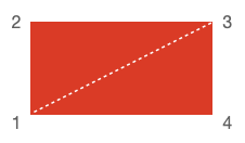
To draw this shape, you would need to draw the two triangles, which means drawing 6 vertices:
- 1, 2, 3
- 1, 3, 4
figure.add({
name: 'rectangle',
make: 'generic',
points: [
[-2, -1], [-2, 1], [2, 1],
[-2, -1], [2, 1], [2, -1],
],
drawType: 'TRIANGLES',
});
This method will be able to draw almost anything.
However, for some shapes there are simpler ways to draw the same thing with fewer repeated vertices.
drawType: 'STRIP'
A strip starts with one triangle, and then every subsequent vertex will create a triangle with the last two vertices.
Therefore, to draw the same rectangle we would draw the first triangle with the vertices 2, 1 and then 3. Then 1 and 3 could be used with 4 to create the second triangle.
figure.add({
name: 'rectangle',
make: 'generic',
points: [
[-2, 1], [-2, -1], [2, 1], // first triangle
[2, -1], // second triangle formed with vertices 1 and 3
],
drawType: 'STRIP',
});
This method works well for continuous shapes, but will not work for shapes that have gaps.
A good example of a shape that works with 'STRIP' is below. The vertices are labeled in the order they would be defined.
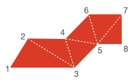
drawType: 'FAN'
A fan starts with one point. The next two points create the first triangle, and then every subsequent point uses the first and last point to create the next triangle.
Therefore, to draw the same rectangle we would draw the first point 1, then complete the first triangle with 2 and 3. Then we would draw point 4 to make the second triangle with points 1 and 3.
figure.add({
name: 'rectangle',
make: 'generic',
points: [
[-2, -1], // first point (vertex 1)
[-2, 1], [2, 1], // complete first triangle (vertices 2, 3)
[2, -1], // second triangle formed with first and last vertex (1, 3)
],
drawType: 'FAN',
});
This method works for any shape that can be broken into triangles that all share a common point. For example:
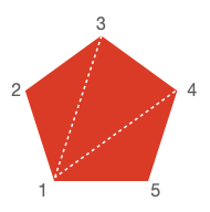
Note, 'STRIP' can create any shape 'FAN' can, but it can be a little more involved. For instance, the shape above would need to duplicate one of the vertices to fully fill it:
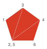
drawType: 'LINES'
'LINES' is the final style that WebGL accepts for drawing primitives. In this case vertex pairs are used to create lines.
This is not useful for drawing filled shapes, but is useful for drawing thin outlines.
For instance, to draw a rectangle outline:
figure.add({
name: 'rectangle',
make: 'generic',
points: [
[-2, -1], [-2, 1], // left edge
[-2, 1], [2, 1], // top edge
[2, 1], [2, -1], // right edge
[2, -1], [-2, -1], // bottom edge
],
drawType: 'LINES',
});
OBJ_FigurePrimitive
Options object for any FigureElementPrimitive.
These properties are available when defining any FigureElementPrimitive.
Type: {name: string?, position: TypeParsablePoint?, transform: TypeParsableTransform?, color: TypeColor?, touch: (boolean | OBJ_Touch)?, move: (boolean | OBJ_ElementMove)?, dimColor: TypeColor?, defaultColor: TypeColor?, scenarios: OBJ_Scenarios?, scene: (Scene | OBJ_Scene)?}
(string?)
: name of figure element
(TypeParsableTransform?)
: transform to apply to element
(TypeColor?)
: color to apply to element (is passed as the
'u_color' uniform to the fragment shader)
((boolean | OBJ_Touch)?)
: true
,
number
or
TypeParsablePoint
will set the element as touchable. If
number
, then
element touch volume is the scaled actual volume in x, y, and z. For
example, if
2
, then the touchable volume is twice the actual volume. If
TypeParsablePoint
then the x, y, and z scales can be set independantly
(
false
)
((boolean | OBJ_ElementMove)?)
: setting this to anything but
false
will set the element as movable. Use
OBJ_ElementMove
to customize
the movement options
(TypeColor?)
: RGBA is used when vertex colors are from a
uniform, otherwise just the alpha channel is used.
(TypeColor?)
(OBJ_Scenarios?)
: Define
position/transform/rotation/scale/color scenarios tied to the element
(Scene?)
: Give the element a custom scene that is independant
of the figure scene. For example, use this to create a 3D object in a 2D
figure.
OBJ_Generic

Options object for a FigureElementPrimitive of a generic shape
points will define either triangles or lines which combine
to make the shape.
drawType defines what sort of triangles or lines the points make.
The most useful, common and generic drawType is 'TRIANGLES'
which can be used to create any shape.
The shape's points can be duplicated using the copy property
to conveniently create multiple copies (like grids) of shapes.
The shape is colored with either color or texture.
When shapes move, or are touched, borders are needed to bound their movement, and figure out if a touch happened within the shape. Shapes that do not move, or are not interactive, do not need borders.
A shape can have several kinds of borders. "Draw borders" (drawBorder and
drawBorderBuffer) are sets of points that define reference
borders for a shape. The shapes higher level borders border and
touchBorder may then use these draw borders to define how a shape will
interact with a figure's bounds, or where a shape can be touched.
drawBorder and drawBorderBuffer are each point arrays
that define the outer limits of the shape. For non-contigous shapes
(like islands of shapes), an array of point arrays can be used.
Both borders can be anything, but typically a drawBorder would define the
border of the visible shape, and a drawBorderBuffer would define some
extra space, or buffer, around the visible shape (particulaly useful for
defining the touchBorder later).
border is used for checking if the shape is within some bounds. When
shapes are moved, if their bounds are limited, this border will define when
the shape is at a limit. The border property can be:
draw: usedrawBorderpointsbuffer: usedrawBorderBufferpointsrect: use a rectangle boundingdrawBordernumber: use a rectangle that isnumberlarger than the rectangle boundingdrawBorderArray<TypeParsablePoint>: a custom contiguous borderArray<Array<TypeParsablePoint>>: a custom border of several contiguous portions
touchBorder is used for checking if a shape is touched. The touchBorder
property can be:
draw: usedrawBorderpointsbuffer: usedrawBorderBufferpointsborder: use same asborderrect: use a rectangle boundingbordernumber: use a rectangle that isnumberlarger than the rectangle boundingborderArray<TypeParsablePoint>: a custom contiguous borderArray<Array<TypeParsablePoint>>: a custom border of several contiguous portions
Type: any
(Array<TypeParsablePoint>)
((Array<(CPY_Step | string)> | CPY_Step)?)
: use
drawType
as
'TRIANGLES'
when using copy (
[]
)
(TypeParsableBorder?)
: ,
(TypeParsableBorder?)
: ,
((TypeParsableBuffer | TypeParsableBorder | "buffer" | "draw" | "rect")?)
: defines border of primitive. Use
draw
to use the
drawBorder
of the
element. Use 'buffer' to use the
drawBorderBuffer
property of the element.
Use
'rect'
for the bounding rectangle of
drawBorder
. Use
TypeParsableBuffer
for the bounding rectangle of
drawBorder
. Use
TypeParsableBorder
for a custom border. (
'draw'
)
((TypeParsableBorder | "rect" | "border" | "buffer" | "draw")?)
: defines touch border of the primitive. Use
border
to use the same border
as
border
. Use
draw
to use the
drawBorder
of the element.
Use 'buffer' to use the
drawBorderBuffer
property of the element.
Use
'rect'
for the bounding rectangle of
drawBorderBuffer
. Use
TypeParsableBuffer
for the bounding rectangle of
drawBorderBuffer
. Use
TypeParsableBorder
for a custom border. (
'border'
)
((OBJ_PulseScale | number)?)
: set default scale pulse options
(
OBJ_PulseScale
) or pulse scale directly (
number
)
// Square and triangle
figure.add({
name: 'squareAndTri',
make: 'generic',
points: [
[-1, 0.5], [-1, -0.5], [0, 0.5],
[0, 0.5], [-1, -0.5], [0, -0.5],
[0, -0.5], [1, 0.5], [1, -0.5],
],
});
// rhombus with larger touch borders
figure.add({
name: 'rhombus',
make: 'generic',
points: [
[-0.5, -0.5], [0, 0.5], [1, 0.5],
[-0.5, -0.5], [1, 0.5], [0.5, -0.5],
],
border: [[
[-1, -1], [-0.5, 1], [1.5, 1], [1, -1],
]],
mods: {
isMovable: true,
move: {
bounds: 'figure',
},
},
});
// Grid of triangles
figure.add({
name: 'gridOfTris',
make: 'generic',
points: [
[-1, -1], [-0.7, -1], [-1, -0.7],
],
copy: [
{ along: 'x', num: 5, step: 0.4 },
{ along: 'y', num: 5, step: 0.4 },
],
});
OBJ_Line
Line definition options object that extends OBJ_Generic (without
drawType) and OBJ_FigurePrimitive
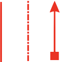
A line can either be defined as two points p1 and p2, or
a single point p1, a length and an angle.
The line has some width that will be filled on both sides
of the line points evenly ('mid'), or on one side only.
The line's 'positive' side is the side to which it rotates toward
when rotating in the positive angle direction around p1.
Similarly the line's 'negative' side is the opposite.
The line can be solid or dashed using the dash property.
The line can have arrows at one or both ends using the arrow property.
Type: any
Extends OBJ_Generic
(TypeParsablePoint?)
: start point of line
(TypeParsablePoint?)
: end point of line
(("mid" | "positive" | "negative" | number)?)
: defines how the width is grown from the polyline's points.
Only
"mid"
is fully compatible with all options in
arrow
. (
"mid"
)
(TypeDash?)
: leave empty for solid line - use array of
numbers for dash line where first number is length of line, second number is
length of gap and then the pattern repeats - can use more than one dash length
and gap - e.g.
[0.1, 0.01, 0.02, 0.01]
produces a lines with a long dash,
short gap, short dash, short gap and then repeats.
((OBJ_LineArrows | TypeArrowHead)?)
: either an object defining custom
arrows or a string representing the name of an arrow head style can be used.
If a string is used, then the line will have an arrow at both ends.
Arrows are only available for
widthIs: 'mid'
and
linePrimitives: false
(boolean?)
: Use WebGL line primitives instead of
triangle primitives to draw the line (
false
)
((number | TypeParsableBorder)?)
: override OBJ_Generic
drawBorderBuffer
with
number
to make the
drawBorderBuffer the same as the line with additional
number
thickness
on each side and the ends (
0
)
// Simple line defined by two points
figure.add({
name: 'l',
make: 'line',
p1: [0, 0],
p2: [0, 1],
width: 0.02,
});
// Dashed line defined by a point, a length and an angle
figure.add({
name: 'l',
make: 'line',
p1: [0, 0],
length: 1,
angle: Math.PI / 2,
width: 0.03,
dash: [0.1, 0.02, 0.03, 0.02],
});
// Line with two different arrows on ends
figure.add({
name: 'l',
make: 'line',
p1: [0, 0],
p2: [0, 1],
width: 0.03,
arrow: {
start: 'rectangle',
end: 'barb',
},
});
OBJ_Polyline
Polyline shape options object that extends OBJ_Generic (without
drawType) and OBJ_FigurePrimitive

A polyline is a series of lines that are connected end to end. It is defined by a series of points which are the ends and corners of the polyline.
The series of points is a zero width ideal polyline, and so to see it we must
give it some width. This width can either be grown on one side of the
ideal polyline or grown on both sides of it equally using widthIs.
A polyline can have a "positive" or "negative" side, and an "inside" or "outside".
If a line is defined from p1 to p2, then the positive side is the side where the line moves if it is rotated around p1 in the positive (counter clockwise) direction. Thus the order of the points that define the line defines which side is positive and negative. A polyline is made up of many lines end to end, and thus itself will have a positive and negative side dependent on the order of points.
Similarly we can define a line's side as either inside or outside. Each corner in the polyline will have an angle on the negative side of the line and a explementary angle on the positive side of the line. The inside side of the line is the same as the negative side if the sum of all the negative side angles is smaller than the sum of all positive side angles.
Both positive/negative and inside/outside are provided to define a line's side as different situations make different side definitions more intuitive. For instance, a closed, simple polygon has an obvious "inside" and "outside", but how the points are ordered would define if the "inside" is "positive" or "negative". In comparison, it would be more intuitive to use "positive" or "negative" for a polyline that has an overall trend in a single direction.
Therefore, the polyline width can be grown on either the 'positive',
'negative', 'inside', or 'outside' side of the line or around the
middle of the line with 'mid'. In addition, a number between 0 and 1 can
be used where 0 is the same as 'positive', 1 the same as 'negative'
and 0.5 the same as 'mid'.
Each point, or line connection, creates a corner that will have an inside angle (<180º) and an outside angle (>180º or reflex angle).
Growing width on an outside corner can be challenging. As the corner becomes
sharper, the outside width joins at a point further and further from the
ideal corner. Eventually trucating the corner makes more visual sense
and therefore, a minimum angle (minAutoCornerAngle) is used to
specify when the corner should be drawn, and when it should be truncated.
By default, the border of the polyline is the line itself (border =
'line'). The border can also just be the points on the positive side of
the line, or the negative side of the line. This is useful for capturing
the hole shape of a closed polyline within a border. The border can also
be the encompassing rectangle of the polyline (border = 'rect') or
defined as a custom set of points.
The touch border can either be the same as the border ('border'), the
encompassing rect ('rect'), a custom set of points, or the same as the
line but with some buffer that effectively increases the width on both sides
of the line.
Type: any
Extends OBJ_Generic
(Array<TypeParsablePoint>)
(boolean?)
: simple and minimum computation polyline. Good
for large numbers of points that need to be updated every animation frame.
widthIs
,
dash
,
arrow
and all corner and line primitive properties are
not available when a polyline is simple. (
false
)
(("mid" | "outside" | "inside" | "positive" | "negative" | number)?)
: defines how the width is grown from the polyline's points.
Only
"mid"
is fully compatible with all options in
cornerStyle
and
dash
. (
"mid"
)
(("line" | "positive" | "negative" | TypeParsableBorder)?)
: override OBJ_Generic
drawBorder
with
'line'
to make the drawBorder just
the line itself,
'positive'
to make the drawBorder the positive side
of the line, and
'negative'
to make the drawBorder the negative side
of the line. Use array definition for custom drawBorder (
'line'
)
((number | TypeParsableBorder)?)
: override OBJ_Generic
drawBorderBuffer
with
number
to make the
drawBorderBuffer the same as the line with additional
number
thickness
on either side (
0
)
(("auto" | "none" | "radius" | "fill")?)
: "auto"
:
sharp corners sharp when angle is less than
minAutoCornerAngle
,
"none"
: no
corners,
"radius"
: curved corners,
"fill"
: fills the gapes between the line
ends, (
"auto"
)
(TypeDash?)
: leave empty for solid line - use array of
numbers for dash line where first number is length of line, second number is
length of gap and then the pattern repeats - can use more than one dash length
and gap - e.g.
[0.1, 0.01, 0.02, 0.01]
produces a lines with a long dash,
short gap, short dash, short gap and then repeats.
((OBJ_LineArrows | TypeArrowHead)?)
: either an object defining custom
arrows or a string representing the name of an arrow head style can be used.
If a string is used, then the line will have an arrow at both ends.
Arrows are only available for
close: false
,
widthIs: 'mid'
and
linePrimitives: false
(boolean?)
: Use WebGL line primitives instead of
triangle primitives to draw the line (
false
)
// Line
figure.add(
{
name: 'p',
make: 'polyline',
points: [[-0.5, -0.5], [-0.1, 0.5], [0.3, -0.2], [0.5, 0.5]],
width: 0.05,
},
);
// Square with rounded corners and dot-dash line
figure.add(
{
name: 'p',
make: 'polyline',
points: [[-0.5, -0.5], [0.5, -0.5], [0.5, 0.5], [-0.5, 0.5]],
width: 0.05,
dash: [0.17, 0.05, 0.05, 0.05],
close: true,
cornerStyle: 'radius',
cornerSize: 0.1,
},
);
// Corners only of a triangle
figure.add(
{
name: 'p',
make: 'polyline',
points: [[-0.5, -0.5], [0.5, -0.5], [0, 0.5]],
width: 0.05,
close: true,
cornersOnly: true,
cornerLength: 0.2,
},
);
// Zig zag with arrows
figure.add({
name: 'arrowedLine',
make: 'polyline',
points: [[0, 0], [1, 0], [0, 0.7], [1, 0.7]],
width: 0.05,
cornerStyle: 'fill',
arrow: {
scale: 0.7,
start: {
head: 'triangle',
reverse: true,
},
end: 'barb',
},
});
OBJ_Arrow
Arrow options object that extends OBJ_Generic (without
drawType) and OBJ_FigurePrimitive
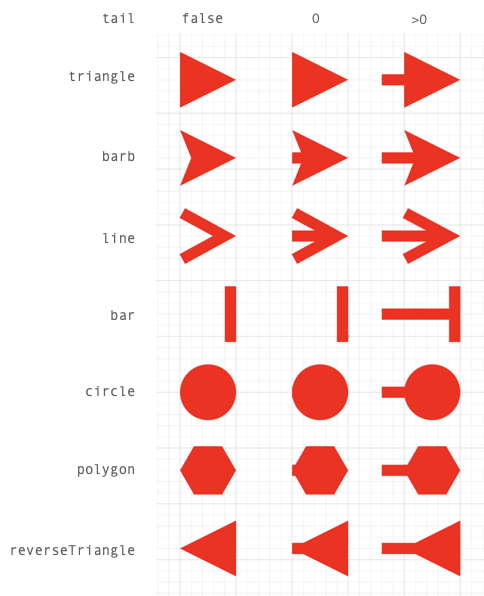
An arrow has a head, tail, length and width. The head defines the head
style of the arrow. The length, width (or radius for polygon and circle
head styles) define the size of the arrow and tail defines wether it has a
tail and how long it is.
All properties have default values that can be scaled with the scale
property. So a scale of 2 will double the size of the default arrow.
An arrow can be aligned and oriented with align and angle. align
positions the tip, start, tail or middle part of the arrow at (0, 0) in
draw space. This part of the arrow will therefore be at the position
or translation of the transform. angle then gives the arrow some drawn
rotation.
Alignment definitions are:
tip: arrow tipstart: opposite side oftipmid: mid points betweenstartandtip- useful for polygon, circle and bar arrows without tails when the head should be on a point, not next to ittail: the end of the tail when a tail exists, or where a tail would start if it doesn't exist.
Setting the tail property to false will draw only the arrow head,
true will draw a tail of length 0, and a tail with a custom length
can be defined with a number. A tail length of 0 will only extend a tail
to the boundaries of the head. A positive tail, will extend it beyond the
boundaries.
For arrow heads that use length and width properties, the length is the
dimension along the line. It includes both the head and the tail, so an arrow
with length 1 and tailLength 0.4 will have a head length of 0.6.
For polygon and circle arrows, only radius and tail are used to
determine the dimension of the arrow (length and width are ignored).
Type: any
Extends OBJ_Generic
(number?)
: scale the default dimensions of the arrow
(number?)
: dimension of the arrow head along the line
(number?)
: dimension of the arrow head along the line width
(number?)
: number of sides in polygon or circle arrow head
(number?)
: radius of polygon or circle arrow head
(number?)
: barb length (along the length of the line) of the
barb arrow head
(number?)
: width of the line that joins the arrow - if
defined this will create minimum dimensions for the arrow
((boolean | number)?)
: true
includes a tail in the arrow of
with
tailWidth
. A
number
gives the tail a length where 0 will not
extend the tail beyond the boundaries of the head
(("tip" | "start" | "mid" | "tail")?)
: define which part of
the arrow is aligned at (0, 0) in draw space (
'tip'
)
// Triangle arrow with tail
figure.add({
name: 'a',
make: 'arrow',
head: 'triangle',
tail: 0.15,
length: 0.5,
});
// Barb arrow with 0 tail
figure.add({
name: 'a',
make: 'arrow',
head: 'barb',
angle: Math.PI / 2,
tail: 0,
});
// Create a vector map with arrows by copying an original arrow by a
// transforms defining the position, rotation and scale of the arrows
// Create transforms to apply to each arrow
const r = Fig.range(0, Math.PI / 2, Math.PI / 18);
const x = [0, 1, 2, 0, 1, 2, 0, 1, 2];
const y = [0, 0, 0, 1, 1, 1, 2, 2, 2];
const s = [0.5, 0.8, 0.4, 0.6, 0.8, 0.6, 0.5, 0.8, 0.6];
const transforms = [];
for (let i = 0; i < 9; i += 1) {
transforms.push(new Fig.Transform().scale(s[i], s[i]).rotate(r[i]).translate(x[i], y[i]));
}
// Create arrow and copy to transforms
figure.add({
name: 'a',
make: 'arrow',
head: 'barb',
align: 'mid',
length: 0.7,
copy: {
to: transforms,
original: false,
},
});
OBJ_Triangle
Triangle shape options object that extends OBJ_Generic (without
drawType) and OBJ_FigurePrimitive

The most generic way to define a triangle is with three points (points
property). When using points, all the other properties that can also
define a triangle are ignored: width, height, top,
SSS, ASA, AAS, SAS, direction, rotation, xAlign and yAlign.
The other ways to define a triangle are (in order of highest override preference to lowest if more than one is defined in the object):
ASAor Angle-Side-AngleSASor Side-Angle-SideAASor Angle-Angle-SideSSSor Side-Side-Sidewidth,heightandtoplocation
All these methods also use direction to define the triangles, and
rotation, xAlign and yAlign to position the triangles. Each corner
and side of the triangle is indexed, and can be used for positioning.
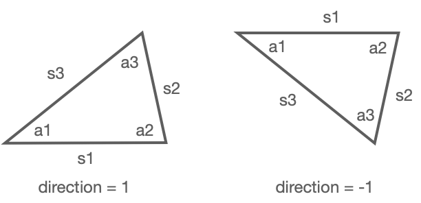
A triangle starts with an angle (a1) at (0, 0) and base side extending along the x axis to a second angle a2. The base side is side 1 (s1).
Angles a1 and a2 extend the triangle above s1 if direction is 1, and
below s1 when direction is -1.
s2, a3, and s3 are then the consecutive sides and angles.
Triangles can be defined with a combination of side length and angle using
ASA, SAS, AAS and SSS, where the first side or angle is s1 or a1
respectively, and the subsequent sides and angles progress consecutively.
For instance, ASA defines the angle a1, then side length s1, then angle
a2. SSS defines the side lenghts s1, s2 then s3. All these combinations of
three properties are sufficient to define a unique triangle completely.
When defining the triangle with width, height and top, the base side
s1 is the width, and the top point is either aligned with the left,
center or right of the base at some height above s1.
When defined, a triangle's a1 corner will be at (0, 0), and s1 will be along
the x axis. Next, a rotation can be applied to the triangle. A rotation
can either be a number rotating it relative to its definition, or relative
to one of its sides: s1, s2 or s3.
Finally, the triangle can be positioned (in draw space) using xAlign and
yAlign. An xAlign of 'left' will position the triangle so that it's
left most point will be at (0, 0). Similarly, a yAlign of 'top' will
position the triangle so its top most point is at (0, 0). Triangles
can also be aligned by angles (corners) and side mid points. For instance, an
xAlign of 'a2', will position the a2 corner at x = 0. Similarly a
yAlign of 's3' will position the triangle vertically such that the mid
point of s3 is at y = 0. 'centroid' is relative to the geometric center of
the triangle.
Once a triangle is defined and positioned in draw space, it can then be
copied (copy) if more than one triangle is desired.
The triangle(s) can then be positioned (position) or transformed
(transform) in the FigureElementPrimitive local space.
Triangles can either be a solid fill, texture fill or outline. When line
is not defined, the triangle will be filled.
Type: any
Extends OBJ_Generic
(Array<Point>?)
: defining points will take precedence over
all other ways to define a triangle.
(number?)
(number?)
(("left" | "right" | "center")?)
: (
center
)
((1 | -1)?)
((number | "s1" | "s2" | "s3" | OBJ_TriangleSideRotationAlignment)?)
(("left" | "center" | "right" | number | "a1" | "a2" | "a3" | "s1" | "s2" | "s3" | "centroid" | "points")?)
: (
'centroid'
)
(("bottom" | "middle" | "top" | number | "a1" | "a2" | "a3" | "s1" | "s2" | "s3" | "centroid" | "points")?)
: (
'centroid'
)
(OBJ_LineStyleSimple?)
: line style options - do not use any corner
options
// Right angle triangle
figure.add({
name: 't',
make: 'triangle',
width: 0.5,
height: 1,
top: 'right',
});
// 30-60-90 triangle with dashed line
const t = figure.primitives.triangle({
ASA: [Math.PI / 2, 1, Math.PI / 6],
line: {
width: 0.02,
dash: [0.12, 0.04],
},
});
figure.elements.add('t', t);
// Star from 4 equilateral triangles
figure.add({
name: 'star',
make: 'triangle',
SSS: [1, 1, 1],
xAlign: 'centroid',
yAlign: 'centroid',
copy: {
along: 'rotation',
num: 3,
step: Math.PI / 6,
},
});
OBJ_Rectangle
Rectangle shape options object that extends OBJ_Generic (without `drawType) and OBJ_FigurePrimitive

Type: any
Extends OBJ_Generic
(OBJ_CurvedCorner?)
: define for rounded corners
(OBJ_LineStyleSimple?)
: line style options
((number | TypeParsableBorder)?)
: override the OBJ_Generic
drawBorderBuffer
with
number
to make the
drawBorderBuffer a rectangle that is
number
wider and higher on each side
(
0
)
(TypeParsablePoint?)
// Filled rectangle
figure.add({
name: 'r',
make: 'rectangle',
width: 1,
height: 0.5,
});
// Corners with radius and dashed line
figure.add({
name: 'r',
make: 'rectangle',
width: 0.5,
height: 0.5,
line: {
width: 0.02,
dash: [0.05, 0.03]
},
corner: {
radius: 0.1,
sides: 10,
},
});
// Rectangle copies rotated
figure.add({
name: 'r',
make: 'rectangle',
width: 0.5,
height: 0.5,
line: {
width: 0.01,
},
copy: {
along: 'rotation',
num: 3,
step: Math.PI / 2 / 3
},
});
OBJ_Ellipse
Ellipse shape options object that extends OBJ_Generic (without
drawType) and OBJ_FigurePrimitive

Type: any
Extends OBJ_Generic
(OBJ_LineStyleSimple?)
: line style options
((number | TypeParsableBorder)?)
: override the OBJ_Generic
drawBorderBuffer
with
number
to make the
drawBorderBuffer a ellipse that is
number
thicker around its border (
0
)
// Filled ellipse
figure.add({
name: 'e',
make: 'ellipse',
height: 1,
width: 0.5,
sides: 100,
});
// Dashed line circle
figure.add({
name: 'e',
make: 'ellipse',
height: 1,
width: 1,
sides: 100,
line: {
width: 0.02,
dash: [0.05, 0.02],
},
});
// Ellipse grid
figure.add({
name: 'e',
make: 'ellipse',
height: 0.08,
width: 0.2,
sides: 20,
copy: [
{ along: 'x', step: 0.25, num: 5 },
{ along: 'y', step: 0.15, num: 5 },
]
});
OBJ_Arc
Arc shape options object that extends OBJ_Generic (without
drawType) and OBJ_FigurePrimitive

Type: any
Extends OBJ_Generic
(number?)
(OBJ_LineStyleSimple?)
: line style options
((number | TypeParsableBorder)?)
: override the OBJ_Generic
drawBorderBuffer
with
number
to make the
drawBorderBuffer a ellipse that is
number
thicker around its border (
0
)
// Simple fill
figure.add({
make: 'arc',
angle: Math.PI * 2 / 3,
radius: 1,
});
// Fill to center
figure.add({
make: 'arc',
angle: Math.PI * 2 / 3,
startAngle: Math.PI / 3,
radius: 1,
fillCenter: true,
});
// Arc line
figure.add({
make: 'arc',
angle: Math.PI / 3,
radius: 1,
line: { width: 0.05, widthIs: 'inside' },
});
// Arc dashed line
figure.add({
make: 'arc',
angle: Math.PI * 3 / 2,
radius: 1,
sides: 100,
line: { width: 0.05, dash: [0.3, 0.1, 0.1, 0.1] },
});
OBJ_Polygon
Polygon or partial polygon shape options object that extends
OBJ_Generic (without drawType)

Type: any
Extends OBJ_Generic
(number?)
: shape rotation during vertex definition
(different to a rotation step in a trasform) (
0
)
(TypeParsablePoint?)
: shape center offset from origin
during vertex definition (different to a translation step in a transform)
(
[0, 0]
)
(number?)
: number of sides to draw (all sides)
((-1 | 1)?)
: direction to draw polygon where 1 is
counter clockwise and -1 is clockwise (
1
)
center. This is different to position or transform as these translate the
vertices on each draw. (
[0, 0]
)
(OBJ_LineStyleSimple?)
: line style options
((number | TypeParsableBorder)?)
: override the OBJ_Generic
drawBorderBuffer
with
number
to make the
drawBorderBuffer a polygon that is wider by
number
(
0
)
// Simple filled hexagon
figure.add({
name: 'hexagon',
make: 'polygon',
sides: 6,
radius: 0.5,
});
// Circle from dashed line
const circ = figure.primitives.polygon({
sides: 100,
radius: 0.5,
line: {
width: 0.03,
dash: [0.1, 0.03 ],
},
});
figure.elements.add('circle', circ);
// Half octagon rotated
figure.add({
name: 'halfOctagon',
make: 'polygon',
sides: 8,
radius: 0.5,
angleToDraw: Math.PI,
line: {
width: 0.03,
},
direction: -1,
rotation: Math.PI / 2,
});
OBJ_Star
Star options object that extends OBJ_Generic (without
drawType) and OBJ_FigurePrimitive

Type: any
Extends OBJ_Generic
(number?)
: shape rotation during vertex definition
(different to a rotation step in a trasform) (
0
)
(TypeParsablePoint?)
: shape center offset from origin
during vertex definition (different to a translation step in a transform)
(
[0, 0]
)
(OBJ_LineStyleSimple?)
: line style options
((number | TypeParsableBorder)?)
: override the OBJ_Generic
drawBorderBuffer
with
number
to make the
drawBorderBuffer a polygon that is
number
thicker than the radius (
0
)
// Simple 5 pointed star
figure.add({
name: 's',
make: 'star',
radius: 0.5,
sides: 5,
});
// 7 pointed dashed line star
figure.add({
name: 's',
make: 'star',
radius: 0.5,
innerRadius: 0.3,
sides: 7,
line: {
width: 0.02,
dash: [0.05, 0.01],
},
});
// Star surrounded by stars
figure.add({
name: 's',
make: 'star',
radius: 0.1,
sides: 5,
rotation: -Math.PI / 2,
// line: { width: 0.01 },
copy: [
{
to: [0.6, 0],
original: false,
},
{
along: 'rotation',
num: 16,
step: Math.PI * 2 / 16,
start: 1,
},
{
to: new Fig.Transform().scale(3, 3).rotate(Math.PI / 2),
start: 0,
end: 1,
},
],
});
OBJ_Grid
Grid shape options object that extends OBJ_Generic (without
drawType) and OBJ_FigurePrimitive

A grid is a rectangle divided into a series of vertical and horizontal lines.
The rectangle is defined by bounds.
xNum and yNum can be used to defined a number of equally spaced lines
in the rectangle (including the edges).
Alternatively xStep and yStep can be used to define the spacing between
lines from the bottom left corner.
The line width and style is defined with line.
Type: any
Extends OBJ_Generic
(TypeParsableRect?)
: rectangle definition
(number?)
: distance between grid lines
(number?)
: distance between vertical lines in grid from
left - use this instead of
xNum
. This will override
step
.
(number?)
: distance between horizontal lines in grid from
bottom - use this instead of
yNum
. This will override
step
.
(number?)
: number of vertical lines in grid including top and
bottom lines - overrides
num
and
xStep
.
(number?)
: number of horizontal lines in grid including left
and right lines - overrides
num
and
yStep
.
(OBJ_LineStyle?)
: line style options - do not use any corner
options
((number | TypeParsableBorder)?)
: override OBJ_Generic
drawBorderBuffer
with
number
to make the
drawBorderBuffer the same as the grid outline with additional
number
buffer each side (
0
)
// Grid defined by xStep and yStep
figure.add({
name: 'g',
make: 'grid',
bounds: [-0.5, -0.5, 1, 1],
xStep: 0.25,
yStep: 0.25,
line: {
width: 0.03,
},
});
// Grid defined by xNum and yNum with dashed lines
const grid = figure.primitives.grid({
bounds: [-0.5, -0.5, 1, 1],
xNum: 4,
yNum: 4,
line: {
width: 0.03,
dash: [0.1, 0.02],
},
});
figure.elements.add('g', grid);
// Grid of grids
figure.add({
name: 'g',
make: 'grid',
bounds: [-0.7, -0.7, 0.6, 0.6],
xNum: 4,
yNum: 4,
line: {
width: 0.03,
},
copy: [
{ along: 'x', num: 1, step: 0.8},
{ along: 'y', num: 1, step: 0.8},
],
});
Text
FigureOne has several different ways to typeset and render text.
Text Typesetting
Text can either be type-set as:
- Plain text - single font, simple text - OBJ_Text
- Formatted text - multi-font, multi-line text - OBJ_FormattedText
- Equation text - Equation
This guide will cover plain and formatted text. Thissection is then dedicated to equations.
Plain Text
The most simple way to create text is with the 'text' primitive (with options OBJ_Text).
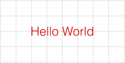
figure.add(
{
make: 'text',
text: 'Hello World',
xAlign: 'center',
yAlign: 'middle',
},
);
The text primitive can be used to create text with a number of horizontal alignment, vertical alignment, and font options.
figure.add(
{
make: 'text',
text: 'Hello World',
xAlign: 'right',
yAlign: 'top',
font: { family: 'Times New Roman', style: 'italic' },
color: [0, 0, 1, 1],
},
);
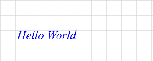
The text primitive can also be used to create many different strings of text at different locations. All strings will share the same alignment and font options.
figure.add(
{
make: 'text',
text: ['North', 'West', 'South', 'East'],
location: [[0, 0.5], [-1, 0], [0, -0.5], [1, 0]],
xAlign: 'center',
yAlign: 'middle',
color: [0, 0, 1, 1],
},
);
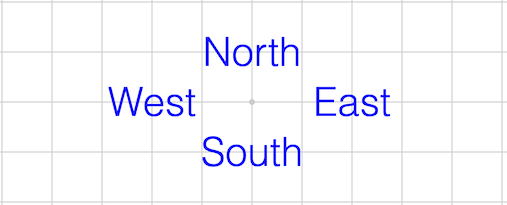
To update text, use the setText method on the created element. The below example updates the text everytime the text is touched.
let counter = 1;
figure.add({
make: 'text',
text: '0',
touch: {
onClick: (e) => {
e.setText(`${counter}`);
counter += 1;
},
},
});
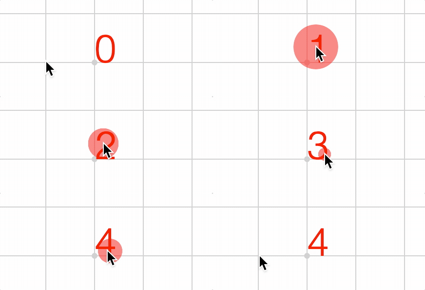
Formatted Text
Formatted text is created with the ftext make definition and supports:
- Multiple lines
- Multiple fonts
- Multiple touch definitions
- Embedded equations
Multiple lines of text can be created by defining an array of strings as the text. Each element in the array is a new line.
figure.add({
make: 'ftext',
text: ['First line', 'This is line two', 'Third line'],
});
Each line can have individual formatting by using a line definition object instead of a string.
figure.add({
make: 'ftext',
text: [
'First line',
'This is line two',
{ text: 'Third line', font: { style: 'italic', color: [0, 0, 1, 1] } },
],
});
Strings withing lines can be formatted by surrounding the string with '|' characters and then defining the modification with the modifiers property. Any string within '|' characters will become a unique identifier that is referenced in the modifiers property. If more than one strings share the same unique identifier, then the will all be modified the same.
figure.add({
make: 'ftext',
text: [
'First |line|',
'This is |line| two',
'Third |line2|',
],
modifiers: {
line: { font: { color: [0, 0, 1, 1] } },
line2: { text: 'line', font: { color: [0, 0.8, 0, 1] } },
},
});
Modifiers can also be used to define specific portions of text that are interactive.
igure.add({
make: 'ftext',
text: [
'First |line|',
'This is |line2| two',
'Third |line3|',
],
modifiers: {
line: {
font: { color: [0, 0, 1, 1] },
onClick: () => console.log('line 1'),
},
line2: {
text: 'line',
font: { color: [0, 0.8, 0, 1] },
onClick: () => console.log('line 2'),
},
line3: {
text: 'line',
font: { color: [0, 0.8, 0.8, 1] },
onClick: () => console.log('line 3'),
},
},
});
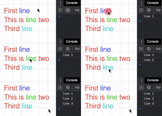
Modifiers can also be used to embed equations into the text. An equation phrase (TypeEquationPhrase) is used to define the equation, and if necessary, the elements property can be used to customize elements within the equation.
figure.add({
make: 'ftext',
text: [
'Equation |e| in text',
],
xAlign: 'center',
modifiers: {
e: {
eqn: { frac: ['1', 'vinculum', { root: ['rad', '2'] }] },
offset: [0, 0.1],
},
},
elements: {
rad: { symbol: 'radical', color: [0, 0, 1, 1] },
},
});

If formatted text is not sufficent, then use Equation for full typesetting customization.
Text Rendering
In FigureOne, text can be rendered to either the WebGL canvas, or a 2D canvas.
Both canvases are different HTML elements, and typically in FigureOne the 2D canvas will be above the WebGL canvas. This means rendering text to the 2D canvas results in text that is always above any and all shapes in the WebGL canvas (which is where all shapes are drawn). However 2D canvas text is drawn natively by the system, and does not have pixelation or resizing challenges that WebGL text has.
On the other hand, WebGL is great at drawing triangles, but as text can be challenging and expensive to decompose into triangles in real time, a common method to draw text is by using an image containing a grid of all the individual letters of the text (this is called a texture atlas of glyphs, where a glyph is a character like 'a' or 'C', and the atlas is a grid of characters, and texture is another name for an image).
WebGL with a texture atlas is very fast at drawing text, but because the text comes from an image, if the resolution of the image does not align well with the screen resolution then there can be pixelation. This means text that is scaled a lot, or a WebGL canvas that resizes a lot may have some cases where the text is not as crisp as it would be on the 2D canvas. Atlases can either be user defined or generated by FigureOne automatically. When generated automatically, the recreateAtlases method on Figure can be used to regenerate the atlases whenever needed to reduce pixelation.
An example atlas is below:
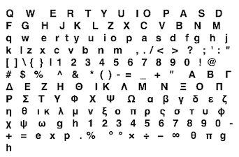
The main advantage of using WebGL rendered text is the text is on the same canvas as all the shapes. This means the draw order of shapes and text is respected and it is easy to chose which text should be infront of shapes and which text should be behind shapes.
To summarize the trade-offs between rendering text in the 2D cavnas and the WebGL canvas:
-
WebGL:
- Pros: Can be covered by shapes, fast to draw large amounts of static text
- Cons: Pixelation when resizing a lot, requires glyph definition and generation
-
2D Canvas:
- Pros: No pixelation, atlas management or glyph limitations
- Cons: Always on top (or below) WebGL shapes
By default text is rendered to the 2D canvas. For many cases this will be easiest to deal with. When text is desired in the WebGL canvas, anytime a font definition (@link OBJ_Font) is used, the render property can be set to 'gl'.
This can either be done globally on the figure by defining it at figure creation:
const figure = new Fig.Figure({
font: { render: '2d' }
});
Or it can be done at an element level:
const figure = new Fig.Figure();
figure.add({
make: 'text',
text: 'Hello World',
font: { color: [0, 0, 1, 1], style: 'italic', render: 'gl' },
});
Font
In FigureOne, a font OBJ_Font defines many properties of text including:
- family (eg: Times New Roman or Helvetica)
- size (vertical height)
- weight (eg: bold, light)
- style (eg: italic, normal)
- underline
- outline
- color
- available glyphs
- glyph size modifiers and adjustments (sometimes the browser or FigureOne measures fonts slightly wrong - especially in the case of obsure or italized fonts)
- atlas options (if using a WebGL font)
- render target (WebGL or 2D canvas)
In general, fonts will mostly be used to change the family, size, weight, style, outline, underline and color of text.
// Simple color and italic font definition
figure.add({
make: 'text',
text: 'Engage!',
font: {
color: [0, 0, 1, 1],
style: 'italic'
},
xAlign: 'center',
position: [0, 0.5],
});
// Font definition with family, color, outline, size and underline
figure.add({
make: 'text',
text: 'Make it so!',
font: {
family: 'monospace',
color: [1, 1, 0, 1],
outline: { fill: true, color: [1, 0, 0, 1], width: 0.02 },
size: 0.6,
underline: { color: [0, 0, 1, 1] },
},
xAlign: 'center',
position: [0, -0.5],
});
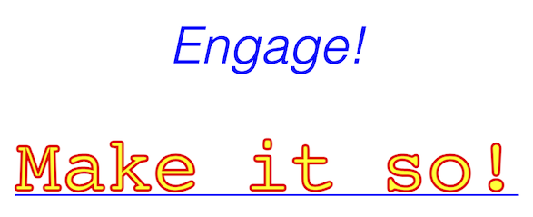
Web Fonts
When a web page uses a font that isn't provided by the browser by default, the font will be loaded asynchronously. This often means the JavaScript program that creates the FigureOne figure will execute before the font has finished loading.
HTML uses a fallback mechanism for fonts meaning if the font family "Helvetica" is defined but unavailable, then the default "sans serif" font will be used instead. As most fonts have different dimensions (like width), this means any text elements created before the font has loaded will have a dimension related to the default font and not the desired one.
Therefore, FigureOne internally tracks when fonts are loaded, and will automatically redimension text elements when a font becomes available.
Similarly, if automatically generated font atlases are used with WebGL rendered fonts, these atlases will automatically be regenerated when a font is loaded.
This should work for most people most of the time.
However, there may be some cases where it is desirable to do this process manually, or execute additional logic when fonts become available.
Therefore, every Figure has a FontManager as a property. The FontManager can be used to watch when fonts become available.
OBJ_Text
Text options object that extends OBJ_FigurePrimitive.
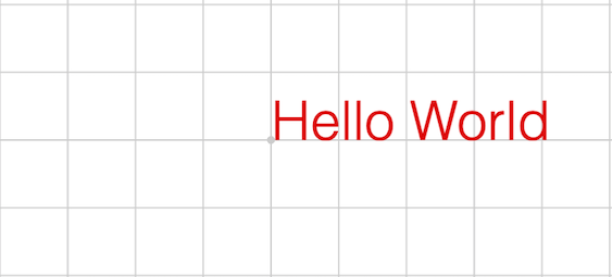
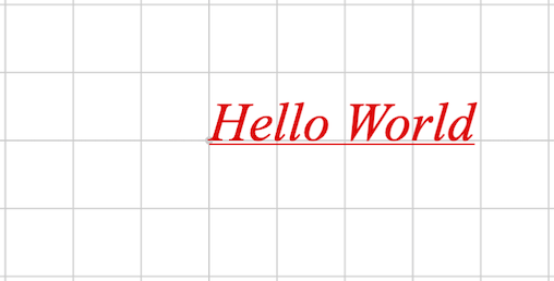
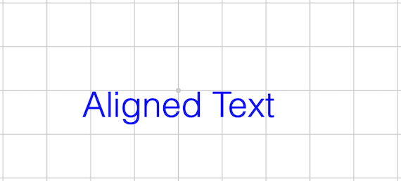
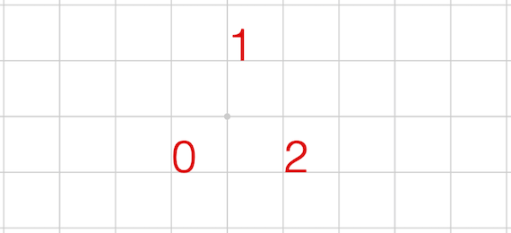
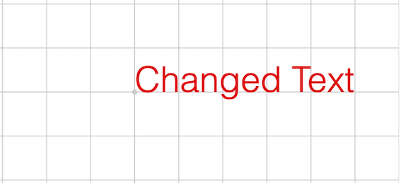
A text element can either be defined as a single string, or an array of strings combined with an array of locations.
The adjustments property allows customization of the borders around the
text. This may be needed when the browser or FigureOne does not accurately
calculate the size of the text (usually for non-standard fonts, and
sometimes italized fonts).
Atlernately border and touchBorder can also be used for complete
customization.
All text in this element will use the same font, x and y alignment, and adjustments.
Note - Text can be rendered to either the WebGL canvas or the 2D canvas
using the render property in font. For more information, see
OBJ_Font.
Type: any
Extends OBJ_FigurePrimitive
((TypeParsablePoint | Array<TypeParsablePoint>)?)
: draw
space location of each string (
[0, 0]
)
(OBJ_Font?)
: defaults to default Figure font
(("left" | "center" | "right")?)
: (
'left'
)
(("top" | "bottom" | "middle" | "alphabetic" | "baseline")?)
: (
'baseline'
)
(OBJ_TextAdjustments?)
((TypeParsableBuffer | TypeParsableBorder | "buffer" | "draw" | "rect")?)
((TypeParsableBuffer | TypeParsableBorder | "rect" | "border" | "buffer" | "draw")?)
// Simple text
figure.add({
make: 'text',
text: 'Hello World',
});
// Custom Font
figure.add({
make: 'text',
text: 'Hello World',
font: { family: 'Times New Roman', style: 'italic', underline: true },
});
// Aligned text
figure.add({
make: 'text',
text: 'Aligned Text',
xAlign: 'center',
yAlign: 'top',
color: [0, 0, 1, 1],
});
// Multi Text
figure.add({
make: 'text',
text: ['0', '1', '2'],
location: [[-0.5, -0.5], [0, 0.5], [0.5, -0.5]],
});
// Change Text
t = figure.add({
make: 'text',
text: 'Hello World',
});
t.setText('Changed Text')
// Change text and options
t = figure.add({
make: 'text',
text: 'Hello World',
});
t.setText({
text: 'Changed Text',
xAlign: 'center',
font: { family: 'Times New Roman' },
});
OBJ_FormattedText
FormattedText options object that extends OBJ_Collection
options object (without parent).


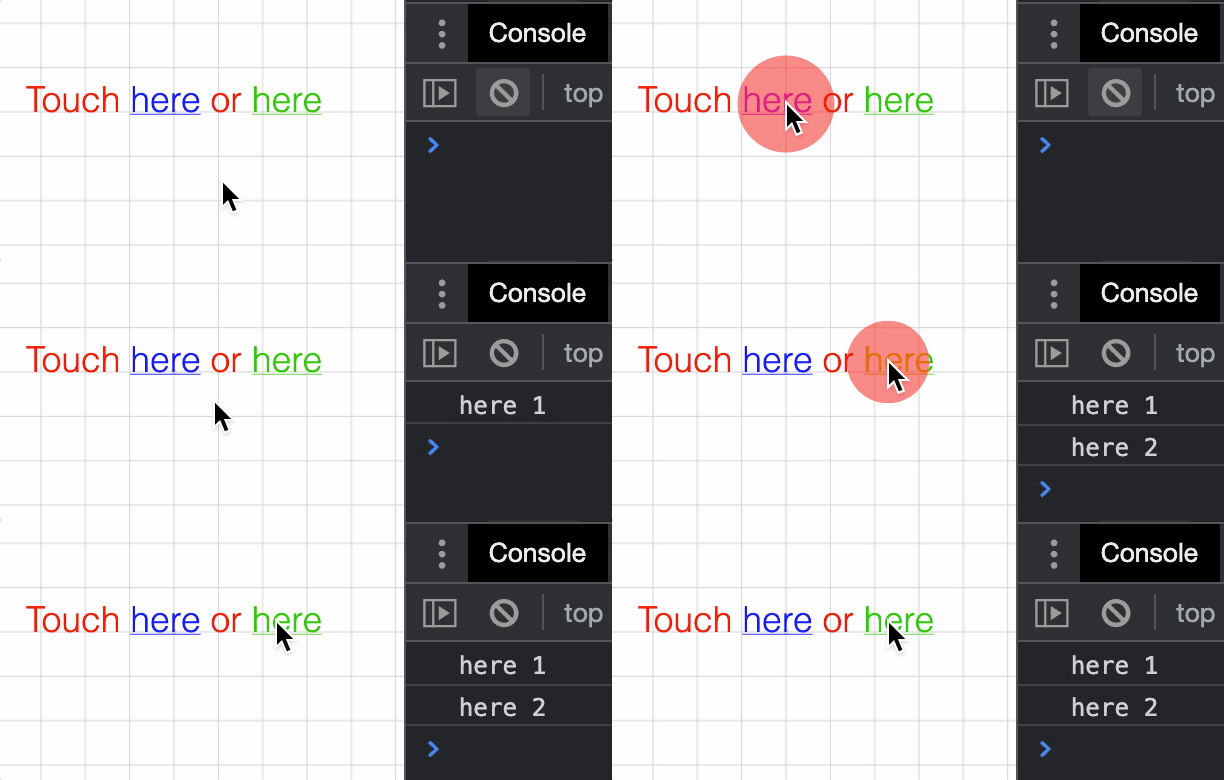

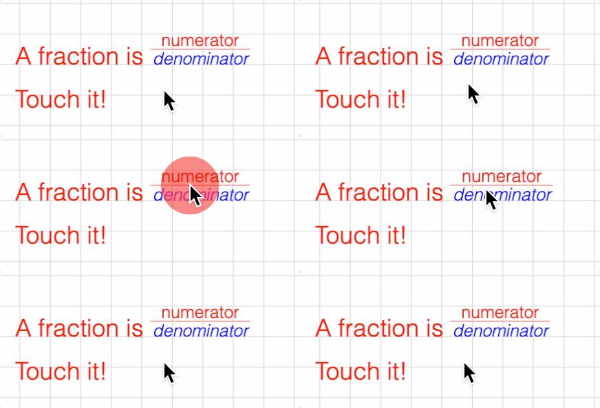
Formatted text allows:
- Use of more than one font
- Multi-line text
- Embedded equations
- Interactivity on select strings
If text is defined as an array of strings of line definition objects, then
each element of the array will be a new line of text.
All text will be laid out with the default font (or default line font if a line definition object is used).
To modify the font of portions of text within a line, surround the text to
modify with '|' characters. The string surrounded by the '|' characters will
then be a unique identifier that can be referenced in the modifiers
property which will then allow for replacing that text with some other text,
changing the font of the text, changing the touchability of the text and/or
replacing the text with an embedded equation.
If a string is surrounded by '|' characters but not defined in modifiers
then that string will have the formmating of the accent property applied
to it.
Type: any
Extends OBJ_Collection
((Array<(string | OBJ_TextLineDefinition)> | string)?)
: array of
line strings - single string is single line only.
(OBJ_TextModifiersDefinition?)
: modifier definitions
(OBJ_Font?)
: Default font to use in lines
(TypeParsableBuffer?)
: default buffer for
touch
property in
OBJ_TextModifiersDefinition
(EQN_EquationElements?)
: equation elements to use within
the equation phrases defined in
modifiers
(number?)
: Space between ascent of each line with
descent of previous line (
font.size * 0.5
)
(number?)
: Space between baselines of lines. This
will override
lineSpace
for all lines including individual line settings
(
undefined
)
(("left" | "right" | "center")?)
: horizontal alignment of
lines with
position
(
left
)
(("bottom" | "baseline" | "middle" | "top")?)
: vertical
alignment of lines with
position
(
baseline
)
((TypeParsableBuffer | TypeParsableBorder | "children" | "rect" | number)?)
: border used for keeping shape within limits (
'draw'
)
((TypeParsableBuffer | TypeParsableBorder | "border" | "children" | "rect" | number)?)
: border used for determining shape was touched.
number
and
'rect'
use
the the points in
'buffer'
to calculate the bounding rects (
'buffer'
).
(OBJ_Font?)
: default modifier for accented text without a
specific modification. By default accented text will be italic.
// Accent a word figure.add({ make: 'ftext', text: 'Hello |World|', });
// Multi-line center justified
figure.add({
make: 'ftext',
text: ['First line', 'Second line'],
justify: 'center',
});
// Modifiers
figure.add({
make: 'ftext',
text: ['|First| |line|', 'Second |line2|'],
modifiers: {
First: { font: { underline: 'true', color: [0, 0.7, 0.7, 1] } },
line: { font: { color: [0, 0, 1, 1] } },
line2: { text: 'line', font: { color: [0, 0.7, 0, 1], style: 'italic' } },
},
});
// Interactive words in formatted text
figure.add({
make: 'ftext',
text: 'Touch |here| or |here2|',
modifiers: {
here: {
font: { underline: true, color: [0, 0, 1, 1] },
touch: 0.1,
onClick: () => console.log('here 1'),
},
here2: {
text: 'here',
font: { underline: true, color: [0, 0.8, 0, 1] },
touch: 0.1,
onClick: () => console.log('here 2'),
},
},
xAlign: 'center',
});
// Embedded equation (inline form definition)
figure.add({
make: 'ftext',
text: '|root2| is irrational',
modifiers: {
root2: { eqn: { root: ['radical', '2'] } },
},
xAlign: 'center',
});
// Embedded equation with defined, touchable elements
figure.add({
name: 't',
make: 'ftext',
text: ['A fraction is |fraction|', 'Touch it!'],
modifiers: {
fraction: {
eqn: {
scale: [{ frac: ['num', 'v', 'den'] }, 0.7],
},
offset: [0, 0.2],
touch: 0.1,
onClick: () => figure.get('t').pulse({
elements: ['num', 'den', 'v'],
centerOn: 'v',
xAlign: 'left',
scale: 1.3,
}),
space: 0.3,
},
},
elements: {
num: 'numerator',
den: { text: 'denominator', color: [0, 0, 1, 1], style: 'italic' },
v: { symbol: 'vinculum' },
},
xAlign: 'center',
});
OBJ_Font
Font definition object.
A font can be defined either from a subset of the properties used to define fonts in css, or by using a texture altas of the various glyphs to be used.
A font can be rendered into a 2D canvas or into the WebGL canvas using the texture atlas.
A texture atlas can either be supplied as an image, or generated automatically by FigureOne based on css font definitions.
Choosing how to render text depends on the application.
If text size is to be animated through a large scale range, then rendering on the 2D canvas is advantageous as it can scale text to any size without a loss of sharpness. The main disadvantage of the 2D canvas is the fact that it's a different HTML canvas element to the WebGL canvas. Thus all text on the 2D canvas will always be above (default) or below the WebGl canvas independent of when it is drawn. This means text will always be above or below shapes. regenerated each time the size changes by some threshold.
Conversely, drawing text on the WebGL canvas provides control on which shapes can hide text and vise versa. The disadvantage is that text is drawn from a texture atlas of bitmapped fonts. This means as text is progressively scaled up or down, the the text will look more pixelated or blurry. For many scalings (like common scalings in an equation), this will likely not be a problem. But for large changes in animated scale, it will be better to use the 2D canvas. Scaling also needs to be considered if the WebGL canvas is expected to be resized. On a desktop browser, a canvas element can be resized a lot, and so if using the WebGL atlas, it may need to be
Note, the choice of where to render text can be made for each text element. Therefore it is possible to have some text rendered to the 2D canvas, and other text rendered to the WebGL canvas in the same figure.
A texture atlas can either be supplied as an image, or generated automatically by FigureOne based on the css font definitions.
CSS font definition:
family- the typeface family from which it comes (e.g. 'Helvetica', 'Times New Roman')style- its slope (e.g. 'italic')weight- its thickness (e.g. 'bold')size
Atlas font definition:
src- the image or url to the image - if not supplied then atlas will be generated automaticallymap- description of location and size of each glyph in the atlasglyphs- the available glyphs in the atlas. To reduce the size of the atlas, include only the glyphs that are being used, or use a preset alphabet (like 'latin', or 'math')atlasColor- iftruethen the rendered glyph color will be the same as that in the texture. Iffalse, then only the transparency channel of the texture will be used and color will be defined by the FigureElement drawing the text.atlasSize- if defined, and if the glyphs are generated automatically then the glyphs will be created with a pixel size that isatlasSizeportion of the canvas height. If undefined, then the glyphs will be created with a pixel size that is the ratio of the font size to the scene height portion of the canvas height.
A font can also have a number of modifying properties:
color- fill or outline color of each glyph - not used if the texture atlas color is to be usedunderlineoutline- defines whether the font is filled, is an outline, or both
Fonts that are generated automatically rely on the client's browser to measure the font's width. From this the ascent and descent of each glyph is then estimated. Each glyph's width, ascent and descent is used to layout the glyphs in regular text and equations, as well as determine the borders and touch borders of FigureElements that draw the text.
However, this estimate for different font families is not always perfectly accurate. If the estimate is not sufficient, then it can be modified by using the following properties (where each property is a proportion of the width of a character 'a'):
maxAscent: Maximum ascent of glyphs like "A" or "$"midAscent: ascent of mid level glyphs like "a" and "g"descent: descent of glyphs that do not noticeably go below the baseline (but often do a little) like "a" and "b"midDescent: descent of glyphs that go a little below the baseline like "," and ";"maxDescent: maximum descent of glyphs like "g" and "|"
Individual glyphs can also be modified (for atlas based fonts only) using
the modifiers property.
Type:
{family: string?, weight: TypeFontWeight?, style: ("normal" | "italic" | "oblique")?, size: number?, underline: (boolean | OBJ_Underline)?, color: (TypeColor | null)?, outline: (boolean | OBJ_Outline)?, descent: number?, maxDescent: number?, midDescent: number?, maxAscent: number?, midAscent: number?, modifiers: OBJ_GlyphModifiers?, src: (Image | string)?, map: OBJ_AtlasMap?, glyphs: (string | "greek" | "math" | "latin" | "all" | "common" | "mathExt")?, loadColor: TypeColor?, atlasColor: boolean?, atlasSize: (number | null)?, timeout: number?, modifiers: OBJ_GlyphModifiers?, render: ("gl" | "2d" | "html")?}
(("normal" | "italic" | "oblique")?)
: (
'normal'
)
((boolean | OBJ_Underline)?)
: true
to include
an underline or use object to define its properties (
false
)
([number, number, number, number]?)
: Font color
[red, green, blue, alpha]
between 0 and 1 - (
[1, 0, 0, 1]
)
(OBJ_Outline?)
: options to draw the text in outline
instead of or in addition to a fill (
false
)
(OBJ_GlyphModifiers?)
: individual glyph adjustments for
texture atlas fonts
(OBJ_AtlasMap?)
: atlas definition needed if using a source
image or url
((string | "greek" | "math" | "latin" | "all" | "common" | "mathExt" | Array<string>)?)
: glyphs included in the font - an array can be used combining glyphs together
((null | number)?)
: font size of atlas as a proportion of
the WebGL canvas height. If this is null, then the atlas font size is
calculated from the font size, scene height and number of pixels in the
canvas height. (
null
)
(TypeColor?)
: color of temporary texture while actual
texture is loading
(boolean?)
: true
to use the color of the glyphs in
the atlas.
false
will just use the opacity and color the glyphs from the
FigureElement drawing them
(("gl" | "2d" | "html")?)
: render the associated text to
either the WebGL canvas, the 2D canvas, or the HTML canvas.
(number?)
// Full font definition
const font = new FigureFont({
family: 'Helvetica',
style: 'italic',
weight: 'bold',
color: [1, 1, 0, 1],
opacity: 1,
});
// Define style only, remaining properties are defaults
const font = new FigureFont({
style: 'italic',
});
FontManager
Font manager can be used to query if fonts are available, and watch to see when they load or time out.
Notifications - The notification manager property notifications will
publish the following events:
fontsLoaded: published when all fonts have been loaded or timed outfontLoaded: published after each font is loadedfontUnavailable: published when loading a font has timed out
(FunctionMap
= new FunctionMap())
(NotificationManager
= new NotificationManager())
Check if a font's weights are all available.
The weights must all belong to the same font family and style. The glyphs
defined in fontDefinition will be used to check the weights.
This method compares the width of the glyphs for all given weights. If all
widths are different, then this method returns true.
This means only weights that should exist should be input. For example if a font only supports 'normal' and 'bold', but weights 'lighter' and 'bold' are input, then this will return true as 'lighter' will likely fallback to 'normal'.
(OBJ_Font)
(Array<TypeFontWeight>)
Return arrays of weights that produce the same output.
(OBJ_Font)
Return arrays of styles that produce the same output.
This will usually return [['normal'], ['italic', 'oblique']] meaning that italic and oblique styles are the same, but different to normal. Even if only the normal font is available, often the browser will auto italicize the normal font to get an italic font.
In contrast, this will show [['normal', 'italic', 'oblique']] (meaning all three are the same) if only the italic version of a font is available. This is because the browser simply uses the italic version as the normal version if it is requested.
(OBJ_Font)
Watch for when a font becomes available, or a timeout is reached.
Either a font definition, a FigureFont object or a FigureElement can be used to define which font(s) to watch.
When a FigureElement is used, then all the unique fonts associated with that element will be watched, and any callback defined will be executed when each font is loaded or times out.
If weights is specified, then the font will not be considered loaded
until weights number of different weights are available.
((OBJ_Font | FigureFont | FigureElement))
((OBJ_LoadFontOptions | function (): void | string))
3D Shape Primitives
3D shapes can be drawn, animated and interacted with in FigureOne.
FigureOne tries to simplify the process for using 3D as much as possible. In fact, a number of simple shapes like cubes, spheres and surfaces can be created similarly to shapes in 2D.
However, there are a number of concepts that are useful to know when dealing with 3D that are not needed for 2D. These concepts are especially useful if customizing shapes, or if creating your own.
Geometry
Point
In FigureOne, the Point class is used extensively to define shapes and their properties. Points can be defined by instantiating a Point or by using array notation. For example, creating two rectangles with different positions in two dimensions could look like:
// Create two rectangles. One centered at [0.5, 0.5], and the other at
// [-0.5, -0.5]
figure.add([
{ make: 'rectangle', position: new Fig.Point(0.5, 0.5) },
{ make: 'rectangle', position: [-0.5, -0.5] },
]);
All points in FigureOne have an x, y, and z component. If working in two dimensions, then the z component never has to be defined (as above), and will be 0 by default. When working in three dimensions, the z component can be added.
// Create two rectangles. One centered at [0.5, 0.5, 1], and the other at
// [-0.5, -0.5, -1]
figure.add([
{ make: 'rectangle', position: new Fig.Point(0.5, 0.5, 1) },
{ make: 'rectangle', position: [-0.5, -0.5, -1] },
]);
Plane
While Point, Line and Rect are used to define most geometries in two dimensions, a Plane is required for some three dimensional definitions.
A plane is defined as a position and a normal vector to the plane.
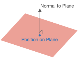
// Create an XZ plane at [0, 0, 0] (the normal is thus along the y axis)
const p = new Fig.Plane([0, 0, 0], [0, 1, 0]);
The Plane object has a number of useful methods for working with planes and can determine things like:
- if a point is on the plane
- if two planes are equal
- if two planes are parallel
- the line at the intersection of two planes
- if a line is parallel to the plane
- the intersect point of a line and plane
- if a line lies on the plane
- a point's projection onto the plane
- the distance between the plane and a point
Scene
In FigureOne shapes are created in a space. The Scene then defines how the shapes are presented to the user (what portion of space gets shown to the user).
Two Dimensions
In two dimensions the Scene simply defines the range of x and y values that will be shown. Four properties are used for this:
left- the minimum x valueright- the maximum x valuebottom- the minimum y valuetop- the maximum y value
Three Dimensions
In three dimensions, we want capture a three dimensional space or volume and draw it to a two dimensional screen. To do this we:
- Choose a position from which to observe the space from
- Choose a direction to look at
- Choose which direction is up
- Choose the limits of the space we want to view in the direction we are looking
- Choose whether proximity changes the size of things (in the real world, things further away look smaller)
- Choose how to light the scene (without lighting, three dimensional objects look flat)
These choices are bundled into three categories:
- Camera
- Projection
- Light
Camera
The camera is the observer of the scene. Scene.camera defines how we are looking at the space we which to draw. It has the properties
position- where the camera is locatedlookAt- where the camera is looking atup- which direction is up for the camera
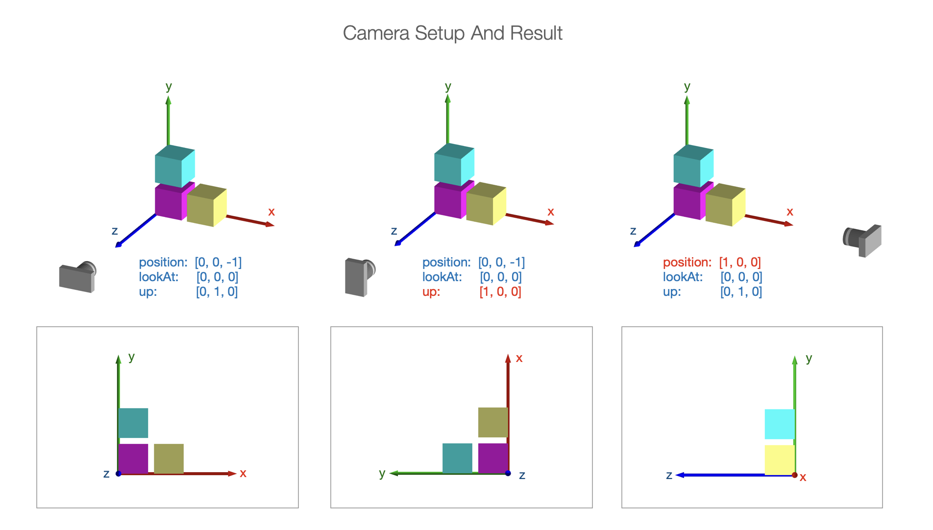
Projection
Setting up the camera defines how we are looking at the 3D space. We then need to project what we are looking at into two dimensions for the screen.
In three dimensions, some objects will be closer to the camera and others further away.
In real life, objects that are further away look smaller than closer objects. But in technical drawings, it is often useful to have an object's size remain constant (no matter the distance from the camera) so proportions of objects can be properly compared.
Therefore the projection can have two styles:
- perspective projection - shapes get smaller the further they are away from the camera
- orthographic projection - shape size is the same at all distances to the camera
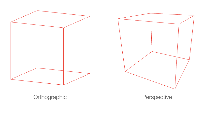
Orthographic Projection
Depending on the style of projection, the expanse of space to be captured in the projection can be defined.
For orthographic projection, adding near and far to left, right, bottom, and top creates a rectangular prism in front of the camera. Any shapes (or portions of shapes) within this prism will be shown. The property names are relative to the camera. camera.lookAt will be a normal to the near and far sides of the prism. camera.up will orient the the top of the prism. camera.position and near will then position the prism while far will give it depth.
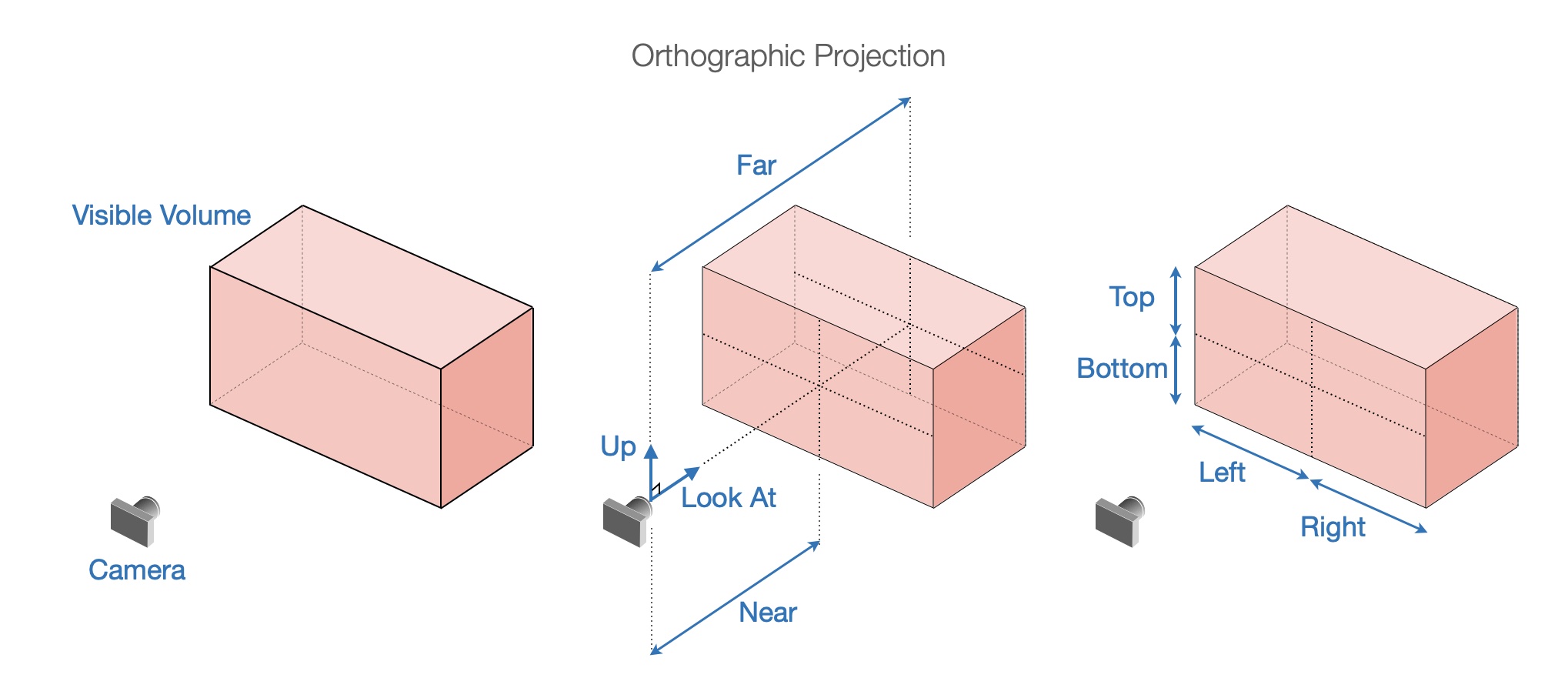
Perspective Projection
These same properties cannot be used for perspective projection because size changes with distance from camera. For example the width left and right will be different closer to the camera compared with further away. Therefore, a frustum is used to define visible space with the properties:
fieldOfView: the angular field of view in thecamera.updirectionaspectRatio: the ratio of width to heightnear: the closest visible point to the camerafar: the furthest visible point to the camera
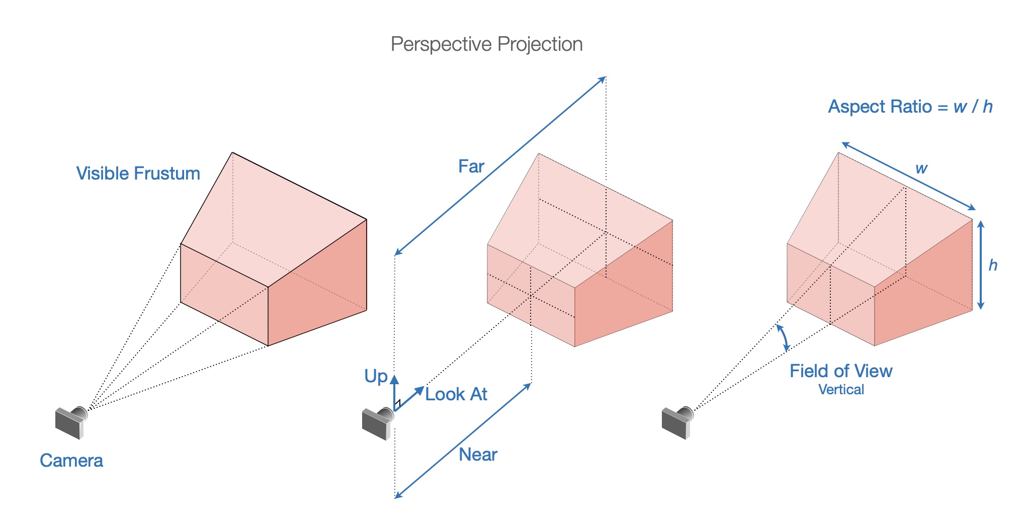
Light
Light is an important factor in vizualizing 3D. If all surfaces of an object are illuminated equally (no lighting modifier, or ambient light), then different faces or curvature of the surface will be indistinguishable. The image will look flat.
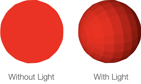
FigureOne lighting is a color modifier based on the amount of light reflected from a surface. If all light is reflected from a surface, then the surface color will be the original color. If only a portion of light is reflected from the surface, then the surface color will be a darker form of the original color.
The amount of light reflected from a surface is a function of the direction of the light relative to the surface, and whether the surface faces the light source or not. The direction the surface faces is the direction of its normal.

If L is the normalized light incidence vector and n is the normalized surface normal, then the color modifier m is given by:

Where m will be a value between 0 (no light) and 1 (full light), and a is the ambient light (also between 0 and 1) and is the minimum amount of light that each surface will reflect.
The goal of FigureOne lighting is to provide simple lighting options that can easily show the curvature of a 3D object. It is not realistic:
- It does not cast shaddows
- It lights surfaces from behind
- A surface color is the same on top and below the surface
If more realistic lighting, shaddows or multiple light sources are required, then custom shaders can be used.
FigureOne provides four simple lighting options:
- no light: All surfaces are the shape color with no lighting modification (looks flat)
- ambient light: All surfaces of a shape reflect the same amount of light. If ambient light is less than 1, then the color of each surface will be a darker shade of the shape color (also looks flat).
- directional light: All surfaces of a shape use the same light incidence vector L. This is similar to a plane of light coming from a single direction. The direciton light vector definition points toward the light source.
- point light: All surfaces of a shape use a L equal to the vector between the point source and the surface position.
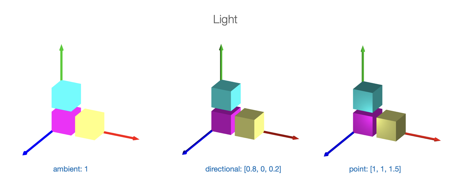
As an example, let's create a cube with directional lighting. The light source will be predominantly from the x direction, and so the +x face of the cube will be brightest.
const figure = new Fig.Figure();
figure.scene.setProjection({ style: 'orthographic' });
figure.scene.setCamera({ position: [2, 1, 1], up: [0, 1, 0] });
// Setup the direction of directional light. Note, this vector describes where
// the light is coming from.
figure.scene.setLight({ directional: [1, 0.5, -0.1] });
figure.add(
{
make: 'cube',
color: [1, 0, 0, 1],
side: 0.5,
// Note: 'directional' is the default value, and so when using direcitonal
// light this line is not required. It is here for example only.
light: 'directional',
},
);
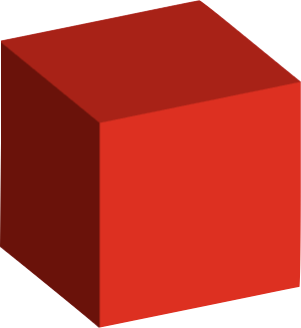
Rotation
The only information needed for a 2D rotation is the magnitude of rotation and direction. The rotation axis is always along the z axis.
In three dimensions, a rotation can be around any arbitrary axis, and therefore 4 numbers are required. The rotation, and the x, y, and z components of the axis vector.
Both a transform object, or short-hand transform notation can be used to define a 3D rotation. In both cases, first the rotation value is defined, then the axis of rotation.
// Create a rotation component in a transform object
const t1 = new Fig.Transform().rotate(Math.PI / 2, [1, 0, 0]);
// Create a transform from short hand transform notation
const t2 = Fig.getTransform(['r', Math.PI / 2, 1, 0, 0]);
For example, to rotate a cube around the x-Axis
const cube = figure.add({
make: 'cube',
side: 0.5,
color: [0, 1, 1, 1],
// Set the transform so the rotation is arount the x axis
transform: ['r', 0, 1, 0, 0],
});
// Animate rotation around the x axis
cube.animations.new()
.rotation({ velocity: 0.5, duration: null })
.start();
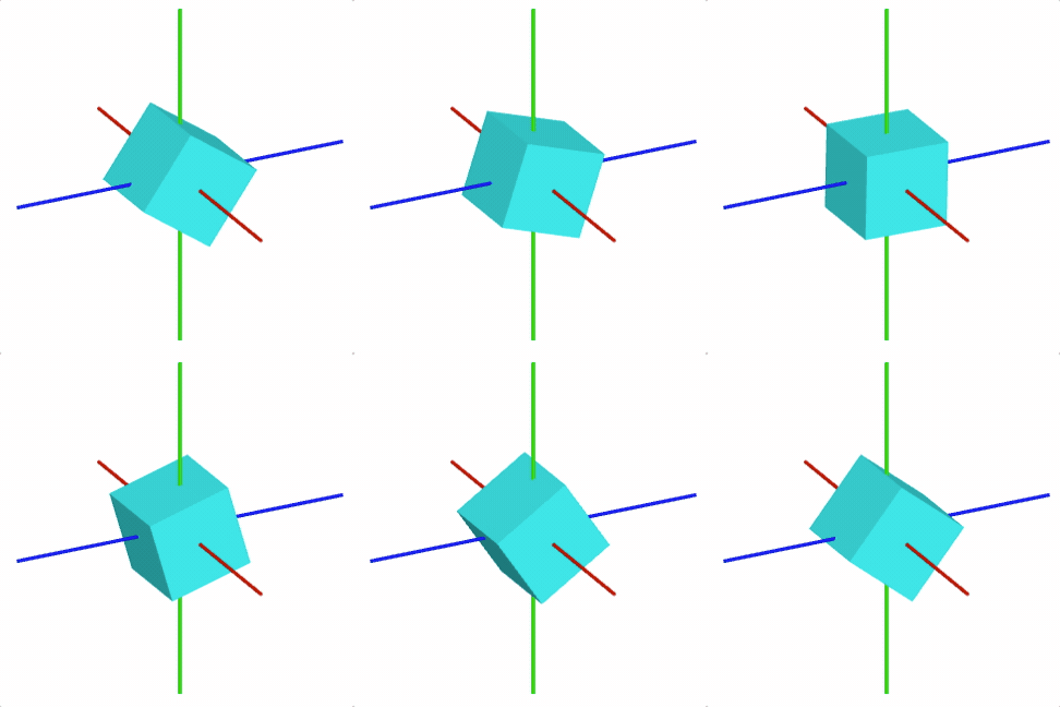
3D Shape Primitives Boilerplate
To test examples within the '3D Shape Primitives' section of the API reference create an index.html file and index.js file.
All examples are snippets which can be appended to the end of the index.js file.
<!-- index.html -->
<!doctype html>
<html>
<body>
<div id="figureOneContainer" style="width: 800px; height: 800px; background-color: white;">
</div>
<script type="text/javascript" src='https://cdn.jsdelivr.net/npm/figureone@0.15.10/figureone.min.js'></script>
<script type="text/javascript" src='./index.js'></script>
</body>
</html>
// index.js
const figure = new Fig.Figure({
scene: {
style: 'orthographic',
camera: {
position: [2, 1, 1],
up: [0, 1, 0],
},
light: {
directional: [0.7, 0.5, 1],
},
},
});
OBJ_Generic3All
Type:
{light: ("directional" | "point" | "ambient" | null)?, copy: (Array<(CPY_Step | string)> | CPY_Step)?, usage: TypeGLBufferUsage?, touchScale: (number | TypeParsablePoint)?}
(("directional" | "point" | null)?)
: the scene light that will
be cast on the shape. Use
null
for no lighting - all surfaces will have
the defined color. (
'directional'
)
((Array<(CPY_Step | string)> | CPY_Step)?)
: Create copies the
shapes vertices to replicate the shape in space. Copies of normals, colors
(if defined) and texture coordinates (if defined) will also be made.
(TypeGLBufferUsage?)
: use
'DYNAMIC'
if the shape's vertices
will be updated very frequently (
'STATIC'
)
((number | TypeParsablePoint)?)
OBJ_Generic3
Options object for a FigureElementPrimitive of a generic 3D shape. Extends OBJ_Generic3All and OBJ_FigurePrimitive


OBJ_GenericGL can be used for shape creation with custom shaders.
But for many custom shapes, only points and normals of the shape need to be defined, without needing to customize the shaders.
OBJ_Generic3 Provides the ability to create many custom shapes that don't need shader customization.
Type: any
(("TRIANGLES" | "POINTS" | "FAN" | "STRIP" | "LINES")?)
: (
'TRIANGLES'
)
(Array<TypeParsablePoint>?)
: positions of vertices of shape
(Array<TypeParsablePoint>?)
: normals for each vertex
(Array<TypeColor>?)
: define a color for each vertex if the
shape will be more than just a single color. Otherwise use
color
if a
single color.
(OBJ_Texture?)
: use to overlay a texture onto the shape's
surfaces
// Cubes with texture on each face
figure.scene.setProjection({ style: 'orthographic' });
figure.scene.setCamera({ position: [1, 1, 2] });
figure.scene.setLight({ directional: [0.7, 0.5, 1] });
const [points, normals] = Fig.cube({ side: 0.8 });
figure.add({
make: 'generic3',
points,
normals,
texture: {
src: './flowers.jpeg',
coords: [
0, 0, 0.333, 0, 0.333, 0.5,
0, 0, 0.333, 0.5, 0, 0.5,
0.333, 0, 0.666, 0, 0.666, 0.5,
0.333, 0, 0.666, 0.5, 0.333, 0.5,
0.666, 0, 1, 0, 1, 0.5,
0.666, 0, 1, 0.5, 0.666, 0.5,
0, 0.5, 0.333, 1, 0, 1,
0, 0.5, 0.333, 0.5, 0.333, 1,
0.333, 0.5, 0.666, 1, 0.333, 1,
0.333, 0.5, 0.666, 0.5, 0.666, 1,
0.666, 0.5, 1, 1, 0.666, 1,
0.666, 0.5, 1, 0.5, 1, 1,
],
loadColor: [0, 0, 0, 0],
},
});
// Create a a ring around a sphere.
figure.scene.setProjection({ style: 'orthographic' });
figure.scene.setCamera({ position: [1, 1, 2] });
figure.scene.setLight({ directional: [0.7, 0.5, 1] });
const { sphere, polygon, revolve } = Fig;
const [spherePoints, sphereNormals] = sphere({ radius: 0.15 });
// The ring is a flattened doughnut
const [ringPoints, ringNormals] = revolve({
profile: polygon({
close: true,
sides: 20,
radius: 0.05,
center: [0, 0.3],
direction: -1,
transform: ['s', 0.1, 1, 1],
}),
normals: 'curve',
sides: 50,
transform: ['d', 0, 1, 0],
});
const a = figure.add({
make: 'generic3',
points: [...spherePoints, ...ringPoints],
normals: [...sphereNormals, ...ringNormals],
color: [1, 0, 0, 1],
transform: [['r', 0.15, 1, 0, 0], ['r', 0.3, 0, 1, 0]],
});
// Animate the shape to slowly rotate around the x and y axes
a.animations.new()
.custom({
callback: (t) => {
a.transform.updateRotation(t * 0.15);
a.transform.updateRotation(t * 0.3, null, 1);
},
duration: null,
})
.start();
OBJ_Cube
Cube shape options object that extends OBJ_Generic3All and OBJ_FigurePrimitive

By default, a cube will be constructed around the origin, with the xyz axes being normal to the cube faces.
Type: any
(boolean?)
: if
true
then points representing
the 12 edges of the cube will be returned. If
false
, then points
representing two triangles per face (12 triangles, 36 points) and an
associated normal for each point will be returned. (
false
)
figure.add({
make: 'cube',
side: 0.5,
color: [1, 0, 0, 1],
});
// 3x3 grid of cubes
figure.add({
make: 'cube',
side: 0.2,
color: [1, 0, 0, 1],
copy: [
{ along: 'x', num: 2, step: 0.22 },
{ along: 'y', num: 2, step: 0.22 },
{ along: 'z', num: 2, step: 0.22 },
],
});
// Wire mesh cube
figure.add({
make: 'cube',
side: 0.5,
lines: true,
color: [1, 0, 0, 1],
});
OBJ_Sphere
Sphere shape options object that extends OBJ_Generic3All and OBJ_FigurePrimitive

By default, a sphere with its center at the origin will be created.
Type: any
(("curve" | "flat")?)
: flat
normals will make light
shading across a face cone constant.
curve
will gradiate the shading. Use
curve
to make a surface look more round with fewer number of sides.
(
flat
)
(boolean?)
: if
true
then points representing
the edes of the faces will be returned. If
false
, then points
representing two triangles per face and an
associated normal for each point will be returned.
figure.add({
make: 'sphere',
radius: 0.5,
color: [1, 0, 0, 1],
});
// Sphere with 'curve' normals
figure.add({
make: 'sphere',
radius: 0.5,
normals: 'curve',
color: [1, 0, 0, 1],
});
// Wire mesh sphere
figure.add({
make: 'sphere',
radius: 0.5,
sides: 30,
lines: true,
normals: 'curve',
color: [1, 0, 0, 1],
});
// Ring of spheres, rotated to by in xz plane
figure.add({
make: 'sphere',
radius: 0.1,
color: [1, 0, 0, 1],
center: [0.3, 0, 0],
normals: 'curve',
copy: [
{ along: 'rotation', num: 10, step: Math.PI * 2 / 10 },
],
transform: ['r', Math.PI / 2, 1, 0, 0],
});
OBJ_Cylinder
Cylinder shape options object that extends OBJ_Generic3All and OBJ_FigurePrimitive

By default, a cylinder along the x axis will be created.
Type: any
(("curve" | "flat")?)
: flat
normals will make
shading (from light source) across a face cone constant.
curve
will gradiate the shading. Use
curve
to make a surface look more
round with fewer number of sides. (
flat
)
(TypeParsableLine?)
: line that can position and
orient the cylinder. First point of line is cylinder base center, and second
point is the top center.
((boolean | 1 | 2)?)
: true
fills both ends of the cylinder.
false
does not fill ends.
1
fills only the first end.
2
fills only the
the second end. (
true
)
(number?)
: rotation of base - this is only noticable for
small numbers of sides (
0
)
points of cube
(boolean?)
: if
true
then points representing
the edes of the faces will be returned. If
false
, then points
representing two triangles per face and an
associated normal for each point will be returned.
figure.add({
make: 'cylinder',
radius: 0.2,
length: 0.5,
sides: 20,
color: [1, 0, 0, 1],
});
// Use curve normals to give rounder looks for same number of sides
figure.add({
make: 'cylinder',
radius: 0.2,
length: 0.5,
sides: 20,
normals: 'curve',
color: [1, 0, 0, 1],
});
// Wire mesh cylinder
figure.add({
make: 'cylinder',
radius: 0.2,
length: 0.2,
lines: true,
sides: 50,
ends: false,
color: [1, 0, 0, 1],
});
// Three cylinders as x, y, z axes
figure.add([
{
make: 'cylinder',
radius: 0.02,
line: [[0, 0, 0], [0.5, 0, 0]],
color: [1, 0, 0, 1],
},
{
make: 'cylinder',
radius: 0.02,
line: [[0, 0, 0], [0, 0.5, 0]],
color: [0, 1, 0, 1],
},
{
make: 'cylinder',
radius: 0.02,
line: [[0, 0, 0], [0, 0, 0.5]],
color: [0, 0, 1, 1],
},
]);
OBJ_Cone
Cone shape options object that extends OBJ_Generic3All and OBJ_FigurePrimitive
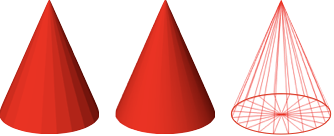
By default, a cone with its base at the origin and its tip along the x axis will be created.
Type: any
(number?)
: radius of cube base
(("curve" | "flat")?)
: flat
normals will make light
shading across a face cone constant.
curve
will gradiate the shading. Use
curve
to make a surface look more round with fewer number of sides.
(
flat
)
(TypeParsableLine?)
: line that can position and
orient the cone. First point of line is cone base center, and second point
is cone tip.
(number?)
: rotation of base - this is only noticable for
small numbers of sides (
0
)
points of cube
(boolean?)
: if
true
then points representing
the edes of the faces will be returned. If
false
, then points
representing two triangles per face and an
associated normal for each point will be returned.
figure.add({
make: 'cone',
radius: 0.2,
sides: 20,
color: [1, 0, 0, 1],
line: [[0, 0, 0], [0, 0.5, 0]],
});
// Cone with curve normals
figure.add({
make: 'cone',
radius: 0.2,
normals: 'curve',
sides: 20,
color: [1, 0, 0, 1],
line: [[0, 0, 0], [0, 0.5, 0]],
});
// Wire mesh cone
figure.add({
make: 'cone',
radius: 0.2,
normals: 'curve',
sides: 20,
color: [1, 0, 0, 1],
line: [[0, 0, 0], [0, 0.5, 0]],
lines: true,
});
OBJ_Prism
Prism shape options object that extends OBJ_Generic3All and OBJ_FigurePrimitive

A prism base is defined in the XY plane, and it's length extends
into +z. Use transform to orient it in any other way.
Triangles will be created for the ends if the base is convex. If the base
is not convex, use baseTriangles to define the triangles.
Type: any
(number?)
: base border points defined in the XY plane - the
points should be defined in the counter-clock-wise direction.
(Array<TypeParsablePoint>)
: triangles in the XY plane
that create the base fill. If the base is convex, then the triangles can be
auto-generated and this property left undefined.
(number?)
: length of the prism
(boolean?)
: if
true
then points representing
the edges of the prism will be returned. If
false
, then points
representing triangle faces and associated normals will be returned.
(
false
)
// Create a rectangular prism
figure.add(
{
make: 'prism',
base: [[0, 0], [0.5, 0], [0.5, 0.2], [0, 0.2]],
color: [1, 0, 0, 1],
},
);
// Create a hexagonal prism along the x axis with lines
figure.add(
{
make: 'prism',
base: Fig.polygon({ radius: 0.1, sides: 6 }),
color: [1, 0, 0, 1],
transform: ['r', Math.PI / 2, 0, 1, 0],
lines: true,
},
);
// Create a bow tie prism defining the base triangles
figure.add(
{
make: 'prism',
base: [[0, 0], [0.25, 0.1], [0.5, 0], [0.5, 0.3], [0.25, 0.2], [0, 0.3]],
baseTriangles: [
[0, 0], [0.25, 0.1], [0.25, 0.2],
[0, 0], [0.25, 0.2], [0, 0.3],
[0.25, 0.1], [0.5, 0], [0.5, 0.3],
[0.25, 0.1], [0.5, 0.3], [0.25, 0.2],
],
color: [1, 0, 0, 1],
transform: ['r', Math.PI / 2, 0, 1, 0],
},
);
OBJ_Line3
3D Line options object that extends OBJ_Generic3All and OBJ_FigurePrimitive
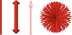
A 3D line is a cylinder with optional arrows on the end. Unlike a 2D line, the arrow profiles can only be simple triangles.
Type: any
(number?)
: width of line
((OBJ_Line3Arrow | boolean)?)
: define to use arrows at one or both ends
of the line
(("curve" | "flat")?)
: flat
normals will make light
shading across a line face constant.
curve
will gradiate the shading. Use
curve
to make a surface look more round with fewer number of sides.
(
curve
)
(number?)
: rotation of line around its axis - this is
only noticable for small numbers of sides (
0
)
(boolean?)
: if
true
then points representing
the edes of the faces will be returned. If
false
, then points
representing two triangles per face and an
associated normal for each point will be returned.
// Simple line
figure.add({
make: 'line3',
p1: [0, 0, 0],
p2: [0, 1, 0],
color: [1, 0, 0, 1],
});
// Thick line with arrows on both ends
figure.add({
make: 'line3',
p1: [0, 0, 0],
p2: [0, 1, 0],
arrow: { ends: 'all', width: 0.1, length: 0.1 },
sides: 30,
width: 0.05,
color: [1, 0, 0, 1],
});
// Wire mesh line with arrow
figure.add({
make: 'line3',
p1: [0, 0, 0],
p2: [0, 1, 0],
arrow: { ends: 'end' },
color: [1, 0, 0, 1],
lines: true,
});
// Ball of arrows
figure.add(
{
make: 'line3',
p1: [0, 0, 0],
p2: [0, 0.4, 0],
color: [1, 0, 0, 1],
width: 0.01,
arrow: { end: 'end', width: 0.02 },
copy: [
{ along: 'rotation', num: 20, step: Math.PI * 2 / 20 },
{ along: 'rotation', axis: [0, 1, 0], num: 20, step: Math.PI * 2 / 20 },
],
},
);
OBJ_Revolve
Revolve shape options object that extends OBJ_Generic3All and OBJ_FigurePrimitive.

Revolve (or radially sweep) a profile in the XY plane around the x axis to form a 3D surface. The profile y values must be greater than or equal to 0.
Profiles can be open (start and end point are different) or closed (start and end point are equal).
For predictable lighting results, profiles should be created with the following rules:
- An open profile's start points should have an x value less than its end point
- Closed profiles where all points have y > 0 should be defined in the clockwise direction when looking at the XY plane from the +z axis.
If an open profile's start and ends points are at y = 0, then the final shape will look solid.
If an open profile's start and/or ends points have y > 0, then the final shape will look like a surface open at the ends with y > 0. As a surface can have only one color, then looking inside the shape the surface lighting will be opposite to that expected. To create open ended solids with lighting that is as expected, create the outside and inside surface with a closed profile.
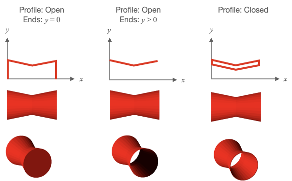
Type: any
(Array<TypeParsablePoint>)
: XY plane profile to be radially
swept around the x axis
(number?)
: number of sides in the radial sweep
(("flat" | "curveRows" | "curveRadial" | "curve")?)
: flat
normals will make shading (from a light source) across a face of the
object a constant color.
curveProfile
will gradiate the shading along the
profile.
curveRadial
will gradiate the shading around the radial sweep.
curve
will gradiate the shading both around the radial sweep and along the
profile. Use
curve
,
curveProfile
, or
curveRadial
to make a surface
look more round with fewer number of sides.
(number?)
: by default the profile will start in the XY
plane and sweep around the x axis following the right hand rule. Use
rotation
to start the sweep at some angle where 0º is in the XY for +y and
90º is in the XZ plane for +z. initial angle of the revolve rotation
(TypeParsablePoint?)
: orient the draw space vertices of the
shape so its axis is along this vector
(boolean?)
: if
true
then points representing
the edes of the faces will be returned. If
false
, then points
representing two triangles per face and an
associated normal for each point will be returned.
figure.add({
make: 'revolve',
profile: [[0, 0], [0, 0.05], [0.5, 0.05], [0.6, 0.1], [0.7, 0]],
axis: [0, 1, 0],
color: [1, 0, 0, 1],
sides: 20,
});
// If creating a shell, then also create the inside surface as this will make
// lighting more correct (note there is not shaddows).
// Ensure to close the shell by adding the first point to the end of the
// profile
figure.add({
make: 'revolve',
profile: [[0, 0.15], [0.5, 0.3], [0.5, 0.29], [0, 0.14], [0, 0.15]],
color: [1, 0, 0, 1],
sides: 30,
normals: 'curveRadial',
});
// Curvy vase like shape
const x = Fig.range(0, 0.5, 0.01);
const profile = x.map(_x => [_x, 0.1 + 0.05 * Math.sin(_x * 2 * Math.PI * 2)]);
figure.add({
make: 'revolve',
profile: [...profile, [0.4, 0], [0, 0], [0, 0.1]],
axis: [0, 1, 0],
color: [1, 0, 0, 1],
sides: 30,
});
// Make a torus by revolving a polygon around the axis. As the polygon is above
// the x axis, a hole will be created
// Try using `normals: 'curve'`, `normals: 'curveProfile'`, and
// `normals: 'curveRadial'` to see different curve options.
const { polygon } = Fig;
figure.add({
make: 'revolve',
profile: polygon({
radius: 0.1, center: [0, 0.3], sides: 20, direction: -1, close: true,
}),
color: [1, 0, 0, 1],
sides: 30,
});
// Wire mesh arrow
figure.add({
make: 'revolve',
profile: [[0, 0.03], [0.4, 0.03], [0.4, 0.09], [0.7, 0]],
axis: [0, 1, 0],
color: [1, 0, 0, 1],
sides: 20,
lines: true,
});
// Open profile y = 0 at ends
figure.add({
make: 'revolve',
profile: [[0, 0], [0, 0.3], [0.5, 0.2], [1, 0.3], [1, 0]],
color: [1, 0, 0, 1],
sides: 30,
});
// Open profile y > 0 at ends
figure.add({
make: 'revolve',
profile: [[0, 0.3], [0.5, 0.2], [1, 0.3]],
color: [1, 0, 0, 1],
sides: 30,
});
// Closed Profile
figure.add({
make: 'revolve',
profile: [[0, 0.3], [0.5, 0.2], [1, 0.3], [1, 0.29], [0.5, 0.19], [0, 0.29], [0, 0.3]],
color: [1, 0, 0, 1],
sides: 30,
});
OBJ_Surface
Surface shape options object that extends OBJ_Generic3All and OBJ_FigurePrimitive.


A surface is defined with a 2D matrix of points. Triangles that fill the surface are created between neighboring points in the matrix.
If a surface is defined with 9 points (an array or arrays in JavaScript):
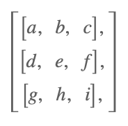
Then triangles will be created between adb, deb, bec, efc, dge,
ghe, ehf, and hif.
The normal for triangle 'adb' is in the direction of the cross product
of vector 'ad' with vector 'ab' (use the right hand rule where the fingers
of the right hand curl from vector 'ad' to 'ab', and the thumb will then be
the direction of the normal). Similarly, the normal of hif will be the
direction of the cross product of hi with hf.
Use the property invertNormals to make all the normals go in the reverse
direction.
A surface can be open or closed at the end rows or columns of the matrix. For example, a surface has closed columns if the first and last column of the matrix have identical points. A surface is has open rows if the first and last row of the matrix have different points.
If using curved normals ('curve', 'curveRows' or 'curveColumns') with
closed surfaces, use closeRows or closeColumns to ensure normal
curvature is maintained at the end rows
and columns.
Type: any
(Array<Array<TypeParsablePoint>>?)
: A grid of points that
define a 3D surface
(("curveColumns" | "curveRows" | "curve" | "flat")?)
: flat
normals will make shading (from a light source) across a face of the
object a constant color.
curveRows
will gradiate the shading along the
rows of the grid.
curveColumns
will gradiate the shading along the columns
of the grid.
curve
will gradiate the shading along both rows and columns.
Use
curve
,
curveRows
, or
curveColumns
to make a surface
look more round with fewer number of sides.
(boolean?)
: Set to
true
if first row and last row are
the same, and normals is
'curveRows'
or
'curve'
to get correct normal
calculations (
false
)
(boolean?)
: Set to
true
if first row and last
column are the same, and normals is
'curveColumns'
or
'curve'
to get
correct normal calculations (
false
)
shape
(boolean?)
: if
true
then points representing
the edes of the faces will be returned. If
false
, then points
representing two triangles per face and an
associated normal for each point will be returned.
const points = Fig.surfaceGrid({
x: [-0.8, 0.7, 0.03],
y: [-0.8, 0.7, 0.03],
z: x => 0.2 * Math.cos(x * 2 * Math.PI),
});
figure.scene.setCamera({ up: [0, 0, 1] });
figure.add({
make: 'surface',
points,
color: [1, 0, 0, 1],
});
// Surface wire mesh
const points = Fig.surfaceGrid({
x: [-0.8, 0.8, 0.03],
y: [-0.8, 0.8, 0.03],
z: (x, y) => y * 0.2 * Math.cos(x * 2 * Math.PI),
});
figure.scene.setCamera({ position: [-1, -1, 0.7], up: [0, 0, 1] });
figure.add({
make: 'surface',
points,
lines: true,
color: [1, 0, 0, 1],
});
// Surface with wire mesh and fill
const points = Fig.surfaceGrid({
x: [-0.8, 0.8, 0.03],
y: [-0.8, 0.8, 0.03],
z: (x, y) => {
const r = Math.sqrt(x * x + y * y) * Math.PI * 2 * 2;
return Math.sin(r) / r;
},
});
// Orient the camera so z is up
figure.scene.setCamera({ up: [0, 0, 1] });
figure.add({
make: 'surface',
points,
color: [1, 0, 0, 1],
});
figure.add({
make: 'surface',
points,
lines: true,
color: [0, 0, 0, 1],
});
// Simple Closed surface around the x axis
figure.add({
make: 'surface',
normals: 'curveColumns',
closeRows: true,
points: [
[[0, 0, 0.5], [1, 0, 0.5]],
[[0, -0.5, 0], [1, -0.5, 0]],
[[0, 0, -0.5], [1, 0, -0.5]],
[[0, 0.5, 0], [1, 0.5, 0]],
[[0, 0, 0.5], [1, 0, 0.5]],
],
color: [1, 0, 0, 1],
});
// Simple Closed surface around the x axis with curved normals
figure.add({
make: 'surface',
normals: 'curveColumns',
closeRows: true,
points: [
[[0, 0, 0.5], [1, 0, 0.5]],
[[0, -0.5, 0], [1, -0.5, 0]],
[[0, 0, -0.5], [1, 0, -0.5]],
[[0, 0.5, 0], [1, 0.5, 0]],
[[0, 0, 0.5], [1, 0, 0.5]],
],
color: [1, 0, 0, 1],
});
// Create a matrix of points by taking a profile in XY and rotating
// it around the x axis
const { Point, Transform } = Fig;
const points = [];
// Rotation step
const dr = Math.PI * 2 / 50;
for (let r = 0; r < Math.PI * 2 + dr / 2; r += dr) {
// Rotation matrix of rotation step around x axis
const m = new Transform().rotate(r, 1, 0, 0).matrix();
// A row of points is a profile rotated by some amount r
points.push([]);
// Make a profile for x values from 0 to 1
for (let x = 0; x < 1; x += 0.05) {
// The y coordinate of the profile changes with both x value, and
// rotation value
const y = 0.1 * Math.sin(6 * x) + 0.25 + 0.1 * Math.cos(3 * r);
const p = new Point(x, y).transformBy(m);
points[points.length - 1].push(p);
}
}
figure.add({
make: 'surface',
points,
color: [1, 0, 0, 1],
});
2D Shape Collections
FigureOne provides a number of collections shapes that combine simple shapes into more complex objects.
Collections shapes are FigureElementCollections that manage a number of FigureElements, and may provide methods to dynamically update and change the shapes, additional animation steps specific to to shape, and additional ways to interact with the shape.
OBJ_Collection
FigureElementCollection options object.
A collection is a group of other FigureElements that will all inherit the parent collections transform.
Type:
{transform: TypeParsableTransform?, position: TypeParsablePoint?, color: TypeColor?, parent: (FigureElement | null)?, border: (TypeParsableBuffer | TypeParsableBorder | "children" | "rect" | number)?, touchBorder: (TypeParsableBuffer | TypeParsableBorder | "border" | "children" | number | "rect")?}
(TypeParsableTransform?)
(TypeColor?)
: default color
((FigureElement | null)?)
: parent of collection
((TypeParsableBuffer | TypeParsableBorder | "children" | "rect")?)
: defines border of collection. Use
children
to use the borders of
the children. Use
'rect'
for the bounding rectangle of the borders
of the children. Use
TypeParsableBuffer
for the bounding rectangle of the
borders of the children with some buffer. Use
TypeParsableBorder
for
a custom border. (
'children'
)
((TypeParsableBuffer | TypeParsableBorder | "border" | "rect")?)
: defines the touch border of the collection. Use
'border'
to use the same
as the border of the collection. Use
children
to use the touch borders of
the children. Use
'rect'
for the bounding rectangle of the touch borders
of the children. Use
TypeParsableBuffer
for the bounding rectangle of the
touch borders of the children with some buffer. Use
TypeParsableBorder
for
a custom touch border. (
'children'
)
figure.add(
{
name: 'c',
make: 'collection',
elements: [ // add two elements to the collection
{
name: 'hex',
make: 'polygon',
sides: 6,
radius: 0.5,
},
{
name: 'text',
make: 'text',
text: 'hexagon',
position: [0, -0.8],
xAlign: 'center',
font: { size: 0.3 },
},
],
},
);
// When a collection rotates, then so does all its elements
figure.getElement('c').animations.new()
.rotation({ target: Math.PI * 1.999, direction: 1, duration: 5 })
.start();
// Collections and primitives can also be created from `figure.collections`
// and `figure.primitives`.
const c = figure.collections.collection();
const hex = figure.primitives.polygon({
sides: 6,
radius: 0.5,
});
const text = figure.primitives.text({
text: 'hexagon',
position: [0, -0.8],
xAlign: 'center',
font: { size: 0.3 },
});
c.add('hex', hex);
c.add('text', text);
figure.add('c', c);
// When a collection rotates, then so does all its elements
c.animations.new()
.delay(1)
.rotation({ target: Math.PI * 1.999, direction: 1, duration: 5 })
.start();
CollectionsLine
FigureElementCollection representing a line.


This object defines a convient and powerful line FigureElementCollection that includes a solid or dashed line, arrows, a label annotation that can self align with line orientation, and some methods to make it convient to use dynamically.
See COL_Line for the options that can be used when creating the line.
The object contains a two additional animation steps. length
animates changing the line length, and pulseWidth animates the
pulseWidth method. The animation steps are available in
the animation manager (FigureElement.animations),
and in the animation builder
(animations.new
and animations.builder).
Some of the useful methods included in an collections line are:
- pulseWidth - pulses the line without changing its length
- grow - starts and animation that executes
a single
lengthanimation step - grow - overrides FigureElement.setMovable and allowing for more complex move options.
Extends FigureElementCollection
See OBJ_PulseWidthAnimationStep for pulse angle animation step options.
To test examples below, append them to the boilerplate.
// Pulse an annotated line
figure.add({
name: 'l',
make: 'collections.line',
p1: [-1, 0],
p2: [1, 0],
arrow: 'triangle',
label: {
text: 'length',
offset: 0.04,
},
});
figure.elements._l.pulseWidth({ duration: 2 });
// Animate growing a line while showing it's length
figure.add({
name: 'l',
make: 'collections.line',
p1: [-1, 0],
p2: [-0.5, 0],
align: 'start',
arrow: { end: { head: 'barb', scale: 2 } },
label: {
text: null,
offset: 0.03,
precision: 2,
location: 'start'
},
});
const l = figure.elements._l;
l.animations.new()
.length({ start: 0.5, target: 2, duration: 2 })
.start();
// Example showing dashed line with an equation label that stays horizontal
const l = figure.collections.line({
p1: [0, 0],
p2: [1.4, 0],
align: 'start',
label: {
text: { // label text is an equation
elements: {
twopi: '2\u03C0',
},
forms: {
base: ['twopi', ' ', { frac: ['a', 'vinculum', 'b'] } ]
},
},
offset: 0.03,
orientation: 'horizontal', // keep label horizontal
location: 'top', // keep label on top of line
},
dash: [0.08, 0.02, 0.02, 0.02],
});
figure.add('l', l);
l.setMovable({ type: 'centerTranslateEndRotation'})
l.setAutoUpdate();
A line has:
- length
- p1, p2
- angle
- position
- reference alignment
Two ways to define a line:
- p1, p2
- position, align, length, angle
Line is defined by:
- primitive line: full length, angle = 0, aligned in draw space with align
- transform.translate: moves align position
- transform.rotate: changes angle
Pulse the line so that it's width pulses and its length doesn't change.
The pulse scales of the line, label and arrows can all be defined separately.
(OBJ_PulseWidth
= {})
Use this method to enable or disable movability of the line.
((OBJ_MovableLine | boolean)?
= {})
true
to
make movable,
false
to make not movable or use options to
set different kinds of movability.
Use this to manually update the rotation of the line collection.
(Transform
= this.transform._dup())
Turn on and off auto label location and orientation updates when line transform changes. When a line is created with a label, auto update is turned off by default.
(boolean
= true)
Get line angle
(("deg" | "rad")?
= 'rad')
number:
Get the text of the label
Set the label to be the real length of the line
Manually update the label orientations with a custom rotation offset.
Automatic updating can be done with setAutoUpdate
((number | null)
= null)
Change the line position, length and angle using end points and an offset.
For most lines, an offset of 0 will be desired, as this will position the
line ends to be at p1 and p2.
A non-positive offset will position the line in parallel with p1 and p2
but some offset away. A positive offset will position the line on the side
it will rotate toward with positive rotation.
Create a new animation that executes a single grow animation step.
(OBJ_LengthAnimationStep)
COL_Line
CollectionsLine options object that extends OBJ_Collection
options object (without parent).
The Collections Line is a convient and powerful line FigureElementCollection that includes the line, arrows, a label annotation and some methods to make it convient to use dynamically.
A line can either be defined by its two end points (p1, p2), or a
point (p1), length and angle.
offset can be used to draw the line some offset away from the line
definition where a positive offset is on the side of the line that the line
rotates toward when rotating in the positive direction. This is especially
useful for creating lines that show dimensions of shapes.
The line also has a control point which is positioned on the line with the
align property. The control point is the line's center of rotation, and
fixes the point from which the line changes length. This is also the point
where the line collection position will be if getPosition is called on the
element.
For instance, setting the control point at align: 'start' will mean that
if the line can rotate, it will rotate around p1, and if the length is
changed, then p1 will remain fixed while p2 changes.
width sets the width of the line. Setting the width to 0 will hide the
line itself, but if arrows or a label are defined they will still be
displayed.
Use the label property to define and position a label relative to the line.
The label can be any string, equation or the actual length of the line and
be oriented relative to the line or always be horizontal.
Use the arrow and dash properties to define arrows and the line style.
Pulsing this collection normally would pulse both the length and width of
the line. If it often desirable to pulse a line without changing its length,
and so this collection provides a method pulseWidth to allow this. This
options object can define the default values for pulseWidth if desired.
Default pulse values can then be specified with the pulse property.
Type: any
Extends OBJ_Collection
(TypeParsablePoint?)
: First point of line
(number?)
: line angle
(number?)
: line length
(number?)
: line offset
(("start" | "end" | "center" | number)?)
: rotation center of
line (only needed if rotating line)
(number?)
: line width
(OBJ_LineLabel?)
: label annotation
((OBJ_LineArrows | TypeArrowHead)?)
: line arrow(s)
(TypeDash?)
: make the line dashed
(OBJ_PulseWidth?)
: default options for pulseWidth pulse
(OBJ_Pulse?)
: default options for normal pulse
(OBJ_LineMove?)
: line move options
CollectionsAngle
FigureElementCollection representing an angle.

This object defines a convient and powerful angle FigureElementCollection that includes one or more curve annotations, arrows, a label annotation that can self align and some methods to make it convient to use dynamically.
See COL_Angle for the options that can be used when creating the angle.
The object contains two additional animation steps angle and pulseAngle
that animate a change in angle, and animate a pulsing of the angle
respectively. The animation steps are available in
the animation manager (FigureElement.animations),
and in the animation builder
(animations.new
and animations.builder).
Some of the useful methods included in an collections angle are:
- pulseAngle - customize pulsing the angle without
- setMovable - overrides FigureElement.setMovable and allowing for more complex move options.
Extends FigureElementCollection
See OBJ_PulseAngleAnimationStep for pulse angle animation step options.
To test examples below, append them to the boilerplate.
// Angle with size label
figure.add({
name: 'a',
make: 'collections.angle',
angle: Math.PI / 4,
label: null,
curve: {
radius: 0.5,
width: 0.01,
},
corner: {
width: 0.01,
length: 1,
},
});
// Right angle, created from figure.collections
const a = figure.collections.angle({
angle: Math.PI / 2,
curve: {
autoRightAngle: true,
width: 0.01,
},
corner: {
width: 0.01,
length: 1,
},
});
figure.add('a', a);
// Multi colored angle with arrows and an equation label
figure.add({
name: 'a',
make: 'collections.angle',
angle: Math.PI / 4 * 3,
label: {
text: {
elements: {
theta: { text: '\u03b8', color: [1, 0, 1, 1] },
},
forms: {
0: { frac: ['theta', 'vinculum', '2']},
},
},
offset: 0.05,
location: 'inside',
color: [0, 0, 1, 1],
},
curve: {
radius: 0.5,
width: 0.01,
},
arrow: 'barb',
corner: {
width: 0.01,
length: 1,
color: [0, 0.5, 0, 1],
},
});
// Multiple curve angle, without corner
const a = figure.collections.angle({
angle: Math.PI / 4,
curve: {
num: 3,
step: -0.03,
radius: 0.5,
width: 0.01,
},
label: {
text: 'a',
offset: 0.05,
},
});
figure.add('a', a);
// Change angle animation
figure.add({
name: 'a',
make: 'collections.angle',
angle: Math.PI / 4,
label: null,
curve: {
radius: 0.5,
width: 0.01,
},
corner: {
width: 0.01,
length: 1,
},
});
figure.elements._a.animations.new()
.angle({ start: Math.PI / 4, target: Math.PI / 4 * 3, duration: 3 })
.start();
// Movable angle
figure.add({
name: 'a',
make: 'collections.angle',
angle: Math.PI / 4 * 3,
label: {
text: null,
location: 'outside',
orientation: 'horizontal',
offset: 0.1,
update: true,
sides: 200,
},
curve: {
radius: 0.3,
fill: true,
},
corner: {
width: 0.02,
length: 1,
color: [0.4, 0.4, 0.4, 1],
},
});
figure.elements._a.setMovable({
startArm: 'rotation',
endArm: 'angle',
movePadRadius: 0.3,
});
Turn on and off auto label location and orientation updates when angle transform changes. When an angle is created with a label, auto update is turned off by default.
Manual updates can be performed with updateLabel
(boolean
= true)
Set the angle. The same direction and angle sign must be used as when originally defined.
(OBJ_AngleSet
= {})
Get the current angle in degrees or radians
(("deg" | "rad")
= 'rad')
Get the label text
Set the label to be the real angle
Manually update the label orientations with a custom rotation offset.
Automatic updating can be done with setAutoUpdate
Pulse the angle where each element can be pulsed in a custom way.
The pulse scales of the curve, label, corner and arrows can all be defined separately.
(OBJ_PulseAngle
= {})
Use this method to enable or disable movability of the line.
((OBJ_MovableAngle | boolean)?)
true
to
make movable,
false
to make not movable or use options to
set different kinds of movability.
COL_Angle
CollectionsAngle options object that extends OBJ_Collection
options object (without parent).
The Collections Angle is a convient and powerful angle FigureElementCollection that can draw one or several arcs of an angle annotation, a label, arrows, and the corner of an angle. It also includes some methods to make it convient to use dynamically.
There are two ways to define an angle. With a position, startAngle and
angle, or with three points. The angle can then be annotated with a curve
and a label on either side of the corner using the direction property.
The first way to define an angle is with position, startAngle and
angle. position is the location of the vertex of the corner.
Two lines join to make a corner, from which an angle annotation can be
superimposed. The first line is defined with startAngle and the second
line defined by angle relative to the first line. angle can either be
positive or negative to define the second line.
The second way to define an angle is with three points p1, p2 and p3.
p2 is the vertex position of the corner. Line21 is first line of the
corner and Line23 is the second.
An angle can be annotated with a curve (or many multiple curves) and a
label. direction defines which side of the corner the annotations will
be drawn. direction can either be positive or negative (1 or -1).
A positive direction will place the annotations:
- on the angle formed between
startAngleandangle - OR the angle formed between Line21 and Line23 in the positive rotation direction
A negative direction will place the annotations on the other side of the corner.
A curve with multiple lines and/or arrows can be defined with curve.
A label that can be the real angle in degrees or radians, text or an
equation can be defined with label.
The annotations will be placed at some radius from the corner vertex.
offset can be used to draw the line some offset away from the line
definition where a positive offset is on the side of the line that the line
rotates toward when rotating in the positive direction.
Pulsing this collection normally would pulse the scale of everything.
If it often desirable to pulse only parts of the angle in special ways.
Therefore this collection provides a method pulseAngle to allow this.
This options object can define the default values for pulseAngle if desired.
Type: any
Extends OBJ_Collection
(Point?)
: position of the angle vertex
(number?)
: rotation where the angle should start
(number?)
: size of the angle
((1 | -1)?)
: side of the corner the angle annotations
reside
(OBJ_AngleCurve?)
: options for a curve annotation
(TypeAngleArrows?)
: options for arrow annotations
(OBJ_AngleCorner?)
: options for drawing a corner
(TypeAngleLabelOptions?)
: options for label annotations
(OBJ_PulseAngle?)
: default pulseAngle options
CollectionsPolyline
FigureElementCollection representing a polyline.
This object defines a convient and powerful polyline FigureElementCollection that includes a solid or dashed, open or closed polyline, arrows, angle annotations for polyline corners, side annotations for straight lines between points and move pads at polyline points to dynamically adjust the polyline.
See COL_Polyline for the options that can be used when creating the line.
Available notifications:
'updatePoints': SUB_PolylineUpdatePoints
Extends FigureElementCollection
// Polyline with angle annotations
figure.add({
name: 'p',
make: 'collections.polyline',
points: [[1, 0], [0, 0], [0.5, 1], [1.5, 1]],
arrow: 'triangle',
angle: {
label: null,
curve: {
radius: 0.3,
},
}
});
// Triangle with unknown angle
figure.add({
name: 'p',
make: 'collections.polyline',
points: [[1, 1], [1, 0], [0, 0]],
close: true,
side: {
label: null,
},
angle: {
label: {
text: '?',
offset: 0.05,
},
curve: {
radius: 0.4,
},
show: [1],
},
});
// Dimensioned square
figure.add({
name: 'p',
make: 'collections.polyline',
points: [[0, 1], [1, 1], [1, 0], [0, 0]],
close: true,
side: {
showLine: true,
offset: 0.2,
color: [0, 0, 1, 1],
arrow: 'barb',
width: 0.01,
label: null,
dash: [0.05, 0.02],
0: { label: { text: 'a' } }, // Customize side 0
},
angle: {
curve: {
autoRightAngle: true,
radius: 0.3,
},
},
});
// User adjustable polyline
figure.add({
name: 'p',
make: 'collections.polyline',
points: [[-0.5, 1], [1, 1], [0, 0], [1, -0.5]],
dash: [0.05, 0.02],
pad: {
radius: 0.2,
color: [1, 0, 0, 0.5], // make alpha 0 to hide pad
isMovable: true,
},
});
// Annotations that automatically updates as user changes triangle
figure.add({
name: 'p',
make: 'collections.polyline',
points: [[-1, 1], [1, 1], [0, 0]],
close: true,
makeValid: {
shape: 'triangle',
hide: {
minAngle: Math.PI / 8,
},
},
side: {
showLine: true,
offset: 0.2,
color: [0.3, 0.6, 1, 1],
arrow: 'barb',
width: 0.01,
label: {
text: null,
},
},
angle: {
label: null,
curve: { radius: 0.25 },
},
pad: {
radius: 0.4,
color: [1, 0, 0, 0.005],
isMovable: true,
},
});
Update the polyline with new point locations.
Will publish SUB_PolylineUpdatePoints unless
doNotPublishUpdatePoints is true.
Reverse points in the polyline.
Will publish SUBSCRIPTION_PolylineUpdatePoints unless
doNotPublishUpdatePoints is true.
(boolean
= true)
if
true
the
updatePoints
subscription will not be published.
The Collections Polyline is a FigureElementCollection, with a transform that includes a translation, or position, transform element.
Changing the position element of the transform would normally move everything in the collection. This method instead changes the position without moving everything by updating the polyline points with an offset that is the opposite new position.
As an example, if a rotation around the second point of a polyline is desired, then setPositionWithoutMoving at the point before rotating.
The Collections Polyline is a FigureElementCollection, with a transform that includes a rotation transform element.
Changing the rotation element of the transform would normally rotate
everything in the collection. This method instead changes the rotation
without rotating everything by updating the polyline points with a
rotation that is the negative of the newRotation.
(number)
The Collections Polyline is a FigureElementCollection, with a transform that includes a scale transform element.
Changing the scale element of the transform would normally scale everything in the collection. This method instead changes the scale without scaling everything by updating the polyline points with a scale that is the inverse of the new scale.
Hide all angle annotations.
Hide all side annotations.
Show all angle annotations.
Hide all side annotations.
COL_Polyline
CollectionsPolyline options object that extends
OBJ_Polyline and OBJ_Collection
options object (without parent).
The Collections Polyline is a convient and powerful polyline FigureElementCollection that includes the polyline, angle annotations, side label and arrow annotations, and movable pads on each polyline point for the user to adjust dynamically.
The polyline itself is defined with an OBJ_Polyline options Object.
Angle and side annotations can be defined as COL_Angle and COL_Line, and movable pads defined with (OBJ_Polygon & OBJ_PolylinePad).
Angles, sides and pads can all be defined either as an options object or an array of options objects. If an array, then each element in the array will correspond with a pad on the polyline. If there are less elements in the array than pads on the polyline, then the elements will recycle from the start.
Using object definitions allows for a definition of all angles, sides and pads. To customize for specific side, angle or pad indexes use = OBJ_PolylineCustomization.
Type: any
Extends OBJ_Polyline, OBJ_Collection
((OBJ_PolylineAngle | Array<COL_Angle>)?)
: angle annotations - leave undefined for no angle annotations
((OBJ_PolylineSide | Array<COL_Line>)?)
: side annotations - leave undefined for no side annotations
((OBJ_PolylinePad | Array<OBJ_PolylinePadSingle>)?)
: move pad - leave undefined for no move pads
((null | OBJ_ValidShape)?)
: if defined, whenever
points are updated the shape will be checked to ensure consistency with
displayed labels of angles and sides.
(OBJ_Font?)
: default font to use for labels
CollectionsRectangle
FigureElementCollection representing a rectangle.

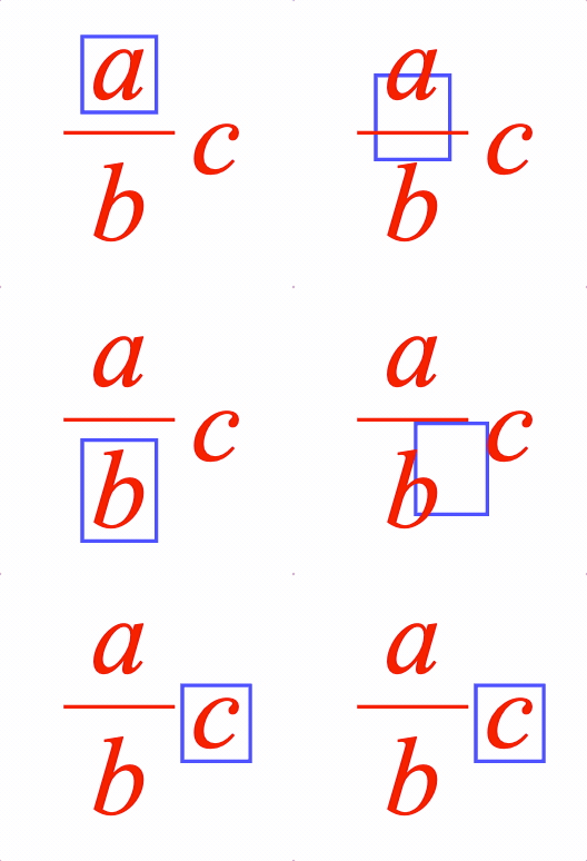
This object defines a rectangle FigureElementCollection that may include:
- border (line)
- fill
- label
- ability to surround another FigureElement with some space
- button behavior when clicked
Surrounding another element can be executed through either the surround method or the OBJ_SurroundAnimationStep found in the in the animation manager (FigureElement.animations), and in the animation builder (animations.new and animations.builder).
Button behavior means the button will temporarily change a different color when it is clicked. By default, the button will become a little more transparent, but colors for the fill, label and border can also be specified.
Extends FigureElementCollection
See OBJ_SurroundAnimationStep for surround animation step options.
To test examples below, append them to the boilerplate.
// Simple rectangle
figure.add({
name: 'rect',
make: 'collections.rectangle',
width: 2,
height: 1,
});
// Round corner rectangle with fill and outside line
const rect = figure.collections.rectangle({
width: 2,
height: 1,
line: {
width: 0.02,
widthIs: 'outside',
dash: [0.1, 0.02],
},
corner: {
radius: 0.2,
sides: 10,
},
fill: [0.7, 0.7, 1, 1],
});
figure.add('rect', rect);
// Rectangle surrounds elements of an equation
figure.add([
{
name: 'rect',
make: 'collections.rectangle',
color: [0.3, 0.3, 1, 1],
line: { width: 0.01 },
},
{
name: 'eqn',
make: 'equation',
forms: { 0: [{ frac: ['a', 'vinculum', 'b'] }, ' ', 'c'] },
position: [1, 0],
scale: 1.5,
}
]);
const rect = figure.getElement('rect');
const eqn = figure.getElement('eqn');
rect.surround(eqn._a, 0.03);
rect.animations.new()
.pulse({ delay: 1, scale: 1.5 })
.surround({ target: eqn._b, space: 0.03, duration: 1 })
.pulse({ delay: 1, scale: 1.5 })
.surround({ target: eqn._c, space: 0.03, duration: 1 })
.pulse({ delay: 1, scale: 1.5 })
.start();
// Make a rectangle that behaves like a button
figure.add([
{
name: 'rect',
make: 'collections.rectangle',
width: 0.5,
height: 0.3,
color: [0.3, 0.3, 0.3, 1],
label: 'Save',
corner: { radius: 0.05, sides: 10 },
fill: [0.9, 0.9, 0.9, 1],
button: {
fill: [0.95, 0.95, 0.95, 1],
},
mods: {
isTouchable: true,
onClick: () => console.log('clicked'),
},
},
]);
Surround element of elements with the rectangle.
((FigureElement | Array<FigureElement>))
(TypeParsableBuffer
= 0)
(boolean
= false)
Set button label.
((string | OBJ_FormattedText))
Get button label.
COL_Rectangle
CollectionsRectangle options object that extends OBJ_Collection
options object (without parent).
This rectangle is similar to OBJ_Rectangle, except it can accomodate both a fill and a border or line simultaneously with different colors.
Type: any
Extends OBJ_Collection
(number?)
: rectangle width
(number?)
: rectangle height
(("left" | "center" | "right" | number)?)
: horiztonal
alignment of the rectangle
(("bottom" | "middle" | "top" | number)?)
: vertical alignment
of the rectangle
(OBJ_LineStyleSimple?)
: lines style - leave empty if only
want fill
((TypeColor | OBJ_Texture)?)
: fill color or texture
(OBJ_CurvedCorner?)
: corner style of rectangle
(OBJ_TextLines?)
: Rectangle label
((boolean | TypeColor | OBJ_ButtonColor)?)
: true
to
make the rectangle behave like a button when clicked.
TypeColor
to
make fill, line and label the same color when clicked or
OBJ_ButtonColor
to specify click colors for each (
false
)
CollectionsButton
FigureElementCollection representing a button.


A button can be simple, or it can change state with each press.
Notifications - The notification manager property notifications will
publish the following events:
touch: button is pressed - the current state index is passed to the subscriber
See COL_Button for setup options.
To test examples below, append them to the boilerplate
Extends FigureElementCollection
// Simple button
figure.add({
make: 'collections.button',
label: 'Start',
});
// Borderless button
figure.add({
make: 'collections.button',
label: 'Start',
colorFill: [0.8, 0.8, 0.8, 1],
line: null,
});
// Button that changes state and has a touch buffer of 0.1 around it
const button = figure.add({
make: 'collections.button',
states: ['Slow', 'Medium', 'Fast'],
width: 0.7,
height: 0.3,
touchBorder: 0.1,
});
button.notifications.add('touch', (index) => {
console.log(index);
});
COL_Button
CollectionsButton options object that extends OBJ_Collection
options object (without parent).
Type: any
Extends OBJ_Collection
(number?)
: button width
(number?)
: button height
(OBJ_CurvedCorner?)
: button corner
(OBJ_ButtonLabel?)
: button label
(TypeColor?)
(TypeColor?)
(TypeColor?)
(Array<(OBJ_ButtonState | string)>?)
CollectionsToggle
FigureElementCollection representing a toggle switch.
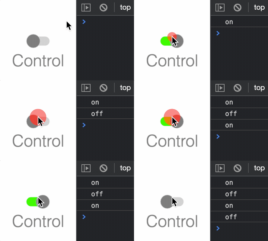
The toggle switch can be turned on or off.
Notifications - The notification manager property notifications will
publish the following events:
toggle: switch is changed -truewill be passed if the switch is changed to on, andfalsewill be passed if the switch is changed to offon: switch is changed to onoff: switch is changed to off
See COL_Toggle for setup options.
To test examples below, append them to the boilerplate
Extends FigureElementCollection
// Simple toggle switch with notification causing a console statement
const toggle = figure.add({
make: 'collections.toggle',
label: {
text: 'Control',
location: 'bottom',
scale: 0.6,
},
});
toggle.notifications.add('toggle', (state) => {
state ? console.log('on') : console.log('off');
});
COL_Toggle
CollectionsToggle options object that extends OBJ_Collection
options object (without parent).
Type: any
Extends OBJ_Collection
(number?)
: toggle width
(number?)
: toggle height
(number?)
: height of toggle bar showing on
or off
(("dark" | "light")?)
: selects default colors for a light or
dark switch (
dark
)
(TypeColor?)
: toggle off color
(OBJ_ToggleBorder?)
: border around circle (defaults to on
where width is half the figure's default line width)
(OBJ_ToggleBorder?)
: border around bar
(defaults to off - width = 0)
(OBJ_ToggleLabel?)
CollectionsSlider
FigureElementCollection representing a slider control.

Notifications - The notification manager property notifications will
publish the following events:
changed: slider value is changed - slider position in percent is passed as parameter to callback.
See COL_Slider for setup options.
To test examples below, append them to the boilerplate
Extends FigureElementCollection
// Simple slider with notification causing a console statement
const slider = figure.add({
make: 'collections.slider',
barHeight: 0.02,
height: 0.1,
width: 1,
color: [0.5, 0.5, 0.5, 1],
touchBorder: 0.2,
});
slider.notifications.add('changed', (position) => {
console.log(position)
});
// Slider without a marker and red fill for on
figure.add({
make: 'collections.slider',
barHeight: 0.1,
colorOn: [1, 0, 0, 1],
width: 1,
touchBorder: 0.2,
marker: 'none',
});
// Slider with rectangle marker and multi-colors
const slider = figure.add({
make: 'collections.slider',
barHeight: 0.02,
height: 0.1,
width: 1,
marker: 'rectangle',
colorOff: [1, 0, 0, 1],
colorOn: [0, 0.8, 0, 1],
color: [0, 0, 0, 1],
});
COL_Slider
CollectionsSlider options object that extends OBJ_Collection
options object (without parent).
Type: any
Extends OBJ_Collection
(number?)
: slider width
(number?)
: slider height
(number?)
: height of slider bar bar
(("dark" | "light")?)
: selects default colors for a light or
dark switch (
dark
)
(TypeColor?)
: slider off color (bar color from slider
value to 1)
(OBJ_SliderBorder?)
: border around circle (defaults to on
where width is half the figure's default line width)
(OBJ_SliderBorder?)
: border around bar
(defaults to off - width = 0)
CollectionsAxis
FigureElementCollection representing an Axis.


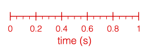

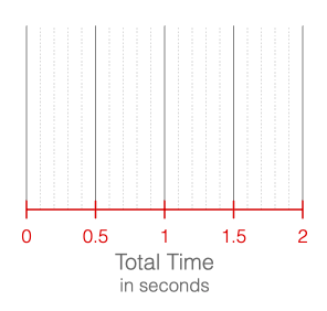
This object defines an axis with an axis line, tick marks, labels, grid lines and a title.
See COL_Axis for the options that can be used when creating the axis.
An axis is drawn to a length. It will have values along its length
from start to stop. Ticks, grid lines and labels are all drawn
at axis value positions. All other dimensions, such as line lengths,
widths, positions, spaces and offsets are defined in draw space, or in the
same space as the length of the axis.
The object contains additional methods that convert between axis values and draw space positions, as well as a convenience method to report if a value is within an axis.
To test examples below, append them to the boilerplate.
For more examples of axis labels and axis ticks, see OBJ_AxisLabels and OBJ_AxisTicks.
Extends FigureElementCollection
// By default an axis is an 'x' axis
figure.add({
make: 'collections.axis',
});
// An axis can also be created and then added to a figure
// An axis can have specific start and stop values
// An axis can be a y axis
const axis = figure.collections.axis({
axis: 'y',
start: -10,
stop: 10,
step: 5,
});
figure.add('axis', axis);
// An axis can have multiple sets of ticks and a title
figure.add({
make: 'collections.axis',
step: [0.2, 0.05],
ticks: [
true,
{ length: 0.04, location: 'bottom' },
],
title: 'time (s)',
});
// An axis line and ticks can be customized to be dashed
// and have arrows
figure.add({
make: 'collections.axis',
length: 2.5,
start: -100,
stop: 100,
step: 25,
line: {
dash: [0.01, 0.01],
arrow: 'barb',
},
ticks: { dash: [0.01, 0.01] },
title: {
font: { style: 'italic', family: 'Times New Roman' },
text: 'x',
location: 'right',
},
});
// An axis can have grid lines extend from it, and
// multi-line, formatted titles
figure.add({
make: 'collections.axis',
stop: 2,
step: [0.5, 0.1],
grid: [
{ length: 1, color: [0.5, 0.5, 0.5, 1] },
{ length: 1, dash: [0.01, 0.01], color: [0.7, 0.7, 0.7, 1] },
],
title: {
font: { color: [0.4, 0.4, 0.4, 1] },
text: [
'Total Time',
{
text: 'in seconds',
font: { size: 0.1 },
lineSpace: 0.12,
},
],
},
});
Convert an axis value or values to a draw space position or positions.
'x' axes have a draw space position of 0 on the left end of the axis and 'y' axes have a draw space position of 0 on the bottom end of the axis.
(T)
number:
draw space position
Convert an axis draw space value or values to an axis value or values.
'x' axes have a draw space position of 0 on the left end of the axis and 'y' axes have a draw space position of 0 on the bottom end of the axis.
(T)
number:
draw space position
COL_Axis
CollectionsAxis options object that extends OBJ_Collection
options object (without parent).
A zoom axis can be used to create a number line, used as an axis in COL_Plot and/or used to plot a COL_Trace against.
An axis is a line that may have
- tick marks
- labels
- grid lines
- a title
An axis is drawn to a length. It will have values along its length
from start to stop. Ticks, grid lines and labels are all drawn
at axis value positions. All other dimensions, such as line lengths,
widths, positions, spaces and offsets are defined in draw space, or in the
same space as the length of the axis.
Type: any
Extends OBJ_Collection
(("x" | "y")?)
: 'x'
axes are horizontal,
'y'
axes are
vertical (
'x'
)
(number?)
: length of the axis in draw space
((OBJ_AxisLineStyle | boolean)?)
: line style of the axis -
false
will draw no line. By default, a solid line will be drawn if not
defined.
((OBJ_AxisTicks | Array<OBJ_AxisTicks> | boolean)?)
: tick
options. Use an Array to setup multiple sets/styles of ticks. Use a boolean
value to turn ticks on or off. Use a
TypeTickLocation
to only set
tick location property (
false
)
((OBJ_AxisTicks | Array<OBJ_AxisTicks> | boolean)?)
: grid
options. Use an array for multiple sets of grids, and use a boolean to
turn grids on and off (
false
)
((OBJ_AxisTitle | string)?)
: axis title
(OBJ_Font?)
: default font of axis (used by title and labels)
(boolean?)
: false
hides the axis. Two axes are needed
to plot an
CollectionsTrace
on a
CollectionsPlot
, but if either or
both axes aren't to be drawn, then use
false
to hide each axis (
true
)
([number, number]?)
: Will select automatic values for
start
,
stop
, and
step
that cover the range
[min, max]
((boolean | "decimal")?)
: If
true
then start, stop and
step tick, grid and label values will be automatically calculated such that
they land on 0 and either double/half the original step (
true
) or ensure
the steps land on factors of 10 (
'decimal'
). This needs to be not
false
if panning or zooming. If
false
, then the tick, grid and label values will
be from the
start
,
stop
and
step
properties. (
false
)
CollectionsPlot
FigureElementCollection representing a plot including axes, traces, labels and titles.
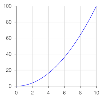
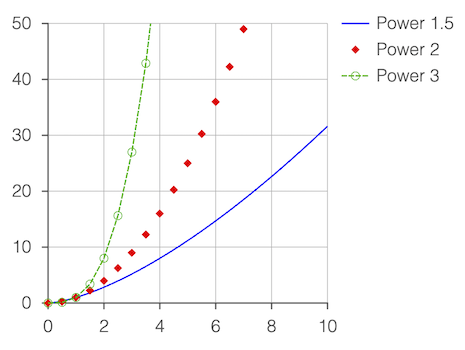
This object provides convient and customizable plot functionality.
At its simplist, just the points of the trace to be plotted need to be passed in to get a plot with automatically generated axes, tick marks, labels and grid lines.
Additional options can be used to finely customize each of these, as well as add and customize plot and axis titles, a legend, and a frame around the entire plot.
Plots can also be interactive, with both zoom and pan functionality from mouse, mouse wheel, touch and pinch gestures.
Extends FigureElementCollection
To test examples below, append them to the boilerplate.
All examples below also use this power function to generate the traces:
const pow = (pow = 2, start = 0, stop = 10, step = 0.05) => {
const xValues = Fig.range(start, stop, step);
return xValues.map(x => new Fig.Point(x, x ** pow));
}
// Plot of single trace with auto axis scaling
figure.add({
make: 'collections.plot',
trace: pow(),
});
// Multiple traces with a legend
// Some traces are customized beyond the default color to include dashes and
// markers
figure.add({
make: 'collections.plot',
width: 2, // Plot width in figure
height: 2, // Plot height in figure
y: { start: 0, stop: 50 }, // Customize y axis limits
trace: [
{ points: pow(1.5), name: 'Power 1.5' }, // Trace names are for legend
{ // Trace with only markers
points: pow(2, 0, 10, 0.5),
name: 'Power 2',
markers: { sides: 4, radius: 0.03 },
},
{ // Trace with markers and
points: pow(3, 0, 10, 0.5), // dashed line
name: 'Power 3',
markers: { radius: 0.03, sides: 10, line: { width: 0.005 } },
line: { dash: [0.04, 0.01] },
},
],
legend: true,
});
// Multiple grids and simple titles
figure.add({
make: 'collections.plot',
y: {
start: -50,
stop: 50,
step: [25, 5],
grid: [
true,
{ width: 0.005, dash: [0.01, 0.01], color: [1, 0.7, 0.7, 1] },
],
title: 'velocity (m/s)',
},
x: {
start: -5,
stop: 5,
step: [2.5, 0.5, 0.1],
grid: [
true,
{ width: 0.005, dash: [0.01, 0.01], color: [1, 0.7, 0.7, 1] },
],
title: 'time (s)',
},
trace: pow(3, -10, 10),
title: 'Velocity over Time',
});
// Hide axes
// Use plot frame and plot area
// Title has a subtitle
figure.add({
make: 'collections.plot',
trace: pow(3),
x: { show: false },
y: { show: false },
plotArea: [0.93, 0.93, 0.93, 1],
frame: {
line: { width: 0.005, color: [0.5, 0.5, 0.5, 1] },
corner: { radius: 0.1, sides: 10 },
space: 0.15,
},
title: {
text: [
'Velocity over Time',
{ text: 'For object A', lineSpace: 0.13, font: { size: 0.08 } },
],
offset: [0, 0],
},
});
// Secondary y axis
figure.add({
make: 'collections.plot',
trace: pow(2),
y: {
title: {
text: 'velocity (m/s)',
rotation: 0,
xAlign: 'right',
},
},
x: { title: 'time (s)' },
axes: [
{
axis: 'y',
start: 0,
stop: 900,
step: 300,
color: [1, 0, 0, 1],
location: 'right',
title: {
offset: [0.6, 0.1],
text: 'displacment (m)',
rotation: 0,
},
},
],
position: [-1, -1],
});
// Cartesian axes crossing at the zero point
// Automatic layout doesn't support this, but axes, ticks, labels and titles
// can all be customized to create it.
figure.add({
make: 'collections.plot',
trace: pow(3, -10, 10),
font: { size: 0.1 },
styleTheme: 'numberLine',
x: {
title: {
text: 'x',
font: { style: 'italic', family: 'Times New Roman', size: 0.15 },
},
},
y: {
step: 500,
title: {
text: 'y',
font: { style: 'italic', family: 'Times New Roman', size: 0.15 },
},
},
grid: false,
});
// Zoomable and Pannable plot
// Create the points for the plot
const points = Array(3000).fill(0).map(() => {
const x = Math.random() * 8 - 4;
const y = Math.random() / Math.sqrt(2 * Math.PI) * Math.exp(-0.5 * x ** 2);
return [x, y];
});
// Make a zoomable and pannable plot
const plot = figure.add({
make: 'collections.plot',
trace: { points, markers: { sides: 6, radius: 0.01 } },
zoom: { axis: 'xy', min: 0.5, max: 16 },
pan: true,
});
// Initialize by zooming in by a magnification factor of 10
plot.zoomValue([1.8333, 0.06672], 10);
Convert a plot point value on the axes yAxisName and xAxisName to
a plot draw space position.
The plot draw space is (0, 0) at the bottom
left of the plot area and extends to (width, height) in the top right
corner of the plot area where width and height are defined when
creating the plot.
Convert a plot draw space position to a plot point value on the axes
yAxisName and xAxisName.
The plot draw space is (0, 0) at the bottom
left of the plot area and extends to (width, height) in the top right
corner of the plot area where width and height are defined when
creating the plot.
Set a figure element's position to the position in the figure where some point on the plot is.
(FigureElement)
(TypeParsablePoint)
Get the plot value where some element is.
(FigureElement)
COL_Plot
CollectionsPlot options object that extends OBJ_Collection
options object (without parent).
A plot is a collection of axes and traces, and may include a title, legend and bounding frame.
Use width, height and position to define the size of the plot area
(area where the traces are drawn) and where it is in the figure.
Type: any
Extends OBJ_Collection
(number?)
: width of the plot area
(number?)
: height of the plot area
(Array<OBJ_PlotAxis>?)
: add axes additional to x and y
(boolean?)
: turn on and off the grid - use the grid options
in x axis, y axis or axes for finer customization
((OBJ_PlotTitle | string)?)
: plot title can be simply a
string
or fully customized with OBJ_PlotTitle
((Array<(COL_Trace | TypeParsablePoint)> | COL_Trace | Array<TypeParsablePoint>)?)
: Use array if plotting more than one trace. Use COL_Trace to customize the
trace.
((COL_PlotLegend | boolean)?)
: true
to turn the legend on,
or use COL_PlotLegend to customize it's location and layout
((boolean | TypeColor | OBJ_PlotFrame)?)
: frame around the
plot can be turned on with
true
, can be a simple color fill using
Array<number>
as a color, or can be fully customized with OBJ_PlotFrame
((TypeColor | COL_Rectangle)?)
: plot area can be a
color fill with
TypeColor
as a color, or be fully customized with
COL_Rectangle
(OBJ_Font?)
: Default font for plot (title, axes, labels, etc.)
(TypeColor?)
: Default color
(TypeParsablePoint?)
: Position of the plot
((OBJ_PlotZoomOptions | "x" | "y" | "xy")?)
: options for
interactive zooming
((OBJ_PlotPanOptions | "x" | "y" | "xy")?)
: options for
interactive panning
(TypeParsablePoint?)
: value where the default x and y
axes should cross. If defined, each
axis.position
will be overridden. If
the cross point is outside of the plot area, then the axes will be drawn on
the border of the plot area. (
undefined
)
((boolean | OBJ_PlotAreaLabelBuffer)?)
: if
true
then axes with a cross point
will be drawn such that the labels stay within the plot area. So, if the
labels are on the left side of a y axis, and the cross point is out of the
plot area to the left, then instead of the axis being drawn on the left edge
of the plot area, it will be drawn within the plot area such that its labels
are within the plot area (
false
).
(boolean?)
: if
true
sets the grid for an axes to expand
accross the entire plot area. Set to
false
if only a partial length grid
is needed (
true
)
(("box" | "numberLine" | "positiveNumberLine")?)
: defines
default values for tick, label, axis locations and cross points. (
'box'
)
(("light" | "dark")?)
: defines defaul colors.
'dark'
theme is better on light backgrounds while '
light'
theme is better on dark
backgrounds (
'dark'
)
(OBJ_GestureArea?)
: the gesture area is the plot area
by default. Use this property to extend the gesture area beyond the plot
area. This is useful for the user to zoom in on areas on the edge of the
plot area.
3D Shape Collections
CollectionsAxis3
FigureElementCollection representing x, y, z axes.

This object creates an x, y, and z axes.
The axes can be created uniformly, or customized individually.
See COL_Axis3 for setup options.
To test examples below, append them to the boilerplate
Extends FigureElementCollection
// Create positive x, y, and z axes
figure.add(
{
make: 'collections.axis3',
arrow: true,
length: 0.5,
},
);
// Create full x, y, and z axes with arrows
figure.add(
{
make: 'collections.axis3',
arrow: { ends: 'all' },
start: -0.5,
length: 1,
},
);
// Customize each axis
figure.add(
{
make: 'collections.axis3',
arrow: [{ ends: 'end' }, false, { ends: 'all', width: 0.02 }],
width: 0.02,
start: [0, 0, -0.5],
length: [0.5, 0.5, 1],
},
);
// Lines axes all the same color
figure.add(
{
make: 'collections.axis3',
arrow: { ends: 'all' },
start: -0.5,
length: 1,
lines: true,
color: [1, 0, 0, 1],
},
);
COL_Axis3
CollectionsAxis3 options object that extends OBJ_Collection
options object (without parent).
Each option can either be singular and applied to all axes, or in a 3 element tuple where the first, second and third elements apply to the x, y, and z axes respectively.
To not create an axis, use a width of exactly 0.
Type: any
Extends OBJ_Collection
Interactivity
Touch
Figure elements can be made touchable (or clickable with a mouse).
To set an element as touchable, use the touch property during its definition or the FigureElement.setTouchable() method on the element after its creation.
The following three examples all set an element to be touchable, and trigger a console statement when touched.
// Use a notification to handle a touch event
const hex = figure.add({
make: 'polygon',
sides: 6,
color: [1, 0, 0, 1],
touch: true,
});
hex.notifications.add('onClick', () => console.log('Touched!'));
// Create a touchable element
figure.add({
make: 'polygon',
sides: 6,
color: [1, 0, 0, 1],
// simply including the `touch` property will make the element touchable
touch: {
onClick: () => console.log('Touched!'),
},
});
// Set an element to be touchable after creation
const hex = figure.add({
make: 'polygon',
sides: 6,
color: [1, 0, 0, 1],
});
hex.setTouchable({ onClick: () => console.log('Touched!')});
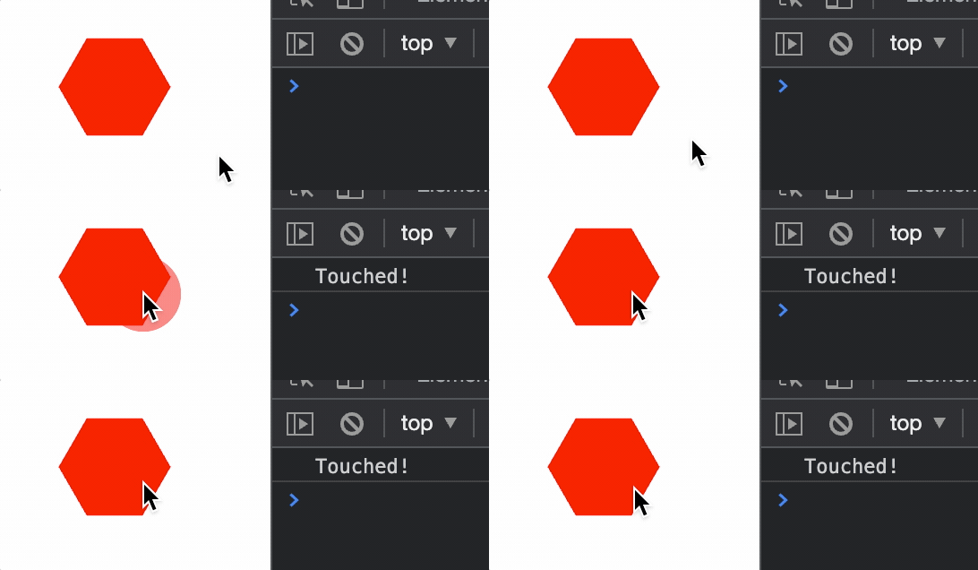
Sometimes touching small elements can be challenging with a finger. Therefore it is useful to set how much of the area around an element can also trigger a touch event. To do so, borders and touch borders of elements can be defined.
Borders
Two Dimensions
Two dimensional shapes can have borders and touch borders to determine when shapes overlap, or when a touch event is on a shape.
Each FigureElementPrimitive has drawBorder and drawBorderBuffer properties. The drawBorder is typically a border (convex hull) around all the vertices that make up the shape. The drawBorderBuffer is usually equal to or larger than the drawBorder and often follows the contours of the border but with some additional buffer. Built-in shapes will generate these automatically, but they can also be be fully customized with a TypeParsableBorder by the user.
drawBorder and drawBorderBuffer are then used to calculate the border and touchBorder of a shape. The border can be used for determining the shape's visual edge, and therefore any collision it has with other shapes or the figure's edge. The touchBorder is used to determine when a touch event is on the shape.
The border and touch borders can be defined with either the drawBorder or drawBorderBuffer directly, as a rectangle with or without some buffer around these properties, or as a fully customized TypeParsableBorder.
The documentation in OBJ_Generic has the specifics on how to define borders and touch borders for FigureElementPrimitives. Similarly the documentation for @{OBJ_Collection} details the same for FigureElementCollections.
The border for a FigureElement can be retrieved with FigureElementPrimitive.getBorder() and FigureElementCollection.getBorder()
When debugging, the borders and touchBorders of all shapes can be shown with Figure.showBorders() and Figure.showTouchBorders().
Borders and touch borders can be created during an object's creation:
const figure = new Fig.Figure();
figure.add(
{
make: 'polygon',
sides: 8,
radius: 0.2,
// create a touch border that is a rectangle around the border
// with a buffer of 0.1 on the left and right, and 0.3 on bottom
// and top
touchBorder: [0.1, 0.3],
touch: true,
color: [1, 0, 0, 1],
},
);
figure.showTouchBorders();
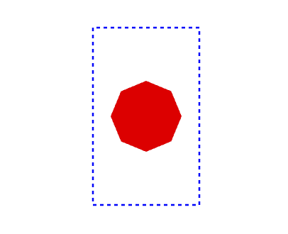
Three Dimensions
In two dimensions, polygon borders are used to define where a figure element can be touched. This is useful in examples such as equations, where equation elements are touchable, but spaced different to each other, so maximizing touch locations between elements means having touch borders that have different buffers on each side of the element.
In three dimensions, defining volumes in which to select becomes challenging, both to define the volumes and to decide which volume was selected in a quick time on lower end client devices.
Therefore, selection of 3D objects is performed in FigureOne by:
- Rendering each touchable element into a temporary texture
- Each element is rendered with a unique color
- The temporary texture pixels are mapped to the screen pixels and the corresponding touched pixel found
- The color of the pixel touched is mapped to the figure element with that color
This method is commonly used, performant, simple (as complex touch volumes don't need to be defined), and will automatically handle depth - elements in front of other elements relative to the camera will be selected.
When a larger touch border is required for a 3D element, use the touchScale property to scale the element in the temporary texture.
When debugging, the Figure.showTouchable() method can be used to render the temporary texture being used to determine what is touched to the screen.
const figure = new Fig.Figure({ scene: { style: 'orthographic' } });
figure.add({
make: 'cube',
color: [1, 0, 0, 1],
touch: true,
touchScale: 1.5,
});
figure.showTouchable();
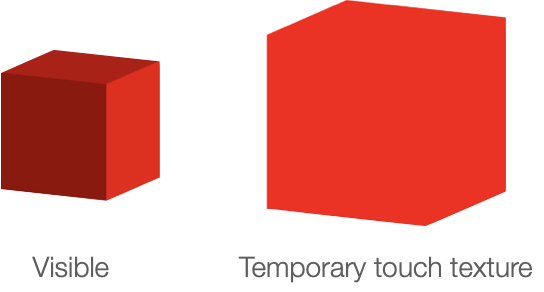
Move Interactivity
Once an element is touched, it can be moved.
To make an element movable, use the move property during its definition or use the FigureElement.setMove() on an instantiated element.
const figure = new Fig.Figure();
figure.add(
{
make: 'polygon',
sides: 8,
radius: 0.2,
move: true,
color: [1, 0, 0, 1],
},
);
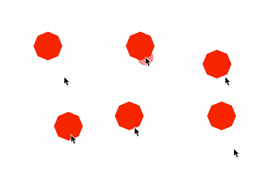
By default, element movement will be translation. OBJ_ElementMove options can be used to make movement a rotation or scaling and add bounds to movement.
Moving Freely
When an element is being moved and is released it can either immediately stop, or continue on with its current velocity and some deceleration (move freely).
By default, elements will move freely after they are released (if they were released during movement). The options for if and how they move freely are set within the OBJ_ElementMove options object.
This example makes the free movement deceleration small (so free movement is pronounced), and only allows movement within rectangular bounds.
const figure = new Fig.Figure()
figure.add(
{
make: 'polygon',
sides: 8,
radius: 0.2,
move: {
freely: {
deceleration: 0.01,
},
bounds: { left: -0.8, bottom: -0.8, right: 0.8, top: 0.8 },
},
color: [1, 0, 0, 1],
},
);
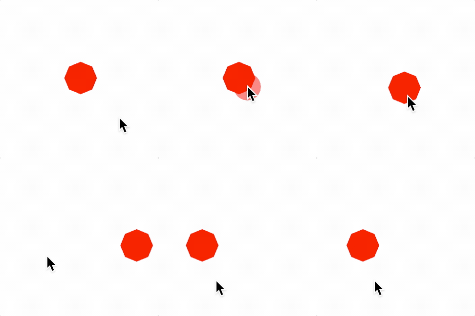
Notifications
Often it is desirable to change the state of other elements when an element is moved. Use the FigureElement's NotificationManager to get notifications when an element has moved. Useful notifications are:
beforeMove- sent before the element transform has been updated with a move eventbeforeMovingFreely- sent before the element transform has been updated with a move freely framesetTransform- sent after the element transform has been updated
Three Dimensions
In three dimensions a choice needs to be made about how a mouse of finger movement on a 2D screen translates to a movement in 3D space.
The default way to do this in FigureOne is to use a movement plane (element.move.plane). FigureOne will automatically project a movement on the screen onto this plane and move the element accordingly.
For example, to create a cube that can be translated in the YZ plane:
For the following examples, use 3D boiler plate.
// Add a grid in the YZ plane
figure.add([
{
make: 'grid',
bounds: [-0.8, -0.8, 1.6, 1.6],
xStep: 0.05,
yStep: 0.05,
line: { width: 0.002 },
color: [0.7, 0.7, 0.7, 1],
// By default, the grid is created in the XY plane
// To rotate it to the XZ plane rotate π/2 around the y axis
transform: ['r', Math.PI / 2, 0, 1, 0],
},
]);
// Add a red cube movable in the XZ plane
figure.add({
make: 'cube',
side: 0.3,
color: [1, 0, 0, 1],
move: {
plane: [[0, 0, 0], [1, 0, 0]],
},
});
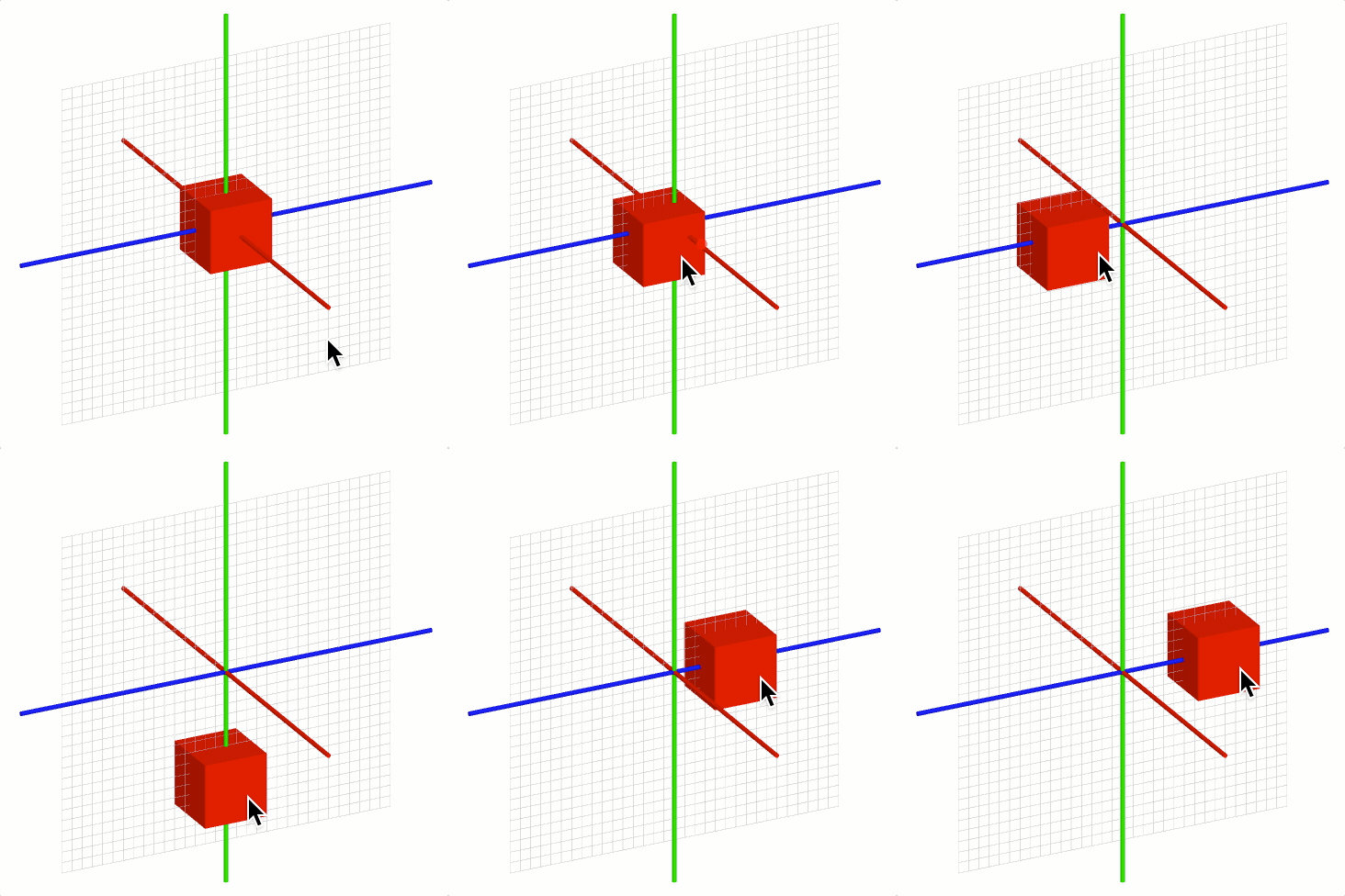
Camera Interactivity
In 3D figures, it is often useful to allow a user to change the scene manually using gestures. This can be achieved by changing the scene with setCamera to change the camera location and setProjection to change the expanse of visible space.
FigureOne also provides a built-in FigureElementPrimitive cameraControl (see OBJ_CameraControl) which defines a transparent rectangle in which the user can swipe horizontally to rotate a scene around a vertical axis, and swipe vertically to change the elevation of the camera relative to the vertical axis.
figure.add([
{
make: 'cube',
side: 0.5,
color: [0, 1, 1, 1],
transform: ['r', 0, 1, 0, 0],
},
{
make: 'cameraControl',
},
]);
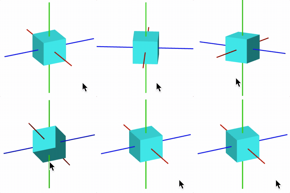
OBJ_ElementMove
Figure element move parameters
Type:
{type: ("rotation" | "translation" | "position" | "scale" | "scaleX" | "scaleY" | "scaleZ")?, bounds: TypeParsableBounds?, plane: Plane?, maxVelocity: (number | TypeParsablePoint)?, freely: (OBJ_ElementMoveFreely | false)?, element: (FigureElement | null | string)?}
(TypeParsableBounds)
: rectangle to
limit movement within
(Plane)
: movement plane
(TypeTransformValue)
: maximum velocity allowed (5)
(OBJ_ElementMoveFreely)
: free movement parameters - use
false for disabling free movement after touch up
((FigureElement | null | string))
(("rotation" | "translation" | "position" | "scale" | "scaleX" | "scaleY" | "scaleZ")?)
OBJ_ElementMoveFreely
Figure element move freely parameters
If a figure element is released from moving with some velocity then these parameters will define how it continues to move freely
Type: {zeroVelocityThreshold: number, deceleration: number, bounceLoss: number, callback: (string | function (boolean): void)?}
(TypeTransformValue)
: used to overcome
limitations of floating point numbers not reaching 0
(TypeTransformValue)
: amount to decelerate in local
space units per second squared
(TypeTransformValue)
: 0.5 results in 50% velocity loss
if bouncing of boundary
OBJ_CameraControl
Camera control definition object that extends and OBJ_FigurePrimitive
A camera control is a transparent rectangle that uses touch and drag gestures to rotate the position of the camera in a 3D scene around a vertical axis.
The vertical axis will always remain vertical. Left/right movements will rotate the scene around the vertical axis (in the azimuth of the vertical axis), while up/down movements will change the elevation relative to the vertical axis.
The transparent rectangle will be positioned relative to the 2D HTML canvas
the figure is drawn in on the screen. The left, bottom, width and
height properties are numbers from 0 to 1 which represent percentage of
the screen width and height.
Thus for the rectangle to cover the entire screen, values of left: 0,
bottom: 0, width: 1 and height: 1 would be used (these are the default
values as well).
By default, the figure's Scene camera position is modified. If an
element's custom scene is to be controlled, use the scene property to link
to it.
How fast the camera is rotated in the aziumuth and elevation is controlled by
the sensitivity, xSensitivity and ySensitivity properties.
A higher sensitivity value will result in more rotation for the same user
movement. If only azimuthal or elevation rotation is desired set
ySensitivity or xSensitivity to 0 respectively.
Type: any
(number?)
: screen left position to place the control
rectangle. 0 is the left edge, while 1 is the right edge (
0
).
(number?)
: screen bottom position to place the control
rectangle. 0 is the bottom edge, while 1 is the top edge (
0
).
(TypeParsablePoint?)
: Axis to keep vertical as camera is
rotated. The axis vector and scene.camera.up vector should be in the same
plane (
[0, 1, 0]
)
((Scene | string)?)
: Use this to control a scene that is not
the default Figure scene.
(number?)
: sensitivity of camera position relative to
user movement where larger numbers result in more rotation for the same
movement (
5
)
(number?)
: sensitivity to a horizontal user movement.
Setting this to 0 will mean the scene doesn't not rotate aziumthally (
1
)
(number?)
: sensitivity to a vertical user movement.
Setting this to 0 will mean the elevation does not change (
1
)
(boolean?)
: if
true
then all 2D and 3D objects that can be
touched will be touched before the camera control, regardless of where it is
on the drawing stack. This should be used everytime 3D objects need priority
over the camera control (
true
)
// Add a camera control that will cover the whole screen
figure.add([
{
make: 'cylinder',
radius: 0.01,
color: [1, 0, 0, 1],
line: [[-1, 0, 0], [1, 0, 0]],
},
{
make: 'cylinder',
radius: 0.01,
color: [0, 1, 0, 1],
line: [[0, -1, 0], [0, 1, 0]],
},
{
make: 'cylinder',
radius: 0.01,
color: [0, 0, 1, 1],
line: [[0, 0, -1], [0, 0, 1]],
},
{
make: 'grid',
bounds: [-0.8, -0.8, 1.6, 1.6],
xStep: 0.05,
yStep: 0.05,
line: { width: 0.002 },
color: [0.7, 0.7, 0.7, 1],
transform: ['r', Math.PI / 2, 1, 0, 0],
},
]);
// Add camera control
figure.add({
make: 'cameraControl',
});
// Add a thin bar at the bottom of the figure that rotates the scene in the
// azimuth only
figure.add([
{
make: 'cylinder',
radius: 0.01,
color: [1, 0, 0, 1],
line: [[-1, 0, 0], [1, 0, 0]],
},
{
make: 'cylinder',
radius: 0.01,
color: [0, 1, 0, 1],
line: [[0, -1, 0], [0, 1, 0]],
},
{
make: 'cylinder',
radius: 0.01,
color: [0, 0, 1, 1],
line: [[0, 0, -1], [0, 0, 1]],
},
{
make: 'grid',
bounds: [-0.8, -0.8, 1.6, 1.6],
xStep: 0.05,
yStep: 0.05,
line: { width: 0.002 },
color: [0.7, 0.7, 0.7, 1],
transform: ['r', Math.PI / 2, 1, 0, 0],
},
]);
// Add a moveable cube
figure.add({
make: 'cube',
side: 0.3,
color: [1, 0, 0, 1],
center: [0.3, 0, 0],
move: {
plane: [[0, 0, 0], [0, 1, 0]],
},
});
// Add camera control bar at the bottom of the screen that only allows
// rotation in the azimuth. As the camera control bar does not overlap the
// cube, then both the cube can moved, and the scene rotated with the bar.
figure.add({
make: 'cameraControl',
color: [0, 0, 0, 0.2],
ySensitivity: 0,
height: 0.1,
});
OBJ_Gesture
Type: any
Extends OBJ_Generic
((OBJ_ZoomOptions | boolean)?)
: zoom options - if not
false
then zoom will be enabled (
false
)
(boolean?)
: (mouse wheel zoom/pan and pinch zoom)
only notify when element gesture rectangle is being touched (
true
)
(number?)
: width of rectangle - defaults to full scene width
(number?)
: height of rectangle - defaults to full scene
height
((OBJ_Scene | Scene)?)
: define if gesture should be an
independeant scene (like if the gestures are being used to change the
default figure scene) - defaults to Figure scene
(OBJ_Scene?)
: if defined, this scene will be
automatically updated with any pan and zoom events
FigureElementPrimitiveGesture
Gesture rectangle.
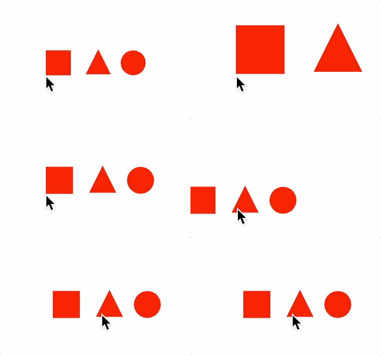
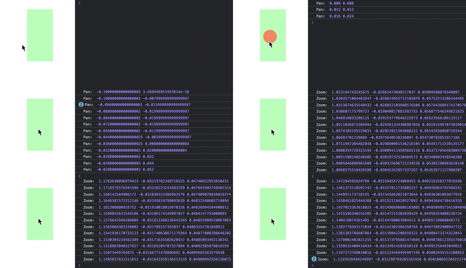
This primitive creates a rectangle within which pan and zoom gestures can be captured (from mouse and touch events) and transformed into pan and zoom values. The pan and zoom values can be used to change Scene objects directly, or used for some custom purpose.
The pan and zoom values are relative to the gesture rectangle and the Scene it is drawn with.
Performing a drag gesture over half the width of the rectangle, will create a pan value that is half the width of the rectangle.
Performing a 2x zoom gesture at a point within the rectangle will create a pan value that is the delta between the original rectangle center and the center of the new zoomed rectangle, and a magnification value of 2.
Any combination of zoom and pan can be expressed as a pan value, that offsets the original rectangle such that when it is then zoomed, the zoom position will be at the same relative position of the original and zoomed rectangle.
Whenever a gesture changes the pan or zoom, then 'pan' or 'zoom'
notifications will be published by the primitive's NotificationManger
(element.notifications).
The handled gestures are:
- Mouse wheel change (often used for zooming and panning with a mouse)
- Drag (often used for panning with touch devices or a mouse)
- Pinching (often used for zooming and panning on touch devices)
Pan
A pan is an offset in xy.
The gestures that can generate pan events are:
- Mouse click then drag
- Finger touch then drag (touch devices)
- Mouse wheel change
For the mouse click and drag, and finger touch and drag gestures, the pan value tracks the change in position of the mouse/finger in the gesture primitive rectangle. For example, if the rectangle has a width of 2, and the mouse or touch moves across half the width of the rectangle, then the pan offset will be 1.
For the mouse wheel change, a wheelSensitivity value is used to speed up or
slow down the pan.
When a pan event happens, a 'pan' notification is published. The parameter
passed to any subscribers is the pan offset value, but if more information
is needed (like the pan delta from the last pan) then getPan() can be
called.
Zoom
A zoom is a magnification at a point in the rectangle. The zoom point will stay stationary, while the other points around it spread out (when zooming in) or compress in (when zooming out). The zoom event thus includes a pan offset to ensure the zoom point stays stationary, as well as a magnification value.
The gestures that can generate zoom events are:
- Mouse wheel vertical change
- Finger touch pinch
A wheelSensitivity or pinchSenstivity value is used to speed up or slow down zooming.
When a zoom event happens, a 'zoom' notification is published. The
parameters passed to any subscribers are the zoom magnification value and
pan offset, but if more information is needed (like the zoom position)
then getZoom() can be called.
Zoom and pan events can be used in many ways. One of the most common ways will be to change a Scene that contains one or more FigureElements allowing a user to pan or zoom through the scene.
In such cases, the zoomScene() and panScene() methods can be used to do
this directly.
Alternately, a changeScene can be defined which will be automatically
panned and zoomed by this primitive.
In general the scene that is being used to draw the gesture primitive should not be panned or zoomed by the gesture primitive, as this will produce unexpected results (especially when panning). If the gesture primitive is setup to change the same scene as it uses itself, then it will assign itself a duplicate scene.
Extends FigureElementPrimitive
(DrawingObject)
(Transform)
(TypeColor)
((FigureElement | null))
(string)
(TimeKeeper)
// Gesture primitive pans and zooms a figure scene
const figure = new Fig.Figure({ color: [1, 0, 0, 1] });
// Elements within the figure to zoom and pan
figure.add([
{ make: 'rectangle', width: 0.2, height: 0.2, position: [-0.3, 0] },
{ make: 'triangle', width: 0.2, height: 0.2, position: [0.02, -0.025] },
{ make: 'ellipse', width: 0.2, height: 0.2, position: [0.3, 0] },
])
// Gesture Primitive
figure.add({
make: 'gesture',
changeScene: figure.scene,
pan: true,
zoom: true,
});
// Using zoom and pan notifications when the gestures are confied
// to a green rectangle
const figure = new Fig.Figure({ color: [1, 0, 0, 1] });
const gesture = figure.add({
make: 'gesture',
color: [0, 1, 0, 0.3],
width: 0.5,
height: 1,
pan: true,
zoom: true,
});
gesture.notifications.add(
'pan', offset => console.log('Pan: ', offset.x, offset.y),
);
gesture.notifications.add(
'zoom', (mag, offset) => console.log('Zoom: ', mag, offset.x, offset.y),
);
Change the position and scale of an element to simulate it zooming.
Note, the element will stay in the same space it was previously, and therefore moving it will be moving it in the same space.
Often a better way to zoom an element (especially if more than one and interactivity is being used) is to zoom the scene the element(s) belong to.
Set zoom gesture options.
(OBJ_ZoomOptions)
Set pan gesture options.
(OBJ_ZoomOptions)
Set zoom manually.
Zoom magnitude can be set with zoom position or pan offset. Either a position or pan should be used (not both).
NB: if manually creating positions or offsets, the position (p) to offset (o) for some zoom (z) conversion is:
o = -(p / z - p)
p = -o / (1/z - 1)
(OBJ_ManualZoom)
Set pan offset manually.
(TypeParsablePoint)
OBJ_CurrentZoom:
OBJ_CurrentPan:
OBJ_Touch
Touch options for a FigureElement.
Type: {onClick: (string | function (Point, FigureElement): void)?, colorSeed: string?, enable: boolean?}
(string?)
: use a unique string to reset color generation
of unique colors used for touch determination (debug only) (
'default'
)
((string | function (Point, FigureElement): void)?)
OBJ_RangeBounds
Range bounds object definition.
A range bounds defines a minimum and maximum value.
Type: {min: (number | null)?, max: (number | null)?, precision: number?}
OBJ_LineBounds
A line bounds defines a line boundary.
Type: any
(TypeParsableLine?)
OBJ_RectBounds
A RectBounds is a rectangle bounds around a point in a plane.
It is defined by:
- a position in plane around which rectangle is formed
- topDirection/rightDirection vectors that orient the rectangle
- left/right magnitudes that define the width of the rectangle
- bottom/top magnitudes that define the height of the rectangle
---------------------------------------------- A
| | |
| Top Vector | |
| A | | top
| | | |
| | | |
| position *-----> | ---
| Right Vector | |
| | | bottom
| | |
---------------------------------------------- V
. |
. |
<-------------|----------------------------->
left right
A rectangle can be defined in one of several ways:
- position, plane normal, one direction vecvtor (top or right)
- position, top and right direction vectors
By default the rectangle will be in the XY plane (+z normal) with a rightDirection vector along the +x axis.
Type: {position: TypeParsablePoint?, normal: TypeParsablePoint?, rightDirection: TypeParsablePoint?, topDirection: TypeParsablePoint?, left: number?, right: number?, up: number?, down: number?, pecision: number?}
(TypeParsablePoint?)
(TypeParsablePoint?)
(TypeParsablePoint?)
(TypeParsablePoint?)
(number?)
(number?)
(number?)
(number?)
(number?)
TypeParsableBounds
Parsable bounds definition.
null |Bounds
| RectBounds|LineBounds|RangeBounds
|OBJ_RectBounds|OBJ_LineBounds|OBJ_RangeBounds
|TypeF1DefRangeBounds|TypeF1DefRectBounds|TypeF1DefLineBounds
Type: (null | Bounds | RectBounds | LineBounds | RangeBounds | OBJ_RectBounds | OBJ_LineBounds | OBJ_RangeBounds | TypeF1DefRangeBounds | TypeF1DefRectBounds | TypeF1DefLineBounds)
Animation
Animations change figure elements over time.
Each figure element has its own AnimationManager (animations property) that can coordinate animations for any element.
An animation is a number of AnimationSteps in either series or parallel. The animation manager provides a way to create these steps, build them into a complete animation, and then manage their execution.
Animation Examples
Let's create a simple animation. Start by defining a figure and retrieving the element to animate by creating the boilerplate files above.
A PositionAnimationStep can be created to translate the shape, and a RotationAnimationStep to rotate it
const translate = p.animations.position({ target: [1, 0], duration: 2 });
const rotate = p.animations.rotation({ target: Math.PI, duration: 2 });
The animation can then be created and started
p.animations.new() .then(translate) .then(rotate) .start();

A more convenient way to chain animation steps in series is to create them inline. The animations.new method returns an AnimationBuilder that allows for inline step creation.
p.animations.new()
.position({ target: [1, 0], duration: 2 })
.rotation({ target: Math.PI, duration: 2 })
.start();
An animation manager is tied to one element, but can be used to animate other elements too
// add another element
const q = figure.add({
make: 'polygon',
radius: 0.5,
sides: 3,
position: [-1, 0]
});
// Use p animation manager to animate q
p.animations.new()
.translation({ target: [1, 0], duration: 2 })
.rotation({ element: q, target: Math.PI / 3 * 2, duration: 2})
.start();
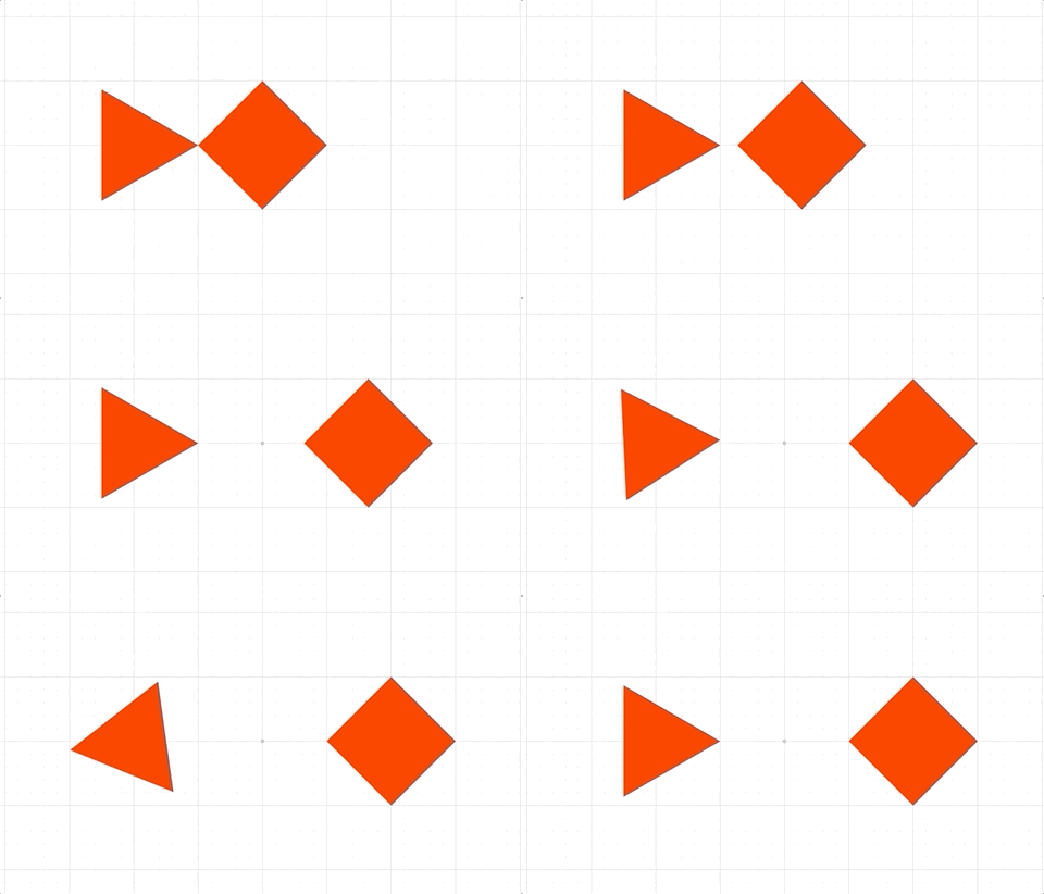
Multiple animations can be added to a single element, but if they modify the same property of the element, then the latter one will overwrite the earlier on each animation frame. In the next example, both animations animate different parts of the element's transform and so will happen in parallel.
// animate the translation
p.animations.new()
.translation({ target: [1, 0], duration: 2 })
.start();
// animate the rotation
p.animations.new()
.rotation({ target: Math.PI / 2 * 3, duration: 2 })
.start();
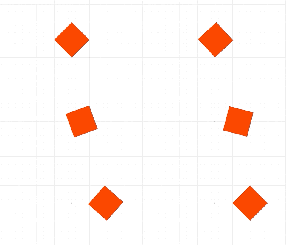
While this is one way to do a parallel animation, a more convenient way (especially when dealing with many steps) is to use a parallel animation step:
p.animations.new()
.inParallel([
p.animations.translation({ target: [1, 0], duration: 2 }),
p.animations.rotation({ target: Math.PI / 2 * 3, duration: 2 }),
p.animations.color({ target: [0, 0, 1, 1], delay: 1, duration: 2 }),
])
.start();
Callbacks can be defined when animations finish
p.animations.new()
.delay(1)
.transform({ target: new Fig.Transform().scale(0.5, 2).rotate(Math.PI).translate(1, 0), duration: 2 })
.scale({ target: [1, 1], duration: 2 })
.dissolveOut(1)
.whenFinished(() => { console.log('animation done') })
.start();
Stopping animations
Animations can be stopped from the animation, element and figure levels.
p.animations.new('mover')
.position({ target: [1, 0], duration: 4})
.start();
// after 1 second, cancel the specific animation by freezing it in place
setTimeout(() => {
p.animations.cancel('mover', 'freeze');
}, 1000);
p.animations.new()
.position({ target: [1, 0], duration: 4})
.start();
// after 1 second, cancel all an element's animations by instantly completing them
setTimeout(() => {
p.stop('complete');
}, 1000);
p.animations.new()
.position({ target: [1, 0], duration: 4})
.start();
// after 1 second, cancel all figure animations by freezing them
setTimeout(() => {
figure.stop('freeze');
}, 1000);
AnimationManager
Animation Manager
This class manages animations and creates animation steps for use in animations.
Each FigureElement has its own AnimationManager in the
animations property, though any
animation manager can animate any other element. Therefore all parallel
animations can go through the same manager, or be spread throughout
different element's animation managers. Spread animations out between
elements, or keeping them all in one AnimationManager can change how
readable code is, how convenient it is to cancel running animations, and
what order the animations are performed in (AnimationManagers tied
to elements drawn earlier will perform their animation steps before those
tied to elements drawn later). AnimationManagers will only be processed
on each animation frame if the element they are tied to is not hidden.
The animations property within AnimationManager is simply an array that
contains a number AnimationSteps that are executed in parallel.
Typically, these steps would themselves be SerialAnimationSteps or a
series of animations. This means the animation manager is running a number of
animation series in parallel.
The AnimationManagers on FigureElements should be used instead
of instantiating this class separately, as those on FigureElements will
be automatically processed every animation frame.
(("animating" | "idle" | "waitingToStart"))
(Array<AnimationStep>)
(NotificationManager)
// At its heart the `AnimationManager` is just executing
// an array of animation steps.
// Create animation steps
const position = new Fig.Animation.PositionAnimationStep({
element: p,
target: [1, 0],
duration: 2,
});
const rotation = new Fig.Animation.RotationAnimationStep({
element: p,
target: Math.PI,
duration: 2,
});
// Combine the animations into a SerialAnimationStep
const series = new Fig.Animation.SerialAnimationStep([
position,
rotation,
]);
// Add the animations to the animation manager and start
p.animations.animations.push(series);
p.animations.start();
// Using the `new` method in `AnimationManager` creates a convenient
// `AnimationBuilder` which extends a `SerialAnimationStep` by using
// a fluent API pattern
//
// Create animation steps
const position = new Fig.Animation.PositionAnimationStep({
element: p,
target: [1, 0],
duration: 2,
});
const rotation = new Fig.Animation.RotationAnimationStep({
element: p,
target: Math.PI,
duration: 2,
});
// Build and start the animation
p.animations.new()
.then(position)
.then(rotation)
.start();
// `AnimationStep`s can also be created from the `AnimationManager`
// with the added convenience that the `FigureElement` that
// has the `AnimationManager` will be used as the default
// `element` property. This combined with the `AnimationBuilder`
// makes defining most animations clean and readable code
// Build and start the animation
p.animations.new()
.position({ target: [1, 0], duration: 2 })
.rotation({ target: Math.PI, duration: 2 })
.start();
// Parallel animations however still need to use explicit animation steps.
// Creating the steps from the `AnimationManager` means the `element` doesn't
// need to be defined.
//
p.animations.new()
.inParallel([
p.animations.position({ target: [1, 0], duration: 2 }),
p.animations.rotation({ target: Math.PI, duration: 2 })
])
.start();
New animation builder attached to this animation manager
(string?)
any:
AnimationBuilder
p.animations.new()
.position({ target: [0.5, 0], duration: 2 })
.rotation({ target: Math.PI, duration: 2 })
.start();
Set time speed of animation relative to real time, where 1 is real time, <1 is slower than real time and >1 is faster than real time.
(number
= 1)
Animation builder object
(OBJ_AnimationBuilder)
AnimationBuilder:
Create a Rotation animation step that uses this element by default
((OBJ_RotationAnimationStep | number))
(OBJ_RotationAnimationStep)
RotationAnimationStep:
const rot = p.animations.rotation({ target: Math.PI, duration: 2 });
p.animations.new()
.then(rot)
.start();
Create a Scale animation step tied to this element
((TypeParsablePoint | OBJ_ScaleAnimationStep | number))
when a number is used, it will apply to both x and y if y is null
((number | null)
= null)
use a number to define the y scale, or use null
to use the
x
value (
null
)
(number
            = 0)
ScaleAnimationStep:
Create a Trigger animation step
((OBJ_TriggerAnimationStep | function (): void | string))
callback can be a function or an id to a function map
TriggerAnimationStep:
Add a custom animation step that uses this element by default
((string | function (number): void | OBJ_CustomAnimationStep))
AnimationBuilder:
Create a Delay animation step
Use the duration value in options to define delay duration
((number | OBJ_AnimationStep)
= {})
DelayAnimationStep:
Create a Translation or Position animation step tied to this element
PositionAnimationStep:
Create a Translation or Position animation step tied to this element
PositionAnimationStep:
Create a Color animation step tied to this element
((OBJ_ColorAnimationStep | TypeColor))
ColorAnimationStep:
Create a Opacity animation step tied to this element
((OBJ_OpacityAnimationStep | number))
OpacityAnimationStep:
Create a Transform animation step tied to this element
((OBJ_TransformAnimationStep | TypeParsableTransform))
TransformAnimationStep:
Create a pulse animation step tied to this element
((OBJ_PulseAnimationStep | number))
pulse scale
(number) or pulse animation step options
PulseAnimationStep:
Create a Dissolve in animation step
Use the duration value in options to define dissolving duration
((number | OBJ_ElementAnimationStep)
= {})
((number | OBJ_ElementAnimationStep))
DissolveInAnimationStep:
Create a Dissolve out animation step
Use the duration value in options to define dissolving duration
((number | OBJ_ElementAnimationStep)
= {})
DissolveOutAnimationStep:
Create a Dim color animation step
Use the duration value in options to define dimming duration
((number | OBJ_ElementAnimationStep)
= {})
DimAnimationStep:
Create a Undim color animation step
Use the duration value in options to define undimming duration
((number | OBJ_ElementAnimationStep)
= {})
UndimAnimationStep:
Create a Scenario animation step tied to this element
((OBJ_ScenarioAnimationStep | OBJ_Scenario | string))
ScenarioAnimationStep:
Create a Parallel animation step that animates all child elements with the target scenario name
((string | OBJ_ScenariosAnimationStep))
((string | OBJ_ScenariosAnimationStep))
ParallelAnimationStep:
Cancel one or all animations managed by this manager (in the animations
array).
((null | "complete" | "freeze")
= null)
force the animation to complete
or freeze -
null
will perform the default operation (
null
)
Get an animation by name.
(string)
(AnimationStep | null):
Start one or all animations managed by this manager (in the animations
array).
(OBJ_AnimationStart?)
AnimationBuilder
Animation Builder
Convenient way to build animation steps in serial. Each step returns the same builder object, and so chaining in a fluent like API can be achieved.
Extends SerialAnimationStep
p.animations.new()
.delay(1)
.position({ target: [1, 0], duration: 2 })
.delay(1)
.rotation({ target: Math.PI, duration: 2 })
.start();
Add a custom animation step that uses this element by default
((string | function (number): void | OBJ_CustomAnimationStep))
AnimationBuilder:
Add a rotation animation step that uses this element by default
AnimationBuilder:
Add a position animation step that uses this element by default
AnimationBuilder:
Add a translation animation step that uses this element by default
AnimationBuilder:
Add a scale animation step that uses this element by default
((TypeParsablePoint | OBJ_ScaleAnimationStep | number))
when a number is used, it will apply to both x and y if y is null
((number | null)
= null)
use a number to define the y scale, or use null
to use the
x
value (
null
)
(number
            = 0)
AnimationBuilder:
Add a transform animation step that uses this element by default
((OBJ_TransformAnimationStep | TypeParsableTransform))
AnimationBuilder:
Add a scenario animation step that uses this element by default
((OBJ_ScenarioAnimationStep | OBJ_Scenario | string))
AnimationBuilder:
Add a scenarios animation step that uses this element by default
((string | OBJ_ScenariosAnimationStep))
((string | OBJ_ScenariosAnimationStep))
AnimationBuilder:
Add a color animation step that uses this element by default
((OBJ_ColorAnimationStep | TypeColor))
AnimationBuilder:
Add an opacity animation step that uses this element by default
((OBJ_OpacityAnimationStep | number))
AnimationBuilder:
Add an dissolve out animation step that uses this element by default
((number | OBJ_ElementAnimationStep)
= {})
AnimationBuilder:
Add an dissolve in animation step that uses this element by default
((number | OBJ_ElementAnimationStep)
= {})
AnimationBuilder:
Add an dim animation step that uses this element by default
((OBJ_ElementAnimationStep | number)
= {})
AnimationBuilder:
Add an undim animation step that uses this element by default
((OBJ_ElementAnimationStep | number)
= {})
AnimationBuilder:
Add a delay animation step
((OBJ_AnimationStep | number)
= {})
AnimationBuilder:
Add a trigger animation step
((OBJ_TriggerAnimationStep | function (): void | string))
callback can be a function or an id to a function map
AnimationBuilder:
Add a parallel animation step
((Array<(AnimationStep | null)> | OBJ_ParallelAnimationStep)
= {})
(...Array<OBJ_ParallelAnimationStep>)
AnimationBuilder:
Add a serial animation step
((Array<(AnimationStep | null)> | OBJ_SerialAnimationStep)
= {})
(...Array<OBJ_SerialAnimationStep>)
AnimationBuilder:
Add a pulse animation step
((OBJ_PulseAnimationStep | number))
pulse scale
(number) or pulse animation step options
PulseAnimationStep:
PositionAnimationStep
Position animation step

The position animation step animates the first Translation transform in the FigureElement's Transform.
By default, the position will start with the element's current position.
Use either delta or target to define it's end point.
The path of travel between start and target can either be a straight
line ('linear') or a quadratic bezier curve ('curve')
For custom paths, the CustomAnimationStep can be used.
Extends ElementAnimationStep
(OBJ_PositionAnimationStep)
// Using duration
p.animations.new()
.position({ target: [1, 0], duration: 2 })
.start()
// Using velocity
p.animations.new()
.position({ target: [1, 0], velocity: 0.5 })
.start()
// Linear and curved path
p.animations.new()
.delay(1)
.position({ target: [1, 0], duration: 2 })
.position({
target: [0, 0],
duration: 2,
path: {
style: 'curve',
magnitude: 0.8,
direction: 'up',
},
})
.start();
// Different ways to create a stand-alone step
const step1 = p.animations.position({ target: [1, 0], duration: 2 });
const step2 = new Fig.Animation.PositionAnimationStep({
element: p,
target: [0, 0],
duration: 2,
});
p.animations.new()
.then(step1)
.then(step2)
.start();
RotationAnimationStep
Rotation animation step

The rotation animation step animates the first Rotation transform in the FigureElement's Transform.
By default, the rotation will start with the element's current rotation.
Use either delta or target to define it's end point
Extends ElementAnimationStep
(OBJ_RotationAnimationStep)
// Using duration
p.animations.new()
.rotation({ target: Math.PI, duration: 2 })
.start();
// Using velocity
p.animations.new()
.rotation({ target: Math.PI, velocity: Math.PI / 2 })
.start();
// Different ways to create a stand-alone step
const step1 = p.animations.rotation({ target: Math.PI, duration: 2 });
const step2 = new Fig.Animation.RotationAnimationStep({
element: p,
target: 0,
duration: 2,
});
p.animations.new()
.then(step1)
.then(step2)
.start();
ScaleAnimationStep
Scale Animation Step

The scale animation step animates the first Scale transform in the FigureElement's Transform.
By default, the scale will start with the element's current scale.
Use either delta or target to define it's end point.
Scale can be defined as either a point or number. If number, both x and y scale terms will be the same.
Extends ElementAnimationStep
(OBJ_ScaleAnimationStep)
// Using duration
p.animations.new()
.scale({ target: 2, duration: 2 })
.start();
// Using velocity
p.animations.new()
.scale({ target: 2, velocity: 0.5 })
.start();
// Different ways to create a stand-alone step
const step1 = p.animations.scale({ target: 1.5, duration: 2 });
const step2 = new Fig.Animation.ScaleAnimationStep({
element: p,
target: 1,
duration: 2,
});
p.animations.new()
.then(step1)
.then(step2)
.start();
TransformAnimationStep
Transform Animation Step

By default, the transform will start with the element's current transform.
A Transform chains many transform links where each link might be a Rotation, Scale or Translation transform.
start, target and delta should have the same order of transform links
as the element's transform.
The TransformAnimationStep will animate each of these links with the
same duration. If velocity is used to calculate the duration, then the link
with the longest duration will define the duration of the animation.
velocity can either be a transform with the same order of transform links
as the element or it can be a constant value, which will be applied to
all transform links. velocity cannot be 0.
Use either delta or target to define it's end point of the animation.
Extends ElementAnimationStep
(OBJ_TransformAnimationStep)
// Using duration
p.animations.new()
.transform({
target: new Fig.Transform().scale(2, 2).rotate(0.5).translate(1, 0),
duration: 2,
})
.start();
// Using velocity as a transform
p.animations.new()
.transform({
target: new Fig.Transform().scale(2, 2).rotate(0.5).translate(1, 0),
velocity: new Fig.Transform().scale(0.5, 0.5).rotate(0.25).translate(0.5, 0.5),
})
.start();
// Using velocity as a number
p.animations.new()
.transform({
target: new Fig.Transform().scale(2, 2).rotate(0.5).translate(1, 0),
velocity: 0.5,
})
.start();
// Using TypeParsableTransform as transform definition
p.animations.new()
.transform({
target: [['s', 1.5, 1.5], ['r', 0.5], ['t', 1, 0]],
duration: 2,
})
.start();
// Different ways to create a stand-alone step
const step1 = p.animations.transform({
target: [['s', 1.5, 1.5], ['r', 1], ['t', 1, 0]],
duration: 2,
});
const step2 = new Fig.Animation.TransformAnimationStep({
element: p,
target: [['s', 1, 1], ['r', 0], ['t', 0, 0]],
duration: 2,
});
p.animations.new()
.then(step1)
.then(step2)
.start();
ScenarioAnimationStep
Scenario Animation Step

A scenario defines an element's transform and color and can be used to make code more readable and reusable.
By default, the scenario will start with the element's current transform and color.
Extends ElementAnimationStep
(OBJ_ScenarioAnimationStep)
// NOTE - use these scenario definitions for all examples below
p.scenarios['center'] = { position: [0, 0], scale: [1, 1], color: [1, 0, 0, 1] };
p.scenarios['right'] = { position: [1, 0], scale: [2, 1], color: [0, 0, 1, 1] };
p.scenarios['bottom'] = { position: [0, -0.5], scale: [0.5, 1], color: [0, 0.5, 0, 1] };
// Using duration
p.animations.new()
.scenario({ target: 'right', duration: 2 })
.scenario({ target: 'bottom', duration: 2 })
.scenario({ target: 'center', duration: 2 })
.start();
// Using velocity
p.animations.new()
.scenario({
target: 'right',
velocity: { position: 0.5, scale: 0.2 },
})
.scenario({ target: 'bottom', velocity: { position: 0.5 } })
.scenario({ target: 'center', velocity: { color: 0.2 } })
.start();
// Different ways to create a stand-alone step
const step1 = p.animations.scenario({
target: 'right',
duration: 2,
});
const step2 = new Fig.Animation.ScenarioAnimationStep({
element: p,
target: 'bottom',
duration: 2,
});
p.animations.new()
.then(step1)
.then(step2)
.start();
PulseAnimationStep
Pulse animation step
The pulse animation step animates a pulse.
The options are the same as those in the * pulse method.
Extends ElementAnimationStep
(...Array<OBJ_PulseAnimationStep>)
(OBJ_PulseAnimationStep)
// Scale pulse, rotation pulse and translation pulse
p.animations.new()
.pulse({
scale: 1.5,
duration: 1,
})
.pulse({
duration: 1,
rotation: 0.15,
frequency: 4,
})
.pulse({
duration: 1,
translation: 0.02,
min: -0.02,
frequency: 4,
})
.start();
// Different ways to create a stand-alone step
const step1 = p.animations.pulse({
scale: 1.5,
duration: 1,
});
const step2 = new Fig.Animation.PulseAnimationStep({
element: p,
rotation: 0.15,
frequency: 4,
});
p.animations.new()
.then(step1)
.then(step2)
.start();
ColorAnimationStep
Color animation Step

By default, the color will start with the element's current color.
Use either delta or target to define the end color
In an interactive figure, it is often useful to highlight elements of the figure by coloring them and greying out, or dimming the elements not of interest. As such, a FigureElement has several color attributes:
- color - current color
- dimColor - color to dim to
- defaultColor - color to undim to
The target property can accept 'dim' and 'undim' as shortcuts to dim
or undim the element.
In addition, the DimAnimationStep and UndimAnimationStep can be used to do the same, which is especially useful when trying to build easy to read code in a complex animation.
Extends ElementAnimationStep
(OBJ_ColorAnimationStep)
// Using duration
p.animations.new()
.color({ target: [0, 0, 1, 1], duration: 1 })
.color({ target: [0, 0.8, 0, 1], duration: 1 })
.color({ target: [1, 0, 0, 1], duration: 1 })
.start();
// dim and undim an element using dim and undim animation steps
p.animations.new()
.dim(1)
.delay(1)
.undim(1)
.start();
// Different ways to create a stand-alone step
const step1 = p.animations.color({
target: [0, 0, 1, 1],
duration: 2,
});
const step2 = new Fig.Animation.ColorAnimationStep({
element: p,
target: [0, 0.8, 0, 1],
duration: 2,
});
p.animations.new()
.then(step1)
.then(step2)
.start();
DimAnimationStep
Dim color animation step
Animates color of element to the dimColor property of FigureElement
Extends ColorAnimationStep
((number | OBJ_ElementAnimationStep))
// Simple dim
p.animations.new()
.dim(2)
.start();
// Dim using options object
p.animations.new()
.dim({ delay: 1, duration: 2 })
.start();
// Different ways to create a stand-alone step
const step1 = p.animations.dim(2);
const step2 = new Fig.Animation.DimAnimationStep({
element: p,
duration: 2,
});
p.animations.new()
.then(step1)
.undim(1)
.then(step2)
.start();
UndimAnimationStep
Undim color animation step
Animates color of element to the defaultColor property of FigureElement
Extends ColorAnimationStep
((number | OBJ_ElementAnimationStep))
// Simple undim
p.dim();
p.animations.new()
.undim(2)
.start();
// Undim using options object
p.dim();
p.animations.new()
.undim({ delay: 1, duration: 2 })
.start();
// Different ways to create a stand-alone step
const step1 = p.animations.undim(2);
const step2 = new Fig.Animation.UndimAnimationStep({
element: p,
duration: 2,
});
p.dim();
p.animations.new()
.then(step1)
.dim(1)
.then(step2)
.start();
OpacityAnimationStep
Opacity Animation Step
A FigureElement has color and opacity properties. The color
property has an alpha channel that defines opacity, but it should be used
as a base color definition, and not used to dissolve an element in and out.
Therefore, to animate an element's opacity or temporarily dissolve in or out an element, use an opacity animation step.
The opacity is multiplied by the
color alpha channel to get the final opacity of the element.
By default, the opacity will start with the FigureElement's current
opacity unless dissolving. If dissolving, the opacity will start at 0 if
dissolving in, or 1 if dissolving out unless dissolveFromCurrent is
true in which case the opacity will start from the current opacity.
The DissolveInAnimationStep and DissolveOutAnimationStep
extend the OpacityAnimationStep to make it even more convenient to
dissolve.
Extends ElementAnimationStep
(OBJ_OpacityAnimationStep)
// Using numerical values for opacity
p.animations.new()
.opacity({ target: 0.4, duration: 2 })
.opacity({ target: 1, duration: 2 })
.start();
// Dissolve out then in
p.animations.new()
.opacity({ dissolve: 'out', duration: 2 })
.opacity({ dissolve: 'in', duration: 2 })
.start();
// Using the dissolve animation step
p.animations.new()
.dissolveOut(2)
.dissolveIn({ delay: 1, duration: 2 })
.start();
// Different ways to create a stand-alone step
const step1 = p.animations.opacity({
target: 0,
duration: 2,
});
const step2 = new Fig.Animation.OpacityAnimationStep({
element: p,
target: 1,
duration: 2,
});
const step3 = p.animations.dissolveOut({
duration: 2,
});
const step4 = new Fig.Animation.DissolveInAnimationStep({
element: p,
duration: 2,
});
p.animations.new()
.then(step1)
.then(step2)
.then(step3)
.then(step4)
.start();
DissolveInAnimationStep
Dissolve in animation step
Animates opacity of element to dissolve in.
Extends OpacityAnimationStep
((number | OBJ_ElementAnimationStep))
// Simple dissolve in
p.setOpacity(0)
p.animations.new()
.dissolveIn(2)
.start();
// Dissolve in using options object
p.setOpacity(0);
p.animations.new()
.dissolveIn({ delay: 1, duration: 2 })
.start();
// Different ways to create a stand-alone step
const step1 = p.animations.dissolveIn(2);
const step2 = new Fig.Animation.DissolveInAnimationStep({
element: p,
duration: 2,
});
p.setOpacity(0);
p.animations.new()
.then(step1)
.dissolveOut(1)
.then(step2)
.start();
DissolveOutAnimationStep
Dissolve out animation step

Animates opacity of element to dissolve out.
Extends OpacityAnimationStep
((number | OBJ_ElementAnimationStep))
// Simple dissolve out
p.animations.new()
.dissolveOut(2)
.start();
// Dissolve out using options object
p.animations.new()
.dissolveOut({ delay: 1, duration: 2 })
.start();
// Different ways to create a stand-alone step
const step1 = p.animations.dissolveOut(2);
const step2 = new Fig.Animation.DissolveOutAnimationStep({
element: p,
duration: 2,
});
p.animations.new()
.then(step1)
.dissolveIn(1)
.then(step2)
.start();
TriggerAnimationStep
Trigger Animation Step
A trigger step executes a custom function
A delay will delay the triggering of the custom function
while duration will pad time at the end of the trigger before
the animation step finishes.
Extends AnimationStep
((OBJ_TriggerAnimationStep | function (): void))
// Simple trigger
p.animations.new()
.position({ target: [1, 0], duration: 2 })
.trigger(() => { console.log('arrived at (1, 0)') })
.position({ target: [0, 0], duration: 2 })
.trigger(() => { console.log('arrived at (0, 0)') })
.start();
// Trigger with delay, duration and payload
const printPosition = (pos) => {
console.log(`arrived at ${pos}`);
};
p.animations.new()
.position({ target: [1, 0], duration: 2 })
.trigger({
delay: 1,
callback: printPosition,
payload: '(1, 0)',
duration: 1,
})
.position({ target: [0, 0], duration: 2 })
.trigger({ callback: printPosition, payload: '(0, 0)' })
.start();
// Different ways to create a stand-alone step
const step1 = p.animations.trigger({
callback: () => { console.log('arrived at (1, 0)') },
});
const step2 = new Fig.Animation.TriggerAnimationStep({
callback: () => { console.log('arrived at (0, 0)') },
});
p.animations.new()
.position({ target: [1, 0], duration: 2 })
.then(step1)
.position({ target: [0, 0], duration: 2 })
.then(step2)
.start();
CustomAnimationStep
Custom animation step
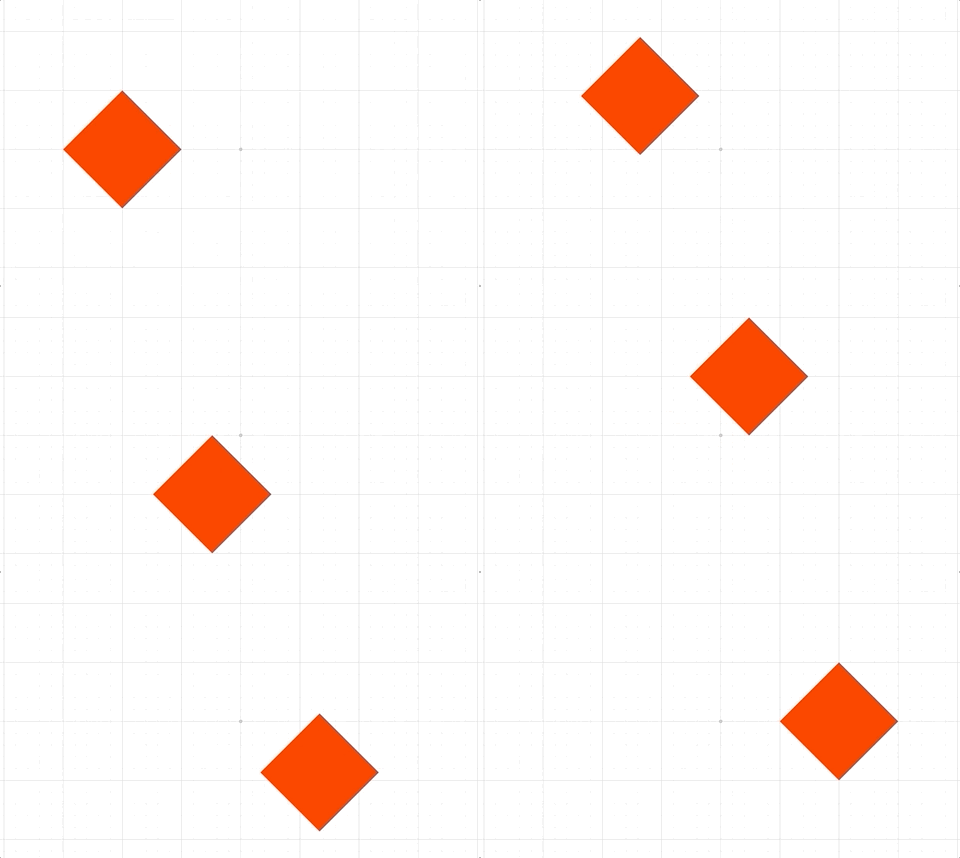
Custom animation steps are useful for orchestrating complex animations, or performing non-linear animations.
This step will execute a custom callback function on each animation frame.
Custom animations can either have finite duration or infinite
(duration = null). If finite, the callback function will be passed
percentage progress through the duration. If infinite, the callback function
will be passed the delta time from the start of the animation.
The animation can be stopped at any time by returning true from the
callback funciton/
For finite durations, the percentage progress can either be linear with
time, or non-linear.
Built-in non-linear progressions are 'easeinout', 'easein' and
'easeout' which will slow progress at the start and/or end of the
animation. A function to create a custom non-linear progressor can also be
used.
Extends AnimationStep
(OBJ_CustomAnimationStep)
// Move an object through a sine wave of wavelength 1 from
// x = -1 to x = 1
function sine(percentComplete) {
const x = -1 + percentComplete * 2;
const y = 0.5 * Math.sin(Math.PI * 2 * x);
p.setPosition(x, y);
}
p.animations.new()
.custom({ callback: sine, duration: 5 })
.start();
// Animate a object in a circle indefinitely at a frequency of 0.1Hz
p.animations.new()
.custom({
callback: (t) => {
const x = 0.5 * Math.cos(2 * Math.PI * 0.1 * t);
const y = 0.5 * Math.sin(2 * Math.PI * 0.1 * t);
p.setPosition(x, y);
},
duration: null,
})
.start();
SerialAnimationStep
Execute an array of AnimationSteps in series.
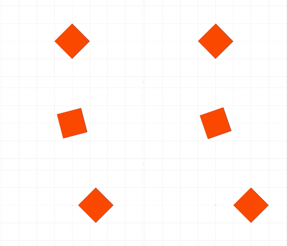
Often the AnimationBuilder class which extends
SerialAnimationStep can be used to create serial animations
in a more clean way.
Extends AnimationStep
((Array<AnimationStep> | OBJ_SerialAnimationStep))
animation steps to perform in serial
// Using a SerialAnimation step can be cumbersome, but
// can be useful if modularizing animations between files
const Rot = Fig.Animation.RotationAnimationStep;
const Delay = Fig.Animation.DelayAnimationStep;
const Pos = Fig.Animation.PositionAnimationStep;
const series = new Fig.Animation.SerialAnimationStep([
new Rot({ element: p, target: Math.PI / 2, duration: 2 }),
new Delay({ duration: 0.2 }),
new Rot({ element: p, target: Math.PI, duration: 2 }),
new Delay({ duration: 0.2 }),
new Rot({ element: p, target: 0, direction: -1, duration: 1.3, progression: 'easein' }),
new Pos({ element: p, target: [1, 0], duration: 2, progression: 'easeout' }),
]);
p.animations.animations.push(series);
p.animations.start()
// Same animation but with `AnimationBuilder` (which is an extension of
// `SerialAnimationStep`)
p.animations.new()
.rotation({ target: Math.PI / 2, duration: 2 })
.delay(0.2)
.rotation({ target: Math.PI, duration: 2 })
.delay(0.2)
.rotation({ target: 0, duration: 1, direction: -1, progression: 'easein' })
.position({ target: [1, 0], duration: 2, progression: 'easeout' })
.start();
ParallelAnimationStep
Execute an array of {@link AnimationStep}s in parallel.
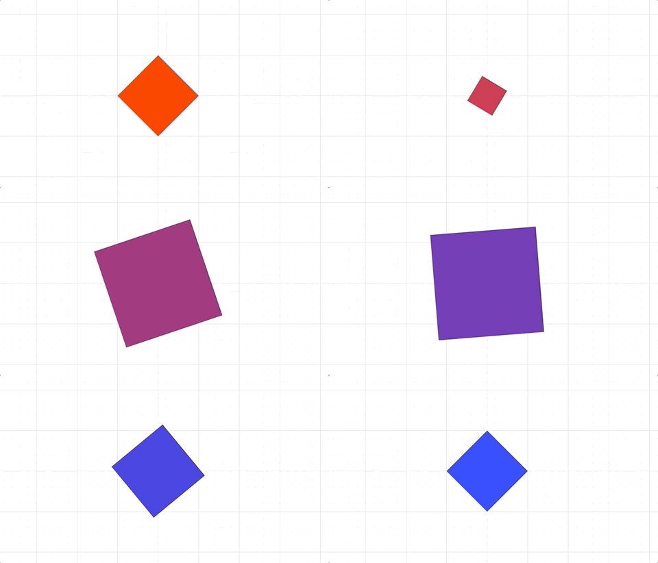
The parallel animation step will not complete till all steps are finished.
Extends AnimationStep
((Array<AnimationStep> | OBJ_SerialAnimationStep))
animation steps to perform in serial
p.animations.new()
.inParallel([
p.animations.position({ target: [1, 0], duration: 2 }),
p.animations.scale({ target: 2, duration: 2 }),
])
.start();
// One of the parallel steps is a series of steps
p.animations.new()
.delay(1)
.inParallel([
p.animations.builder()
.scale({ target: 0.5, duration: 1 })
.scale({ target: 2, duration: 1 })
.scale({ target: 1, duration: 2 }),
p.animations.color({ target: [0, 0, 1, 1], duration: 4 }),
p.animations.rotation({ target: Math.PI, duration: 4 }),
])
.start();
DelayAnimationStep
Delay animation step
While all animations steps accept a delay property, having this step sometimes makes the animation seem more readable.
Extends AnimationStep
((number | OBJ_AnimationStep))
Equations
An equation is a set of terms and operators arranged to make some mathematical statement.
Consider the equation:
a = b + c
Where the terms and operators are:
- terms:
a,b,c - operators:
=,+
An equation can have different forms. One form is above, but it can be rearranged into a different form:
a - b = c
In FigureOne, an equation is a collection (FigureElementCollection) of terms and operators (which are FigureElementPrimitives). A form defines the layout of terms and operators to create an equation. An equation can have many forms, and animation can be used to move between forms.
As the equation, terms and operators are all FigureElements, then they have all the same interactivety and animation abilities as shapes and text.
Quick Start
First let's create an equation, with red as the default color:
const equation = figure.collections.equation({ color: [1, 0, 0, 1] });
Next lets add the definitions for the terms and operators, or the equation elements. The keys of the object are unique identifiers that will be used in the equation forms to layout the elements appropriately. The values of the object are the text to display in the equation, or objects that define the text with additional options including formatting.
equation.addElements({
a: 'a',
b: 'b',
c: { text: 'c', color: [0, 0, 1, 1] },
equals: ' = ',
times: ' \u00D7 ',
});
The simplest form defintion is one that lays out the elements in a line. Here the array values are the unique identifiers (the keys) of the addElements object:
equation.addForms({
a: ['a', 'equals', 'b', 'times', 'c'],
});
An array of elements is called an equation phrase. In the example above, the form is a simple phrase, but in more complicated examples there may be several nested phrases.
Finally, we can add the equation to the figure and show the form:
figure.add('equation', equation);
equation.showForm('b');

Symbols and Equation Functions
Mathematics has many special symbols that operate on terms, or annotate an equation. These symbols and their associated terms usually have a special layout.
FigureOne treats symbols like any other equation element, and uses FigureElementPrimitives to draw them. FigureOne then provides a series of functions that can layout terms around these symbols.
Let's take the equation from the last example, and show the form as a fraction.
Start by adding a vinculum symbol (with id 'v') to the equation's elements:
equation.addElements({
v: { symbol: 'vinculum'},
});
The equation is a FigureElementCollection with an eqn property that contains equation specific information, such as forms and special layout functions, such as frac. Let's use this to add the form:
const e = equation.eqn.functions;
equation.addForms({
b: ['b', 'equals', e.frac(['a', 'v', 'c'])],
});
Finally, we can display the form:
equation.showForm('b');
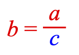
Combine all the steps above gives:
const equation = figure.collections.equation({ color: [1, 0, 0, 1] });
equation.addElements({
a: 'a',
b: 'b',
c: { text: 'c', color: [0, 0, 1, 1] },
v: { symbol: 'vinculum'},
equals: ' = ',
times: ' \u00D7 ',
});
const e = equation.eqn.functions;
equation.addForms({
a: ['a', 'equals', 'b', 'times', 'c'],
b: ['b', 'equals', e.frac(['a', 'v', 'c'])],
});
figure.add('equation', equation);
equation.showForm('a');
Equation Animation
Equations can animate between forms. For example, to animate from form a to b in the equation above:
equation.showForm('a');
equation.goToForm({
form: 'b',
animate: 'move',
duration: 2,
});

The animation can be improved by moving the terms of the equation in curves instead of linearly. To do this we can use the object definition of a form that also defines translation animation properties:
equation.addForms({
bCurve: {
content: ['b', 'equals', { frac: ['a', 'v', 'c'] }],
translation: {
a: { style: 'curve', direction: 'up', mag: 0.8 },
b: { style: 'curve', direction: 'down', mag: 1.2 },
},
},
});
equation.showForm('a');
equation.goToForm({
form: 'bCurve',
animate: 'move',
duration: 2,
delay: 1,
});
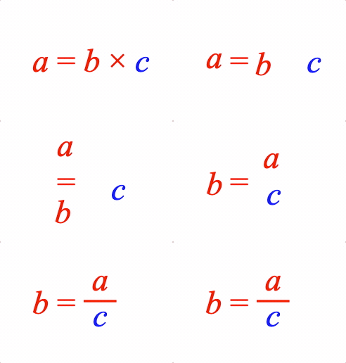
Object Definition
Similar to shapes and text, the same equation above can be defined with an options object. For complicated equations, options objects can be used with code folding in an IDE to more easily read and navigate an equation definition. Also, because object form is JSON compatible, complex equations can be easily shared.
const equation = figure.add(
{
make: 'equation',
color: [1, 0, 0, 1],
font: { size: 0.2 },
elements: {
a: 'a',
b: 'b',
c: { text: 'c', color: [0, 0, 1, 1] },
v: { symbol: 'vinculum'},
equals: ' = ',
times: ' \u00D7 ', // unicode times symbol
},
forms: {
a: ['a', 'equals', 'b', 'times', 'c'],
b: ['b', 'equals', { frac: ['a', 'v', 'c'] }],
bCurve: {
content: ['b', 'equals', { frac: ['a', 'v', 'c'] }],
translation: {
a: { style: 'curve', direction: 'up', mag: 0.8 },
b: { style: 'curve', direction: 'down', mag: 1.2 },
},
},
},
},
);
equation.showForm('a');
Equation highlighting and interactivity
Just like any FigureElement, an equation or its elements can be pulsed, touched or moved.
For example, an element can be pulsed:
// Pulse the c element
equation.showForm('b')
const c = figure.getElement('equation.c');
c.pulse({ scale: 2, yAlign: 'top' });
An element can be touched:
c.setTouchable();
c.onClick = () => { console.log('c was touched') }
And the equation can be moved:
equation.setMovable();
Managing Equations
Complicated equations can have long definitions that may be hard to read.
Therefore there are several useful shortcuts when defining equations that are useful to improve readability.
Inline element definitions
Equation elements can all be defined in the elements property. However, simple elements that have the same text as its unique identifier can be defined inline.
For instance, we can recreate the example above as:
const equation = figure.add({
make: 'equation',
elements: {
times: ' \u00D7 ',
equals: ' = ',
c: { color: [0, 0, 1, 1] },
},
forms: {
1: ['a', 'equals', 'b', 'times', 'c'],
},
});
Elements 'a' and 'b' are defined inline. 'c' is still defined in the elements as it has a color customization. Its definition is shorter however, as the text property is not required if the text is the same as the unique identifier.

Elements defined inline can be used in other forms:
const eqn = figure.add({
make: 'equation',
elements: {
times: ' \u00D7 ',
equals: ' = ',
v: { symbol: 'vinculum' },
},
forms: {
1: ['a', 'equals', 'b', 'times', 'c'],
2: ['b', 'equals', { frac: ['a', 'v', 'c'] }],
},
});
eqn.showForm('1');
eqn.goToForm({
form: 2,
animate: 'move',
delay: 1,
});
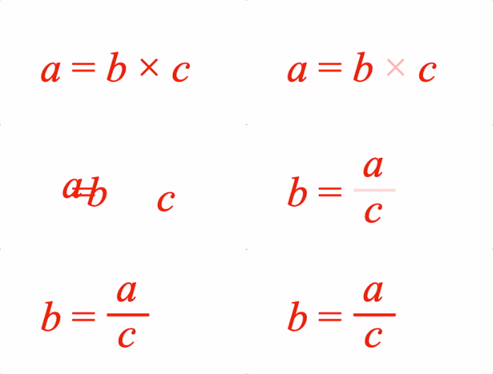
Even symbols can be defined inline:
figure.add({
make: 'equation',
elements: {
equals: ' = ',
},
forms: {
1: ['b', 'equals', { frac: ['a', 'vinculum', 'c'] }],
},
});
Underscores have a special meaning for inline definitions.
Underscores before text will be hidden when rendered, but can make unique ids that are valid javascript object keys (a requirement for a unique id). In javascript, a space cannot be the first character of an object key, but it can be after the first character.
Underscores after text can be used to create unique identifiers and therefore used to make multiple elements with the same text. The underscore, and all text after it will not be rendered.
figure.add({
make: 'equation',
forms: {
1: ['2', 'a', '_ = ', 'a_1', '_ + ', 'a_2'],
},
});

Underscores can also be used to give inline symbol definitions unqiue identifiers. In this case, the text before the underscore is the unique identifier, and the text after defines the symbol.
const eqn = figure.add({
name: 'eqn',
make: 'equation',
forms: {
1: ['b', '_ = ', { frac: ['a', 'v_vinculum', 'c'] }],
2: ['c', '_ = ', { frac: ['a', 'v', 'b'] }],
},
});
eqn.goToForm({
form: '2',
animate: 'move',
delay: 1,
});
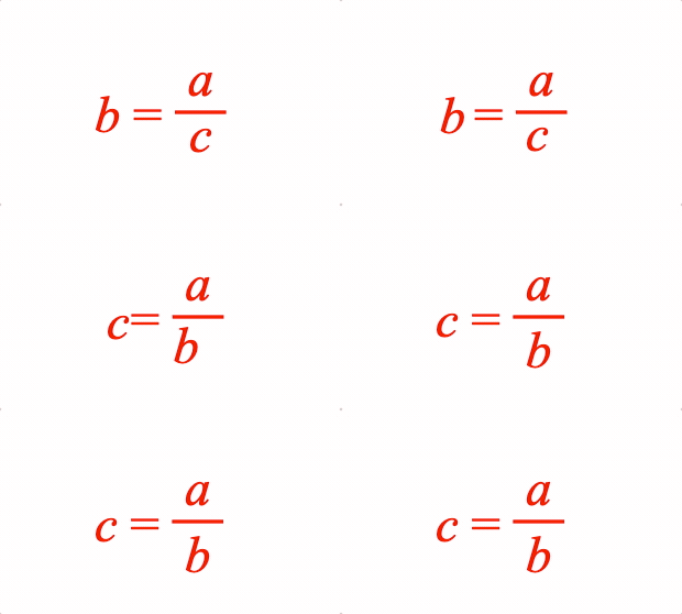
Function Definitions
Function definitions can either be array definitions (an equation phrase) or object definitions. Array definitions are useful in simple definitions with minimal layout customizations. Object definitions are more readable when many options are required to customize a layout, or the input to the functions are more complicated equation phrases.
Array definitions, or equation phrases, can also be spread over several lines to increase readability.
figure.add({
// name needs to be defined as it is used to get the element in the onClick method
name: 'eqn',
make: 'equation',
elements: {
v: { symbol: 'vinculum' },
},
forms: {
// Array definition for simple fraction
1: { frac: ['a', 'v', 'b']},
// Object definition for fraction with complex phrases
2: {
frac: {
numerator: ['a', '_ + ', 'c'],
symbol: 'v',
denominator: ['t', { sub: ['b', '2'] }],
},
},
// Array definition split over several lines
3: {
frac: [
['a', '_ + ', 'x'],
'v',
['t', { sub: ['b', '3'] }],
],
},
// Object definition when additional options are needed
4: {
frac: {
numerator: 'a',
symbol: 'v',
denominator: 'b',
numeratorSpace: 0.07,
denominatorSpace: 0.07,
overhang: 0.1,
scale: 1.5,
},
},
},
formSeries: ['1', '2', '3', '4'],
mods: {
isTouchable: true,
// eqn isn't instantiated when this is defined, so need to use the element's name
// to get the element at click time
onClick: () => figure.get('eqn').nextForm(),
touchBorder: 0.5,
}
});
Here, the touchability of the equation is setup in the mods property. The keys in mods represent property names of the equation FigureElementCollection.
The above example also uses a form series. A form series allows animation between equation forms using the equation.nextForm and equation.prevForm methods.
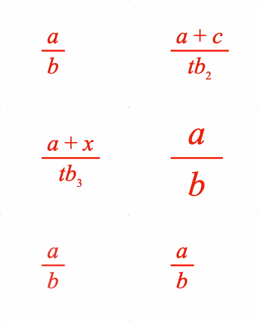
Phrases
Often different forms of an equation reuse equation phrases, like fractions. To make equation forms more readable, it can be useful to define a phrase once, and then refer to its identifier throughout the forms.
figure.add({
name: 'eqn',
make: 'equation',
elements: {
v: { symbol: 'vinculum' },
times: ' \u00d7 ',
div: ' \u00f7 ',
lb: { symbol: 'bracket', side: 'left' },
rb: { symbol: 'bracket', side: 'right' },
},
phrases: {
ac: ['a', '_ + ', 'c'],
// Phrases can be nested
br: { brac: ['lb', 'ac', 'rb'] },
},
forms: {
1: ['d', 'times', 'br'],
2: ['d', 'times', { bottomComment: ['br', ['div', 'b']] }],
3: ['d', 'times', { frac: ['ac', 'v', 'b']},],
},
formSeries: ['1', '2', '3'],
mods: {
onClick: () => figure.getElement('eqn').nextForm(),
touchBorder: 0.5,
isTouchable: true,
},
});
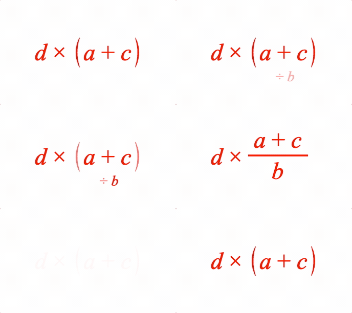
Element interaction
In the last two examples, equation touchability was setup in the mods property of the equation definition object. Similarly, equation elements can be set up in a similar way.
figure.add({
make: 'equation',
elements: {
a: {
mods: {
isTouchable: true, touchBorder: 0.1, onClick: () => console.log('a'),
},
},
b: {
isTouchable: true, touchBorder: 0.1, onClick: () => console.log('b'),
},
c: {
isTouchable: true, touchBorder: 0.1, onClick: () => console.log('c'),
},
times: ' \u00d7 ',
equals: ' = ',
},
forms: {
1: ['a', 'equals', 'b', 'times', 'c'],
},
});
Element 'a' is setup with the mods property. However, as isTouchable, touchBorder and onClick are frequenty used, they are also native options in the element definition object. As such, elements 'b' and 'c' do not use the mods property.
Equation
An Equation is a collection of elements that can be arranged into different forms.
Equation should be instantiated from an object definition, or from
the figure.collections.equation method.
Equation includes two additional animation steps in Equation.animations:
Extends FigureElementCollection
(EQN_Equation)
// Create with options definition
figure.add({
name: 'eqn',
make: 'equation',
elements: {
a: 'a',
b: { color: [0, 0, 1, 1] },
c: 'c',
equals: ' = ',
plus: ' + ',
},
forms: {
1: ['a', 'equals', 'b', 'plus', 'c'],
},
});
// Create with methods
const eqn = figure.collections.equation();
eqn.addElements({
a: 'a',
b: { color: [0, 0, 1, 1] },
c: 'c',
equals: ' = ',
plus: ' + ',
});
eqn.addForms({
1: ['a', 'equals', 'b', 'plus', 'c'],
});
figure.add('eqn', eqn);
eqn.showForm('1');
Equation parameters and functions
Type:
{forms: {}, functions: EquationFunctions, symbols: EquationSymbols, currentForm: string, font: FigureFont, textFont: FigureFont, scale: number, formSeries: {}, currentFormSeries: Array<string>, currentFormSeriesName: string, formDefaults: {alignment: {fixTo: (FigureElementPrimitive | FigureElementCollection | Point), xAlign: TypeHAlign, yAlign: TypeVAlign}, elementMods: OBJ_ElementMods, duration: number?, translation: EQN_TranslationStyle?, onShow: (null | string | function (): void)?, onTransition: (null | string | function (): void)?, layout: ("always" | "lazy" | "init")?, ignoreColor: boolean?}, isAnimating: boolean, descriptionElement: (FigureElementPrimitive | null), descriptionPosition: Point, formRestart: {moveFrom: (Point | FigureElementCollection)?, pulse: {duration: number, scale: number, element: FigureElement}?}?}
(EquationFunctions)
: equation functions
AnimationManager extended to include additional animation steps specific to equations
Type: any
Extends AnimationManager
(NextFormAnimationStep)
(GoToFormAnimationStep)
For equation layout. If an equation layout happens before a desired font is fully loaded, then use this method to re-layout the equation when the font is available.
Either the current form only, all forms already laid out (set), or all forms of the equation can be re-laid-out.
(("none" | "current" | "all" | "set" | "reset")
= 'all')
(boolean
= true)
true will re-show current form
Update text of equation element or elements
(EQN_UpdateElementText)
elements to update
(("all" | "current" | "none")?
= 'none')
which forms to re-layout
with the updated text
Add elements to equation.
(EQN_EquationElements)
Return all the elements that are used in a form.
Array<FigureElement>:
Return all the elements that are used in an equation phrase.
(TypeEquationPhrase)
Array<FigureElement>:
Get the current equation form
EquationForm?
Set current equation form - Note, this does not show the form.
((EquationForm | string))
Get an equation form object from a form name
((string | EquationForm))
(null | EquationForm)
Start an animation to an equation form
(EQN_EquationGoToForm
= {})
Animate to previous form in the current form series
((number | null | EQN_EquationGoToForm)
= null)
(number
= 0)
Animate to next form in the current form series
((number | null | EQN_EquationGoToForm)
= null)
(number
= 0)
EQN_Equation
Options objects to construct an Equation class.
All properties are optional.
Type: {color: TypeColor?, dimColor: TypeColor?, font: OBJ_Font?, textFont: OBJ_Font?, scale: number?, elements: EQN_EquationElements?, formDefaults: EQN_FormDefaults, forms: EQN_Forms?, initialForm: string?, formSeries: (Array<string> | {})?, defaultFormSeries: string?, formRestart: EQN_FormRestart?, position: TypeParsablePoint?, transform: Transform?}
(TypeColor?)
: default equation color
(TypeColor?)
: default equation dim color
(EQN_EquationElements?)
: equation element definitions
(EQN_Forms?)
: form definitions
(string?)
: form to show when first added to a figure
(EQN_FormDefaults?)
: default form options applied to
all forms
((Array<string> | Object<Array<string>>)?)
: an object
with each key being a form series name, and each value an array for form
names. If defined as an array, then a form series object is created where
the form series name is 'base'. Default: {}
(string?)
: If more than one form series is
defined, then a default must be chosen to be the first current one. Default:
first form defined
(EQN_FormRestart??)
: behavior when form transitions
from last in form series back to first
(TypeParsablePoint?)
: position will override first
translation element of transform
(Transform?)
EQN_EquationElements
Object where keys are element names, and values are the element definitions
Type: {}
(TypeEquationElement?)
TypeEquationElement
An equation element can be any of the below. If string, then a
EQN_TextElement will be used where the text property is the
string.
string- FigureElementPrimitive
- FigureElementCollection
- EQN_TextElement
- EQN_VinculumSymbol
- EQN_BoxSymbol
- EQN_ArrowSymbol
- EQN_SumSymbol
- EQN_ProdSymbol
- EQN_IntegralSymbol
- EQN_StrikeSymbol
- EQN_BracketSymbol
- EQN_AngleBracketSymbol
- EQN_BraceSymbol
- EQN_BarSymbol
- EQN_SquareBracketSymbol
- EQN_LineSymbol
- EQN_RadicalSymbol
Type: (string | FigureElementPrimitive | FigureElementCollection | EQN_TextElement | EQN_VinculumSymbol | EQN_BoxSymbol | EQN_ArrowSymbol | EQN_SumSymbol | EQN_ProdSymbol | EQN_IntegralSymbol | EQN_StrikeSymbol | EQN_BracketSymbol | EQN_AngleBracketSymbol | EQN_BraceSymbol | EQN_BarSymbol | EQN_SquareBracketSymbol | EQN_LineSymbol | EQN_RadicalSymbol)
EQN_TextElement
Definition of a text or equation element.
The properties 'color', 'isTouchable', 'onClick' and touchBorder
modify the corresponding properties on the FigureElementPrimitive
itself, and so could equally be set in mods. They are provided in the
root object for convenience as they are commonly used.
Type:
(string | {text: string?, font: OBJ_Font?, style: ("italic" | "normal" | null)?, weight: ("normal" | "bold" | "lighter" | "bolder" | "100" | "200" | "300" | "400" | "500" | "600" | "700" | "800" | "900")?, size: number?, color: TypeColor?, isTouchable: boolean?, onClick: function (): (void | "string" | null)?, touchBorder: (TypeBorder | "border" | number | "rect" | "draw" | "buffer")?, mods: OBJ_ElementMods?} | FigureElementPrimitive | FigureElementCollection)
(string?)
: Text element only
(OBJ_Font?)
: Text element only
(("italic" | "normal")?)
: Text element only
(object?)
: Properties to set on instantiated element
(TypeColor?)
: Color to set the element
(boolean?)
: make the element touchable
((TypeBorder | "border" | number | "rect" | "draw" | "buffer")?)
: set the element's touch border
(OBJ_ElementMods?)
EQN_Forms
An object of equation forms where each key is the form name and each value is a form defintion TypeEquationForm
Type: {}
(TypeEquationForm?)
TypeEquationForm
A form definition can either be:
- an equation form object EQN_FormObjectDefinition
- an equation phrase TypeEquationPhrase
Type: (TypeEquationPhrase | EQN_FormObjectDefinition)
EQN_FormObjectDefinition
In mathematics, an equation form is a specific arrangement of an equation's terms and operators. Different forms will have different arrangements, that can be achieved by performing a series of operations to both sides of the equation.
For instance, the equation:
a + b = c
can be rearranged to a different form:
a = c - b
From a FigureOne figure's perspective, a form is a specific layout of equation elements.
This object defines a how the elements are laid out, what properties the elements have, and some animation properties for when animating to this form.
Type: {content: TypeEquationPhrase, scale: number?, alignment: EQN_FormAlignment?, description: string?, modifiers: {}?, duration: number??, translation: EQN_TranslationStyles?, onShow: (string | function (): void)?, onTransition: (string | function (): void)?, elementMods: OBJ_ElementMods?, fromForm: EQN_FromForms, ignoreColor: boolean?}
(TypeEquationPhrase)
: The equation phrase of the form
defines how the elements are laid out
(number?)
: scaling factor for this form
(EQN_FormAlignment?)
: how the equation's position
is aligned with this form
(string?)
: description of this form
({}?)
: description modifiers
(EQN_TranslationStyles?)
: translation style
when animating to this form
(OBJ_ElementMods?)
: properties to set in the equation element
(@FigureElementPrimitive) when this form is shown
(EQN_FromForms?)
: override
duration
,
translation
onTransition
and/or
onShow
with this if coming from specific forms
(boolean?)
: when
false
, color will be set
automatically in the equation based on EQN_Color equation functions. In such
cases, colors that are set external to the equation will be overridden. Use
true
to allow setting of colors externally only. (
false
)
((string | function (): void)?)
((string | function (): void)?)
// Simple form definition of two different forms of the same equation and one
// of the elements is colored blue in one form and red in the other
figure.add({
name: 'eqn',
make: 'equation',
elements: { equals: ' = ', plus: ' + ', minus: ' \u2212 ' },
forms: {
form1: {
content: ['a', 'plus', 'b', 'equals', 'c'],
elementMods: {
a: { color: [0, 0, 1, 1] },
},
},
form2: {
content: ['a', 'equals', 'c', 'minus', 'b'],
elementMods: {
a: { color: [1, 0, 0, 1] },
},
},
},
});
// Example showing all form options
figure.add({
name: 'eqn',
make: 'equation',
forms: {
form1: {
content: ['a', 'b', 'c'],
subForm: 'deg',
scale: 1.2,
alignment: {
fixTo: 'b',
xAlign: 'center',
yAlign: 'bottom',
},
description: '|Form| 1 |description|',
modifiers: {
Form: { font: { color: [0, 0, 1, 0] } },
},
elementMods: {
a: {
color: [0, 0, 1, 1],
isTouchable: true,
},
},
duration: 1,
translation: {
a: {
style: 'curved',
direction: 'up',
mag: 0.95,
},
b: ['curved', 'down', 0.45],
},
fromPrev: {
duration: null,
translation: {
a: ['curved', 'down', 0.2],
b: ['curved', 'down', 0.2],
},
},
fromNext: {
duration: 2,
translation: {
a: ['curved', 'down', 0.2],
b: ['curved', 'down', 0.2],
},
},
},
},
});
TypeEquationPhrase
An equation phrase is used to define an equation form and can be any of the below:
string(which represents the unique identifier of an equation element){ frac:EQN_Fraction}{ strike:EQN_Strike}{ box:EQN_Box}{ tBox:EQN_TouchBox}{ root:EQN_Root}{ brac:EQN_Bracket}{ sub:EQN_Subscript}{ sup:EQN_Superscript}{ supSub:EQN_SuperscriptSubscript}{ topBar:EQN_Bar}{ bottomBar:EQN_Bar}{ annotate:EQN_Annotate}{ topComment:EQN_Comment}{ bottomComment:EQN_Comment}{ pad:EQN_Pad}{ bar:EQN_Bar}{ scale:EQN_Scale}{ container:EQN_Container}{ offset:EQN_Offset}{ matrix:EQN_Matrix `}{ lines:EQN_Lines}{ int:EQN_Integral}{ sumOf:EQN_SumOf}{ prodOf:EQN_ProdOf}{ topStrike:EQN_StrikeComment}{ bottomStrike:EQN_StrikeComment}Array<TypeEquationPhrase>
Type: (string | number | {frac: EQN_Fraction} | {strike: EQN_Strike} | {box: EQN_Box} | {tBox: EQN_TouchBox} | {root: EQN_Root} | {brac: EQN_Bracket} | {sub: EQN_Subscript} | {sup: EQN_Superscript} | {supSub: EQN_SuperscriptSubscript} | {topBar: EQN_Bar} | {bottomBar: EQN_Bar} | {annotate: EQN_Annotate} | {topComment: EQN_Comment} | {bottomComment: EQN_Comment} | {pad: EQN_Pad} | {bar: EQN_Bar} | {scale: EQN_Scale} | {container: EQN_Container} | {offset: EQN_Offset} | {matrix: EQN_Matrix} | {matrix: EQN_Lines} | {int: EQN_Integral} | {sumOf: EQN_SumOf} | {prodOf: EQN_ProdOf} | {topStrike: EQN_StrikeComment} | {bottomStrike: EQN_StrikeComment} | Array<TypeEquationPhrase> | FigureElementPrimitive | FigureElementCollection | Elements | Element | BaseAnnotationFunction)
figure.add({
name: 'eqn',
make: 'equation',
elements: { equals: ' = ' },
forms: {
form1: 'a',
form2: ['a', 'equals', 'b'],
form3: [{
frac: {
numerator: 'a',
symbol: 'vinculum',
denominator: 'c',
},
}, 'equals', 'b'],
form4: { frac: ['a', 'vinculum', 'c'] },
},
});
figure.getElement('eqn').animations.new()
.goToForm({ target: 'form2', animate: 'move', delay: 1 })
.goToForm({ target: 'form3', animate: 'move', delay: 1 })
.goToForm({ target: 'form4', animate: 'move', delay: 1 })
.start();
EQN_FormAlignment
Form alignment object definition.
Each equation form is positioned within the Equation FigureElementCollection draw space (0, 0) point. This object defines how the form is aligned with this (0, 0) point.
Using the fixTo property forms can either be aligned relative to the
bounds of the form itself, or to an element within the form, or to a
position other than the (0, 0) in in the equation's collection draw space.
If fixTo is an element in the equation:
- the
fixToelement is positioned at (0, 0), and all other elements repositioned relative to that. - The equation collection setPosition (or translation transform) can then be used to position the equation in the figure (or relative collection space)
-
if
xAlignis:'center': thefixToelement is centered in x around (0, 0)'right': thefixToelement right most point is at x = 0'left': default - thefixToelement x position at 0
-
if
yAlignis:'middle': thefixToelement is centered in y around (0, 0)'bottom': thefixToelement bottom most point is at y = 0'top': thefixToelement top most point is at y = 0'baseline': default - thefixToelement y position at 0
If fixTo is a Point, the equation is positioned at that point in the
equation's draw space.
-
xAlign:
'left': The equation's left most element's left most point is at Point.x'right': The equation's right most element's right most point is at Point.x'center': The equation is centered horizontally around Point.x
-
yAlign:'baseline': The equation's baseline is at Point.y'top': The equation's top most element's top most point is at Point.y'bottom': The equation's top most element's top most point is at Point.y'middle': The equation is centered vertically around Point.y
Type: {fixTo: (FigureElement | TypeParsablePoint | string), xAlign: TypeHAlign, yAlign: TypeVAlign}
// Note - the points are drawn in the figure's draw space, but as the
// equation collection is at (0, 0) and it has not scaling applied, then
// the equation's draw space is the same as the figure's draw space.
// Draw (0, 0) point in equation collection
figure.add({
make: 'polygon', options: { radius: 0.01, color: [0, 0, 1, 1], sides: 9 },
});
// Default alignment is left, baseline
figure.add([
{
make: 'equation',
forms: { 0: ['a', '_ = ', 'bg'] },
},
]);
// Draw (0, 0) point in equation collection
figure.add({
make: 'polygon', options: { radius: 0.01, color: [0, 0, 1, 1], sides: 9 },
});
// Align with right, middle
figure.add([
{
make: 'equation',
forms: { 0: ['a', '_ = ', 'bg'] },
formDefaults: {
alignment: {
xAlign: 'right',
yAlign: 'middle',
},
},
},
]);
// Draw (0, 0) point in equation collection
figure.add({
make: 'polygon', options: { radius: 0.01, color: [0, 0, 1, 1], sides: 9 },
});
// Align with center of equals sign
figure.add([
{
make: 'equation',
forms: { 0: ['a', '_ = ', 'bg'] },
formDefaults: {
alignment: {
fixTo: '_ = ',
xAlign: 'center',
yAlign: 'baseline',
},
},
},
]);
// Draw (0, 0) and (0.2, 0.1) points
figure.add([
{
make: 'polygon',
options: { radius: 0.01, color: [0, 0, 1, 1], sides: 9 }
},
{
make: 'polygon',
options: {
radius: 0.01, color: [0, 0.8, 0, 1], sides: 9, position: [0.2, 0.1],
},
},
]);
// Align with point (0.2, 0.1) in the equation collection
figure.add([
{
make: 'equation',
forms: { 0: ['a', '_ = ', 'bg'] },
formDefaults: {
alignment: {
fixTo: [0.2, 0.1],
xAlign: 'right',
yAlign: 'baseline',
},
},
},
]);
EQN_FromForms
Equation form FromForm definition.
When animating from a specific form, it can be useful to customize some of the form properties specific to that transition.
To do so, use this options object where each key is the specific form from which the equation is animating from, and the value is the specific properties.
Type: {}
(EQN_FromForm?)
EQN_FromForm
From form options object.
Any defined properties will override the corrsponding properties of the form if it being animated to from a specific form.
Type: {onTransition: (null | string | function (): void)?, onShow: (null | string | function (): void)?, duration: number?, translation: {}?, elementMods: OBJ_ElementMods?}
(EQN_TranslationStyle?)
: translation style
when animating to this form
(OBJ_ElementMods?)
: properties to set in the equation element
(@FigureElementPrimitive) when this form is shown
((null | string | function (): void)?)
((null | string | function (): void)?)
EQN_TranslationStyle
Form translation properties
Type:
{style: ("curved" | "linear"), direction: ("up" | "down")?, mag: number}
(("curved" | "linear"))
: element should move in a straight
line, or through a curve. Default:
"linear"
(("up" | "down")?)
: curve only - element should move
through an up or down curve
(number?)
: the magnitude of the curve
EQN_FormDefaults
Default form values applied to all forms
Type:
{alignment: EQN_FormAlignment?, elementMods: OBJ_ElementMods?, duration: number?, translation: EQN_TranslationStyle?, onShow: (null | string | function (): void)?, onTransition: (null | string | function (): void)?, layout: ("lazy" | "init" | "always")?, ignoreColor: boolean?}
(EQN_FormAlignment?)
(OBJ_ElementMods?)
(number?)
(EQN_TranslationStyle?)
((null | string | function (): void)?)
((null | string | function (): void)?)
(("lazy" | "init" | "always")?)
(boolean?)
EQN_FormRestart
When an equation form series is restarted, or cycled back to the first form in the series, then two special animations can be defined with this object:
moveFrom: the equation will move from a location (usually another equation of the same form)pulse: An element will be pulsed when the animation is finished.
The default values in the pulse object are are:
duration: 1sscale: 1.1
Type: {moveFrom: (Point? | FigureElementCollection)?, pulse: {duration: number?, scale: number?, element: FigureElement??}?}
((Point? | FigureElementCollection)?)
({duration: number?, scale: number?, element: FigureElement??}?)
Equation Layout
EQN_Fraction
Equation fraction options
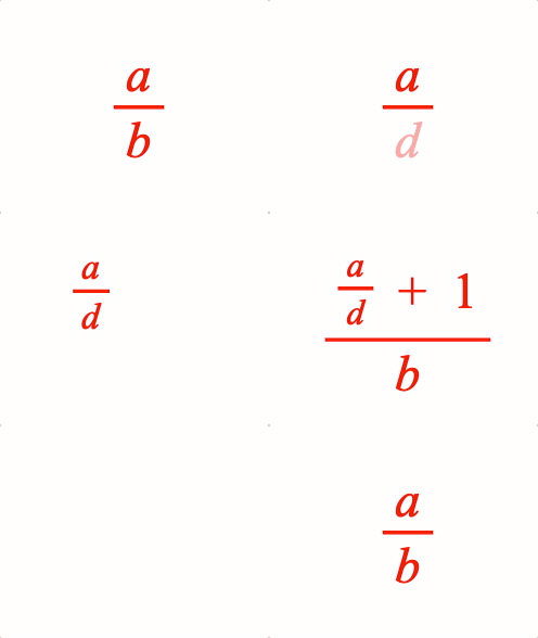
A fraction has a numerator and denominator separated by a vinculum symbol EQN_VinculumSymbol.
Options can be an object, or an array in the property order below
Type:
({numerator: TypeEquationPhrase, symbol: string, denominator: TypeEquationPhrase, scale: number?, numeratorSpace: number?, denominatorSpace: number?, overhang: number?, offsetY: number?, baseline: ("numerator" | "denominator" | "vinculum")?, fullContentBounds: boolean?} | [TypeEquationPhrase, string, TypeEquationPhrase, number?, number?, number?, number?, number?, ("numerator" | "denominator" | "vinculum")?, boolean?])
// Simple
figure.add({
name: 'eqn',
make: 'equation',
forms: {
1: { frac: ['a', 'vinculum', 'b'] },
},
});
figure.elements._eqn.showForm('1');
// Example showing object and array fraction definitions, and nesting
figure.add({
name: 'eqn',
make: 'equation',
elements: {
v1: { symbol: 'vinculum' },
v2: { symbol: 'vinculum' },
plus: ' + ',
},
forms: {
// Fraction object form
1: {
frac: {
numerator: 'a',
denominator: 'b',
symbol: 'v1',
},
},
// Fraction array form
2: { frac: ['a', 'v1', 'd'] },
// Nested
3: {
frac: {
numerator: [{ frac: ['a', 'v1', 'd', 0.7] }, 'plus', '_1'],
symbol: 'v2',
denominator: 'b',
}
},
},
formSeries: ['1', '2', '3'],
});
const eqn = figure.elements._eqn;
eqn.onClick = () => eqn.nextForm();
eqn.setTouchable();
eqn.showForm('1');
// Create equation object then add to figure
const eqn = figure.collections.equation({
elements: {
v1: { symbol: 'vinculum' },
v2: { symbol: 'vinculum' },
plus: ' + ',
},
forms: {
1: {
frac: {
numerator: 'a',
denominator: 'b',
symbol: 'v1',
},
},
2: { frac: ['a', 'v1', 'd'] },
3: {
frac: {
numerator: [{ frac: ['a', 'v1', 'd', 0.7] }, 'plus', '_1'],
symbol: 'v2',
denominator: 'b',
}
},
},
formSeries: ['1', '2', '3'],
});
figure.add('eqn', eqn);
eqn.onClick = () => eqn.nextForm();
eqn.setTouchable();
eqn.showForm('1');
EQN_Root
Equation root
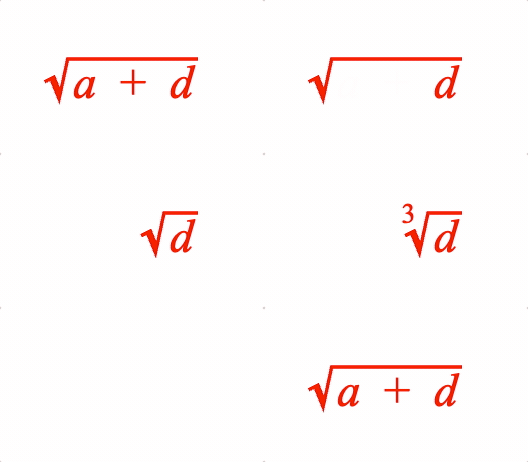
Surround an equation phrase with a radical symbol EQN_RadicalSymbol and add a custom root if needed
Options can be an object, or an array in the property order below.
Type: ({symbol: string, content: TypeEquationPhrase, inSize: boolean?, space: number?, topSpace: number?, rightSpace: number?, bottomSpace: number?, leftSpace: number?, root: TypeEquationPhrase, rootOffset: number?, rootScale: number?, fullContentBounds: boolean?, useFullBounds: boolean?} | [string, TypeEquationPhrase, boolean?, number?, number?, number?, number?, number?, TypeEquationPhrase?, number?, number?, boolean?, boolean?])
(string)
: radical symbol
(TypeEquationPhrase)
(boolean?)
: false
excludes radical symbol and root (if
defined) from size of resulting phrase (
true
)
(number?)
: (
0.02
) default space between content and
radical symbol in left, right, top and bottom directions.
(TypeEquationPhrase?)
: custom root
(boolean?)
: use full bounds of content,
overriding any
inSize=false
properties in the content (
false
)
(boolean?)
: make the bounds of this phrase equal to
the full bounds of the content even if
fullContentBounds=false
and the
brackets only surround a portion of the content (
false
)
// Simple
figure.add({
name: 'eqn',
make: 'equation',
forms: {
1: { root: ['radical', 'a'] },
},
});
figure.elements._eqn.showForm('1');
// Example showing object and array root definitions, and custom roots
figure.add({
name: 'eqn',
make: 'equation',
elements: {
r: { symbol: 'radical' },
plus: ' + ',
},
formDefaults: { alignment: { fixTo: 'd' } },
forms: {
// Root object form
1: {
root: {
symbol: 'r',
content: ['a', 'plus', 'd'],
},
},
// Root array form
2: { root: ['r', 'd'] },
// Cube root
3: { root: { content: 'd', symbol: 'r', root: '_3' } },
},
formSeries: ['1', '2', '3'],
});
const eqn = figure.elements._eqn;
eqn.onClick = () => eqn.nextForm();
eqn.setTouchable();
eqn.showForm('1');
// Create equation object then add to figure
const eqn = figure.collections.equation({
elements: {
r: { symbol: 'radical' },
plus: ' + ',
},
formDefaults: {
alignment: { fixTo: 'd' },
},
forms: {
1: {
root: {
symbol: 'r',
content: ['a', 'plus', 'd'],
},
},
2: { root: ['r', 'd'] },
3: { root: { content: 'd', symbol: 'r', root: '_3' } },
},
formSeries: ['1', '2', '3'],
});
figure.add('eqn', eqn);
eqn.onClick = () => eqn.nextForm();
eqn.setTouchable();
eqn.showForm('1');
EQN_Subscript
Equation subscript
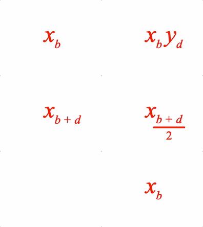
Options can be an object, or an array in the property order below
Type: ({content: TypeEquationPhrase, subscript: TypeEquationPhrase, scale: number?, offset: TypeParsablePoint?, inSize: boolean} | [TypeEquationPhrase, TypeEquationPhrase, number?, TypeParsablePoint?, boolean?])
(TypeEquationPhrase)
(TypeEquationPhrase)
//Simple
figure.add({
name: 'eqn',
make: 'equation',
forms: {
1: { sub: ['x', '_2'] },
},
});
figure.elements._eqn.showForm('1');
// Example showing different subscript options
figure.add({
name: 'eqn',
make: 'equation',
forms: {
// Object form
1: {
sub: {
content: 'x',
subscript: 'b',
},
},
// Array form
2: [{ sub: ['x', 'b'] }, ' ', { sub: ['y', 'd'] }],
3: { sub: ['x', ['b', ' ', '+', ' ', 'd']] },
// Subscript offset to adjust layout to keep animation smooth
4: {
sub: {
content: 'x',
subscript: { frac: [['b', ' ', '+', ' ', 'd'], 'vinculum', '_2'] },
offset: [-0.025, -0.02],
},
},
},
formSeries: ['1', '2', '3', '4'],
});
const eqn = figure.elements._eqn;
eqn.onClick = () => eqn.nextForm();
eqn.setTouchable();
eqn.showForm('1');
EQN_Superscript
Equation superscript
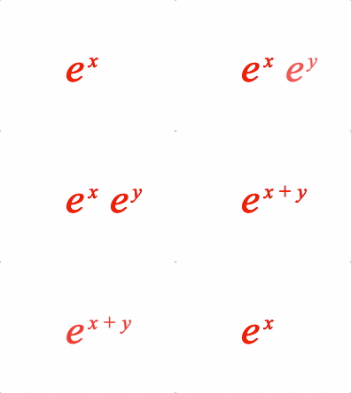
Options can be an object, or an array in the property order below
Type: ({content: TypeEquationPhrase, superscript: TypeEquationPhrase, scale: number?, offset: TypeParsablePoint?, inSize: boolean} | [TypeEquationPhrase, TypeEquationPhrase, number?, TypeParsablePoint?, boolean?])
(TypeEquationPhrase)
(TypeEquationPhrase)
// Simple
figure.add({
name: 'eqn',
make: 'equation',
forms: {
1: { sup: ['e', 'x'] },
},
});
figure.elements._eqn.showForm('1');
// Examples of superscript animations
figure.add({
name: 'eqn',
make: 'equation',
forms: {
// Object form
1: {
sup: {
content: 'e',
superscript: 'x',
},
},
// Array form
2: [{ sup: ['e', 'x'] }, ' ', { sup: ['e_1', 'y'] }],
3: { sup: ['e', ['x', ' ', '+', ' ', 'y']] },
},
formSeries: ['1', '2', '3'],
});
const eqn = figure.elements._eqn;
eqn.onClick = () => eqn.nextForm();
eqn.setTouchable();
eqn.showForm('1');
EQN_SuperscriptSubscript
Equation superscript and subscript
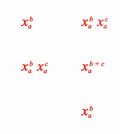
Options can be an object, or an array in the property order below
Type: ({content: TypeEquationPhrase, subscript: TypeEquationPhrase, superscript: TypeEquationPhrase, scale: number?, superscriptOffset: TypeParsablePoint?, subscriptOffset: TypeParsablePoint?, inSize: boolean?} | [TypeEquationPhrase, TypeEquationPhrase, TypeEquationPhrase, number?, TypeParsablePoint?, TypeParsablePoint?, boolean?])
// Simple
figure.add({
make: 'equation',
forms: {
1: { supSub: ['x', 'b', 'a'] },
},
});
// Example showing different super-sub script options
figure.add({
name: 'eqn',
make: 'equation',
forms: {
// Object form
1: {
supSub: {
content: 'x',
superscript: 'b',
subscript: 'a',
},
},
// Array form
2: [{ supSub: ['x', 'b', 'a'] }, ' ', { supSub: ['x_1', 'c', 'a_1'] }],
3: { supSub: ['x', ['b', ' ', '+', ' ', 'c'], 'a'] },
},
formSeries: ['1', '2', '3'],
});
const eqn = figure.elements._eqn;
eqn.onClick = () => eqn.nextForm();
eqn.setTouchable();
EQN_Matrix
Equation matrix
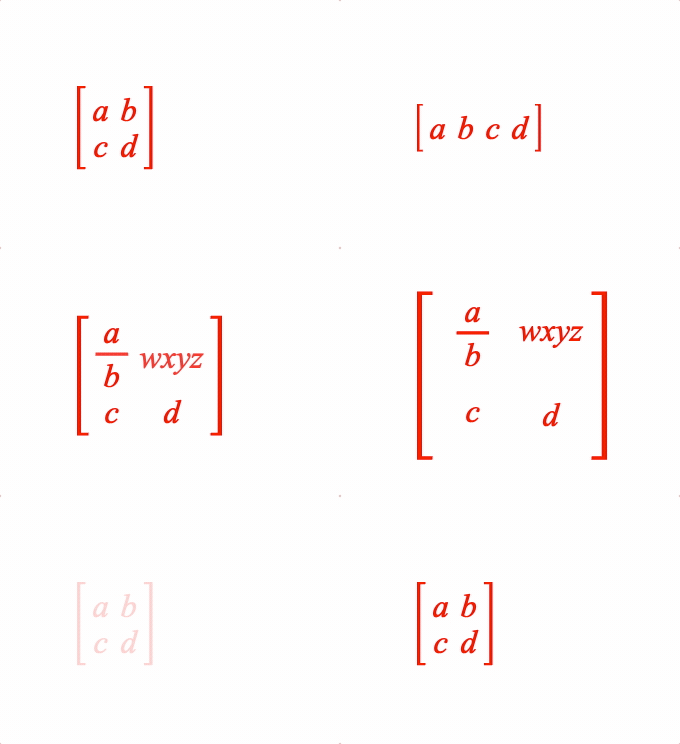
Options can be an object, or an array in the property order below
Type:
({order: [number, number]?, left: string?, content: TypeEquationPhrase, right: string?, scale: number?, fit: ("max" | "min" | TypeParsablePoint)?, space: TypeParsablePoint?, yAlign: ("baseline" | "middle")?, brac: EQN_Bracket?, fullContentBounds: boolean?} | [[number, number]?, string?, TypeEquationPhrase, string?, number?, ("max"? | "min"), TypeParsablePoint?, ("baseline"? | "middle"), EQN_Bracket?, boolean?])
(string?)
: left bracket symbol
(Array<TypeEquationPhrase>?)
: Array of equation phrases
where each element is a matrix element
(string?)
: right bracket symbol
(("max" | "min" | TypeParsablePoint)?)
: cell size -
min
each cell is a rectangle with width equal to largest width in its
column, and height equal to largest height in its row -
max
all cells are a square with dimension equal to the largest dimension of the
largest cell -
point
all cells are a rectangle with width as point.x and
height as point.y - note -
max
and
point
only work with
yAlign
=
'middle'
(
'min'
)
(("baseline" | "middle")?)
: align cells in a row with the
text baseline, or middle of the cell (
baseline
)
(boolean?)
: use full bounds of content,
overriding any
inSize=false
properties in the content (
false
)
// Simple
figure.add({
name: 'eqn',
make: 'equation',
elements: {
lb: { symbol: 'squareBracket', side: 'left' },
rb: { symbol: 'squareBracket', side: 'right' },
},
forms: {
1: { matrix: [[2, 2], 'lb', ['a', 'b', 'c', 'd'], 'rb'] },
},
});
figure.elements._eqn.showForm('1');
// Some different equation examples
figure.add({
name: 'eqn',
make: 'equation',
elements: {
lb: { symbol: 'squareBracket', side: 'left' },
rb: { symbol: 'squareBracket', side: 'right' },
v: { symbol: 'vinculum' },
},
phrases: {
f: { frac: ['a', 'v', 'b'] },
},
forms: {
// Array equation 2x2 matrix
1: { matrix: [[2, 2], 'lb', ['a', 'b', 'c', 'd'], 'rb'] },
// Object definition vector
2: {
matrix: {
content: ['a', 'b', 'c', 'd'],
left: 'lb',
right: 'rb',
order: [1, 4],
},
},
// Additional options for layout
3: {
matrix: {
content: ['f', 'wxyz', 'c', 'd'],
symbol: 'bSqr',
left: 'lb',
right: 'rb',
order: [2, 2],
},
},
// Fixed size matrix cells
4: {
matrix: {
content: ['f', 'wxyz', 'c', 'd'],
symbol: 'bSqr',
left: 'lb',
right: 'rb',
order: [2, 2],
fit: [0.2, 0.2],
yAlign: 'middle',
},
},
},
formSeries: ['1', '2', '3', '4']
});
const eqn = figure.elements._eqn;
eqn.onClick = () => eqn.nextForm();
eqn.setTouchable();
eqn.showForm('1');
EQN_Integral
Equation integral
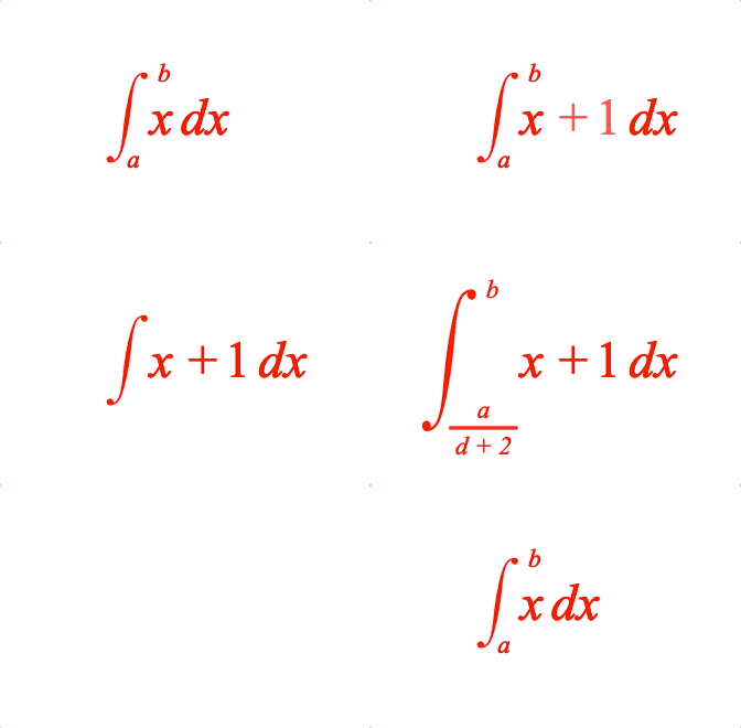
Place an integral (with optional limits) before an equation phrase
Use with a EQN_IntegralSymbol symbol.
Options can be an object, or an array in the property order below.
Type:
({symbol: string?, content: TypeEquationPhrase?, from: TypeEquationPhrase?, to: TypeEquationPhrase?, inSize: boolean?, space: number?, topSpace: number?, bottomSpace: number?, height: number?, yOffset: number?, scale: number?, fromScale: number?, toScale: number?, fromOffset: TypeParsablePoint?, toOffset: TypeParsablePoint?, limitsPosition: ("side" | "topBottom" | "topBottomCenter")?, limitsAroundContent: boolean?, fromXPosition: ("left" | "center" | "right" | number)?, fromYPosition: ("bottom" | "top" | "middle" | "baseline" | number)?, fromXAlign: ("left" | "center" | "right" | number)?, fromYAlign: ("bottom" | "top" | "middle" | "baseline" | number)?, toXPosition: ("left" | "center" | "right" | number)?, toYPosition: ("bottom" | "top" | "middle" | "baseline" | number)?, toXAlign: ("left" | "center" | "right" | number)?, toYAlign: ("bottom" | "top" | "middle" | "baseline" | number)?, fullBoundsContent: boolean?, useFullBounds: boolean?} | [string?, TypeEquationPhrase?, TypeEquationPhrase?, TypeEquationPhrase?, boolean?, number?, number?, number?, number?, number?, number?, number?, number?, TypeParsablePoint?, TypeParsablePoint?, ("side"? | "topBottom" | "topBottomCenter"), boolean?, ("left"? | "center" | "right" | number), ("bottom"? | "top" | "middle" | "baseline" | number), ("left"? | "center" | "right" | number), ("bottom"? | "top" | "middle" | "baseline" | number), ("left"? | "center" | "right" | number), ("bottom"? | "top" | "middle" | "baseline" | number), ("left"? | "center" | "right" | number), ("bottom"? | "top" | "middle" | "baseline" | number), boolean?, boolean?])
(string)
(TypeEquationPhrase)
(TypeEquationPhrase?)
: bottom limit
(TypeEquationPhrase?)
: top limit
(number?)
: force height of symbol
(TypeParsablePoint?)
: from limit offest (
side
:
[0, 0]
,
topBottom
:
[0, -0.04]
,
topBottomCenter
:
[0, -0.04]
)
(TypeParsablePoint?)
: to limit offest (
side
:
[0, 0]
topBottom
:
[0, 0.04]
,
topBottomCenter
:
[0, 0.04]
)
(("side" | "topBottom" | "topBottomCenter")?)
: limits
relative to symbol.
side
is to the right of the symbol ends,
topBottom
is above and below the symbol ends and
topBottomCenter
is above and below
the integral mid point (
'side'
)
(("left" | "center" | "right" | number)?)
: x position
of limit relative to the symbol (
side
:
0.5
,
topBottom
:
0.1
,
topBottomCenter
:
'center'
)
(("bottom" | "top" | "middle" | "baseline" | number)?)
: y position of the limit relavite to the symbol (
'bottom'
)
(("left" | "center" | "right" | number)?)
: limit x
alignment (
side
:
'left'
,
topBottom
:
center
,
topBottomCenter
:
'center'
)
(("bottom" | "top" | "middle" | "baseline" | number)?)
: limit y alignment (
side
:
'middle'
,
topBottom
:
'top'
,
topBottomCenter
:
'top'
)
(("left" | "center" | "right" | number)?)
: x position
of limit relative to the symbol (
side
:
'right'
,
topBottom
:
0.9
,
topBottomCenter
:
'center'
)
(("bottom" | "top" | "middle" | "baseline" | number)?)
: y position of the limit relavite to the symbol (
side
:
'top'
,
topBottom
:
top
,
topBottomCenter
:
'top'
)
(("left" | "center" | "right" | number)?)
: limit x
alignment (
side
:
'left'
,
topBottom
:
center
,
topBottomCenter
:
'center'
)
(("bottom" | "top" | "middle" | "baseline" | number)?)
: limit y alignment (
side
:
'middle'
,
topBottom
:
bottom
,
topBottomCenter
:
'bottom'
)
(boolean?)
: use full bounds of content,
overriding any
inSize=false
properties in the content (
false
)
(boolean?)
: make the bounds of this phrase equal to
the full bounds of the content even if
fullContentBounds=false
and the
brackets only surround a portion of the content (
false
)
// Simple
figure.add({
name: 'eqn',
make: 'equation',
forms: {
1: { int: ['int', 'x dx', 'a', 'b'] },
},
});
figure.elements._eqn.showForm('1');
// Example showing different integral options
figure.add({
name: 'eqn',
make: 'equation',
elements: {
i: { symbol: 'int' },
// ic: { symbol: 'int', num: 1, type: 'line' },
},
formDefaults: { alignment: { fixTo: 'x' } },
forms: {
// Root object form
1: {
int: {
symbol: 'i',
content: ['x', ' ', 'dx'],
from: 'a',
to: 'b',
},
},
// Root array form
2: { int: ['i', ['x', ' ', '+', ' ', '_1', ' ', 'dx'], 'a', 'b'] },
// Indefinite tripple integral
3: { int: ['i', ['x', ' ', '+', ' ', '_1', ' ', 'dx']] },
// Custom spacing
4: {
int: {
symbol: 'i',
content: ['x', ' ', '+', ' ', '_1', ' ', 'dx'],
to: 'b',
from: { frac: ['a', 'vinculum', 'd + 2'] },
topSpace: 0.2,
bottomSpace: 0.2,
limitsAroundContent: false,
},
},
},
formSeries: ['1', '2', '3', '4'],
});
const eqn = figure.elements._eqn;
eqn.onClick = () => eqn.nextForm();
eqn.setTouchable();
eqn.showForm('1');
EQN_SumOf
Equation sum of
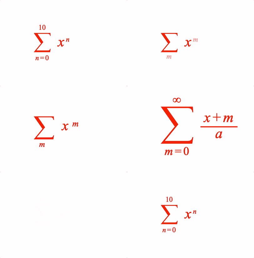
Place an equation phrase in a sum of operation with the symbol EQN_SumSymbol.
Options can be an object, or an array in the property order below
Type: ({symbol: string?, content: TypeEquationPhrase, from: TypeEquationPhrase?, to: TypeEquationPhrase?, inSize: boolean?, space: number?, topSpace: number?, bottomSpace: number?, height: number?, yOffset: number?, scale: number?, fromScale: number?, toScale: number?, fromSpace: number?, toSpace: number?, fromOffset: TypeParsablePoint?, toOffset: TypeParsablePoint?, fullBoundsContent: boolean?, useFullBounds: boolean?} | [string?, TypeEquationPhrase, TypeEquationPhrase?, TypeEquationPhrase?, boolean?, number?, number?, number?, number?, number?, number?, number?, number?, number?, number?, (TypeParsablePoint? | null), (TypeParsablePoint? | null), boolean?, boolean?])
(string)
(TypeEquationPhrase)
(TypeEquationPhrase?)
(TypeEquationPhrase?)
(boolean?)
: use full bounds of content,
overriding any
inSize=false
properties in the content (
false
)
(boolean?)
: make the bounds of this phrase equal to
the full bounds of the content even if
fullContentBounds=false
and the
brackets only surround a portion of the content (
false
)
// Simple
figure.add({
name: 'eqn',
make: 'equation',
forms: {
1: { sumOf: ['sum', 'x', 'b', 'a'] },
},
});
figure.elements._eqn.showForm('1');
// Example showing different options
figure.add({
name: 'eqn',
make: 'equation',
elements: {
s: { symbol: 'sum', draw: 'dynamic' },
inf: '\u221e',
},
forms: {
// Object form
1: {
sumOf: {
symbol: 's',
content: [{ sup: ['x', 'n'] }],
from: ['n_1', ' ', '=', ' ', '_0'],
to: '_10',
},
},
// Array form
2: { sumOf: ['s', [{ sup: ['x', 'm'] }], 'm_1', null]},
// Styling with options
3: {
sumOf: {
symbol: 's',
content: { frac: [['x', ' ', '+', ' ', 'm'], 'vinculum', 'a'] },
from: ['m_1', ' ', '=', ' ', '_0'],
to: 'inf',
fromScale: 0.8,
toScale: 0.8,
},
},
},
formSeries: ['1', '2', '3'],
});
const eqn = figure.elements._eqn;
eqn.onClick = () => eqn.nextForm();
eqn.setTouchable();
eqn.showForm('1');
EQN_ProdOf
Place an equation phrase in a product of operation with the symbol EQN_ProdSymbol.
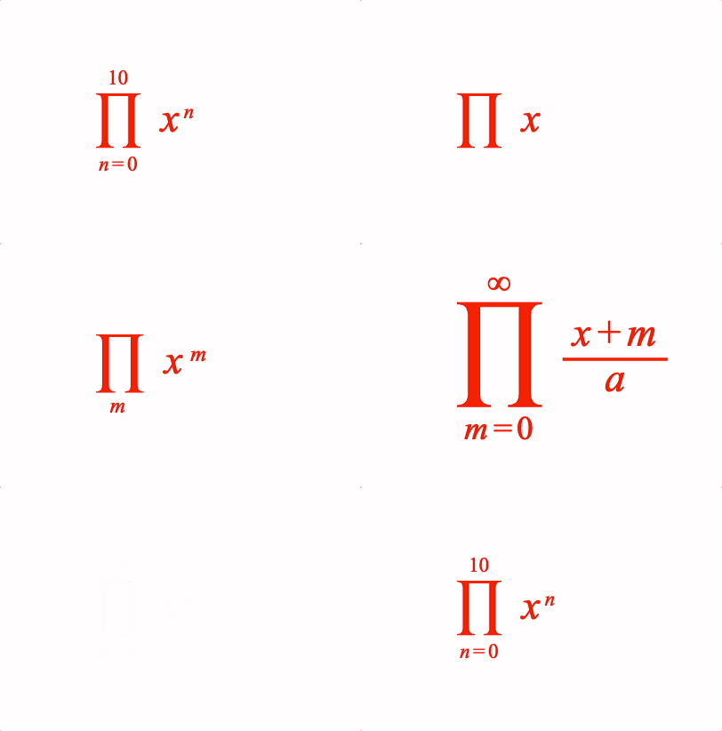
Place an equation phrase in a product of operation
Options can be an object, or an array in the property order below
Type: ({symbol: string?, content: TypeEquationPhrase, from: TypeEquationPhrase?, to: TypeEquationPhrase?, inSize: boolean?, space: number?, topSpace: number?, bottomSpace: number?, height: number?, yOffset: number?, scale: number?, fromScale: number?, toScale: number?, fromSpace: number?, toSpace: number?, fromOffset: TypeParsablePoint?, toOffset: TypeParsablePoint?, fullBoundsContent: boolean?, useFullBounds: boolean?} | [string?, TypeEquationPhrase, TypeEquationPhrase?, TypeEquationPhrase?, boolean?, number?, number?, number?, number?, number?, number?, number?, number?, number?, number?, (TypeParsablePoint? | null), (TypeParsablePoint? | null), boolean?, boolean?])
(string)
(TypeEquationPhrase)
(TypeEquationPhrase?)
(TypeEquationPhrase?)
(boolean?)
: use full bounds of content,
overriding any
inSize=false
properties in the content (
false
)
(boolean?)
: make the bounds of this phrase equal to
the full bounds of the content even if
fullContentBounds=false
and the
brackets only surround a portion of the content (
false
)
// Simple
figure.add({
name: 'eqn',
make: 'equation',
forms: {
1: { prodOf: ['prod', 'x', 'b', 'a'] },
},
});
figure.elements._eqn.showForm('1');
// Example showing different options
figure.add({
name: 'eqn',
make: 'equation',
elements: {
p: { symbol: 'prod', draw: 'dynamic' },
inf: '\u221e',
},
forms: {
// Object form
1: {
prodOf: {
symbol: 'p',
content: [{ sup: ['x', 'n'] }],
from: ['n_1', ' ', '=', ' ', '_0'],
to: '_10',
},
},
// Array form
2: { prodOf: ['p', [{ sup: ['x', 'm'] }], 'm_1', null]},
// Styling with options
3: {
prodOf: {
symbol: 'p',
content: { frac: [['x', ' ', '+', ' ', 'm'], 'vinculum', 'a'] },
from: ['m_1', ' ', '=', ' ', '_0'],
to: 'inf',
fromScale: 0.8,
toScale: 0.8,
},
},
},
formSeries: ['1', '2', '3'],
});
const eqn = figure.elements._eqn;
eqn.onClick = () => eqn.nextForm();
eqn.setTouchable();
eqn.showForm('1');
EQN_Bar
Equation bar
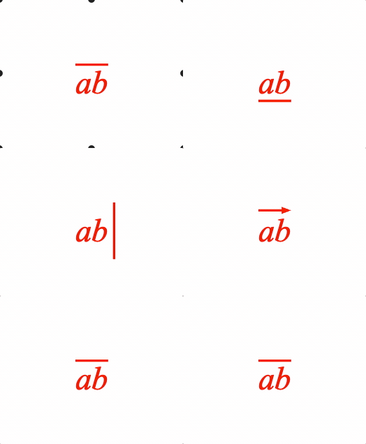
Place a bar (or bracket) symbol to the side of an equation phrase.
Symbols that can be used with bar are:
- EQN_BarSymbol
- EQN_ArrowSymbol
- EQN_BraceSymbol
- EQN_BracketSymbol
- EQN_SquareBracketSymbol
- EQN_AngleBracketSymbol
Options can be an object, or an array in the property order below
Type:
({content: TypeEquationPhrase, symbol: string?, inSize: boolean?, space: number?, overhang: number?, length: number?, left: number?, right: number?, top: number?, bottom: number?, side: ("left" | "right" | "top" | "bottom")?, minContentHeight: number?, minContentDescent: number?, minContentAscent: number?, descent: number?, fullContentBounds: boolean?, useFullBounds: boolean?} | [TypeEquationPhrase, string?, boolean?, number?, number?, number?, number?, number?, number?, number?, ("left"? | "right" | "top" | "bottom"), number?, number?, number?, number?, boolean?, boolean?])
(TypeEquationPhrase)
(string)
(number?)
: amount symbol extends beyond content to the left
(overrides
overhang
and
length
, and only for side
'top'
or
'bottom'
)
(number?)
: amount symbol extends beyond content to the right
(overrides
overhang
and
length
, and only for side
'top'
or
'bottom'
)
(number?)
: amount symbol extends beyond content to the top
(overrides
overhang
and
length
, and only for side
'left'
or
'right'
)
(number?)
: amount symbol extends beyond content to the
bottom (overrides
overhang
and
length
, and only for side
'left'
or
'right'
)
(("left" | "right" | "top" | "bottom")?)
: (
top
)
(number?)
: custom min content height for auto
symbol sizing when side is
'top'
or
'bottom'
(number?)
: custom min content descent for auto
symbol sizing when side is
'top'
or
'bottom'
(number?)
: custom min content ascent for auto
symbol sizing when side is
'top'
or
'bottom'
(number?)
: force descent of symbol when side is
'top'
or
'bottom'
- height is forced with
length
property
(boolean?)
: use full bounds of content,
overriding any
inSize=false
properties in the content (
false
)
(boolean?)
: make the bounds of this phrase equal to
the full bounds of the content even if
fullContentBounds=false
and the
brackets only surround a portion of the content (
false
)
// Simple
figure.add({
name: 'eqn',
make: 'equation',
elements: {
bar: { symbol: 'bar', side: 'top' },
},
forms: {
1: { bar: ['a', 'bar', 'top'] },
},
});
figure.elements._eqn.showForm('1');
// Some different bar examples
figure.add({
name: 'eqn',
make: 'equation',
elements: {
hBar: { symbol: 'bar', side: 'top' },
vBar: { symbol: 'bar', side: 'right' },
hArrow: { symbol: 'arrow', direction: 'right' },
},
forms: {
// Array equation
1: { bar: [['a', 'b'], 'hBar', 'top'] },
// Object definition
2: {
bar: {
content: ['a', 'b'],
symbol: 'hBar',
side: 'bottom',
},
},
// Additional options for layout
3: {
bar: {
content: ['a', 'b'],
symbol: 'vBar',
side: 'right',
overhang: 0.1,
},
},
// Vector arrow
4: {
bar: {
content: ['a', 'b'],
symbol: 'hArrow',
side: 'top',
},
},
},
formSeries: ['1', '2', '3', '4']
});
const eqn = figure.elements._eqn;
eqn.onClick = () => eqn.nextForm();
eqn.setTouchable();
eqn.showForm('1');
EQN_Bracket
Equation bracket
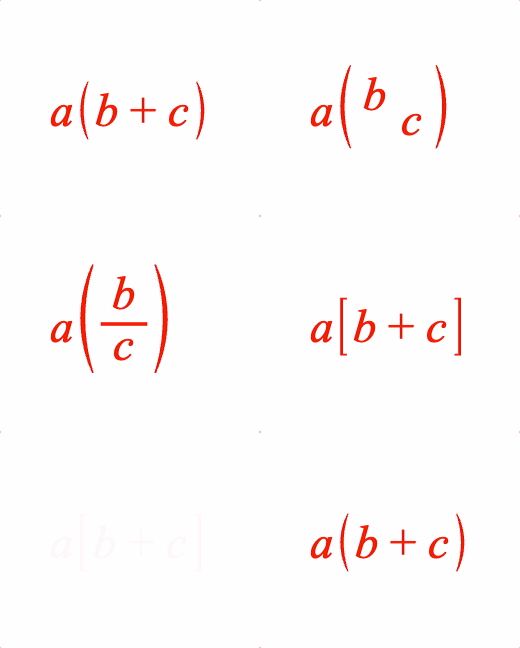
Surround an equation phrase with brackets.
Symbols that can be used with bracket are:
- EQN_BarSymbol
- EQN_ArrowSymbol
- EQN_BraceSymbol
- EQN_BracketSymbol
- EQN_SquareBracketSymbol
- EQN_AngleBracketSymbol
Options can be an object, or an array in the property order below
Type: ({left: string?, content: TypeEquationPhrase, right: string?, inSize: boolean?, insideSpace: number?, outsideSpace: number?, topSpace: number?, bottomSpace: number?, minContentHeight: number?, minContentDescent: number?, height: number?, descent: number?, fullContentBounds: boolean?, useFullBounds: boolean?} | [string, TypeEquationPhrase, string?, boolean?, number?, number?, number?, number?, number?, number?, number?, boolean?, boolean?])
(string?)
: left bracket symbol
(TypeEquationPhrase?)
(string?)
: right bracket symbol
(number?)
: if content height is less than this,
then this number will be used when sizing the brackets (unless it is
null
)
(
null
)
(number?)
: if content descent is less than this,
then this number will be used when sizing the brackets (unless it is
null
)
(
null
)
(boolean?)
: use full bounds of content,
overriding any
inSize=false
properties in the content (
false
)
(boolean?)
: make the bounds of this phrase equal to
the full bounds of the content even if
fullContentBounds=false
and the
brackets only surround a portion of the content (
false
)
// Simple
figure.add({
make: 'equation',
elements: {
lb: { symbol: 'bracket', side: 'left' },
rb: { symbol: 'bracket', side: 'right' },
},
forms: {
1: ['a', { brac: ['lb', ['b', '_ + ', 'c'], 'rb'] }],
},
});
// Some different bracket examples
figure.add({
name: 'eqn',
make: 'equation',
elements: {
lb: { symbol: 'bracket', side: 'left' },
rb: { symbol: 'bracket', side: 'right' },
lsb: { symbol: 'squareBracket', side: 'left' },
rsb: { symbol: 'squareBracket', side: 'right' },
leftBrace: { }
},
forms: {
// Array definition
1: ['a', { brac: ['lb', ['b', '_ + ', 'c'], 'rb'] }],
// Object definition
2: ['a', {
brac: {
left: 'lb',
content: { frac: ['b', 'vinculum', 'c'] },
right: 'rb',
},
}],
// Square brackets
3: ['a', { brac: ['lsb', ['b', '_ + ', 'c'], 'rsb'] }],
},
formSeries: ['1', '2', '3']
});
const eqn = figure.elements._eqn;
eqn.onClick = () => eqn.nextForm();
eqn.setTouchable();
EQN_Lines
Equation lines.
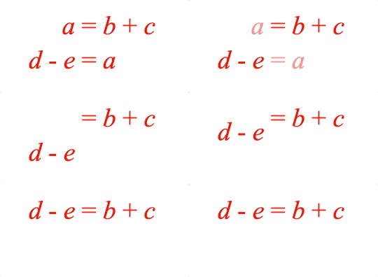
Options can be an object, or an array in the property order below
The equation lines function can split an equation into multiple lines. This might be because one line is too long, or it might be convenient to display different forms of the same equation simultaneously on different lines and then animate between them.
Lines can be justified to the left, center or right, or lines can be aligned
with a specific element from each line (for instance an equals sign). To
justify to a specific element, use justify: 'element' and then define the
element name in the justify property of each line.
Lines can be aligned in y with either the top most part of the top line, the bottom most part of the bottom line, the middle of the lines or any of the line's baselines.
Spacing between lines is defined as either the space between the lowest point (descent) of one line to the highest point (ascent) of the next, or as the space between line baselines.
Type:
{content: Array<(TypeEquationPhrase | EQN_Line)>, justify: ("left" | "right" | "center" | "element")?, baselineSpace: (null | number)?, space: number?, yAlign: ("bottom" | "top" | "middle" | number)?, fullContentBounds: boolean?}
(Array<(EQN_Line | TypeEquationPhrase)>)
: Array of equation
phrases or equation line objects
(("left" | "center" | "right" | "element")?)
: how to align
the lines in x. Use 'element' to align the lines with a specific element
from each line (that is defined with the
justify
property in each line)
(
'left'
)
((number | null)?)
: default space between baselines
of lines. If not
null
then will override
space
(
null
).
(("bottom" | "middle" | "top" | number)?)
: How to align the
lines in y.
number
can be any line index, and it will align the baseline
of that line. So, using
0
will align the first line's baseline. (
0
)
(boolean?)
: use full bounds of content,
overriding any
inSize=false
properties in the content (
false
)
// Two lines, array definition
figure.add({
name: 'eqn',
make: 'equation',
forms: {
0: {
lines: [
[
['a', '_ = ', 'b', '_ + _1', 'c', '_ - _1', 'd'],
['_ + _2', 'e', '_ - _2', 'f'],
],
'right',
0.2,
],
},
},
});
// Two lines animating to 1
figure.add({
name: 'eqn',
make: 'equation',
elements: {
equals1: ' = ',
equals2: ' = ',
},
forms: {
0: {
lines: {
content: [
{
content: ['a_1', 'equals1', 'b', '_ + ', 'c'],
justify: 'equals1',
},
{
content: ['d', '_ - ', 'e', 'equals2', 'a_2'],
justify: 'equals2',
},
],
space: 0.08,
justify: 'element',
},
},
1: ['d', '_ - ', 'e', 'equals1', 'b', '_ + ', 'c'],
},
});
figure.getElement('eqn').showForm(0);
figure.getElement('eqn').animations.new()
.goToForm({
delay: 1, target: '1', duration: 1, animate: 'move',
})
.start();
EQN_Box
Equation box
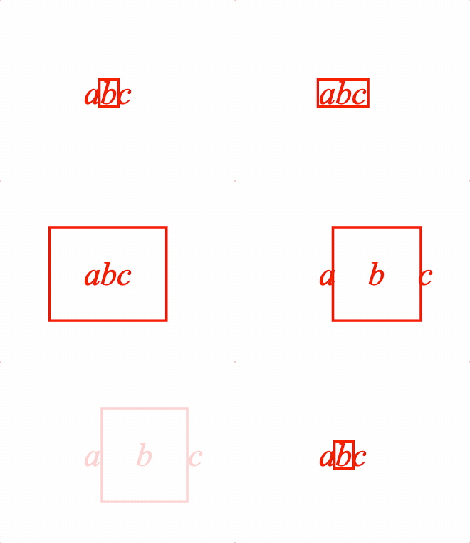
Place a EQN_BoxSymbol around an equation phrase
Options can be an object, or an array in the property order below
Type: ({content: TypeEquationPhrase, symbol: string, inSize: boolean?, space: number?, topSpace: number?, rightSpace: number?, bottomSpace: number?, leftSpace: number?, fullContentBounds: boolean?, useFullBounds: boolean?} | [TypeEquationPhrase, string, boolean?, number?, number?, number?, number?, number?, boolean?, boolean?])
(TypeEquationPhrase)
(string)
(number?)
: space between box symbol and content on
the left, right, bottom and top sides (
0
)
(number?)
: use when top space between content and
box should be different thant
space
property (
space
)
(number?)
: use when right space between content and
box should be different thant
space
property (
space
)
(number?)
: use when bottom space between content and
box should be different thant
space
property (
space
)
(number?)
: use when left space between content and
box should be different thant
space
property (
space
)
(boolean?)
: use full bounds of content,
overriding any
inSize=false
properties in the content (
false
)
(boolean?)
: make the bounds of this phrase equal to
the full bounds of the content even if
fullContentBounds=false
and the
brackets only surround a portion of the content (
false
)
// Simple
figure.add({
name: 'eqn',
make: 'equation',
forms: {
1: { box: ['a', 'box', true, 0.1] },
},
});
figure.elements._eqn.showForm('1');
// Some different box examples
figure.add({
name: 'eqn',
make: 'equation',
elements: {
box: { symbol: 'box' },
},
forms: {
// Array equation
1: ['a', { box: ['b', 'box'] }, 'c'],
// Object definition
2: {
box: {
content: ['a', 'b', 'c'],
symbol: 'box',
},
},
// Additional options for layout
3: {
box: {
content: ['a', 'b', 'c'],
symbol: 'box',
space: 0.2,
},
},
// Box is included in the layout spacing
4: [
'a',
{
box: {
content: 'b',
symbol: 'box',
space: 0.2,
inSize: true,
},
},
'c'
],
},
formSeries: ['1', '2', '3', '4']
});
const eqn = figure.elements._eqn;
eqn.onClick = () => eqn.nextForm();
eqn.setTouchable();
eqn.showForm('1');
EQN_Strike
Equation strike-through
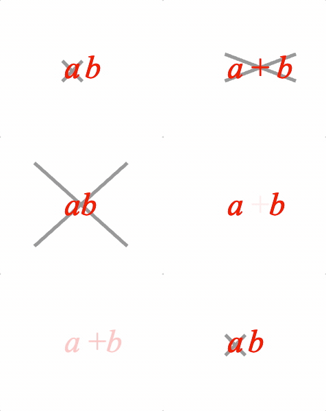
Overlay a strike symbol on an equation phrase.
Use with EQN_Strike symbol.
Options can be an object, or an array in the property order below
Type: ({content: TypeEquationPhrase, symbol: string, inSize: boolean?, space: number?, topSpace: number?, rightSpace: number?, bottomSpace: number?, leftSpace: number?, fullContentBounds: boolean?, useFullBounds: boolean?} | [TypeEquationPhrase, string, boolean?, number?, number?, number?, number?, number?, boolean?, boolean?])
(TypeEquationPhrase)
(string)
(number?)
: amount the strike symbol overhangs the content on
the left, right, bottom and top sides (
0.02
)
(number?)
: use when top overhang between content and
strike should be different thant
space
property (
space
)
(number?)
: use when right overhang between content and
strike should be different thant
space
property (
space
)
(number?)
: use when bottom overhang between content and
strike should be different thant
space
property (
space
)
(number?)
: use when left overhang between content and
strike should be different thant
space
property (
space
)
(boolean?)
: use full bounds of content,
overriding any
inSize=false
properties in the content (
false
)
(boolean?)
: make the bounds of this phrase equal to
the full bounds of the content even if
fullContentBounds=false
and the
brackets only surround a portion of the content (
false
)
// Simple
figure.add({
name: 'eqn',
make: 'equation',
elements: {
x: { symbol: 'strike', color: [0.6, 0.6, 0.6, 1] },
},
forms: {
1: [{ strike: ['a', 'x']}, ' ', 'b'],
},
});
figure.elements._eqn.showForm('1');
// Some different strike examples
figure.add({
name: 'eqn',
make: 'equation',
elements: {
s1: { symbol: 'strike', color: [0.6, 0.6, 0.6, 1] },
s2: { symbol: 'strike', style: 'forward', color: [0.6, 0.6, 0.6, 1] },
},
forms: {
// Array definition
1: [{ strike: ['a', 's1']}, ' ', 'b'],
// Object definition
2: {
strike: {
content: ['a', '_ + ', 'b'],
symbol: 's1',
},
},
// Additional options to make strike overhang more
3: {
strike: {
content: ['a', 'b'],
symbol: 's1',
topSpace: 0.2,
rightSpace: 0.2,
leftSpace: 0.2,
bottomSpace: 0.2,
},
},
// Forward strike
4: { strike: [['a', '_ +', 'b'], 's2'] },
},
formSeries: ['1', '2', '3', '4']
});
const eqn = figure.elements._eqn;
eqn.onClick = () => eqn.nextForm();
eqn.setTouchable();
eqn.showForm('1');
EQN_StrikeComment
Equation strike with comment options used with topStrike and bottomStrike
functions.
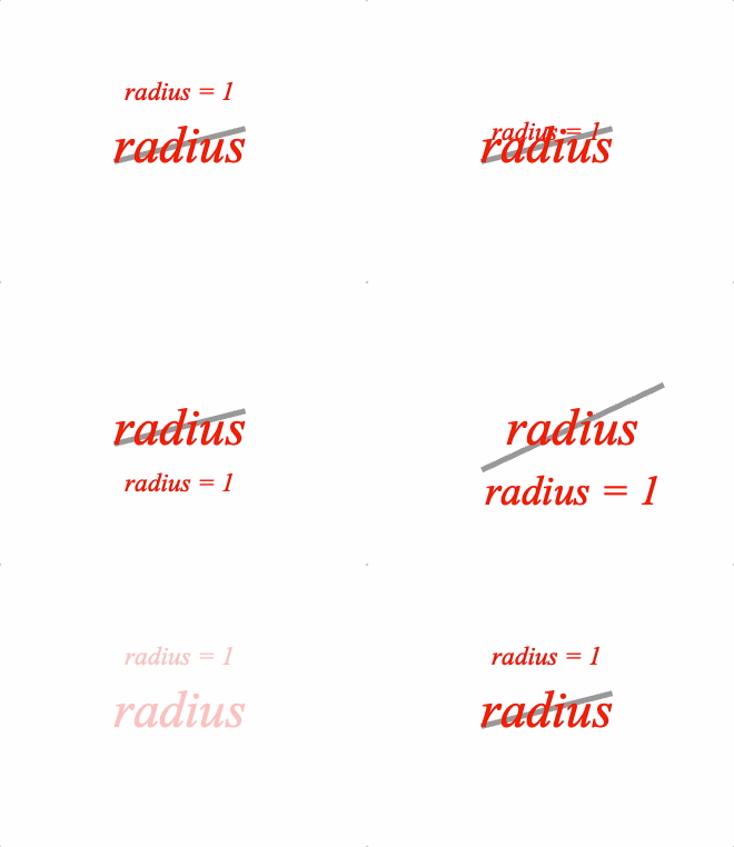
Use with EQN_Strike symbol.
Options can be an object, or an array in the property order below
Type: ({content: TypeEquationPhrase?, symbol: string?, comment: TypeEquationPhrase?, inSize: boolean?, space: number?, scale: number?, commentSpace: number?} | [TypeEquationPhrase?, string?, TypeEquationPhrase?, boolean?, number?, number?, number?])
(TypeEquationPhrase)
(string)
: strike symbol
(TypeEquationPhrase)
(boolean?)
: false
excludes the symbol and comment from
thre resulting size of the equation phrase (
true
)
// Simple
figure.add({
name: 'eqn',
make: 'equation',
elements: {
x: { symbol: 'strike', color: [0.6, 0.6, 0.6, 1] },
},
forms: {
1: { topStrike: ['radius', 'x', 'radius = 1'] },
},
});
figure.elements._eqn.showForm('1');
// Some different strike examples
figure.add({
name: 'eqn',
make: 'equation',
elements: {
s1: { symbol: 'strike', style: 'forward', color: [0.6, 0.6, 0.6, 1] },
},
forms: {
// Array equation
1: { topStrike: ['radius', 's1', 'radius = 1'] },
// Object definition
2: {
bottomStrike: {
content: 'radius',
symbol: 's1',
comment: 'radius = 1',
},
},
// Additional options for layout
3: {
bottomStrike: {
content: 'radius',
comment: 'radius = 1',
symbol: 's1',
scale: 0.8,
space: 0.1,
commentSpace: 0.01,
},
},
},
formSeries: ['1', '2', '3']
});
const eqn = figure.elements._eqn;
eqn.onClick = () => eqn.nextForm();
eqn.setTouchable();
eqn.showForm('1');
EQN_Comment
Equation comment options used with topComment and bottomComment
functions.
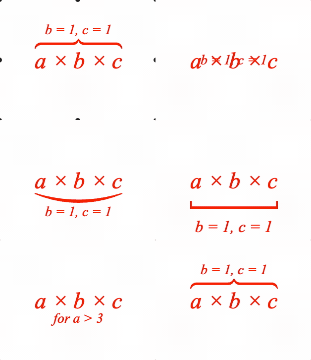
A symbol between the content and comment is optional.
Options can be an object, or an array in the property order below
Type: ({content: TypeEquationPhrase, comment: TypeEquationPhrase, symbol: string?, contentSpace: number?, commentSpace: number?, contentLineSpace: number?, commentLineSpace: number?, scale: number?, inSize: boolean?, fullContentBounds: boolean?, useFullBounds: boolean?} | [TypeEquationPhrase, TypeEquationPhrase, string, number?, number?, number?, boolean?, boolean?, boolean?])
(TypeEquationPhrase)
(TypeEquationPhrase)
(string?)
: optional symbol between content and comment
(boolean?)
: false
excludes the symbol and comment from
thre resulting size of the equation phrase (
true
)
(boolean?)
: use full bounds of content,
overriding any
inSize=false
properties in the content (
false
)
(boolean?)
: make the bounds of this phrase equal to
the full bounds of the content even if
fullContentBounds=false
and the
brackets only surround a portion of the content (
false
)
// Simple
figure.add({
name: 'eqn',
make: 'equation',
forms: {
1: { topComment: ['radius', 'r = 1'] },
},
});
figure.elements._eqn.showForm('1');
// Some different comment examples
figure.add({
name: 'eqn',
make: 'equation',
elements: {
bBkt: { symbol: 'bracket', side: 'bottom' },
tBrc: { symbol: 'brace', side: 'top' },
bSqr: { symbol: 'squareBracket', side: 'bottom' },
},
forms: {
// Array equation
1: { topComment: ['a \u00d7 b \u00d7 c', 'b = 1, c = 1', 'tBrc'] },
// Object definition
2: {
bottomComment: {
content: 'a \u00d7 b \u00d7 c',
symbol: 'bBkt',
comment: 'b = 1, c = 1',
},
},
// Additional options for layout
3: {
bottomComment: {
content: 'a \u00d7 b \u00d7 c',
symbol: 'bSqr',
comment: 'b = 1, c = 1',
contentSpace: 0.1,
commentSpace: 0.1,
scale: 0.7,
},
},
// Just comment
4: {
bottomComment: {
content: 'a \u00d7 b \u00d7 c',
comment: 'for a > 3',
},
},
},
formSeries: ['1', '2', '3', '4']
});
const eqn = figure.elements._eqn;
eqn.onClick = () => eqn.nextForm();
eqn.setTouchable();
eqn.showForm('1');
EQN_Pad
Equation padding options.

Pads the size of the equation phrase with space.
Options can be an object, or an array in the property order below
Type: ({content: TypeEquationPhrase, top: number?, right: number?, bottom: number?, left: number?} | [TypeEquationPhrase, number?, number?, number?, number?])
(TypeEquationPhrase)
// Simple
figure.add({
name: 'eqn',
make: 'equation',
forms: {
1: ['a', { pad: ['b', 0.1, 0.1, 0.1, 0.1] }, 'c'],
},
});
figure.elements._eqn.showForm('1');
// Some different padding examples
figure.add({
name: 'eqn',
make: 'equation',
forms: {
// No padding
1: ['a', 'b', 'c'],
// Array form
2: ['a', { pad: ['b', 0.1, 0.1, 0.1, 0.1] }, 'c'],
// Object form
3: [
'a',
{
pad: {
content: 'b',
left: 0.3,
right: 0.1,
},
},
'c',
],
},
formSeries: ['1', '2', '3'],
});
const eqn = figure.elements._eqn;
eqn.onClick = () => eqn.nextForm();
eqn.setTouchable();
eqn.showForm('1');
EQN_Scale
Equation scale

Scale an equation phrase
Options can be an object, or an array in the property order below
Type: ({content: TypeEquationPhrase, scale: number?, fullContentBounds: boolean?} | [TypeEquationPhrase, number?, boolean?])
(TypeEquationPhrase)
// Simple
figure.add({
name: 'eqn',
make: 'equation',
forms: {
2: ['a', { scale: ['b', 2] }, 'c'],
},
});
figure.elements._eqn.showForm('1');
// Some different bracket examples
figure.add({
name: 'eqn',
make: 'equation',
forms: {
// Default
1: ['a', 'b', 'c'],
// Array definition magnify
2: ['a', { scale: ['b', 2] }, 'c'],
// Object definition shrink
3: [
'a',
{
scale: {
content: ['b', 1],
scale: 0.5,
},
},
'c',
],
// Back to start
4: ['a', { scale: ['b', 1] }, 'c'],
},
formSeries: ['1', '2', '3']
});
const eqn = figure.elements._eqn;
eqn.onClick = () => eqn.nextForm();
eqn.setTouchable();
eqn.showForm('1');
EQN_Container
Equation container options

A container is useful to fix spacing around content as it changes between equation forms.
Options can be an object, or an array in the property order below
Type:
({content: TypeEquationPhrase, width: number?, inSize: boolean?, descent: number?, ascent: number?, xAlign: ("left" | "center" | "right" | number)?, yAlign: ("bottom" | "middle" | "top" | "baseline" | number)?, fit: ("width" | "height" | "contain")?, scale: number?, fullContentBounds: boolean?, showContent: boolean?} | [TypeEquationPhrase, number?, boolean?, number?, number?, ("left"? | "center" | "right" | number), ("bottom"? | "middle" | "top" | "baseline" | number), ("width"? | "height" | "contain"), number?, boolean?, boolean?])
(TypeEquationPhrase)
(boolean?)
: (`true)
(("width" | "height" | "contain")?)
: fit width,
ascent and descent to either match width, height or fully contain the content (
null
)
(boolean?)
: if
false
, a container will be created
around the content, but the content will not be shown (
true
)
// Example showing the difference between with and without container
figure.add({
name: 'eqn',
make: 'equation',
forms: {
// Container object definition
1: [
'length',
{
container: {
content: 'width',
width: 0.5,
},
},
'height',
],
// Container array definition
2: ['length', { container: ['w', 0.5] }, 'height'],
// No container
3: ['length', ' ', 'w', ' ', 'height']
},
formSeries: ['1', '2', '3'],
});
const eqn = figure.elements._eqn;
eqn.onClick = () => eqn.nextForm();
eqn.setTouchable();
eqn.showForm('1');
// Create equation object then add to figure
const eqn = figure.collections.equation({
forms: {
1: [
'length',
{ container: { content: 'width', width: 0.5 } },
'height',
],
2: ['length', { container: ['w', 0.5] }, 'height'],
3: ['length', ' ', 'w', ' ', 'height']
},
formSeries: ['1', '2', '3'],
});
figure.add('eqn', eqn);
eqn.onClick = () => eqn.nextForm();
eqn.setTouchable();
eqn.showForm('1');
EQN_TouchBox
Equation touch box
Place a box symbol around an equation phrase
Options can be an object, or an array in the property order below
Type: ({content: TypeEquationPhrase, symbol: string, space: number?, topSpace: number?, rightSpace: number?, bottomSpace: number?, leftSpace: number?} | [TypeEquationPhrase, string, number?, number?, number?, number?, number?])
(TypeEquationPhrase)
(string)
(number?)
: space between box symbol and content on
the left, right, bottom and top sides (
0
)
(number?)
: use when top space between content and
box should be different thant
space
property (
space
)
(number?)
: use when right space between content and
box should be different thant
space
property (
space
)
(number?)
: use when bottom space between content and
box should be different thant
space
property (
space
)
(number?)
: use when left space between content and
box should be different thant
space
property (
space
)
EQN_Offset
Equation offset options

Offset a phrase from the position it would normally be. An offest phrase will not contribute to layout of subsequent equation elements and phrases.
Options can be an object, or an array in the property order below
Type: ({content: TypeEquationPhrase, offset: TypeParsablePoint?, inSize: boolean?, fullContentBounds: boolean?} | [TypeEquationPhrase, TypeParsablePoint?, boolean?, boolean?])
(TypeEquationPhrase)
figure.add([
{
name: 'rect1',
make: 'equation',
forms: {
0: [
'a', '_ = ', 'n',
{ offset: ['for a > 0', [0.3, 0]] },
],
},
},
]);
EQN_Color
Equation color
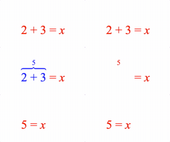
Color an equation phrase.
Options can be an object, or an array in the property order below
Type: ({content: TypeEquationPhrase, color: TypeColor, fullContentBounds: boolean?} | [TypeEquationPhrase, TypeColor, boolean?])
(TypeEquationPhrase)
(TypeColor)
// Simple Array Definition
figure.add({
make: 'equation',
forms: {
0: ['a', { color: ['b', [0, 0, 1, 1]] }, 'c'],
},
});
// Simple Object Definition
figure.add({
make: 'equation',
forms: {
0: [
'a',
{
color: {
content: 'b',
color: [0, 0, 1, 1],
},
},
'c',
],
},
});
figure.add({
make: 'equation',
elements: {
equals: ' = ',
plus: ' + ',
brace: { symbol: 'brace', side: 'top' },
},
forms: {
0: ['2', 'plus', '3', 'equals', 'x'],
1: [
{
color: {
content: { topComment: [['2', 'plus', '3'], '5', 'brace'] },
color: [0, 0, 1, 1],
},
},
'equals', 'x',
],
2: ['5', 'equals', 'x'],
},
touch: { onClick: e => e.nextForm() },
});
EQN_Annotate
Equation annotation
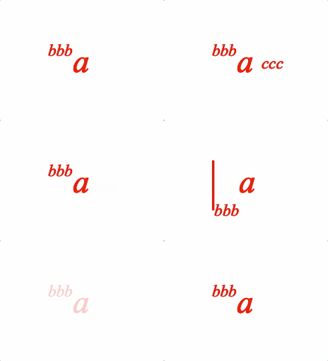
An annotation is an equation phrase ('annotation') which is laid out relative to another equation phrase ('content'). For example:
AAAA
AAAA
CCCCCCCC
CCCCCCCC
CCCCCCCC
CCCCCCCC
The options for defining how to annotate one equation phrase with another is EQN_Annotation
Content can also be annotated with a glyph (that itself may also be annotated). The glyph can either encompass the content, or can be to the top, bottom, left or right of the content
Top Glyph
GGGGGGGGGGGGGGGGGGGGGGG
GGGGGGGGGGGGGGGGGGGGGGG Encompassing Glyph
/
/
GGG GGGGGGGGGGGGGGGGGGGGGGG GGG
GGG GGG GGG GGG
GGG GGG CCCCCCC GGG GGG
Left GGG GGG CCCCCCC GGG GGG Right
Glyph GGG GGG CCCCCCC GGG GGG Glyph
GGG GGG GGG GGG
GGG GGGGGGGGGGGGGGGGGGGGGGG GGG
GGGGGGGGGGGGGGGGGGGGGGG
GGGGGGGGGGGGGGGGGGGGGGG
Bottom Glyph
This function is used internally by almost all equation functions (except for fraction) for their layout. As such, it is very generic and powerful. It should also almost never neeed to be used as most layouts can be achieved with a different functions that will have more succinct code that is more readable.
This is provided so all layout corner cases not covered by the functions above are possible - including with custom glyphs.
Options can only be an object.
Type: {content: TypeEquationPhrase, annotation: EQN_Annotation?, annotations: Array<EQN_Annotation>?, fullContentBounds: boolean?, useFullBounds: boolean?, glyphs: EQN_Glyphs?, inSize: boolean?, space: number?, topSpace: number?, bottomSpace: number?, leftSpace: number?, rightSpace: number?, contentScale: number?}
(TypeEquationPhrase)
(EQN_Annotation?)
: use for just one annotation
(Array<EQN_Annotation>?)
: use for multiple annotations
(number?)
: extend resulting equation phrase size by space on
top, right, bottom and left sides (
0
)
(number?)
: extend resulting equation phrase size by space
on top
(number?)
: extend resulting equation phrase size by
space on bottom
(number?)
: extend resulting equation phrase size by space
on left
(number?)
: extend resulting equation phrase size by
space on right
(EQN_Glyphs?)
: glyphs to annotate content with
(boolean?)
: use full bounds of content,
overriding any
inSize=false
properties in the content (
false
)
(boolean?)
: make the bounds of this phrase equal to
the full bounds of the content even if
fullContentBounds=false
and the
brackets only surround a portion of the content (
false
)
// Some different annotation examples
figure.add({
name: 'eqn',
make: 'equation',
elements: {
bar: { symbol: 'bar', side: 'right' },
},
forms: {
// Single annotation
1: {
annotate: {
content: 'a',
annotation: {
content: 'bbb',
yPosition: 'top',
yAlign: 'bottom',
xPosition: 'left',
xAlign: 'right',
scale: 0.5,
},
},
},
// Multiple annotations
2: {
annotate: {
content: 'a',
annotations: [
{
content: 'bbb',
yPosition: 'top',
yAlign: 'bottom',
xPosition: 'left',
xAlign: 'right',
scale: 0.5,
},
{
content: 'ccc',
xPosition: 'right',
yPosition: 'middle',
xAlign: 'left',
yAlign: 'middle',
scale: 0.5,
offset: [0.05, 0],
},
],
},
},
// With glyph
3: {
annotate: {
content: 'a',
glyphs: {
left:{
symbol: 'bar',
overhang: 0.1,
annotation: {
content: 'bbb',
xPosition: 'right',
yPosition: 'bottom',
xAlign: 'left',
yAlign: 'middle',
scale: 0.5,
},
},
},
},
},
},
formSeries: ['1', '2', '3'],
});
const eqn = figure.elements._eqn;
eqn.onClick = () => eqn.nextForm();
eqn.setTouchable();
eqn.showForm('1');
Equation Symbols
EQN_Symbol
Base object options for all equation symbols
isTouchable, touchBorder, color and onClick change the corresponding
properties on the FigureElementPrimitive, and could therefore also
be set in mods. However, as these are commonly used, they are included in
the root object for convenience.
Type:
{color: TypeColor?, isTouchable: boolean?, touchBorder: (TypeBorder | "border" | number | "rect" | "draw" | "buffer")?, onClick: function (): (void | string | null)?, mods: Object?}
EQN_VinculumSymbol
Vinculum symbol used in fractions (EQN_Fraction equation function).
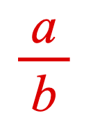
width
|<---------------------------------------->|
| |
| | ____
00000000000000000000000000000000000000000000 A
00000000000000000000000000000000000000000000 | lineWidth
00000000000000000000000000000000000000000000 __V_
Type: any
Extends EQN_Symbol
("vinculum")
(("static" | "dynamic")?)
: 'dynamic'
updates vertices on
resize,
'static'
only changes scale transform (
'dynamic'
)
((number | "first")?)
: used when
draw
=
static
.
number
sets width of static symbol -
'first'
calculates and sets width
based on first use (
'first'
)
// Define as element
figure.add({
make: 'equation',
elements: {
v: { symbol: 'vinculum' },
},
forms: {
form1: { frac: ['a', 'v', 'b'] },
},
});
// Define inline simple one use
figure.add({
make: 'equation',
forms: {
form1: { frac: ['a', 'vinculum', 'b'] },
},
});
// Define inline with reuse
const eqn = figure.add({
make: 'equation',
forms: {
form1: { frac: ['a', 'v1_vinculum', { frac: ['c', 'v2_vinculum', 'b'] }] },
form2: { frac: [['a', 'ef'], 'v1', { frac: ['c', 'v2', 'd'] }] },
},
});
eqn.animations.new()
.goToForm({ delay: 1, target: 'form2', animate: 'move' })
.start();
// Define inline with customization
figure.add({
make: 'equation',
forms: {
form1: { frac: ['a', { vinculum: { lineWidth: 0.004 } }, 'b'] },
},
});
EQN_BoxSymbol
Box equation symbol used in EQN_Box and as a EQN_EncompassGlyph.
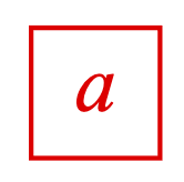
width
|<--------------------------------------------------->|
| |
| |
------- 0000000000000000000000000000000000000000000000000000000
A 0000000000000000000000000000000000000000000000000000000
| 0000 0000
| 0000 0000
| 0000 0000
height | 0000 0000
| 0000 0000
| 0000 0000
| 0000 0000
| 0000 0000
| 0000000000000000000000000000000000000000000000000000000
V______ 0000000000000000000000000000000000000000000000000000000
Type: any
Extends EQN_Symbol
("box")
(number?)
: force width instead of auto calculation
(number?)
: force height instead of auto calculation
(("static" | "dynamic")?)
: 'dynamic'
updates vertices on
resize,
'static'
only changes scale transform (
dynamic
)
((number | "first")?)
: used when
draw
=
static
.
number
sets width of static symbol -
'first'
calculates and sets width
based on first use
((number | "first")?)
: used when
draw
=
static
.
number
sets height of static symbol -
'first'
calculates and sets height
based on first use
// Define in element
figure.add({
make: 'equation',
elements: {
b: { symbol: 'box', lineWidth: 0.008 },
},
forms: {
form1: { box: ['a', 'b', true, 0.1] },
},
});
// Define inline simple one use
figure.add({
make: 'equation',
forms: {
form1: { box: ['a', 'box', true, 0.1] },
},
});
// Define inline with reuse
const eqn = figure.add({
make: 'equation',
forms: {
form1: { box: ['a', 'b_box', false, 0.1] },
form2: { box: ['a', 'b', false, 0.2] },
},
});
eqn.animations.new()
.goToForm({ delay: 1, target: 'form2', animate: 'move' })
.start();
// Define inline with customization
figure.add({
make: 'equation',
forms: {
form1: { box: ['a', { box: { lineWidth: 0.004 } }, true, 0.1] },
},
});
EQN_ArrowSymbol
Arrow equation symbol.
The arrow direction defines where it can be used:
'left','right': EQN_Bar (top and bottom sides), EQN_Comment, and EQN_LeftRightGlyph'up','down': EQN_Bracket, EQN_Bar (left and right sides), and EQN_TopBottomGlyph
Note, as the default direciton is 'right', using the inline definition of
arrow will only work with EQN_Bar (top and bottom sides),
EQN_Comment, and EQN_LeftRightGlyph.
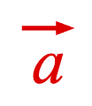
arrowWidth
|<--------------->|
| |
| |
-------|------- 0 |
A | 00000 |
arrowHeight | | 0000000 |
| | 00000000000 |
V | 000000000000000 |
------ 0000000000000000000
0000000
0000000
0000000
0000000
0000000
0000000
0000000
0000000
0000000
0000000
0000000
0000000
0000000
0000000
0000000
0000000
| |
| |
|<--->|
lineWidth
Type: any
Extends EQN_Symbol
("arrow")
(("up" | "down" | "left" | "right")?)
: (
'right'
)
(("static" | "dynamic")?)
: 'dynamic'
updates vertices on
resize,
'static'
only changes scale transform (
dynamic
)
((number | "first")?)
: used when
draw
=
static
.
number
sets height of static symbol -
'first'
calculates and sets height
based on first use (
'first'
)
// Define in element
figure.add({
make: 'equation',
elements: {
rightArrow: { symbol: 'arrow', direction: 'right' },
},
forms: {
form1: { bar: ['a', 'rightArrow', false, 0.05, 0.03] },
},
});
// Define inline simple one use
figure.add({
make: 'equation',
forms: {
form1: { bar: ['a', 'arrow', false, 0.05, 0.03] },
},
});
// Define inline with reuse
const eqn = figure.add({
make: 'equation',
forms: {
form1: { bar: ['a', 'ar_arrow', false, 0.05, 0] },
form2: { bar: ['a', 'ar', false, 0.05, 0.1] },
},
});
eqn.animations.new()
.goToForm({ delay: 1, target: 'form2', animate: 'move' })
.start();
// Define inline with customization
figure.add({
make: 'equation',
forms: {
form1: {
bar: {
content: 'a',
side: 'left',
symbol: { arrow: { direction: 'up' } },
overhang: 0.1,
},
},
},
});
EQN_SumSymbol
Sum equation symbol used with the EQN_SumOf equation function.
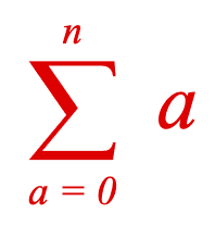
---------- 00000000000000000000000000000000000
A 0000000 000000
| 0000000 000
| 0000000 00
| 0000000
| 0000000
| 0000000
| 0000000
| 0000000
| 0000000
| 0000000
| 000000
| 000
| 0000
height | 0000
| 0000 \
| 0000 \
| 0000 lineWidth
| 0000
| 0000
| 0000
| 0000 00
| 0000 000|
| 0000 000000|
V 000000000000000000000000000000000000 |
-------- 000000000000000000000000000000000000 |
| |
| |
| width |
|<------------------------------------>|
Type: any
Extends EQN_Symbol
("sum")
(("static" | "dynamic")?)
: 'static'
updates vertices on
resize,
'static'
only changes scale transform (
dynamic
)
((number | "first")?)
: used when
draw
=
static
.
number
sets height of static symbol -
'first'
calculates and sets height
based on first use (
'first'
)
// Define in element
figure.add({
make: 'equation',
elements: {
sigma: { symbol: 'sum' },
},
forms: {
form1: { sumOf: ['sigma', 'a', 'a = 0', 'n'] },
},
});
// Define inline simple one use
figure.add({
make: 'equation',
forms: {
form1: { sumOf: ['sum', 'a', 'a = 0', 'n'] },
},
});
// Define inline with reuse
const eqn = figure.add({
make: 'equation',
forms: {
form1: { sumOf: ['s1_sum', 'a', 'a = 0', 'n'] },
form2: { sumOf: ['s1', 'a', 'a = 0', 'm'] },
},
});
eqn.animations.new()
.goToForm({ delay: 1, target: 'form2', animate: 'move' })
.start();
// Define inline with customization
figure.add({
make: 'equation',
forms: {
form1: { sumOf: [{ sum: { lineWidth: 0.01 } }, 'a', 'a = 0', 'n'] },
},
});
EQN_ProdSymbol
Product equation symbol used with the EQN_ProdOf equation function.
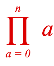
width
|<--------------------------------------------------------->|
| |
| |
| |
| lineWidth |
| / |
| / |
---- 00000000000000000000000000000000000000000000000000000000000000
A 000000000000000000000000000000000000000000000000000000
| 00000000000000000000000000000000000000000000000000
| 00000000000 00000000000
| 00000000000 00000000000
| 00000000000 00000000000
| 00000000000 00000000000
| 00000000000 00000000000
| 00000000000 00000000000
| 00000000000 00000000000
| 00000000000 00000000000
| 00000000000 00000000000
height | 00000000000 00000000000
| 00000000000 00000000000
| 00000000000 00000000000
| 00000000000 00000000000
| 00000000000 00000000000
| 00000000000 00000000000
| 00000000000 00000000000
| 00000000000 00000000000
| 00000000000 00000000000
| 00000000000 00000000000
| 00000000000 00000000000
| 00000000000 00000000000
| 0000000000000 00000000000000
V 00000000000000000 000000000000000000
----- 0000000000000000000000000 00000000000000000000000000
Type: any
Extends EQN_Symbol
("prod")
(number?)
: (related to height)
(("static" | "dynamic")?)
: 'static'
updates vertices on
resize,
'static'
only changes scale transform (
dynamic
)
((number | "first")?)
: used when
draw
=
static
.
number
sets height of static symbol -
'first'
calculates and sets height
based on first use (
'first'
)
// Define in element
figure.add({
make: 'equation',
elements: {
sigma: { symbol: 'prod' },
},
forms: {
form1: { prodOf: ['sigma', 'a', 'a = 0', 'n'] },
},
});
// Define inline simple one use
figure.add({
make: 'equation',
forms: {
form1: { prodOf: ['prod', 'a', 'a = 0', 'n'] },
},
});
// Define inline with reuse
const eqn = figure.add({
make: 'equation',
forms: {
form1: { prodOf: ['p1_prod', 'a', 'a = 0', 'n'] },
form2: { prodOf: ['p1', 'a', 'a = 0', 'm'] },
},
});
eqn.animations.new()
.goToForm({ delay: 1, target: 'form2', animate: 'move' })
.start();
// Define inline with customization
figure.add({
make: 'equation',
forms: {
form1: { prodOf: [{ prod: { lineWidth: 0.01 } }, 'a', 'a = 0', 'n'] },
},
});
EQN_IntegralSymbol
Integral equation symbol used with the EQN_Integral equation function.
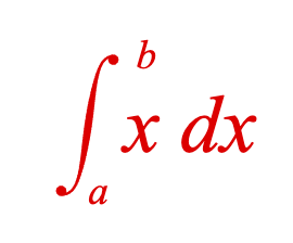
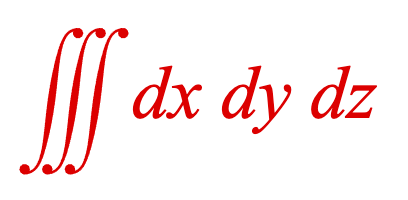
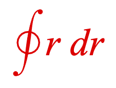
-------------------------------------------------- 0000000
A 000000011111111
| 0000000 111111111111
| 0000000 11111111111111
| 0000000 11111111111111
| 0000000 111111111111
| 000000000 11111111
| 000000000
| 0000000000
| 000000000
| 0000000000
| 0000000000
| 00000000000
| 00000000000
| 000000000000
| 000000000000 lineWidth
| height ------->000000000000<----------
| 000000000000
| 000000000000
| 000000000000
| 00000000000
| 00000000000
| 0000000000
| 0000000000
| Serif 000000000
| \ 000000000
| \ 0000000000
| 11111111 000000000
| 111111111111 00000000
| 11111111111111 0000000
| 11111111111111 0000000
| 111111111111 0000000
V 111111110000000
------- 0000000
Type: any
Extends EQN_Symbol
("int")
(number?)
: (related to height)
(("line" | "generic")?)
: line
draws a circle through the
symbols denoting a line integral (
generic
)
(number?)
: width of s curve tip (related to lineWidth)
(("static" | "dynamic")?)
: 'static'
updates vertices on
resize,
'static'
only changes scale transform (
dynamic
)
((number | "first")?)
: used when
draw
=
static
.
number
sets height of static symbol -
'first'
calculates and sets height
based on first use (
'first'
)
// Define in element
figure.add({
make: 'equation',
elements: {
int: { symbol: 'int' },
},
forms: {
form1: { int: ['int', 'x dx', 'a', 'b'] },
},
});
// Triple Integral
figure.add({
make: 'equation',
elements: {
int: { symbol: 'int', num: 3 },
},
forms: {
form1: { int: ['int', 'dx dy dz'] },
},
});
// Line Integral
figure.add({
make: 'equation',
elements: {
int: { symbol: 'int', type: 'line' },
},
forms: {
form1: { int: ['int', 'r dr'] },
},
});
// Define inline simple one use
figure.add({
make: 'equation',
forms: {
form1: { int: ['int', 'x dx', 'a', 'b'] },
},
});
// Define inline with reuse
const eqn = figure.add({
make: 'equation',
forms: {
form1: { int: ['i1_int', 'x dx', 'a', 'b'] },
form2: { int: ['i1', 'y dy', 'a', 'b'] },
},
});
eqn.animations.new()
.goToForm({ delay: 1, target: 'form2', animate: 'move' })
.start();
// Define inline with customization
figure.add({
make: 'equation',
forms: {
form1: { int: [{ int: { serif: false } }, 'x dx', 'a', 'b'] },
},
});
EQN_StrikeSymbol
Strike equation symbol used in EQN_Strike.
Integral equation symbol used with the EQN_Strike and EQN_StrikeComment equation functions.




Four styles of strike symbol are available:
000 000
000 000
000 000
000 0000000000000000
000 000
000 000
000 000
cross horizontal
000 000
000 000
000 000
000 000
000 000
000 000
000 000
forward back
Type: any
Extends EQN_Symbol
("strike")
(("cross" | "forward" | "back" | "horizontal")?)
: (
'cross'
)
(number?)
: force width of strike (normally defined by
content size)
(number?)
: force height of strike (normally defined by
content size)
(("static" | "dynamic")?)
: 'static'
updates vertices on
resize,
'static'
only changes scale transform (
dynamic
)
((number | "first")?)
: used when
draw
=
static
.
number
sets height of static symbol -
'first'
calculates and sets height
based on first use (
'first'
)
((number | "first")?)
: used when
draw
=
static
.
number
sets width of static symbol -
'first'
calculates and sets width
based on first use (
'first'
)
// Define in element
figure.add({
make: 'equation',
elements: {
s: { symbol: 'strike', style: 'cross', lineWidth: 0.01 },
},
forms: {
form1: { strike: ['ABC', 's'] },
},
});
// Forward Strike
figure.add({
make: 'equation',
elements: {
s: { symbol: 'strike', style: 'forward', lineWidth: 0.01 },
},
forms: {
form1: { strike: ['ABC', 's'] },
},
});
// Back Strike
figure.add({
make: 'equation',
elements: {
s: { symbol: 'strike', style: 'back', lineWidth: 0.01 },
},
forms: {
form1: { strike: ['ABC', 's'] },
},
});
// Horizontal Slash
figure.add({
make: 'equation',
elements: {
s: { symbol: 'strike', style: 'horizontal', lineWidth: 0.01 },
},
forms: {
form1: { strike: ['ABC', 's'] },
},
});
// Define inline simple one use
figure.add({
make: 'equation',
forms: {
form1: { strike: ['ABC', 'strike'] },
},
});
// Define inline with reuse
const eqn = figure.add({
make: 'equation',
forms: {
form1: { strike: ['ABC', 's1_strike'] },
form2: { strike: ['DEFGH', 's1'] },
},
});
eqn.animations.new()
.goToForm({ delay: 1, target: 'form2', animate: 'move' })
.start();
// Define inline with customization
figure.add({
make: 'equation',
forms: {
form1: { strike: ['ABC', { strike: { style: 'forward' } }] },
},
});
EQN_BracketSymbol
Bracket equation symbol used in EQN_Bracket, EQN_Bar, EQN_Matrix, and EQN_Comment.
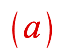
tipWidth
----->| |<---
| |
| |
000
0000
00000
000000
000000
000000
lineWidth 000000
------>000000<---
000000
|000000
|000000
| 000000
| 00000
| 0000
| 000
| |
| |
|<------->|
width
Type: any
Extends EQN_Symbol
("bracket")
(("left" | "right" | "top" | "bottom")?)
: how to orient the
bracket ('left')
(number?)
: (depends on height)
(number?)
: (depends on lineWidth)
(number?)
: force width bracket (normally depends on height)
(("static" | "dynamic")?)
: 'static'
updates vertices on
resize,
'static'
only changes scale transform (
dynamic
)
((number | "first")?)
: used when
draw
=
static
.
number
sets height of static symbol -
'first'
calculates and sets height
based on first use (
'first'
)
// Define in element
figure.add({
make: 'equation',
elements: {
lb: { symbol: 'bracket', side: 'left' },
rb: { symbol: 'bracket', side: 'right' },
},
forms: {
form1: { brac: ['lb', 'a', 'rb'] },
},
});
// Define inline
figure.add({
make: 'equation',
forms: {
form1: {
brac: [
{ lb_bracket: { side: 'left' } },
'a',
{ rb_bracket: { side: 'right' } },
],
},
},
});
EQN_AngleBracketSymbol
Angle bracket equation symbol used in EQN_Bracket, EQN_Bar, EQN_Matrix, and EQN_Comment.

width
|<------->|
| |
--------|----- 0000
A | 0000
| | 0000
| | 0000
| | 0000
| 0000
height | 0000
| 0000
| 0000
| 0000
| 0000
| 0000
| 0000
V_____________ 0000
Type: any
Extends EQN_Symbol
("angleBracket")
(("left" | "right" | "top" | "bottom")?)
: how to orient the
angle bracket ('left')
(number?)
: (depends on height)
(number?)
: force width bracket (normally depends on height)
(("static" | "dynamic")?)
: 'static'
updates vertices on
resize,
'static'
only changes scale transform (
dynamic
)
((number | "first")?)
: used when
draw
=
static
.
number
sets height of static symbol -
'first'
calculates and sets height
based on first use (
'first'
)
// Define in element
figure.add({
make: 'equation',
elements: {
lb: { symbol: 'angleBracket', side: 'left' },
rb: { symbol: 'angleBracket', side: 'right' },
},
forms: {
form1: { brac: ['lb', 'a', 'rb'] },
},
});
// Define inline
figure.add({
make: 'equation',
forms: {
form1: {
brac: [
{ lb_angleBracket: { side: 'left' } },
'a',
{ rb_angleBracket: { side: 'right' } },
],
},
},
});
EQN_BraceSymbol
Brace equation symbol used in EQN_Bracket, EQN_Bar, EQN_Matrix, and EQN_Comment.
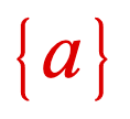
width
|<------>|
| |
| |
| 000
| 000
| 000
| 0000
| 0000
| 0000
| 0000
| 000
| 000
000
000
000
0000
0000
0000
0000
- - -0000 - - - -
| 000 |
| 000 |
| 000 |
- - - - - - - - -
\
\
\
- - - - - - - - - - - - - - - - - - - - - - - - -
| 00000000000000 |
| 00000000000000 |
| 000000000000 tipWidth |
| 000000000000 | |
| 000000000000 | |
| 0000000000000 _______V_ |
| 00000000000 |
| 0000000_________ |
| A |
- - - - - - - - - - - - - - - - - - - - - - - - -
Type: any
Extends EQN_Symbol
("brace")
(("left" | "right" | "top" | "bottom")?)
: how to orient the
brace ('left')
(number?)
: (depends on height)
(number?)
: (depends on lineWidth)
(number?)
: force width bracket (normally depends on height)
(("static" | "dynamic")?)
: 'static'
updates vertices on
resize,
'static'
only changes scale transform (
dynamic
)
((number | "first")?)
: used when
draw
=
static
.
number
sets height of static symbol -
'first'
calculates and sets height
based on first use (
'first'
)
// Define in element
figure.add({
make: 'equation',
elements: {
lb: { symbol: 'brace', side: 'left' },
rb: { symbol: 'brace', side: 'right' },
},
forms: {
form1: { brac: ['lb', 'a', 'rb'] },
},
});
// Define inline
figure.add({
make: 'equation',
forms: {
form1: {
brac: [
{ lb_brace: { side: 'left' } },
'a',
{ rb_brace: { side: 'right' } },
],
},
},
});
EQN_BarSymbol
Bar equation symbol.
The bar side defines where it can be used:
'top','bottom': EQN_Bar (top and bottom sides), EQN_Comment, and EQN_LeftRightGlyph'left','right': EQN_Bracket, EQN_Bar (left and right sides), EQN_Matrix and EQN_TopBottomGlyph
Note, as the default direciton is 'right', using the inline definition of
arrow will only work with EQN_Bar (top and bottom sides),
EQN_Comment, and EQN_LeftRightGlyph.
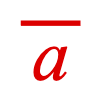
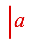
>| |<---- lineWidth
| |
| |
000
000
000
000
000
000
000
000
000
000
000
Type: any
Extends EQN_Symbol
("bar")
(("left" | "right" | "top" | "bottom")?)
: how to orient the
bar ('left')
(("static" | "dynamic")?)
: 'static'
updates vertices on
resize,
'static'
only changes scale transform (
dynamic
)
((number | "first")?)
: used when
draw
=
static
.
number
sets height of static symbol -
'first'
calculates and sets height
based on first use (
'first'
)
// Define in element
figure.add({
make: 'equation',
elements: {
b: { symbol: 'bar', side: 'top' },
},
forms: {
form1: { bar: ['a', 'b', false, 0.05, 0.03] },
},
});
// Define inline simple one use
figure.add({
make: 'equation',
forms: {
form1: {
bar: {
content: 'a',
symbol: 'bar',
side: 'left',
overhang: 0.1,
},
},
},
});
// Define inline with reuse
const eqn = figure.add({
make: 'equation',
forms: {
form1: { bar: ['a', { bar: { side: 'top' } }, false, 0.05, 0.03] },
form2: { bar: [['a', 'bc'], { bar: { side: 'top' } }, false, 0.05, 0.03] },
},
});
eqn.animations.new()
.goToForm({ delay: 1, target: 'form2', animate: 'move' })
.start();
// Define inline with customization
figure.add({
make: 'equation',
forms: {
form1: { bar: ['a', { bar: { side: 'top' } }, false, 0.05, 0.03] },
},
});
EQN_SquareBracketSymbol
Square bracket equation symbol used in EQN_Bracket, EQN_Bar, EQN_Matrix, and EQN_Comment.
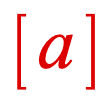
width
|<--------------------->|
| |
___ ____
A 0000000000000000000000000 A
| 0000000000000000000000000 | tipWidth
| 0000000000000000000000000 ___V
| 00000000
| 00000000
| 00000000
| 00000000
height | 00000000
| 00000000
| 00000000
| 00000000
| 00000000
| 00000000
| 0000000000000000000000000
| 0000000000000000000000000
V___ 0000000000000000000000000
| |
| |
|<---->|
line width
Type: any
Extends EQN_Symbol
("squareBracket")
(("left" | "right" | "top" | "bottom")?)
: how to orient the
square bracket ('left')
(number?)
: (depends on lineWidth)
(("static" | "dynamic")?)
: 'static'
updates vertices on
resize,
'static'
only changes scale transform (
dynamic
)
((number | "first")?)
: used when
draw
=
static
.
number
sets height of static symbol -
'first'
calculates and sets height
based on first use (
'first'
)
// Define in element
figure.add({
make: 'equation',
elements: {
lb: { symbol: 'squareBracket', side: 'left' },
rb: { symbol: 'squareBracket', side: 'right' },
},
forms: {
form1: { brac: ['lb', 'a', 'rb'] },
},
});
// Define inline
figure.add({
make: 'equation',
forms: {
form1: {
brac: [
{ lb_squareBracket: { side: 'left' } },
'a',
{ rb_squareBracket: { side: 'right' } },
],
},
},
});
EQN_RadicalSymbol
Radical equation symbol used in EQN_Root.
The radical symbol allows customization on how to draw the radical. Mostly it will not be needed, but for edge case equation layouts it may be useful.
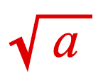
height
|
|
|_____________________________ XXXXXXXXXXXXXXXXXXXXXXXXXXXXXX
A X|
| startHeight X | CCCCCCCCCCCCCCCCCCCCCCC
| | X | CCCCCCCCCCCCCCCCCCCCCCC
| | tickHeight X | CCCCCCCCCCCCCCCCCCCCCCC
| | | X | CCCCCCCCCCCCCCCCCCCCCCC
| |____V____ X | CCCCCCCCCCCCCCCCCCCCCCC
| A | X X | CCCCCCCCCCCCCCCCCCCCCCC
| | |__X |X X | CCCCCCCCCCCCCCCCCCCCCCC
| | A | | X X | CCCCCCCCCCCCCCCCCCCCCCC
| | | | X X | CCCCCCCCCCCCCCCCCCCCCCC
| | | | X X | CCCCCCCCCCCCCCCCCCCCCCC
V___V______|__|____X |
| | | |
| | | |
tickWidth >|--|< | |
| | | |
| |<-->|downWidth |
| |
|<----------------->|
startWidth
Type: any
Extends EQN_Symbol
("radical")
(number?)
: force width of content area (normally defined by content size)
(number?)
: force height of content area (normally defined by content size)
(number?)
(number?)
(number?)
(boolean?)
: true
makes
startHeight
,
startWidth
,
tickHeight
,
tickWidth
, and
downWidth
a percentage of
height instead of absolute (
true
)
(("static" | "dynamic")?)
: 'static'
updates vertices on
resize,
'static'
only changes scale transform (
dynamic
)
((number | "first")?)
: used when
draw
=
static
.
number
sets height of static symbol -
'first'
calculates and sets height
based on first use (
'first'
)
((number | "first")?)
: used when
draw
=
static
.
number
sets width of static symbol -
'first'
calculates and sets width
based on first use (
'first'
)
// Define in element
figure.add({
make: 'equation',
elements: {
r: { symbol: 'radical' },
},
forms: {
form1: { root: ['r', 'a', false, 0.05] },
},
});
// Define inline simple one use
figure.add({
make: 'equation',
forms: {
form1: { root: ['radical', 'a', false, 0.05] },
},
});
// Define inline with reuse
const eqn = figure.add({
make: 'equation',
forms: {
form1: { root: ['r1_radical', 'a', false, 0.05] },
form2: { root: ['r1', ['a', 'b'], false, 0.05] },
},
});
eqn.animations.new()
.goToForm({ delay: 1, target: 'form2', animate: 'move' })
.start();
// Define inline with customization
figure.add({
make: 'equation',
forms: {
form1: { root: [{ radical: { lineWidth: 0.005 } }, 'a', false, 0.05] },
},
});
EQN_DivisionSymbol
Division equation symbol used in EQN_Root.
The division symbol allows customization on how to draw the long form and short form division symbol. Mostly it will not be needed, but for edge case equation layouts it may be useful.

left space right space
bend width |<->|<---->| >|--|<
| | | | |
| | | | |
------- XXXXXXXXXXXXXXXXXXXXXXXXXXXXXXXXXXXXXX____V
A X | | |_______|
| X | CCCCCCCCCCCCCCCCCCCCCCC A
| X CCCCCCCCCCCCCCCCCCCCCCC top space
| X CCCCCCCCCCCCCCCCCCCCCCC
height | X CCCCCCCCCCCCCCCCCCCCCCC
| X CCCCCCCCCCCCCCCCCCCCCCC
| X CCCCCCCCCCCCCCCCCCCCCCC
| X CCCCCCCCCCCCCCCCCCCCCCC
| X CCCCCCCCCCCCCCCCCCCCCCC
| X CCCCCCCCCCCCCCCCCCCCCCC bottom space
V X CCCCCCCCCCCCCCCCCCCCCCC_______V
------ X _________________________________________|
| A
| |
| width |
|<----------------------------------------->
Type: any
Extends EQN_Symbol
("division")
(number?)
: force width of content area (normally defined by content size)
(number?)
: force height of content area (normally defined by content size)
(("static" | "dynamic")?)
: 'static'
updates vertices on
resize,
'static'
only changes scale transform (
dynamic
)
((number | "first")?)
: used when
draw
=
static
.
number
sets height of static symbol -
'first'
calculates and sets height
based on first use (
'first'
)
((number | "first")?)
: used when
draw
=
static
.
number
sets width of static symbol -
'first'
calculates and sets width
based on first use (
'first'
)
// Define in element
figure.add({
make: 'equation',
elements: {
d: { symbol: 'division', bendWidth: 0.05 },
},
forms: {
form1: { box: ['abc', 'd'] },
},
});
// Define inline simple one use
figure.add({
make: 'equation',
forms: {
form1: { box: ['abc', 'division'] },
},
});
// Define inline with reuse
const eqn = figure.add({
make: 'equation',
forms: {
form1: { box: ['abc', 'd1_division'] },
form2: { box: ['abc', 'd1'] },
},
});
eqn.animations.new()
.goToForm({ delay: 1, target: 'form2', animate: 'move' })
.start();
// Define inline with customization
figure.add({
make: 'equation',
forms: {
form1: { box: ['abc', { division: { lineWidth: 0.005 } }] },
},
});
EQN_LineSymbol
A line symbol to be used in EQN_Annotate and EQN_Comment as an EQN_LineGlyph to draw a line between the content and an annotation.
The line can be solid or dashed, and have arrows on either or both ends.


Type: any
Extends EQN_Symbol
(number?)
: line width
(TypeDash?)
: dash style of line
(OBJ_LineArrows?)
: arrow styles of line where start is
toward the content
// Define in element
figure.add({
make: 'equation',
elements: {
l: { symbol: 'line', arrow: 'barb', width: 0.005 },
},
forms: {
form1: { topComment: ['a', 'b', 'l', 0.2, 0.2] },
},
});
// Dashed line
figure.add({
make: 'equation',
elements: {
l: { symbol: 'line', dash: [0.01, 0.01], width: 0.005 },
},
forms: {
form1: { topComment: ['a', 'b', 'l', 0.2, 0.2] },
},
});
// Define inline simple one use
figure.add({
make: 'equation',
forms: {
form1: { topComment: ['a', 'b', 'line', 0.2, 0.2] },
},
});
// Define inline with reuse
const eqn = figure.add({
make: 'equation',
forms: {
form1: { topComment: ['a', 'b', 'l1_line', 0.2, 0.2] },
form2: { topComment: ['c', 'd', 'l1', 0.2, 0.2] },
},
});
eqn.animations.new()
.goToForm({ delay: 1, target: 'form2', animate: 'move' })
.start();
// Define inline with customization
figure.add({
make: 'equation',
forms: {
form1: { topComment: ['a', 'b', { line: { arrow: 'barb' } }, 0.2, 0.2] },
},
});
Morphing
A shape morphs when its vertices change relative to each other. For example, a square would morph into a circle.

Morph using updatePoints
FigureElementPrimitives generally come with an updatePoints method, which changes the vertices of a shape. If updatePoints is called on each animation frame, the shape can morph from one shape to another.
For instance, if we want to morph a straight line into a wave we could:
const figure = new Fig.Figure();
const sin = (mag) => {
const xValues = Fig.range(-0.8, 0.8, 0.001);
return xValues.map(x => [x, mag * Math.sin(2 * Math.PI * x / 0.5)]);
};
const line = figure.add({
make: 'polyline',
points: sin(0),
width: 0.03,
color: [1, 0, 0, 1],
simple: true,
});
line.animations.new()
.delay(1)
.custom({
callback: p => line.custom.updatePoints({ points: sin(p / 2) }),
progression: 'easeinout',
duration: 2,
})
.start();
This works fine, even on low end clients. For example, a low end 2016 Chromebook can render this at over 40 frames per second. This example is a polyline of 1600 points, resulting in 6400 vertices, and you can do a lot with that.
However, if we increase this by an order of magnitude (polyline 16,000 points, 64,000 vertices), then the frame rate drops to 1-2 fps.
There are two reasons for this:
1) Calculations: each frame 16,000 polyline points need to be calculated, followed by the calculation of 64,000 vertices to give the line thickness 2) Memory: each frame, all vertices need to be transferred from a CPU related memory location to a GPU memory buffer
In this example 1) is probably more expensive than 2), but there will be other times where 2) is more expensive than 1).
So updatePoints is an easy and sufficient way to morph many things, but it will struggle when the number of vertices gets too high.
FigureElementPrimitive Morph
FigureOne has a FigureElementPrimitiveMorph optimized for morphing many vertices.
At initialization, multiple arrays are defined, and then loaded into GPU memory buffers. FigureElementPrimitiveMorph then animates between these point arrays by translating corresponding points in the GPU. This means on each animation frame there are no calculations done in the CPU, and no large memory buffers being transferred to the GPU.
As a result, hundreds of thousands of points can be morphed with minimal performance impact - even on low end clients.
A simple example using morph on just three vertices is:
const figure = new Fig.Figure();
const tri = figure.add({
make: 'morph',
points: [
[0, 0, 0.5, 0, 0.5, 0.5],
[0, 0, 0.5, 0, 0, 0.5],
],
color: [1, 0, 0, 1],
});
tri.animations.new()
.morph({ start: 0, target: 1, duration: 3 })
.start();

The points property defines the different vertex configurations. The first array of points, representing the first vertex configuration is [0, 0, 0.5, 0, 0.5, 0.5] which defines three points [0, 0], [0.5, 0], and [0.5, 0.5].
The morph primitive comes with a built-in morph animation step, which can animate between configurations. This animation step is only available to FigureElementPrimitiveMorph primitives.
Let's now recreate the line to wave example above using morph.
const figure = new Fig.Figure();
const sin = (mag) => {
const xValues = Fig.range(-0.8, 0.8, 0.001);
return xValues.map(x => [x, mag * Math.sin(2 * Math.PI * x / 0.5)]);
};
const { pointsToShapes } = Fig.morph;
const [line] = pointsToShapes({
points: sin(0),
shape: 'hex',
});
const [sine] = pointsToShapes({
points: sin(0.5),
close: true,
shape: 'hex',
});
const m = figure.add({
make: 'morph',
points: [line, sine],
color: [1, 0, 0, 1],
});
m.animations.new()
.delay(1)
.morph({ start: 0, target: 1, duration: 10 })
.start();

Instead of morphing a polyline as before, we are now morphing a series of shapes distributed along a polyline. In this case the shapes are hexagons. If the shapes have more sides, the curves will look more natural for thicker lines. For this line thickness, hexagons are a good trade-off. For thinner lines, squares could be used, and for thicker lines polygons with more sides would be required.
This example comprises 1600 shapes along the line, each shape being 12 vertices - giving a total of 19,200 vertices.
The power of the morph primitive can be seen when using large numbers of vertices. When we increase the number of vertices by two orders of magnitude:
const sin = (mag) => {
const xValues = Fig.range(-0.8, 0.8, 0.00001);
return xValues.map(x => [x, mag * Math.sin(2 * Math.PI * x / 0.5)]);
};
we can still achieve 25 fps on the 2016 Chromebook, while morphing 1.9 million vertices.
Tips for Morphing Lines
It will often take fewer vertices to construct a polyline with rectangular line segments between polyline corners, compared to a string of shapes along the polyline. This is especially the case when the polyline has straight segments that are longer than the required distance between shapes needed to make the line look smooth (usually a fraction of the shape with).
Nevertheless, most times it will be better to use a string of shapes to represent a morphing line, as the line will look more natural during the morph.
The FigureElementPrimitiveMorph primitive linearly translates all vertices from one location to another. If a rectangular line segment's angle changes significantly, the transition between the two states may involve the rectange width temporarily reducing.
An extreme example is when we change angle by 180º:
const figure = new Fig.Figure();
const { polyline } = Fig.morph;
const line = figure.add({
make: 'morph',
points: [
polyline({ points: [[0, 0], [0.5, 0]], width: 0.04 }),
polyline({ points: [[0, 0], [-0.5, 0]], width: 0.04 }),
],
color: [1, 0, 0, 1],
});
line.animations.new()
.morph({ start: 0, target: 1, duration: 4 })
.start();

Compare this to a string of points that has no width change:
const figure = new Fig.Figure();
const { polylineToShapes } = Fig.morph;
const line = figure.add({
make: 'morph',
points: [
polylineToShapes({ points: [[0, 0], [0.5, 0]], num: 20, size: 0.04 })[0],
polylineToShapes({ points: [[0, 0], [-0.5, 0]], num: 20, size: 0.04 })[0],
],
color: [1, 0, 0, 1],
});
line.animations.new()
.morph({ start: 0, target: 1, duration: 3 })
.start();

Trade-offs
Morphing hundreds of thousands of points with minimal performance impact is useful for many situations, but will not solve every problem.
This approach is good for problems with deterministic start and end states (meaning you can calculate the point arrays at initialization).
The challenges with this approach are:
- translation between corresponding vertices is linear - so if for example you want a line to uncurl in a very specific way, then using
updatePointsor a custom shader will be a better solution - vertex configurations that cannot be pre-caclculated cannot be handled - so if for example user feedback is morphing a shape unpredictably in real time, then
updatePointsor a custom shader will be a better solution
Morph Tools
FigureOne has a number of tools that can create vertices ready for morphing:
- pointsToShapes can create a number of shapes centered at defined points
- polylineToShapes can distribute a number of shapes along a polyline
- imageToShapes can create a number of shapes from pixels of an image
- polygonCloudShapes can create a number of shapes distributed randomly within a polygon border
- circleCloudShapes can create a number of shapes distributed randomly within a circle border
- rectangleCloudShapes can create a number of shapes distributed randomly within a rectangle border
- getPolygonCorners can calulate the corner points of a polygon
- polyline can create vertices that represent a polyline with some width
Generic Morphing
It can be challenging to construct vertices that represent a relatively arbitrary shape. It is even tougher to align those vertices to those in another shape so the two shapes can be morphed.
imageToShapes can help with this problem (to a degree), as it can scan an image and create shapes that represent the pixels of that image. Additionally, filters can be used to only create shapes for some pixels. So for example if you have a shape with a transparent background, you can use a filter that rejects transparent pixels and only processes pixels with a color.
const figure = new Fig.Figure();
const { imageToShapes } = Fig.morph;
const micImage = new Image();
micImage.src = './mic.png';
const headphonesImage = new Image();
headphonesImage.src = './headphones.png';
let index = 0;
const loaded = () => {
index += 1;
if (index < 2) {
return;
}
const [mic, micColors] = imageToShapes({
image: micImage,
width: 0.7,
filter: c => c[3] > 0,
});
const [headphones, headphoneColors] = imageToShapes({
image: headphonesImage,
width: 0.7,
filter: c => c[3] > 0,
num: mic.length / 6 / 2,
});
const m = figure.add({
make: 'morph',
points: [mic, headphones],
color: [micColors, headphoneColors],
});
m.animations.new()
.delay(1)
.morph({ start: 0, target: 1, duration: 2 })
.start();
};
micImage.onload = loaded.bind(this);
headphonesImage.onload = loaded.bind(this);
};

The mic image has 31,720 pixels, which we are reducing to 17,516 pixels by filtering out the completely transparent pixels (we are keeping semi-transparent pixels as they make the transitions from opaque pixels to transparent pixels look more natural). This means that even though these images are relatively small, we are still creating 105,096 vertices.
For larger images, consider reducing the vertices by just taking a random sampling of pixels from the image. This produces a cloud like effect for the image, and it won't always be appropriate, but in this case we will reduce the number of vertices by almost an order of magnitude and still communicate the same information.
In the prior example, we are loading the first image, and using the number of shapes produced to define the number of shapes for the second image (as the second image has less colored pixels than the first).
This time, we will limit the number of shapes to just 2000 per image. We will play with the shape size, and force a dither (random offset) to the pixels to make the spaces look intentional. The result is just 12,000 vertices.
const figure = new Fig.Figure();
const { imageToShapes } = Fig.morph;
const micImage = new Image();
micImage.src = './mic.png';
const headphonesImage = new Image();
headphonesImage.src = './headphones.png';
let index = 0;
const loaded = () => {
index += 1;
if (index < 2) {
return;
}
const num = 2000;
const [mic, micColors] = imageToShapes({
image: micImage,
width: 0.7,
filter: c => c[3] > 0,
num,
size: 0.01,
dither: 0.005,
});
const [headphones, headphoneColors] = imageToShapes({
image: headphonesImage,
width: 0.7,
filter: c => c[3] > 0,
num,
size: 0.007,
dither: 0.005,
});
const m = figure.add({
make: 'morph',
points: [mic, headphones],
color: [micColors, headphoneColors],
});
m.animations.new()
.delay(1)
.morph({ start: 0, target: 1, duration: 2 })
.start();
};
micImage.onload = loaded.bind(this);
headphonesImage.onload = loaded.bind(this);
FigureElementPrimitiveMorph
FigureElementPrimitive that can efficiently translate large numbers of points.
The morph primitive is optimized to animate hundreds of thousands of points with minimal performance impact.
Multiple arrays of points can be defined, and the translation of corresponding points in two arrays can be animated.
Being able to accomodate so many points means this primitive can be used to efficiently morph shapes.
All points in all point arrays can be assigned an individual color if
desired. Use color: TypeColor to assign all points in all arrays the same
color, color: Array<TypeColor> to assign all points in each array a
specific color, color: Array<Array<TypeColor>> to assign each point in
each array a specific color, and
color: Array<TypeColor | Array<TypeColor> to assign some point arrays
with one color, and others with a specific color per point.
A point array is an array of numbers representing consecutive x, y points. For example, [x1, y1, x2, y2, ...].
A color array is an array of numbers representing the color of each points. For example, [r1, g1, b1, a1, r2, g2, b2, a2, ...].
If color is an array of colors and/or color arrays, then the its length
must be equal to the number of point Arrays. The colors in the array will
be matched up with the corresponding point arrays in points.
This element's specialty is creating a visual effect, and so does not
automatically calculate touch borders, and doesn't allow for color changes
(with the setColor, dim, and undim methods). If touch borders are
desired then either setup touch borders manually, or use a different
element as a touch pad.
This element comes with two specialized methods and an animation step:
setPoints- sets points to a specific point arraysetPointsBetween- sets points to a position between two point arraysanimations.morph- morph betweenstartandtarget
Note, while animation is efficient, loading or generating hundreds of thousands of points when first instantiated can be slow on lower end systems, and may need to be accounted for (like letting the user know that loading is ongoing).
Extends FigureElementPrimitive
const { polylineToShapes, getPolygonCorners } = Fig.morph;
const { range } = Fig;
// Number of shapes that make up the lines
const n = 300;
// Generate a line of points along a sinc function
const sinc = (xIn, a, b) => {
const x = xIn === 0 ? 0.00001 : xIn;
return a * Math.sin(b * x) / (b * x);
};
// Generate line of shapes along a sinc function
const xValues = range(-0.8, 0.8, 0.01);
const [sincPoints] = polylineToShapes({
points: xValues.map(x => [x, sinc(x, 0.6, 20)]),
num: n,
size: 0.04,
shape: 15,
});
// Generate a line of shapes along a square
const [squarePoints] = polylineToShapes({
points: [[0.5, 0.5], [-0.5, 0.5], [-0.5, -0.5], [0.5, -0.5]],
num: n,
size: 0.04,
close: true,
shape: 15,
});
// Generate a line of shapes along a circle
const [circlePoints] = polylineToShapes({
points: getPolygonCorners({ radius: 0.5, sides: 50, rotation: Math.PI / 4 }),
num: n,
size: 0.04,
close: true,
shape: 15,
});
const morpher = figure.add({
make: 'morph',
names: ['sinc', 'square', 'circle'],
points: [sincPoints, squarePoints, circlePoints],
color: [1, 0, 0, 1],
});
// Animate morph
morpher.animations.new()
.delay(1)
.morph({ start: 'sinc', target: 'square', duration: 2 })
.morph({ start: 'square', target: 'circle', duration: 2 })
.morph({ start: 'circle', target: 'sinc', duration: 2 })
.start();
const { imageToShapes, circleCloudShapes, polylineToShapes } = Fig.morph;
const { range } = Fig;
const image = new Image();
image.src = './logocolored.png';
image.onload = () => {
const [logo, logoColors] = imageToShapes({
image,
width: 2,
height: 2,
dither: 0.003,
});
const n = logo.length / 2 / 6;
const cloud = circleCloudShapes({
radius: 3,
num: n,
size: 0.005,
});
const xValues = range(-0.8, 0.8, 0.001);
const [sine] = polylineToShapes({
points: xValues.map(x => [x, 0.3 * Math.sin(x * 2 * Math.PI / 0.4)]),
num: n,
size: 0.01,
});
const m = figure.add({
make: 'morph',
points: [cloud, logo, sine],
names: ['cloud', 'logo', 'sine'],
color: [logoColors, logoColors, [0, 0, 1, 1]],
});
m.setPoints('sine');
m.animations.new()
.delay(1)
.morph({ start: 'sine', target: 'cloud', duration: 2 })
.morph({ start: 'cloud', target: 'logo', duration: 2 })
.start();
};
OBJ_Morph
morph options object.
Type:
{name: string?, pointArrays: Array<Array<number>>, color: (TypeColor | Array<(TypeColor | Array<TypeColor>)>), names: Array<string>, glPrimitive: ("TRIANGLES" | "POINTS" | "FAN" | "STRIP" | "LINES")}
(string)
: primitive name
(Array<Array<number>>)
: point arrays to morph between.
Each point array is an array of consecutive x, y values of points. For
example:
[x1, y1, x2, y2, x3, y3, ...]
.
(Array<String>)
: optional names for each point array. Names
can be used when using the morph animation step instead of point array
indeces.
(("TRIANGLES" | "POINTS" | "FAN" | "STRIP" | "LINES")?)
: glPrimitive is the same for all point arrays (
'TRIANGLES'
)
pointsToShapes
pointsToShapes creates shapes at each point input.
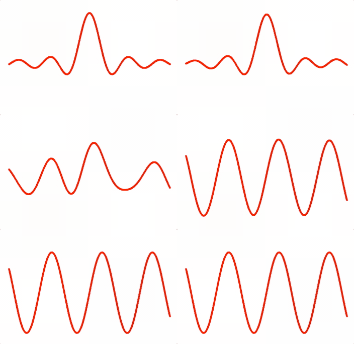
This method is useful for morphing between shapes.
(OBJ_PointsToShapes)
[Array<number>, Array<number>]:
[vertices, colors]
const { pointsToShapes } = Fig.morph;
const xValues = Fig.range(-0.8, 0.8, 0.001);
const sinc = (xIn, a, b, c) => {
const x = (xIn + c) === 0 ? 0.00001 : xIn + c;
return a * Math.sin(b * x) / (b * x);
};
const [trace1] = pointsToShapes({
points: xValues.map(x => [x, sinc(x, 0.5, 20, 0)]),
shape: 'hex',
});
const [trace2] = pointsToShapes({
points: xValues.map(x => [x, 0.4 * Math.sin(x * 2 * Math.PI / 0.5)]),
shape: 'hex',
});
const m = figure.add({
make: 'morph',
points: [trace1, trace2],
color: [1, 0, 0, 1],
});
m.animations.new()
.morph({ start: 0, target: 1, duration: 2 })
.start();
OBJ_PointsToShapes
Options obect for pointsToShapes that creates a shape at each point
Type: {points: Array<TypeParsablePoint>, size: number?, shape: (number | function (Point, number): Array<number>)?, makeColors: function (number, Point, number, number, number): Array<number>?}
(Array<TypeParsablePoint>)
: array of points to create shapes
at
(number)
: size of shape
((function (Point, number): Array<number> | number)?)
: By default a square of two triangles is created (six vertices). Use a
number
to create a regular polygon with
number
sides. Use a custom
function to make a custom shape. The function takes as input the
[x, y]
position of the point to build the shape around, and
size
. It outputs an
array of interlaced x and y coordinates of triangle vertices - i.e.:
[x1, y1, x2, y2, x3, y3, ....]
polylineToShapes
polylineToShapes distributes a number of shapes equally along a polyline.
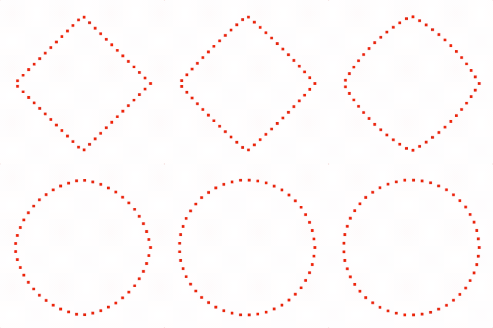
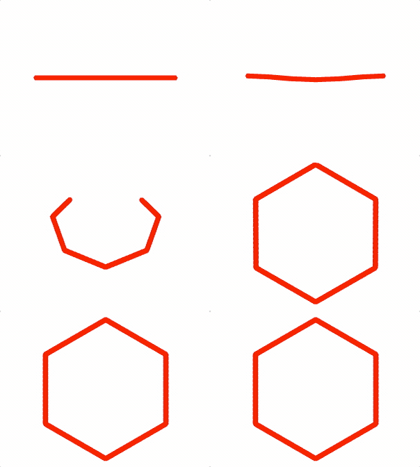
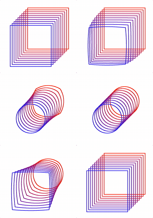
The polyline is defined by an array of points, where each point is a corner in the polyline
The start and ends of the polyline each have a centered shape
The polyline can be closed or open.
This method is useful for morphing between shapes.
(OBJ_PolylineToShapes)
[Array<number>, Array<number>]:
[vertices, colors]
const { polylineToShapes, getPolygonCorners } = Fig.morph;
const [square] = polylineToShapes({
points: [[0.5, 0], [0, 0.5], [-0.5, 0], [0, -0.5]],
num: 50,
size: 0.03,
close: true,
});
const [circle] = polylineToShapes({
points: getPolygonCorners({ radius: 0.5, sides: 30 }),
num: 50,
size: 0.03,
close: true,
});
const m = figure.add({
make: 'morph',
points: [square, circle],
color: [1, 0, 0, 1],
});
m.animations.new()
.morph({ start:0, target: 1, duration: 2 })
.start();
const { polylineToShapes, getPolygonCorners } = Fig.morph;
const [square] = polylineToShapes({
points: [[-0.5, 0], [0.5, 0]],
num: 500,
size: 0.02,
shape: 'hex',
});
const [circle] = polylineToShapes({
points: getPolygonCorners({ radius: 0.5, sides: 6, rotation: Math.PI / 2 }),
num: 500,
size: 0.02,
close: true,
shape: 'hex',
});
const m = figure.add({
make: 'morph',
points: [square, circle],
color: [1, 0, 0, 1],
});
m.animations.new()
.morph({ start:0, target: 1, duration: 2 })
.start();
const { polylineToShapes, getPolygonCorners } = Fig.morph;
const [square] = polylineToShapes({
points: getPolygonCorners({ radius: 0.5, sides: 4, rotation: Math.PI / 4 }),
num: 500,
close: true,
});
const [circle] = polylineToShapes({
points: getPolygonCorners({ radius: 0.25, sides: 100, rotation: Math.PI / 4 }),
num: 500,
close: true,
});
for (let i = 0; i < 10; i += 1) {
const m = figure.add({
make: 'morph',
points: [square, circle],
position: [0.2 - i / 30, 0.2 - i / 30],
color: [1 - i / 10, 0, i / 10, 1],
});
m.animations.new()
.delay(2 - i / 10)
.morph({ start: 0, target: 1, duration: 2 })
.delay(2)
.morph({ start: 1, target: 0, duration: 2 })
.start();
}
OBJ_PolylineToShapes
Options obect for polylineToShapes that evenly distributes shapes along a line
Type: {points: Array<TypeParsablePoint>, num: number?, close: boolean?, size: number?, shape: (number | function (Point, number): Array<number>)?, makeColors: function (number, Point, number, number, number): Array<number>?}
(Array<TypeParsablePoint>)
: array of points representing a
polyline where each point is a corner in the line
(number)
: number of shapes to distribute along line
(number)
: size of shape
((function (Point, number): Array<number> | number)?)
: By default a square of two triangles is created (six vertices). Use a
number
to create a regular polygon with
number
sides. Use a custom
function to make a custom shape. The function takes as input the
[x, y]
position of the point to build the shape around, and
size
. It outputs an
array of interlaced x and y coordinates of triangle vertices - i.e.:
[x1, y1, x2, y2, x3, y3, ....]
(function (number, Point, number, number, number): Array<number>)
: function that creates colors for each vertex of the shape.
Function input parameters are the number of shape vertices to be colored,
the center point coordinate, the previous polyline point index, the
cumulative length from the start of the polyline, and the percentLength from
the start of the polyline. The function must return a single array
containing all vertex colors.
imageToShapes
imageToShapes maps the pixels of an image to shapes that will be
used to draw those pixels.


All pixels in an image can be made shapes, or a filter function can be used
to only use desired pixels.
The shapes can be rasterized in order (raster from top left to bottom right) or be in a random order.
The image pixel centers are mapped to some width and height and aligned
to a position relative to either all pixels in the original image, or just
the filtered pixels. The shapes are centered on the pixel centers.
This method is useful for including images in morphing effects. It should not be used to simply show an image (use a texture with some FigureElementPrimitive for this).
(OBJ_ImageToShapes)
[Array<number>, Array<number>]:
[vertices, colors]
const { imageToShapes, rectangleCloudShapes } = Fig.morph;
const image = new Image();
image.src = './logo.png';
image.onload = () => {
const [logo, logoColors] = imageToShapes({
image,
width: 0.7,
height: 0.7,
filter: c => c[3] > 0,
});
const cloud = rectangleCloudShapes({
width: 2,
height: 2,
num: logo.length / 2 / 6,
});
const m = figure.add({
make: 'morph',
points: [cloud, logo],
color: [logoColors, logoColors],
});
m.animations.new()
.delay(1)
.morph({ start: 0, target: 1, duration: 2 })
.start();
};
const { imageToShapes } = Fig.morph;
const micImage = new Image();
micImage.src = './mic.png';
const headphonesImage = new Image();
headphonesImage.src = './headphones.png';
let index = 0;
const loaded = () => {
index += 1;
if (index < 2) {
return;
}
const [mic, micColors] = imageToShapes({
image: micImage,
width: 0.7,
filter: c => c[3] > 0,
});
const [headphones, headphoneColors] = imageToShapes({
image: headphonesImage,
width: 0.7,
filter: c => c[3] > 0,
num: mic.length / 6 / 2,
});
const m = figure.add({
make: 'morph',
points: [mic, headphones],
color: [micColors, headphoneColors],
});
m.animations.new()
.delay(1)
.morph({ start: 0, target: 1, duration: 2 })
.start();
};
micImage.onload = loaded.bind(this);
headphonesImage.onload = loaded.bind(this);
OBJ_ImageToShapes
Type:
{image: Image, maxPoints: (number | null)?, xAlign: TypeHAlign?, yAlign: TypeVAlign?, align: ("image" | "filteredImage")?, distribution: ("raster" | "random")?, filter: ("none" | Array<number>)?, position: TypeParsablePoint?, dither: number?, width: (number | null)?, height: (number | null)?, size: number?, excess: ("repeatOpaqueOnly" | "lastOpaque" | "repeat")?, makeColors: function (TypeColor, number): Array<number>?, shape: (number | function (Point, number): Array<number>)?}
(Image?)
((number | null)?)
: maximum number of shapes to return -
null
defaults to the number of pixels (or filtered pixels if a filter is
used) (
null
)
(("repeatOpaqueOnly" | "lastOpaque" | "repeat")?)
: if
num is greater than the number of pixels, then either
'repeat'
the
shapes from all the pixels again, repeat the shapes from only the opaque
pixels
'repeatOpaqueOnly'
or put all execess shapes on the
'lastOpaque'
pixel. Note, repeating pixels that are semitransparent will effectively put
multiple pixels on top of each other, reducing the transparency of the pixel
(
'repeatOpaqueOnly'
).
(("raster" | "random")?)
: Returned shapes are randomly
distributed throughout shape (
'random'
) or rasterized in order from top
left to bottom right of image (or filtered image) (
random
)
((number | null)?)
: width to map image pixels to. Width is
between center of most left to most right pixels
((number | null)?)
: height to map image pixels to. Height is
between center of most bottom to most top pixels
(number?)
: shape size to map pixel to. Final points will
have a width of
width + size
center of points are used to determine
width
and
height
. Default shape is a square, and default size
(if left undefined) is the size needed to make adjacent square shapes
touch
(TypeParsablePoint?)
: position to place shapes at
(("image" | "filteredImage")?)
: image
will align the shapes
as if there were no pixels filtered out.
filteredImage
will align to only
the shapes that exist.
(number?)
: Add a random offset to each shape to create a
dither effect
((function (Point, number): Array<number> | number)?)
: By default a square of two triangles is created (six vertices). Use a
number
to create a regular polygon with
number
sides. Use a custom
function to make a custom shape. The function takes as input the
[x, y]
position of the point to build the shape around, and
size
. It outputs an
array of interlaced x and y coordinates of triangle vertices - i.e.:
[x1, y1, x2, y2, x3, y3, ....]
(function (TypeColor, number): Array<number>?)
: use this function to customze color mapping. The function takes as input the
pixel's color, and the number of vertices that need to be colored. It
outputs an array of colors for each vertex - i.e.:
[r1, b1, g1, a1, r2, g2, b, a2, ...]
((number | null)?)
polygonCloudShapes
Generate random points within a polygon.
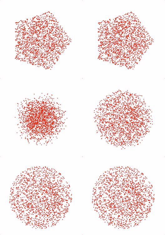
(OBJ_PolygonCloudShapes)
(OBJ_PolygonCloudShapes)
Array<number>:
array of interlaced x and y coordinates of vertices
const { polygonCloudShapes } = Fig.morph;
const cloud1 = polygonCloudShapes({
num: 2000,
radius: 0.5,
sides: 5,
});
const cloud2 = polygonCloudShapes({
num: 2000,
radius: 0.5,
sides: 100,
});
const m = figure.add({
make: 'morph',
points: [cloud1, cloud2],
color: [1, 0, 0, 1],
});
m.animations.new()
.morph({ start: 0, target: 1, duration: 2 })
.start();
OBJ_PolygonCloudShapes
Options object to generate shapes at random positions within a polygon.
Type: {radius: number?, sides: number?, position: TypeParsablePoint?, rotation: number?, num: number?, size: number?, shape: (number | function (Point, number): Array<number>)?}
((function (Point, number): Array<number> | number)?)
: By default a square of two triangles is created (six vertices). Use a
number
to create a regular polygon with
number
sides. Use a custom
function to make a custom shape. The function takes as input the
[x, y]
position of the point to build the shape around, and
size
. It outputs an
array of interlaced x and y coordinates of triangle vertices - i.e.:
[x1, y1, x2, y2, x3, y3, ....]
circleCloudShapes
Generate random points within a circle.
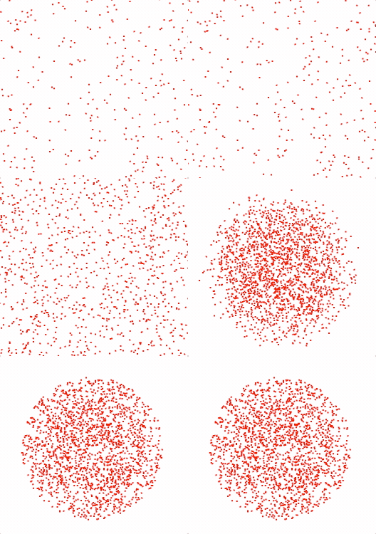
(OBJ_CircleCloudShapes)
Array<number>:
array of interlaced x and y coordinates of vertices
const { circleCloudShapes } = Fig.morph;
const cloud1 = circleCloudShapes({
num: 2000,
radius: 2,
});
const cloud2 = circleCloudShapes({
num: 2000,
radius: 0.5,
});
const m = figure.add({
make: 'morph',
points: [cloud1, cloud2],
color: [1, 0, 0, 1],
});
m.animations.new()
.morph({ start: 0, target: 1, duration: 2 })
.start();
OBJ_CircleCloudShapes
Options object to generate shapes at random positions within a circle.
Type: {radius: number?, position: TypeParsablePoint?, num: number?, shape: function ([number, number], number): Array<number>?, size: number?}
((function (Point, number): Array<number> | number)?)
: By default a square of two triangles is created (six vertices). Use a
number
to create a regular polygon with
number
sides. Use a custom
function to make a custom shape. The function takes as input the
[x, y]
position of the point to build the shape around, and
size
. It outputs an
array of interlaced x and y coordinates of triangle vertices - i.e.:
[x1, y1, x2, y2, x3, y3, ....]
(number?)
rectangleCloudShapes
Generate random points within a rectangle.
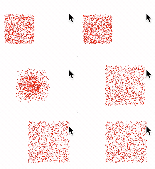
(OBJ_RectangleCloudShapes)
Array<number>:
array of interlaced x and y coordinates of vertices
const { rectangleCloudShapes } = Fig.morph;
const cloud1 = rectangleCloudShapes({
num: 1000,
width: 0.5,
height: 0.5,
position: [-0.5, 0],
});
const cloud2 = rectangleCloudShapes({
num: 1000,
width: 0.7,
height: 0.7,
});
const m = figure.add({
make: 'morph',
points: [cloud1, cloud2],
color: [1, 0, 0, 1],
});
m.animations.new()
.morph({ start: 0, target: 1, duration: 2 })
.start();
OBJ_RectangleCloudShapes
Options object to generate shapes at random positions within a rectangle.
Type: {width: number?, height: number?, position: TypeParsablePoint?, num: number?, shape: function ([number, number], number): Array<number>?, size: number?}
((function (Point, number): Array<number> | number)?)
: By default a square of two triangles is created (six vertices). Use a
number
to create a regular polygon with
number
sides. Use a custom
function to make a custom shape. The function takes as input the
[x, y]
position of the point to build the shape around, and
size
. It outputs an
array of interlaced x and y coordinates of triangle vertices - i.e.:
[x1, y1, x2, y2, x3, y3, ....]
(number?)
(number?)
Slide Navigator
SlideNavigator
Slide Navigator
It is sometimes useful to break down a visualization into easier to consume parts.
For example, a complex figure or concept can be made easier if built up from a simple begining. Each step along the way might change the elements within the figure, or the form of an equation, and be accompanied by a corresponding description giving context, reasoning or next steps.
An analogy to this is a story or presentation, where each step along the way is a presentation slide.
This class is a simple slide navigator, providing a convenient way to define slides and step through them.
CollectionsSlideNavigator creates the navigation buttons, and
textElement automatically, and will usually be more convenient than
manually creating them (unless custom buttons are needed).
Notifications - The notification manager property notifications will
publish the following events:
goToSlide: published when slide changes - will pass slide index to subscribersteady: steady state reached (slide transition complete)
((OBJ_SlideNavigator | null)
= null)
use
null
to load options later
with the
load
method. Options should only be loaded when an instantiated
FigureElementCollection
is available for the
collections
property.
(NotificationManager)
: notification manager for
element
(number)
: index of slide current shown
Load options after object instantiation. Usefull for if the
collection, prevButton, nextButton, equation and/or text figure
elements are not available at instantiation.
(OBJ_SlideNavigator)
Load slides into navigator
(Array<OBJ_SlideNavigatorSlide>)
Progress to next slide.
(boolean
= false)
when
false
, if the slide is still in
a transition when nextSlide is called, then the transition will skip
through to the end, without moving to the next slide - effectively skipping
through to the steady state of the current slide. If
true
, then the
transition will instantly complete, setState and leaveStates called and the
next slide will be progressed to.
Progress to the previous slide.
OBJ_SlideNavigator
SlideNavigator options object
The options here associate a number of FigureElements with the SlideNavigator, which will be ustilized by the slide definitions in OBJ_SlideNavigatorSlide.
The collection property associates a FigureElementCollection. If a
Figure is passed in, then the root level collection will be
used. All animations in slide transitions should be attached to
this collection or its children as this is the collection that will be
stopped when skipping slides. All string definitions of other elements
will be relative to this collection, and therefore must be children of
this collection. A collection must be passed in.
prevButton and nextButton are buttons that can be used to progress
backwards and forwards through the slides. The SlideNavigator will
disable prevButton on the first slide and update nextButton label
(if it exists) with 'restart' when at the last slide.
text is a OBJ_TextLines figure element that will be updated
with the text property in OBJ_SlideNavigatorSlide
equation is one or more Equation elements to associate with the
SlideNavigator. Each associated equation will be operated on by the form
property in OBJ_SlideNavigatorSlide. Use OBJ_EquationDefaults to
set default equation animation properties when form creates slide
transitions.
Type: any
((Figure | FigureElementCollection))
(Array<OBJ_SlideNavigatorSlide>?)
((null | FigureElement | string)?)
((null | FigureElement | string)?)
((null | string | FigureElementCollection)?)
(OBJ_EquationDefaults?)
OBJ_SlideNavigatorSlide
Slide definition options object.
This object defines the state the figure should be set to when this slide is navigated to.
A slide definition has several callback properties that can be used to set figure state including:
- enterState: set an initial state
- transition: define an animation for when moving to this slide
- steadyState: set steady state, then wait for next navigation event
- leaveState: set leave state when moving to another another slide
It is good practice to try and make each slide's state independant of other slides. If a square is shown on slides 4 and 5, then it should be explicitly shown on both slides. If it is only shown on slide 4, then it will be fine when the user navigates from slide 4 to 5, but will not be shown if the user is navigating from slide 6 to 5. Allowing users to go to specific slides out of order makes slide dependencies even more difficult.
Therefore, the enter, steady and leave states above should be used to fully define the figure's state on each slide.
However, while this approach will yield a good user experience, developing many slides, complex figures or numerous equation forms can make slide definition verbose. Even though each slide is different, many slides may share largely the same state, all of which needs to be explicitly defined for each slide.
The SlideNavigator tries to manage this by providing the fundamental state callbacks above, as well as properties that can be defined once, and shared between slides. Slides with shared, or common properties make copies of all the properties so each slide is independant, but require the developer to define them just once. If a slide doesn't define a common property, then it will use the definition in the last slide that defined it.
For example, the enterStateCommon property is a common property. If it is
defined in slides 4 and 7, then slides 0-3 will not have the property, slides
4-6 will use the slide 4 definition, and slides 7 and after will all use
slide 7's definition.
Common state properties include:
- enterStateCommon
- steadyStateCommon
- leaveStateCommon
The reason some states have both a common and slide specific property (such as steadyState and steadyStateCommon) is so the common property can be best leveraged. If all properties were common, then they would need to be redefined every time a small change was made. Having both common and slide specific properties allows a balance of defining some state for a group of slides once, while allowing specific changes to that state where needed.
In addition to the above state properties, there are a number of short-cut properties, that make it easy to set state for common figure elements. When a SlideNavigator is instantiated, a text figure element, a figure collection and one or more equation elements can be associated with it.
The text, modifier and modifierCommon properties can be used to set
the text of the text figure element associated with the SlideNavigator.
text and modifierCommon are common properties.
The form property is also common and can be used to automatically set the
form of the associated equation elements. A SlideNavigator can be associated
with one or more equations. The form property defines the form each of the
equations should be set to on this slide. If there is just one equation, then
the form property can be a string that is the form name. For two or more
equations, the form property should be an array of strings where each element
is the form name for the corresponding equation. The order of equations
passed into the SlideNavigator, needs to be the same as the order of strings
in the form array. To hide an equation, use a null instead of a string.
If the form property has less forms than equations, then all remaining
equations will be hidden.
The form property is a short cut with several consequences:
- All equations with
nullforms will be hidden prior toenterState. - If the slide doesn't have a
transitiondefined, and if an equation form is changed, then a transition will be added that animates the equation form change. Iftransitionis defined, and equation animation is required, then it needs to be defined in thetransitionproperty explicity. - Each equation with a defined form will have
showFormcalled on that form prior tosteadyState.
The life cycle of a slide change is:
leaveStateCommon(for current slide)leaveState(for current slide)- stop all animations
- Update associated text element with
textproperty - Hide all figure elements in associated collection
showCommonshow- show navigator buttons and navigator text element
hideCommonhide- show
fromForm - show all elements that dissolveIn or dissolveOut in an auto transition
scenarioCommonscenarioenterStateCommon(for new slide)enterStateaddReference- show all elements that dissolveOut and hide all elements that dissolveIn in an auto transition
- publish
beforeTransitionnotification - transition
- show
form - set targets from auto transition
steadyStateCommonsteadyState- update slide navigator buttons
- publish
steadynotification
Type: {text: OBJ_FormattedText?, modifiersCommon: OBJ_TextModifiersDefinition?, modifiers: OBJ_TextModifiersDefinition?, showCommon: TypeElementPath?, show: TypeElementPath?, hideCommon: TypeElementPath?, hide: TypeElementPath?, enterStateCommon: TypeSlideStateCallback?, enterState: TypeSlideStateCallback?, transition: TypeTransitionDefinition?, steadyStateCommon: TypeSlideStateCallback?, steadyState: TypeSlideStateCallback?, leaveStateCommon: TypeSlideLeaveStateCallback?, leaveState: TypeSlideLeaveStateCallback?, fromForm: (string | Array<(string | null)> | null)?, form: (string | Array<(string | null)> | null)?, scenarioCommon: (string | Array<string>)?, scenario: (string | Array<string>)?, clear: boolean?, time: TypeRecorderTime?, delta: number?, exec: (Array<[TypeRecorderTime, string]> | [TypeRecorderTime, string])?, execDelta: (Array<[number, string]> | [number, string])?, addReference: boolean?}
(OBJ_TextLines?)
: common property - With
modifiersCommon
and
modifiers
define the text for the text element associated with the
SlideNavigator
(OBJ_TextModifiersDefinition?)
: common property
(OBJ_TextModifiersDefinition?)
: common property - will
overwrite any keys from
modifiersCommon
with the same name
(TypeElementPath?)
: common property
(TypeElementPath?)
(TypeElementPath?)
: common property
(TypeElementPath?)
(TypeSlideStateCallback?)
: common property
(TypeSlideStateCallback?)
(TypeTransitionDefinition?)
: transititions are
only called when moving between adjacent slides in the forward direction.
Progressing backwards, or skipping around with
goToSlide
will not call
transition
. A transition is a callback where animations can be defined. A
done
function is passed to the callback and must be called at the end of
the animation to allow slide steadyStates to be set.
(TypeSlideStateCallback?)
: common property
(TypeSlideStateCallback?)
(TypeSlideLeaveStateCallback?)
: common property
(TypeSlideLeaveStateCallback?)
(("move" | "dissolve" | "moveFrom" | "pulse" | "dissolveInThenMove")?)
: override default animation option for
automatic form animation using the 'form' property
(TypeRecorderTime?)
: recorder only - absolute time to
transition to slide.
(number?)
: recorder only - time delta in seconds from last
slide transition to transition to this slide
((Array<[TypeRecorderTime, string]> | [TypeRecorderTime, string])?)
: recorder only - times to execute functions.
(boolean)
: recorder only
true
will add a new
reference state based on the current state
CollectionsSlideNavigator
FigureElementCollection that creates elements to work with SlideNavigator.
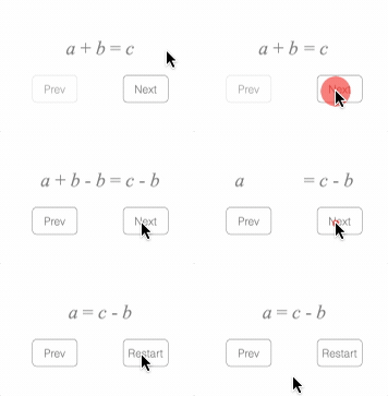
This object defines a rectangle FigureElementCollection that may include:
- previous button
- next button
- OBJ_TextLines object
Extends FigureElementCollection
To test examples below, append them to the boilerplate.
// At its simplest, the SlideNavigator can be used to navigate an equation
figure.add([
{
name: 'eqn',
make: 'equation',
formDefaults: { alignment: { xAlign: 'center' } },
forms: {
0: ['a', '_ + ', 'b', '_ = ', 'c'],
1: ['a', '_ + ', 'b', '_ - b_1', '_ = ', 'c', '_ - ', 'b_2'],
2: ['a', '_ = ', 'c', '_ - ', 'b_2'],
},
formSeries: ['0', '1', '2'],
},
{
name: 'nav',
make: 'collections.slideNavigator',
equation: 'eqn',
},
]);
// Text can be used to describe each slide
figure.add([
{
name: 'eqn',
make: 'equation',
formDefaults: { alignment: { xAlign: 'center' } },
forms: {
0: ['a', '_ + ', 'b', '_ = ', 'c'],
1: ['a', '_ + ', 'b', '_ - b_1', '_ = ', 'c', '_ - ', 'b_2'],
2: ['a', '_ = ', 'c', '_ - ', 'b_2'],
},
},
{
name: 'nav',
make: 'collections.slideNavigator',
equation: 'eqn',
text: { position: [0, 0.3] },
slides: [
{ text: 'Start with the equation', form: '0' },
{ text: 'Subtract b from both sides' },
{ form: '1' },
{ text: 'The b terms cancel on the left hand side' },
{ form: '2' },
],
},
]);
// This example creates a story by evolving a description, a diagram
// and an equation.
figure.add([
{ // Square drawing
name: 'square',
make: 'primitives.rectangle',
width: 0.4,
height: 0.4,
line: { width: 0.005 },
},
{ // Side length label
name: 'label',
make: 'text',
yAlign: 'middle',
position: [0.3, 0],
font: { size: 0.1 },
},
{ // Equation
name: 'eqn',
make: 'equation',
elements: {
eq1: ' = ',
eq2: ' = ',
eq3: ' = ',
},
phrases: {
sideSqrd: { sup: ['side', '_2'] },
areaEqSide: [{ bottomComment: ['Area', 'square'] }, 'eq1', 'sideSqrd'],
},
formDefaults: { alignment: { xAlign: 'center' } },
forms: {
0: ['areaEqSide'],
1: ['areaEqSide', 'eq2', { sup: ['_1', '_2_1'] }, 'eq3', '_1_1'],
2: ['areaEqSide', 'eq2', { sup: ['_2_2', '_2_1'] }, 'eq3', '4'],
},
position: [0, -0.8],
},
{ // Slide Navigator
name: 'nav',
make: 'collections.slideNavigator',
equation: 'eqn',
nextButton: { type: 'arrow', position: [1.2, -0.8] },
prevButton: { type: 'arrow', position: [-1.2, -0.8] },
text: { position: [0, 0.7], font: { size: 0.12 } },
},
]);
const square = figure.getElement('square');
const label = figure.getElement('label');
// Update the square size, and side label for any sideLength
const update = (sideLength) => {
square.custom.updatePoints({ width: sideLength, height: sideLength });
label.setPosition(sideLength / 2 + 0.1, 0);
label.setText({ text: `${(sideLength / 0.4).toFixed(1)}` });
};
// Add slides to the navigator
figure.getElement('nav').loadSlides([
{
showCommon: ['square', 'label', 'eqn'],
text: 'The area of a square is the side length squared',
form: '0',
steadyStateCommon: () => update(0.4),
},
{ text: 'So for side length of 1 we have and area of 1' },
{ form: '1' },
{ form: null, text: 'What is the area for side length 2?' },
{
transition: (done) => {
square.animations.new()
.custom({
duration: 1,
callback: p => update(0.4 + p * 0.4),
})
.whenFinished(done)
.start();
},
steadyStateCommon: () => update(0.8),
},
{ form: '2' },
]);
COL_SlideNavigator
CollectionsSlideNavigator options object that extends
OBJ_Collection options object (without parent).
This rectangle is similar to OBJ_Rectangle, except it can accomodate both a fill and a border or line simultaneously with different colors.
Type: any
Extends OBJ_Collection
((Figure | FigureElementCollection | string)?)
: collection to tie slide navigator to. By default will tie to its parent.
(Array<OBJ_SlideNavigatorSlide>?)
(COL_SlideNavigatorEqnDefaults?)
: default
equation animation options
TypeSlideFrom
Last slide shown
'next' | 'prev' | number
Type:
("next" | "prev" | number)
TypeSlideLeaveStateCallback
(currentIndex: number, nextIndex: number) => void
When using Recorder, a string from a FunctionMap can be used, as long as the function the string maps to allows for the same parameters as above.
TypeSlideStateCallback
(currentIndex: number, from:TypeSlideFrom) => void
When using Recorder, a string from a FunctionMap can be used, as long as the function the string maps to allows for the same parameters as above.
Type: (string | function (TypeSlideFrom, number): void)
TypeSlideTransitionCallback
Callback definition for slide transition.
(done: () => void, currentIndex: number, from:TypeSlideFrom) => void
When using Recorder, a string from a FunctionMap can be used, as long as the function the string maps to allows for the same parameters as above.
Important note: the done parameter MUST be called at the end of the
transition to allow the slide to progress to steady state.
Type: (string | function (function (): void, number, TypeSlideFrom): void)
OBJ_EquationDefaults
Default equation animation properties.
Type:
{duration: number?, animate: ("move" | "dissolve" | "moveFrom" | "pulse" | "dissolveInThenMove")?}
(number?)
(("move" | "dissolve" | "moveFrom" | "pulse" | "dissolveInThenMove")?)
TypeTransitionDefinition
Transition Definition
TypeSlideTransitionCallback | OBJ_AnimationDefinition | Array<OBJ_AnimationDefinition | Array<OBJ_AnimationDefinition>>
For complete control in creating a transition animation, and/or setting necessary transition state within an application, use a function definition TypeSlideTransitionCallback.
Many transitions will be simple animations, dissolving in elements, dissolving out elements, or animating between positions. For these, a short hand way of defining animations can be used.
OBJ_AnimationDefinition is a json like object that defines the animation. When used in an array, multiple animations will be executed in series.
If an array of OBJ_AnimationDefinition objects has an element that itself is an array of OBJ_AnimationDefinition objects, then the the animations within the nested array will be executed in parallel.
Type: (TypeSlideTransitionCallback | OBJ_AnimationDefinition | Array<(OBJ_AnimationDefinition | Array<OBJ_AnimationDefinition>)>)
// Figure has two rectangles and a slide navigator. Slides will dissolve in,
// dissolve out, move and rotate rectangles
const [rect1, rect2] = figure.add([
{
name: 'rect1',
make: 'primitives.rectangle',
width: 0.4,
height: 0.4,
position: [-0.5, 0.5],
},
{
name: 'rect2',
make: 'primitives.rectangle',
width: 0.4,
height: 0.4,
position: [0.5, 0.5],
},
{
name: 'nav',
make: 'collections.slideNavigator',
},
]);
const setPositionAndRotation = (r1Pos, r1Rot, r2Pos, r2Rot) => {
rect1.setPosition(r1Pos);
rect1.setRotation(r1Rot);
rect2.setPosition(r2Pos);
rect2.setRotation(r2Rot);
};
// Add slides to the navigator
figure.getElement('nav').loadSlides([
// Slide 1
{
showCommon: 'rect1',
enterStateCommon: () => setPositionAndRotation([-0.5, 0.5], 0, [0.5, 0.5], * 0),
},
// Slide 2
{
transition: (done) => {
rect2.animations.new()
.dissolveIn({ duration: 1 })
.whenFinished(done) // Make sure to process done when finished
.start();
},
// When using a transition function, any changes during the transition
// need to be explicitly set at steady state
steadyState: () => {
rect2.show();
},
},
// Slide 3
// When using animation objects, the targets of animations will be
// automatically set at steady state, so user does not need to set them
{
showCommon: ['rect1', 'rect2'],
transition: { position: 'rect2', target: [0.3, 0.5], duration: 1 },
},
// Slide 4
// Use an array of animation object definitions to create a sequence of steps
{
enterState: () => setPositionAndRotation([-0.5, 0.5], 0, [0.3, 0.5], 0),
transition: [
{ position: 'rect1', target: [-0.3, 0.5], duration: 1 },
{ rotation: 'rect1', target: Math.PI / 4, duration: 1 },
{ rotation: 'rect2', target: Math.PI / 4, duration: 1 },
],
},
// Slide 5
// Use an array within an array to create parallel steps
{
enterState: () => setPositionAndRotation([-0.3, 0.5], Math.PI / 4, [0.3, 0. * 5], Math.PI / 4),
transition: [
[
{ rotation: 'rect1', target: 0, duration: 1 },
{ rotation: 'rect2', target: 0, duration: 1 },
],
[
{ position: 'rect1', target: [-0.5, 0.5], duration: 1 },
{ position: 'rect2', target: [0.5, 0.5], duration: 1 },
],
{ out: ['rect1', 'rect2'] },
],
},
]);
Interactive Video
With FigureOne, you can create a figure that can be both interactive and animated.
The evolution of this is interactive video, enabled by the Recorder class. For something to be video-like, it needs to have visual content, audio, and the ability to play, pause, stop and seek. The recorder class can:
- record and playback events, such as function calls, mouse movements, mouse clicks and slide navigation - these can either be recorded by a user, or programmed for specific times
- overlay an audio track on playback
- record entire figure state at regular intervals (e.g. 1 second) as seek frames for the video
- allow a user to pause video at any time and interact with the figure in its current state - on resuming playback, the figure will revert to its paused state
As such, the animation in FigureOne can be overlaid with audio to create a video like experience. Except in this case, content on the screen can be just as rich and interactive as that created normally with FigureOne.
State, Seeking and Pausing
Video seeking and pausing is enabled by recording and setting figure state.
A FigureOne diagram may contain numerous FigureElements arranged in a hierarchy of collections that group elements. Each FigureElement has properties that define how it behaves and is displayed, such as its visibility, color, transform, current or pending animations, and its behavior when touched or moved. These properties change over time, such as with animations and interactive actions from the user. We use the term 'state' to describe a snapshot of these property values at some instant in time. As such, individual FigureElements can have a state, and the state of all elements together is called the Figure state.
Part of creating a FigureOne interactive video, is to record figure state at regular intervals. These states are the seek frames. As a user is scrubbing through a video with the seek bar, the figure will be set into the state closest to the seek time. When play is pressed, the video will resume from this state.
Video pausing can happen at any time. Therefore, on pause, the figure state is captured and saved. If the figure is interacted with, and its state changes, then when play is resumed the pause state will be reloaded and playback will resume.
Note however that figure state only captures some of the figure state. For each FigureElement a state capture will include the properties:
animations,coloropacitydimColordefaultColortransformisShownisMovableisTouchablestatemovenotificationscustomState
So that means if the element manages a drawingObject whose vertices change over time, then the vertices will need to be updated when state is set. Use the setState notification from the notifications property of the element to do this.
Video Track
The video track of a FigureOne video contains the recorded event and state information. It is stored in json format, and so all information within it must be stringify-able. Therefore only numbers, booleans, strings and nested objects or arrays with the same types are acceptable.
However, some state information will refer to functions. For example, a trigger animation step has a callback function it needs to trigger. So how can you convert a function to a string?
FigureOne has a FunctionMap class which is a map of identifier strings to functions. When the figure is first loaded, functions are defined and stored in the map. When the functions need to be executed, the string is passed to the FunctionMap which then executes the associated function. When the function execution is recorded, just the string id and any associated parameters (that are also stringify-able) are recorded.
The Figure and each FigureElement within it has an fnMap property which is a local FunctionMap. Each FunctionMap also have a link to a global map of functions at fnMap.global. FunctionMap will first try to execute a method from its local map. If it doesn't exist, then it will try the global map.
Functions can be added to FunctionMaps with the add() method and executed with the exec() method.
For example, to add a function toConsole to a FunctionMap and then execute it while passing in a parameter you can:
figure.fnMap.add('toConsole', s => console.log(s));
figure.fnMap.exec('toConsole', 'hello');
Advantages compared to Traditional Video
Interactivity
FigureOne videos can be made to be interactive. FigureOne elements, be they shapes, text or equations can all be made interactive and so video-like experiences can be made that are similarly interactive.
Some examples of how this could be used are:
- Allow users to manipulate a diagram to help solidfy a concept being explained midway through a video
- Allow users to explore and reformat presented data and/or plots
- Allow feedback from users directly in the video, like with embedded quizzes
- Allow users to discover concepts by providing interative tools, showing them how to experiment with the tools to discover some concept, and giving them hints along the way
File Size and Resolution
Similar to traditional videos, FigureOne interactive videos have a video and an audio track.
The audio track of both traditional and interactive video is similar, and has the same size vs quality trade-offs. For podcast like quality, a 64kbps mp3 file might be approximately 0.5MB/minute.
A traditional video track needs to store information for each pixel on each frame of the video. While significant compression is achieved in modern video, video file sizes are still considerable. For 1080p video at 30 fps it may take upwards of 20MB/minute, and for 4k video upwards of 90MB/minute. Traditional video is both resolution and frame rate dependent. As such, videos are often encoded with multiple resolutions for efficient deployment to clients with different screen resolutions and bandwidth capabilities.
In comparison, a FigureOne video track stores just the construction information of the figure elements on the screen, and how they are animating. This information can be stored as zipped json data, and is small. It is neither resolution nor frame rate dependant. For example, the compressed video data of example Trig 2 - Names is just 69kB for 4:27 minutes of video. Compared with what might be closer to 90MB for 1080p, this is a 1500x saving. In this case, the audio is the largest component of the video package at 2.1MB.
Thus, you might say that FigureOne video is video for the size of an audio file.
A helpful analogy comparing traditional video to FigureOne interactive video is that of a bitmap image file (traditional video) to a vector image file (FigureOne interactive video).
Disadvantages compared to Traditional Video
Creation Complexity
A FigureOne interactive video is created using javascript code. Though much can be simplified down to json like objects, it is still useful to have some programming experience - especially for complex interactivity.
In comparison, traditional videos can be created by a broader range of people with relatively easy to use equipment and video editing software.
Content Complexity
The complexity of the video content (number of different colored pixels and how often they change) on a traditional video impacts the size of the video, but has less impact on the final performance of displaying the video on the client device. Most client devices have significant optization at the OS and often hardware level to make playing video fast and smooth.
FigureOne interactive video is not a standard, and its performance is limited by the client's browser performance. On each video frame, FigureOne needs to calculate the video state and render it to the screen. To achive relatively smooth video, FigureOne needs render a frame in less than 15-20ms.
FigureOne uses WebGL for hardware accelarated graphics performance and so complex figures with lots vertices and animations can be created to perform well (>25 fps) on low end, or old client devices. However, if a figure contains hundreds of different elements, all shown and moving at the same time, then care needs to be taken to optimize the video for performance. As the content complexity increases significantly, the creation complexity increases to keep performance acceptable.
Full Screen Behavior in Safari
FigureOne is a javascript library that can be used in the browser, or in app frameworks that support javascript modules.
On iOS devices, Safari allows traditional video content to fully cover the screen (without menu bars) in landscape mode. This isn't available for other web content, and so for FigureOne to emulate a video experience in the browser then either the video height needs to be reduced, or the top portion of the video should have limited interactivity (as touching the top of the screen in landscape can show the menus).
Important Note
To significanty reduce the size of the seek states, states are generally saved as a delta to some reference state which is generated when the recorder starts, or when triggered with addCurrentStateAsReference.
Important note: within a state, if an array length is less than the length of the corresponding array in the reference state, then it will be padded with
undefinedelements to be the same length as in the reference.
This isn't ideal, and will be fixed in a future release.
Recorder
The Recorder class provides functionality to record and playback video like experiences. It can:
- record and playback events, such as function calls, mouse movements, mouse clicks and slide navigation - these can either be recorded by a user, or programmed for specific times
- overlay an audio track on playback
- record entire figure state at regular intervals (like 1 second) as seek frames for the video
- allow a user to pause video at any time and interact with the figure in its current state - on resuming playback, the figure will revert to its paused state
For performance during recording, a separate javascript worker is used to parallelize state encoding. Therefore, in addition to the FigureOne library, a FigureOne worker file will need to be loaded. See the tutorials for examples on how this is done.
For tutorials and examples of how to use Recorder, see
- Tutorial 15 - Recorder Introduction
- Tutorial 16 - Recording Manual Events
- Tutorial 17 - Recording Slides
- Tutorial 18 - Recording Planned Events
- Trig 1 - Trig Functions
- Trig 2 - Names
- Trig 3 - Relationships
Notifications - The notification manager property notifications will
publish the following events:
timeUpdate: updated at period defined in propertytimeUpdatesdurationUpdated: updated whenever audio or video are loaded, or when recording goes beyond the current durationaudioLoadedvideoLoadedrecordingStartedrecordingStoppedpreparingToPlayplaybackStartedpreparingToPauseplaybackStoppedseekrecordingStatesComplete- recording completed and recorded states ready
(TimeKeeper)
(("recording" | "playing" | "idle" | "preparingToPlay" | "preparingToPause"))
(boolean)
(number)
: in seconds
(number)
: in seconds - change this to change the
duration between recorded seek frames
(number)
: in seconds - how often to publish the
'timeUpdate' notification
(NotificationManager)
: use to subscribe to
notifications
Initiate states recording to generate seek frames. Any existing states will be removed before starting, so the initial state at time 0 must be in place (usually this means only start states recording when the figure is first created and not after any changes to the initial state have been made)
(number
= 0.1)
time between draw frames in seconds. It can be
sometimes be useful to have draw frames happen more frequently than the
seek frames
[0.1s]
Stop Recording
Cancel the states recording.
Use this only for cancelling recording as states recording will be automatically stopped if the event and audio duration has been reached.
Save events and states to video-track json file
Toggle playback (if not recording)
Resume playback if paused.
Pause playback
(("freeze" | "cancel" | "complete" | "animateToComplete" | "dissolveToComplete")
= this.settings.pause)
how any animations currently playing should be stopped
FunctionMap
Function Map
In FigureOne Recorder, state is saved in stringified javascript objects. When the state includes a function (like a trigger method in an animation for example) then that function is referenced in the state object as a unique string id.
When a geometry is loaded, functions that will be captured in state objects
need to be added to a function map. Both Figure and
FigureElement have attached function maps as the property fnMap.
Therefore, the method is added to either the figure or element function map,
with an associated unique string id, and that string id is used when the
function is used. For example as defined callbacks, triggerAnimationStep and
customAnimationStep callbacks, or recorder slide definitions (entryState,
steadyState, leaveState, exec, execDelta).
The funciton map has:
- A map of functions
- A link to a global map of functions (a singleton)
- The ability to execute a function within the map
Extends GeneralFunctionMap
(FunctionMap)
: global function map
(Object)
: local function map where keys are unique identifiers
and values are the associated functions
// Add a console function to a FunctionMap and execute it with a parameter
figure.fnMap.add('toConsole', s => console.log(s));
figure.fnMap.exec('toConsole', 'hello');
TypeRecorderTime
Recorder time format.
number | string
Use number for number of seconds, or use string with format 'm:s.s' (for
example, '1:23.5' would define 1 minute, 23.5 seconds)
Shaders
WebGL utilizes hardware acceleration to draw very complex shapes - even on low end devices. Most FigureOne FigureElementPrimitives interface directly with WebGL to render the shapes, and as such a user doesn't need to know anything about WebGL to use FigureOne.
FigureOne also provides a FigureElementPrimitive OBJ_GenericGL with direct access to WebGL shaders and buffers. This means a user with some WebGL experience can write custom shaders which may dramatically increase the performance of a particularly complicated figure, or a figure with special graphical effects.
It is not in the scope of this API reference to explain what WebGL is, and how to use it. There are many good resources on the web that already do this - for example WebGLFundamentals gives an excellent introduction to WebGL and this quick reference guid is useful to refer to especially when writing shaders. A WebGL API reference is here.
For more detailed information on how to create a FigureOne OBJ_GenericGL, and customize shaders and buffers see this tutorial.
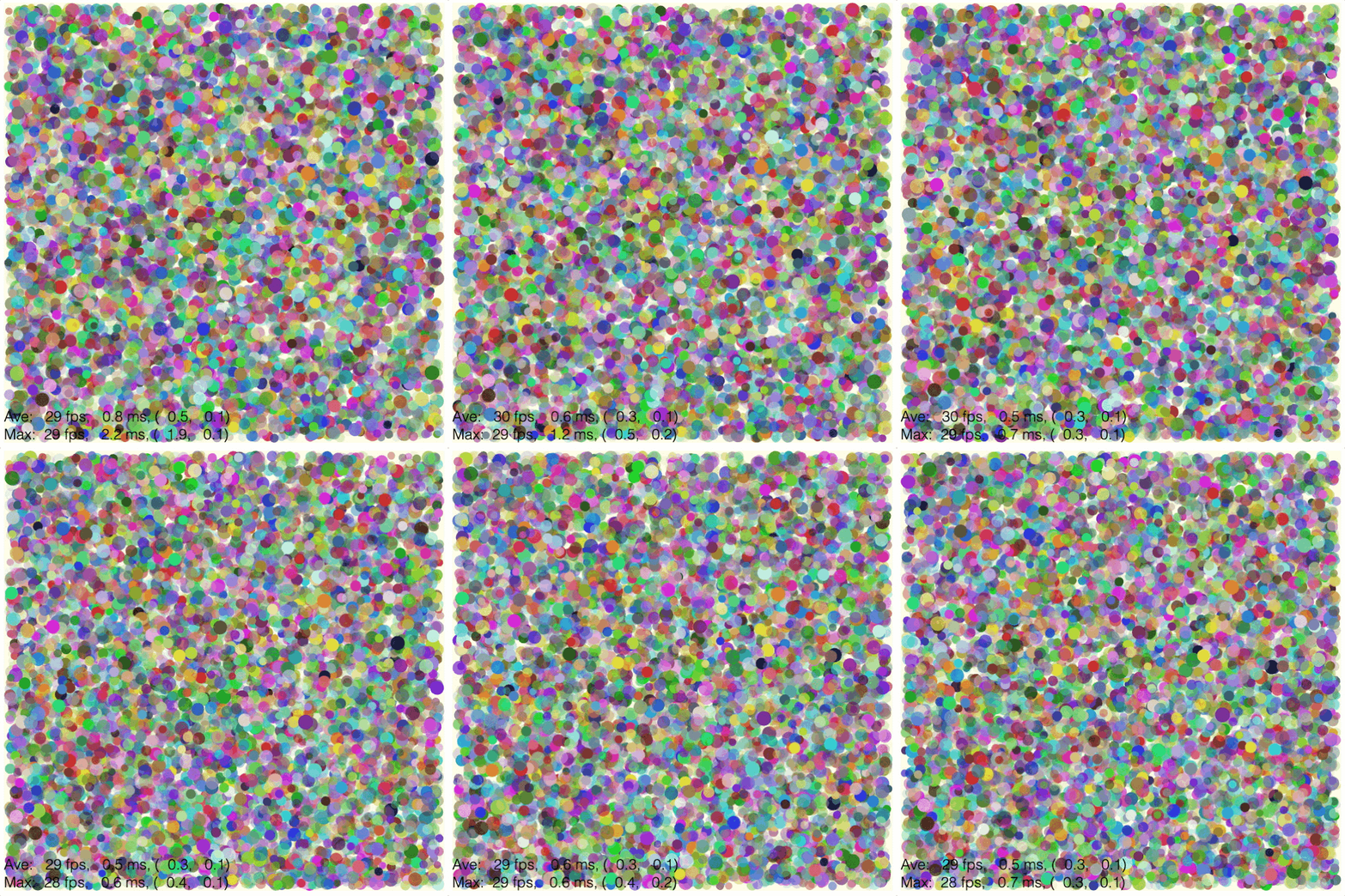
Another example of a OBJ_GenericGL in action is from the FigureOne examples here.
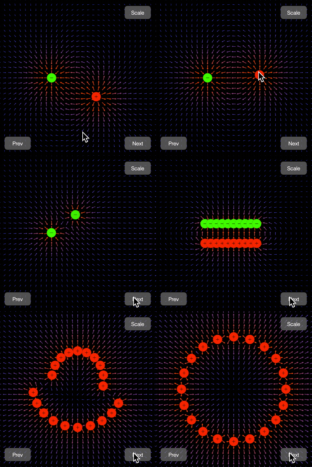
OBJ_GenericGL
DiagramElementPrimitive with low level WegGL drawing object.
A number of WebGL specific properties can be defined.
WebGL specific properties are glPrimitive, vertexShader, fragmentShader
attributes, uniforms and an optional texture. The
nomencalture for these properties is directly from WebGL.
Properties vertices, colors, dimension, light and normals provide
shortcuts for defining the shaders, attributes and uniforms when shaders are
not customized.
Shaders are programs that run in the GPU and are written in a C-like
language. Shaders operate on each vertex of a shape in parallel. The vertex
shader transforms each vertex to some specific position, and performs color
and lighting related calculations for scenarios when color and/or lighting
are vertex specific. The fragment shader computes the final color of each
pixel (fragment) between the vertices that make up a glPrimitive.
Data can be passed from the CPU (JavaScript) to the GPU with attributes and uniforms.
Attributes are arrays of numbers that represent data specific for each vertex in a shape. At a minimum, an attribute that defines the (x, y) or (x, y, z) coordinates of each vertex is needed. Other attributes might be color if all verticies do not have the same color, texture coordinates to map vertex color to a 2D image texture, and normal vectors for defining how light reflects from and thus brightens a surface. Each attribute must define data for every vertex in a shape. Attributes are typically defined and loaded into GPU buffers once. On each animation frame, the GPU will pass the buffered attributes to the shaders. Attributes are only passed to the vertex shader.
Uniforms are small amounts of data (vectors or square matrices with a maximum dimension/rank of 4) that are passed from the CPU to the GPU on each frame. A uniform value can be passed to both the vertex and fragment shader and is thus available to all vertices and fragments. A uniform is like a global variable whose value can change on each animation frame. Example uniforms are:
- transform matrix that transforms all vertices in space the same way
- color value that colors all vertices the same (instead of having to define a color for each vertex)
- light source properties like position, direction, and amplitude
Data can be passed from the vertex shader to the fragment shader in variables called varyings. Example varyings include color attributes (color that is defined for each vertex) and lighting information if the lighting is vertex dependent.
Shaders source code can be defined as a string, or composed automatically
from options including dimension, color and light. Shader source code
contains attribute and uniform variables, and these attributes and uniforms
need to be defined with attributes and uniforms.
If using automated shader composition, then only attributes need to be
defined. The uniforms will be passed to the shader from the information in
the color property of the FigureElementPrimitive and the scene used to
draw the primitive. See OBJ_VertexShader and
OBJ_FragmentShader for names of attributes and uniforms used in the
shaders, and when they are used.
Type: any
(TypeGLPrimitive?)
(TypeVertexShader?)
(TypeFragmentShader?)
(Array<OBJ_GLAttribute>?)
(Array<OBJ_GLUniform>?)
(OBJ_Texture?)
((2 | 3)?)
: default value for
dimension in vertex shader if vertex shader is undefined (
2`)
(("point" | "directional" | null)?)
: default value for
light
in vertex and fragment shader if shaders are not otherwise defined (
null
)
((Array<number> | OBJ_GLColorData)?)
: default value for
light
in vertex and fragment shader if shaders are not otherwise defined
(
uniform
)
// Default options are 2D, uniform color, TRIANGLES.
// Create two red triangles (6 vertices, 12 values)
figure.add({
make: 'gl',
vertices: [0, 0, 0.5, 0, 0, 0.5, 0.5, 0, 1, 0, 0.5, 0.5],
color: [1, 0, 0, 1],
});
// Simple rotatable element with a custom position
figure.add({
make: 'gl',
vertices: [0, 0, 0.5, 0, 0, 0.5, 0.5, 0, 1, 0, 0.5, 0.5],
color: [1, 0, 0, 1],
position: [-0.4, -0.4, 0],
move: { type: 'rotation' },
});
// Assign a color to each vertex
figure.add({
make: 'gl',
vertices: [0, 0, 0.5, 0, 0, 0.5, 0.5, 0, 1, 0, 0.5, 0.5],
colors: [
0, 0, 1, 1,
1, 0, 0, 1,
0, 0, 1, 1,
1, 0, 0, 1,
0, 0, 1, 1,
1, 0, 0, 1,
],
});
// Assign a color to each vertex, using just 3 numbers per color (no alpha)
figure.add({
make: 'gl',
vertices: [0, 0, 0.5, 0, 0, 0.5, 0.5, 0, 1, 0, 0.5, 0.5],
colors: {
data: [
0, 0, 1,
1, 0, 0,
0, 0, 1,
1, 0, 0,
0, 0, 1,
1, 0, 0,
],
size: 3,
},
});
// Texture filled square
figure.add({
make: 'gl',
vertices: [-0.5, -0.5, 0.5, -0.5, -0.5, 0.5, 0.5, -0.5, 0.5, 0.5, -0.5, 0.5],
numVertices: 6,
texture: {
src: './flower.jpeg',
coords: [0, 0, 1, 0, 0, 1, 1, 0, 1, 1, 0, 1],
loadColor: [0, 0, 0, 0],
},
});
// Make a 3D cube using composed shaders
const { toNumbers } = Fig;
const [cubeVertices, cubeNormals] = Fig.cube({ side: 0.5 });
figure.scene.setProjection({ style: 'orthographic' });
figure.scene.setCamera({ position: [2, 1, 2] });
figure.scene.setLight({ directional: [0.7, 0.5, 1] });
figure.add({
make: 'gl',
light: 'directional',
dimension: 3,
vertices: toNumbers(cubeVertices),
normals: toNumbers(cubeNormals),
color: [1, 0, 0, 1],
});
// Custom shaders
// Make a shader with a custom attribute aVertex and custom uniform uColor,
// which are then defined in the options.
// Note, the `u_worldViewProjectionMatrix` uniform does not need to be defined
// as this will be passed by FigureOne using the Scene information of the
// figure (or element if an element has a custom scene attached to it).
figure.add({
make: 'gl',
vertexShader: {
src: `
uniform mat4 u_worldViewProjectionMatrix;
attribute vec4 aVertex;
void main() {
gl_Position = u_worldViewProjectionMatrix * aVertex;
}`,
vars: ['aVertex', 'u_worldViewProjectionMatrix'],
},
fragmentShader: {
src: `
precision mediump float;
uniform vec4 uColor;
void main() {
gl_FragColor = uColor;
gl_FragColor.rgb *= gl_FragColor.a;
}`,
vars: ['uColor'],
},
attributes: [
{
name: 'aVertex',
size: 3,
data: [0, 0, 0, 0.5, 0, 0, 0, 0.5, 0, 0.5, 0, 0, 1, 0, 0, 0.5, 0.5, 0],
},
],
uniforms: [
{
name: 'uColor',
length: 4,
value: [1, 0, 0, 1],
},
],
});
OBJ_GLAttribute
GL buffer.
Type: {name: string, data: Array<number>, size: number?, type: TypeGLBufferType?, normalize: boolean?, stride: number?, offset: number?, usage: TypeGLBufferUsage?}
(string)
: name of attribute in shader
OBJ_GLVertexBuffer
GL vertex - associated with attribute 'a_vertex' in shader.
Assumes buffer parameters of:
- name: 'a_vertex'
- size: 2
- type: 'FLOAT'
- normalize: false
- stride: 0
- offset: 0
Type: {data: Array<number>, usage: TypeGLBufferUsage}
OBJ_GLUniform
GL Uniform
Type:
{name: string, length: (1 | 2 | 3 | 4), type: TypeGLUniform}
TypeGLBufferType
'BYTE' | 'UNSIGNED_BYTE' | 'SHORT' | 'UNSIGNED_SHORT' | 'FLOAT'
Type:
("BYTE" | "UNSIGNED_BYTE" | "SHORT" | "UNSIGNED_SHORT" | "FLOAT")
TypeGLBufferUsage
'STATIC' | 'DYNAMIC'
Type:
("STATIC" | "DYNAMIC")
TypeGLUniform
'FLOAT' | 'FLOAT_VECTOR' | 'INT' | 'INT_VECTOR'
Type:
("FLOAT" | "FLOAT_VECTOR" | "INT" | "INT_VECTOR")
TypeGLPrimitive
GL primitive type that describes the shapes the vertices are creating. Analagous to WebGL drawing primitives where the mapping between the two are:
'TRIANGLES': TRIANGLES'STRIP': TRIANGLE_STRIP'FAN': TRIANGLE_FAN'LINES': LINES'POINTS': LINES
'TRIANGLES' | 'POINTS' | 'FAN' | 'STRIP' | 'LINES'
Type:
("TRIANGLES" | "POINTS" | "FAN" | "STRIP" | "LINES")
TypeFragmentShader
A fragment shader can be defined with either:
{ src: string, vars: Array<string> }: a shader source code string and a list of attributes and uniformsstring: an identifier to a built-in shader- OBJ_VertexShader
| Array<string | number | boolean>: composing options for a composable shader
Type: (string | {src: string, vars: Array<string>?} | Array<(string | number | boolean)> | OBJ_FragmentShader)
TypeVertexShader
A vertex shader can be defined with either:
{ src: string, vars: Array<string> }: a shader source code string and a list of attributes and uniformsstring: an identifier to a built-in shader- OBJ_VertexShader
| Array<string | number | boolean>: composing options for a composable shader
Type: (string | {src: string, vars: Array<string>?} | Array<(string | number | boolean)> | OBJ_VertexShader)
OBJ_VertexShader
Options used to compose vertex shader source code.
Shader source code can be automatically composed for different vertex dimension (2D vs 3D), coloring and lighting options.
Composed source code uses specific attribute, uniform and varying names.
Attributes will need to be defined by the user in the attributes property
of OBJ_GenericGL.
Attributes:
vec2 a_vertex: used to define vertex positions whendimension = 2.vec4 a_vertex: used to define vertex positions whendimension = 3- Note, for this case an attribute size of only 3 is needed as the fourth coordinate (w in the homogenous coordinate system) is automatically filled with a 1.vec4 a_color: used to define the color of a vertex whencolor = 'vertex'vec2 a_texcoord: used to define the texture coordinates to map the vertex to whencolor = 'texture'vec3 a_normal: used to define the normal vector for a vertex used whenlight = 'point'orlight = 'directional'
Uniforms will be defined and updated by FigureOne based on the color and transform of the primitive, and the scene being used to draw the primitive. Thus, the uniform variables listed below for are for informational purposes only.
Uniforms:
mat4 u_worldViewProjectionMatrix: transfomration matrix that cascades projection, camera position, and any additional transformation of the shapefloat u_z: define a specific z for all vertices whendimension = 2u_worldInverseTranspose: transpose of inverse world matrix needed for to correctly transform normal vectors. Used whenlight = 'point'orlight = 'directional'vec3 u_lightWorldPosition: defines the position of a point source light used whenlight = 'point'mat4 u_worldMatrix: defines the world matrix transform that orients the point source light relative to the shape used whenlight = 'point'.
Varyings are passed from the vertex shader to the fragement shader. They are listed here in case the user wants to customize one shader, while relying on composition for the other. All varying expected by the composed shader will need to be defined in the custom shader.
vec2 v_texcoord: pass texture coordinates to fragment shader used whencolor = 'texture'vec4 v_color: pass vertex specific color to fragment shader used whencolor = 'vertex'vec3 v_normal: pass normals (transformed withu_worldInverseTranspose) to fragment shader used whenlight = 'directional'orlight = 'point'vec3 v_vertexToLight: pass vector between point source light and vertex to fragment shader used whenlight = 'point'
Type:
{light: ("point" | "directional" | null)?, color: ("vertex" | "uniform" | "texture")?, dimension: (2 | 3)?}
((2 | 3)?)
: (
2
)
(("vertex" | "uniform" | "texture")?)
: (
uniform
)
(("point" | "directional" | null)?)
: (
null
)
OBJ_FragmentShader
Options used to compose fragment shader source code.
Shader source code can be automatically composed for different coloring and lighting options.
Composed source code uses specific uniform and varying names.
Uniforms will be defined and updated by FigureOne based on the color and transform of the primitive, and the scene being used to draw the primitive. Thus, the uniform variables listed below for are for informational purposes only.
Uniforms:
vec4 u_color: global color for all vertices used all times. Whencolor = 'texture'orcolor = 'vertex', only the alpha channel ofu_coloris used.sampler2D u_texture: texture used whencolor = 'texture'.vec3 u_directionalLight: world space position of directional light source used whenlight = 'directional'float u_ambientLight: ambient light used whenlight = 'directional'orlight = 'point'.
Varyings are passed from the vertex shader to the fragement shader. They are listed here in case the user wants to customize one shader, while relying on composition for the other.
vec2 v_texcoord: texture coordinates from vertex shader used whencolor = 'texture'vec4 v_color: vertex specific color from vertex shader used whencolor = 'vertex'vec3 v_normal: normals from vertex shader used whenlight = 'directional'orlight = 'point'vec3 v_vertexToLight: vector between point source light and vertex from vertex shader used whenlight = 'point'
Type:
{light: ("point" | "directional" | null)?, color: ("vertex" | "uniform" | "texture")?}
((2 | 3)?)
: (
2
)
(("vertex" | "uniform" | "texture")?)
: (
uniform
)
(("point" | "directional" | null)?)
: (
null
)
OBJ_GLColorData
Color definition for a gl primitive.
Type:
{data: Array<number>, normalize: boolean?, size: (3 | 4)?}
2D Geometry Tools
minAngleDiff
Get the minimum absolute angle difference between two angles
number
const minAngleDiff = Fig.minAngleDiff;
const d1 = minAngleDiff(0.1, 0.2);
console.log(d1);
// -0.1
const d2 = minAngleDiff(0.2, 0.1);
console.log(d2);
// 0.1
const d3 = minAngleDiff(0.1, -0.1);
console.log(d3);
// 0.2
getTriangleCenter
Get center of a triangle
const getTriangleCenter = Fig.getTriangleCenter;
const center = getTriangleCenter([0, 0], [1, 0], [0, 1]);
console.log(center);
// Point {x: 0.3333333333333333, y: 0.3333333333333333}
polarToRect
Polar coordinates to cartesian coordinates conversion
const polarToRect = Fig.polarToRect;
const p = polarToRect(Math.sqrt(2), Math.PI / 4);
console.log(p);
// Point {x: 1, y: 1)
rectToPolar
Cartesian coordinates to polar coordinates conversion
{angle: number, mag: number, phi: number, r: number, theta: number}
const rectToPolar = Fig.rectToPolar;
const p = rectToPolar(0, 1);
console.log(p);
// {mag: 1, angle: 1.5707963267948966}
threePointAngle
Returns the angle from the line (p1, p2) to the line (p1, p3) in the positive rotation direction and normalized from 0 to Math.PI * 2.
number
const threePointAngle = Fig.threePointAngle;
const getPoint = Fig.getPoint;
const p1 = threePointAngle(getPoint([1, 0]), getPoint([0, 0]), getPoint([0, 1]));
console.log(p1);
// 1.5707963267948966
const p2 = threePointAngle(getPoint([0, 1]), getPoint([0, 0]), getPoint([1, 0]));
console.log(p2);
// 4.71238898038469
threePointAngleMin
Returns the minimum angle from the line (p1, p2) to the line (p1, p3).
number
const threePointAngleMin = Fig.threePointAngleMin;
const getPoint = Fig.getPoint;
const p1 = threePointAngleMin(getPoint([1, 0]), getPoint([0, 0]), getPoint([0, 1]));
console.log(p1);
// 1.5707963267948966
const p2 = threePointAngleMin(getPoint([0, 1]), getPoint([0, 0]), getPoint([1, 0]));
console.log(p2);
// -1.5707963267948966
clipAngle
Clip and angle between 0 and 2π ('0to360') or -π to π ('-180to180').
null will return the angle between -2π to 2π.
(number)
(("0to360" | "-180to180" | null | "-360to360" | "-360to0"))
number
const clipAngle = Fig.clipAngle
const a1 = clipAngle(Math.PI / 2 * 5, '0to360');
console.log(a1);
// 1.5707963267948966
const a2 = clipAngle(Math.PI / 4 * 5, '-180to180');
console.log(a2);
// -2.356194490192345
const a3 = clipAngle(-Math.PI / 4 * 10, null);
console.log(a3);
// -1.5707963267948966
normAngle
Normalize angle to between 0 and 2π.
(number)
number
getDeltaAngle
Get angle delta based on direction
number
getDeltaAngle3D
Get delta angle of a Point where the x, y, z components are rotations around the x, y, and z axes.
(Point)
(Point)
((TypeRotationDirection | [TypeRotationDirection, TypeRotationDirection, TypeRotationDirection])
= 0)
Geometry Creation
polygon
Create points a regular polygon.
Can return either:
- Array<Point> - corners of a polygon
- Array<
number> - interlaced points of triangles used to a polygon fill
(OBJ_PolygonPoints)
(Array<Point> | Array<number>)
polygonLine
Create a solid regular polygon line.
Can return either:
- Array<Point> - [inner corner 0, outer corner 0, inner corner 1, outer corner 1, inner corner 2...]
- Array<
number> - interlaced points of triangles used to draw a polygon line
(OBJ_PolygonLinePoints)
(Array<Point> | Array<number>)
cone
Return points of a cone.
The points can either represent the triangles that make up each face, or represent the start and end points lines that are the edges of each face of the cone.
If the points represent triangles, then a second array of normal vectors for each point will be available.
(OBJ_ConePoints)
(OBJ_CubePoints)
: cone options
[Array<Point>, Array<Point>]:
an array of points and normals. If
the points represent lines, then the array of normals will be empty.
cube
Return points of a cube.
The points can either represent the triangles that make up each face, or represent the start and end points lines that are the edges of the cube.
If the points represent triangles, then a second array of normal vectors for each point will be available.
(OBJ_CubePoints)
(OBJ_CubePoints)
: cube options
[Array<Point>, Array<Point>]:
an array of points and normals. If
the points represent lines, then the array of normals will be empty.
sphere
Return points of a sphere.
The points can either represent the triangles that make up each face, or represent the start and end points lines that are the edges of each face of the sphere.
If the points represent triangles, then a second array of normal vectors for each point will be available.
(OBJ_SpherePoints)
(OBJ_CubePoints)
: sphere options
[Array<Point>, Array<Point>]:
an array of points and normals. If
the points represent lines, then the array of normals will be empty.
prism
Return points of a prism.
The points can either represent the triangles that make up each base, or represent the start and end points lines that are the edges of the prism.
If the points represent triangles, then a second array of normal vectors for each point will be available.
(OBJ_PrismPoints)
(OBJ_PrismPoints)
: cube options
[Array<Point>, Array<Point>]:
an array of points and normals. If
the points represent lines, then the array of normals will be empty.
revolve
Return points of a 3D surface created by revolving (or radially sweeping) a 2D profile around an axis.
The points can either represent the triangles that make up each face, or represent the start and end points lines that are the edges of each face of the cone.
If the points represent triangles, then a second array of normal vectors for each point will be available.
A profile is defined in the XY plane, and then revolved around the x axis.
The resulting points can oriented and positioned by defining a axis and position. The axis directs the x axis (around which the profile was rotated) to any direction. The position then offsets the transformed points in 3D space, there the original (0, 0, [0]) point is translated to (position.x, position.y, position.z)
All profile points must have a y value that is not 0, with the exceptions of the ends which can be 0.
(OBJ_Revolve)
[Array<Point>, Array<Point>]:
an array of points and normals. If
the points represent lines, then the array of normals will be empty.
surface
Return points of a 3D surface. A 3D surface is defined by a 2D matrix of points (a grid).
The points can either represent the triangles that make up each face, or represent the start and end points lines that are the edges of each face of the cone.
If the points represent triangles, then a second array of normal vectors for each point will be available.
(OBJ_SurfacePoints)
line3
Return points of a 3D line with optional arrows.
The points can either represent the triangles that make up each face, or represent the start and end points of lines that are the edges of each face of the shape.
If the points represent triangles, then a second array of normal vectors for each point will be available.
(OBJ_Line3Points)
(OBJ_Line3Points)
: line options
[Array<Point>, Array<Point>]:
an array of points and normals. If
the points represent lines, then the array of normals will be empty.
Math tools
round
Rounds a number or numbers in an array
(number
= 5)
Number of decimal places to round to
(number | Array<number>):
Rounded value or array of values
range
Creates an array with a range of numbers
(number)
Range start
(number)
Range stop
(number
= 1)
Range step
(number
= 8)
Array<number>:
Range of numbers in an array
randSign
Return a -1 or 1 randomly
number:
-1 or 1
randInt
Return a random int.
If a max = null, then the returned integer will be in the range of 0 to
minOrMax.
Otherwise the returned value is in the range of minOrMax to max.
Use sign to also return a random sign (negative or positive);
number:
random integer
randBool
Return a true or false randomly
boolean:
rand
Return a random number.
If a max = null, then the returned number will be in the range of 0 to
minOrMax.
Otherwise the returned value is in the range of minOrMax to max.
Use sign to also return a random sign (negative or positive);
number:
random number
randElement
Get a random element from an array.
(Array<T>)
T
randElements
Get a number of random elements from an array.
Array<T>
removeRandElement
Remove and return random element from an array.
(Array<T>)
T
Misc Figure Element
ElementMovementState
Element movement state
Type: {previousTime: number?, velocity: (Point | number)}
ElementPulseState
Element pulse state
Type: {startTime: number?}
(number?)
ElementState
Element state
Type: {isBeingMoved: boolean, isMovingFreely: boolean, isChanging: boolean, movement: ElementMovementState, isPulsing: boolean, pulse: ElementPulseState, preparingToStop: boolean}
(boolean)
(boolean)
(boolean)
(ElementMovementState)
(boolean)
(ElementPulseState)
(boolean)
DrawingObject
Drawing Object
Manages drawing an element to a WebGL or Context 2D canvas. Can also be used to manage a HTML element on the screen.
GLObject
FigureElementPrimitive that can be used to utilize custom shaders for WebGL.
Extends DrawingObject
(WebGLInstance)
(TypeVertexShader
= {color:'uniform',dimension:2,normals:false,light:null})
(TypeFragmentShader
= {color:'uniform',light:null})
(TypeVertexShader
= 'selector')
(TypeFragmentShader
= 'selector')
Buffer a texture for the shape to be painted with.
Add a uniform.
Length 16 corresponds to a 4x4 matrix and can only be
'FLOAT_VECTOR' type.
(string)
The variable name used in the shader
((1 | 2 | 3 | 4 | 16)
= 1)
(
1
) number of values in uniform
(("FLOAT" | "FLOAT_VECTOR" | "INT" | "INT_VECTOR")
= 'FLOAT')
type of
value. Use '_VECTOR' suffix if using vector methods on the uniform in the
shader (
'FLOAT'
).
FigurePrimitives
Built in figure primitives.
Including simple shapes, grid and text.
FigureElementPrimitive that draws a generic shape.
(...Array<OBJ_GenericGL>)
FigureElementPrimitive that draws a generic shape.
(...Array<OBJ_Generic3>)
FigureElementPrimitive that draws a generic shape.
FigureElementPrimitive that draws a generic shape.
(...Array<OBJ_Generic>)
FigureElementPrimitive that draws a polyline.
(...Array<OBJ_Polyline>)
FigureElementPrimitive that draws a regular polygon.
(...Array<OBJ_Polygon>)
FigureElementPrimitive that draws a star.
FigureElementPrimitive that draws a rectangle.
(...Array<OBJ_Rectangle>)
FigureElementPrimitive that can control camera position.
(...Array<OBJ_CameraControl>)
FigureElementPrimitive that draws an ellipse.
(...Array<OBJ_Ellipse>)
FigureElementPrimitive that draws an ellipse.
FigureElementPrimitive that draws a triangle.
(...Array<OBJ_Triangle>)
FigureElementPrimitive that draws a line.
FigureElementPrimitive that draws a grid.
FigureElementPrimitive that draws a line.
(...OBJ_Line)
TypeElementPath
Path to a FigureElement within a FigureElementCollection.
string | {[name: string]: TypeElementPath } |FigureElement| Array<TypeElementPath>}
Consider a collection with the below heirachy. The collection has two
children diagram and description of which diagram is another
collection:
-
diagram
- lineA
- lineB
-
lines
- lineC
- lineD
- description
The ways to define lineC, lineD and description are:
['description', 'diagram.lines.lineC', 'diagram.lines.lineD']['description', { diagram: ['lines.lineC', 'lines.lineD'] }]['description', { 'diagram.lines': ['lineC', 'lineD'] }]
Type: (string | {} | FigureElement | Array<TypeElementPath>)
TimeKeeper
TimeKeeper keeps time for a figure, where time is the number of milliseconds after the page is loaded.
Time can be real time, sped up, slowed down or manually stepped.
The current time can be accessed using the now method.
In it's default form, now is the same as the system time
performance.now() or the animation time sent through on frames requested
from requestAnimationFrame .
However, these system times diverge from now when TimeKeeper's time
speed is changed, or manual time deltas are enabled.
When time speed is n times faster than real time, now will report n times
more passage of time from the page load than real time. So if the speed is
set to 2, then now will report time passing twice as fast.
If timeouts are needed in a figure's logic, use figure.timeKeeper. setTimeout and figure.timeKeeper.clearTimeout methods instead of the
system equivalents so the timeouts follow figure time.
TimeKeeper can also be used to synchronize times (for example, for multiple
animations being started where it is desired they all have precisely the
same start time). See getWhen method for information on how to retrieve a
synchronized time
Reset TimeKeeper to 0 time.
All ongoing timers will be cancelled, and all properties reset.
Current relative time now, of most recent animation frame or of most recent synchronized time.
(TypeWhen)
Get synchronized relative now time.
Each call of now when not using manual frames will result in a
progressed time value in ms from the page load.
This can be a challenge if you want to start two animations at precisely the same time.
When syncNow is first called, the actual now time is returned. Each
subsequent call of syncNow will return the same number. syncNow is reset
on each animation frame, or after TimeKeeper.syncNowTimeout is ellapsed
(defaults to 100ms).
Current relative time.
If speed is 1 and manual frames have not been used, then this will return the time in ms after the page is loaded.
If speed is not 1, or manual frames have been or are being used, then this will return the relative time in ms taking into account pauses and frame steps from any manual frames, and any speed changes.
(number)
in ms from page load
Set the speed of time. 1 is normal timer, >1 is faster than normal time and <1 is slower than normal time. The speed must be greater than 0.
(number
= 1)
Set manual frames.
When set, all animation frames can only be initiated with frame.
End manual frames. When ended, animation frames will again be triggered by requestAnimationFrame from the browser.
Step manual frames by a delta time in seconds.
(number)
Use like normal setTimeout in javascript.
(function (): void)
function to be called after some time
(number)
in ms
(string
= '')
timer description useful for debugging but not
requied ('')
(boolean
= false)
(boolean)
internal use only
number:
unique identifier that can be used to clear timer with
clearTimeout
Clear a current timer (the callback will not be called).
OBJ_Subscriber
Subscriber
Type: {callback: (string | function (): void), num: number}
OBJ_Subscribers
Subscriber Map.
Type: {}
(OBJ_Subscriber?)
: each key in this object is a unique
identifier associated with a subscriber callback.
Notification
A single subscription
(FunctionMap
= new FunctionMap())
(OBJ_Subscribers)
(FunctionMap)
Add a subscriber to an event.
((string | function (): void))
to be called when events
are published. If
string
, then
FunctionMap
of the
Figure
or
FigureElement
to which the notification manager is a property
of will be used.
(number
= -1)
(string)
event name
(number)
how many publications the
subscription will receive.
-1
is no limit (
-1
).
number:
subscirber id
OBJ_Notifications
Subscription Map.
Type: {}
(Notification?)
: each key in this object is a
unique notification name associated with an event.
NotificationManager
Notification manager.
Publishes notifications of events to subscribers.
Figure, FigureElement, Recorder, and SlideNavigator all use notification managers for event nofitications.
Notification managers can also be added to custom objects, but will only publish to subscribers when it is told to publish.
(FunctionMap
= new FunctionMap())
default function map to use. Function maps
need only be used with
Recorder
.
(OBJ_Notifications)
(FunctionMap)
// Subscribe to the `setTransform` notification of `ball1` to move `ball2`
// Add ball1 and ball2 to the figure
const [ball1, ball2] = figure.add([
{
name: 'ball1',
make: 'primitives.polygon',
sides: 100, radius: 0.5, color: [1, 0, 0, 1],
},
{
name: 'ball2',
make: 'primitives.polygon',
sides: 100, radius: 0.3, color: [0, 0, 1, 1],
},
]);
// Subscribe to ball1's `setTransform` event notification, and use the set
transform to move ball2 with ball1
ball1.notifications.add('setTransform', (transform) => {
ball2.setTransform(transform[0]);
});
// Animate ball1 to show ball2 moves with it
ball1.animations.new()
.position({ target: [1, 0], duration: 2 })
.start();
Subscribe to a notification.
(string)
event notification name
((string | function (): void))
to be called when events
occur. If
string
, then
FunctionMap
of the
Figure
or
FigureElement
to which the notification manager is a property
of will be used.
(number
= -1)
how many notifications the subscriber will receive.
num = 1
will mean only the first notification will be sent to the
subscriber .
num = -1
means all notifications of the event will be sent
to the subscriber (
-1
).
number:
subscriber id
Publish to all subscribers
FigureElement#setTransform
setTransform event.
Fired whenever the transform is changed.
Type: [Transform]
OBJ_ElementPropertyMod
Object where keys are property names of a FigureElement and values are the values to set the properties to.
Type: {}
(any?)
OBJ_ElementMods
Object where keys are equation element names, and values are objects describing which element properties to modify after creation.
Type: {}
(OBJ_ElementPropertyMod?)
OBJ_Scenarios
All scenarios set to element.
Scenarios are preset transforms, color and visibility settings that can be easily animated to.
This is an object where the keys are scenario names and values are OBJ_Scenario objects defining the scenario.
Type: {}
(OBJ_Scenario)
: where scenarioName can be any
string that names the scenario
TypeCoordinateSpace
'pixel' | 'gl' | 'figure' | 'local' | 'draw'
Type:
("pixel" | "gl" | "figure" | "local" | "draw")
Misc Geometry
isParsablePoint
Test is a point is parsable
(any)
boolean
isParsablePlane
Chech if input parameter can be parsed as a Plane.
(any)
boolean:
isParsableTransform
Test if a value can be parsed to create a transform.
(any)
boolean:
getPoint
Parse a TypeParsablePoint and return a Point.
Point:
getPoints
Parse an array of parsable point definitions (TypeParsablePoint) returning an array of points.
((TypeParsablePoint | Array<TypeParsablePoint>))
Array<Point>:
getScale
Parse a scale definition and return a Point representing the scale
in x and y.
Scale can either be defined as a TypeParsablePoint or a number if
the x and y scale is equal.
((TypeParsablePoint | number))
Point:
x and y scale
getLine
Convert a parsable line definition to a Line.
(TypeParsableLine)
parsable line definition
Line:
Line
object
getRect
Convert a parsable rectangle definition to a Rect.
(TypeParsableRect)
parsable rectangle definition
Rect:
rectangle object
getTransform
Convert a parsable transform definition to a Transform.
Transform:
getPlane
Parse a TypeParsablePoint and return a Point.
Point:
getNormal
Get plane created with three points.
Normal is in the direction of the cross product of p12 and p13
((TypeParsablePoint | [TypeParsablePoint, TypeParsablePoint, TypeParsablePoint]))
(TypeParsablePoint
= null)
(TypeParsablePoint
= null)
any
angleFromVectors
Calculate the rotation axis and angle required to move from one vector to another.
(TypeParsablePoint)
(TypeParsablePoint)
((TypeParsablePoint | null)
            = null)
{axis: Point, angle: number}:
OBJ_QuadraticBezier
Curved translation path options, that defineds the control point of a quadratic bezier curve.
Use controlPoint to define the control point directly. This
will override all other properties.
Otherwise direction, magnitude and offset can be used
to calculate the control point based on the start and end
points of the curve.
The control point is calculated by:
- Define a line from start to target - it will have length
d - Define a point
Pon the line - Define a control line from point
Pwith lengthdand some angle delta from the original line.
The properties then customize this calculation:
magnitudewill scale the distance doffsetwill define where on the line pointPis where0.5is the midpoint and0.1is 10% along the line from the start locationdirectionwill define which side of the line the control line should be drawnangledefines the angle delta between the line and the control line - by default this a right angle (Math.PI / 2)
The directions 'up', 'down', 'left', 'right' all reference the side
of the line. The 'positive'
direction is the side of the line that the line would move toward when
rotated in the positive direction around the start point. The
'negative' side of the line is then the opposite side.
These directions only work when the angle is between 0 and Math.PI.
Type:
{controlPoint: (TypeParsablePoint | null), angle: number, magnitude: number, offset: number, direction: ("up" | "left" | "down" | "right" | "positive" | "negative")}
((TypeParsablePoint | null))
(number)
(number)
(("positive" | "negative" | "up" | "left" | "down" | "right"))
OBJ_LineIntersect
Line intersect result.
Type: {intersect: Point?, collinear: boolean, onLines: boolean}
OBJ_Buffer
Buffer for rectangle, where left, bottom, right and top are
the buffer values for a rectangle's left, bottom, right and top sides
respectively.
Type: {left: number, bottom: number, right: number, top: number}
TypeParsableBuffer
Buffer for rectangle can be:
number: left, bottom, right, top buffer all the same- [
number,number]: left/right and bottom/top buffer values - [
number,number,number,number]: left, bottom, right, top buffer values { left? number, bottom?: number, right?: number, top?: number}: object definition where default values are0.
Can use getBuffer to convert the parsable buffer into
Type: (number | [number, number] | [number, number, number, number] | {left: number?, right: number?, top: number?, bottom: number?})
getBuffer
Convert a parsable buffer into a buffer.
(TypeParsableBuffer)
OBJ_Buffer:
TypeParsableBorder
A border is an array of points defining a contigous, closed border.
Array<TypeParsablePoint> | Array<Array<TypeParsablePoint>>
If a border is not contigous, but rather is several "islands" of contigous, closed borders, then an array of point arrays can be used, where each point array is one island.
Type: (Array<TypeParsablePoint> | Array<Array<TypeParsablePoint>>)
TypeF1DefPlane
Recorder state definition of a Plane that represents a position and normal vector
{
f1Type: 'pl',
state: [[number, number, number], [number, number, number]],
}
Type:
{f1Type: "pl", state: [[number, number, number], [number, number, number]]}
TypeF1DefLine
Recorder state definition of a Line that represents the two end points of the line and the number of finite ends.
{ f1Type: 'l', state: [[number, number, number], [number, number, number], 2 | 1 | 0] }
Type:
{f1Type: "l", state: [[number, number, number], [number, number, number], (2 | 1 | 0)]}
TypeF1DefTransform
Transform state definition of a Transform that represents an array of transform components.
{
f1Type: 'pl',
state: TypeTransformDefinition
}
Type:
{f1Type: "tf", state: TypeTransformDefinition}
("tf")
(TypeTransformDefinition)
TypeF1DefRect
Recorder state definition of a Rect that represents the left, bottom, width and height of the rectangle.
{
f1Type: 'rect',
state: [number, number, number, number],
}
Type:
{f1Type: "rect", state: [number, number, number, number]}
TypeBorder
A border is an array of point arrays. Each point array is a contigous, closed border. Several point arrays represent a border that is several separate borders.
TypeBorder = Array<Array<Point>>
TypeBasisObjectDefinition
Orthonormal basis definition. Use either (i, j, k), (x, y, z) or (right, top, normal). They are identical, but different terminology may be useful for different contexts.
Type: {i: TypeParsablePoint?, j: TypeParsablePoint?, k: TypeParsablePoint?, x: TypeParsablePoint?, y: TypeParsablePoint?, z: TypeParsablePoint?, right: TypeParsablePoint?, top: TypeParsablePoint?, normal: TypeParsablePoint?}
(TypeParsablePoint?)
(TypeParsablePoint?)
(TypeParsablePoint?)
(TypeParsablePoint?)
(TypeParsablePoint?)
(TypeParsablePoint?)
(TypeParsablePoint?)
(TypeParsablePoint?)
(TypeParsablePoint?)
TypeTransformRotation
Rotation transform component definition. First number is the rotation value an the next three numbers define the x, y, and z components of the axis vector.
['r', number, number, number, number]
TypeTransformDirection
Direction transform component. The numbers are the xyz components of the vector to direct to.
This is equivalent to an axis rotation where the axis is the normal
to the plane formed by [1, 0, 0] and d
['d', number, number, number]
TypeTransformTranslation
Translation transform component. The numbers are the xy(z) components of the translation.
['t', number, number, number]
TypeTransformScale
Scale transform component. Using just a single number scales xyz components equally. Using two numbers scales the xy components and sets z to 1. Using three numbers defines each xyz component.
['s', number, number, number] | ['s', number, number] | ['s', number]
TypeTransformCustom
Custom transform component defined by a 4x4 matrix.
['c', number, number, number, number, number, number, number, number, number, number, number, number, number, number, number, number]
Type:
["c", number, number, number, number, number, number, number, number, number, number, number, number, number, number, number, number]
TypeTransformBasis
Change of basis transform component definition. This is a change of basis from the standard basis: i: (1, 0, 0), j: (0, 1, 0), k: (0, 0, 1).
['b', number, number, number, number, number, number, number, number, number]
Type:
["b", number, number, number, number, number, number, number, number, number]
TypeTransformBasisToBasis
Change of basis transform component definition relative to a specified initial basis.
['bb', number, number, number, number, number, number, number, number, number, number, number, number, number, number, number, number, number, number]
Type:
["bb", number, number, number, number, number, number, number, number, number, number, number, number, number, number, number, number, number, number]
TypeTransformBasisUserDefinition
Change of basis transform component definition. This is a change of basis from the standard basis: i: (1, 0, 0), j: (0, 1, 0), k: (0, 0, 1).
A basis can be defined with either the definition object TypeBasisObjectDefinition where only two vectors need to be defined (the third will be automatically calculated), or with 9 numbers where all three vectors need to be defined in (ix, iy, iz, jx, jy, jz, kx, ky, kz) order.
['b',TypeBasisObjectDefinition] | TypeTransformBasis
Type:
(["b", TypeBasisObjectDefinition] | TypeTransformBasis)
TypeTransformBasisToBasisUserDefinition
Change of basis transform component definition relative to a specified initial basis.
A basis can be defined with either the definition object TypeBasisObjectDefinition where only two vectors need to be defined (the third will be automatically calculated), or with 9 numbers where all three vectors need to be defined in (ix, iy, iz, jx, jy, jz, kx, ky, kz) order.
In either case, the first object or nine numbers define the initial basis and the second object or nin numbers define the basis to move to.
['bb',TypeBasisObjectDefinition,TypeBasisObjectDefinition] | TypeTransformBasisToBasis
Type:
(["bb", TypeBasisObjectDefinition, TypeBasisObjectDefinition] | TypeTransformBasisToBasis)
TypeTransformComponent
Transform Component.
TypeTransformRotation | TypeTransformDirection | TypeTransformTranslation | TypeTransformScale | TypeTransformCustom | TypeTransformBasis | TypeTransformBasisToBasis
Type: (TypeTransformRotation | TypeTransformDirection | TypeTransformTranslation | TypeTransformScale | TypeTransformCustom | TypeTransformBasis | TypeTransformBasisToBasis)
TypeTransformComponentUserDefinition
Transform component defined by a user.
TypeTransformRotation | TypeTransformDirection | TypeTransformTranslation | TypeTransformScale | TypeTransformCustom | TypeTransformBasisUserDefinition | TypeTransformBasisToBasisUserDefinition
Type:
(TypeTransformRotation | TypeTransformDirection | TypeTransformTranslation | TypeTransformScale | TypeTransformCustom | TypeTransformBasisUserDefinition | TypeTransformBasisToBasisUserDefinition | ["r", number] | ["t", number, number] | ["s", number] | ["s", number, number])
TypeTransformDefinition
Transform array definition.
Array<TypeTransformComponent>
Type: Array<TypeTransformComponent>
TypeTransformUserDefinition
Transform array user definition.
Array<TypeTransformComponent|TypeTransformBasisUserDefinition|TypeTransformBasisToBasisUserDefinition>
Misc Shapes
OBJ_Texture
Texture definition object
A texture file is an image file like a jpg, or png.
Textures can be used instead of colors to fill a shape in WebGL.
Each vertex in a shape is mapped to a color in the texture. A texture coordinate is used to define where to sample the color in the texture. Texture coodinates (x, y) are between 0 and 1 where the bottom left corner of the texture is (0, 0) and the top right corner is (1, 1). Note, even if the texture is being mapped onto a 3D surface, the texture coordinates are always two dimensional as the texture is two dimensional.
Texture colors can be mapped to vertices of the shape with either:
coords- directly define the texture coordinates for each vertexmapFrom,mapTo- automatically map texture coordinates to the (x, y) draw space components of the shape's vertices. This is only useful for 2D shapes (3D shapes should usecoords).
To automatically map the texture to a shapes vertices, a rectangular window
in the texture (mapFrom) and a rectangular window in draw space (mapTo)
is defined. The texture is then offset and scaled such that its window
aligns with the draw space window.
Therefore, to make a 1000 x 500 image fill a 2 x 1 rectangle in draw space centered at (0, 0) you would define:
mapFrom: new Rect(0, 0, 1, 1)
mapTo: new Rect(-1, -0.5, 2, 1)
If instead you wanted to zoom the image in the same rectange by a factor of 2 you could either:
mapFrom: new Rect(0.25, 0.25, 0.5, 0.5)
mapTo: new Rect(-1, -0.5, 2, 1)
or
mapFrom: new Rect(0, 0, 1, 1)
mapTo: new Rect(-2, -1, 4, 2)
Two ways of doing this are provided as sometimes it is more convenient to think about the window on the image, and other times the window in draw space.
If the shape has fill outside the texture boundaries then either the texture can be repeated, or a pixel from the border (edge) of the image is used (called clamping to edge). WebGL only allows images that are square with a side length that is a power of 2 (such as 16, 32, 64, 128 etc) to be repeated. All other images can only be clamped to their edge.
To repeat all other image resolutions, a texture can be mapped to a rectangle and then the rectangle repeated throughout the figure.
Type: {src: string?, mapFrom: Rect?, mapTo: Rect?, mapToAttribute: string?, coords: Array<number>?, loadColor: TypeColor?, repeat: boolean?, onLoad: function (): void?}
(string)
: The url or location of the image
(Array<number>?)
: texture coordinates to map to each vertex
in shape. If empty, then the texture coorindates will be automatically
generated using
mapTo
and
mapFrom
. (
[]
)
(TypeParsableRect?)
: attribute name of the vertex
definitions to map the texture to (
a_vertex
)
(boolean?)
: true
will tile the image. Only works with
images that are square whose number of side pixels is a power of 2 (
false
)
(TypeColor?)
: color to display while texture is loading.
Use an alpha of 0 if no color is desired. (
[0, 0, 1, 0.5]
)
(function (): void?)
OBJ_TextLineDefinition
Formatted Text line definition object.
Used to define a line of text in OBJ_FormattedText.
Type: {text: string, font: OBJ_Font?, lineSpace: number?, baselineSpace: number?}
(string?)
: string representing a line of text
(OBJ_Font?)
: line specific default font
(number?)
: line specific separation from top of
previous line to baseline of this line
(number?)
: line specific separation from baseline of
this previous line to baseline of this line
OBJ_TextModifierDefinition
Modifier Text Definition object.
Used to define the modifiers of a string within a text lines primitive OBJ_TextLines.
Type: {text: string?, offset: TypeParsablePoint?, inLine: boolean?, font: OBJ_Font?, touchBorder: (TypeParsableBuffer | Array<TypeParsablePoint>)?, onClick: (string | function (): void)?, followOffsetY: boolean?}
(TypeParsablePoint?)
: text offset
(boolean?)
: true
will make any subsequent text
have the same y offset as a starting point (
false
)
(OBJ_Font?)
: font changes for modified text
((string | function (): void)?)
: function to execute on click
within the
touchBorder
of the modified text
((TypeParsableBuffer | Array<TypeParsablePoint>)?)
: touch border can be custom (
Array<TypeParsablePoint>
), or be set to some
buffer (
TypeParsableBuffer
) around the rectangle (default:
'0'
)
OBJ_TextModifiersDefinition
Modifier object.
Used to define the modifiers of a string within a text lines primitive OBJ_TextLines.
Type: {}
(OBJ_TextModifierDefinition?)
: modifierId can be any
key
OBJ_TextModifiersDefinition
Text modifier definition object.
Used to define the modifiers of a string within a formatted text element OBJ_FormattedText.
Type: {text: string?, offset: TypeParsablePoint?, inLine: boolean?, font: OBJ_Font?, touch: (boolean | TypeParsableBuffer)?, onClick: (string | function (): void)?, space: number?, eqn: TypeEquationPhrase?}
(TypeParsablePoint?)
: text offset
(OBJ_Font?)
: font changes for modified text
((string | function (): void)?)
: function to execute on click
within the
touchBorder
of the modified text
((TypeParsableBuffer | boolean)?)
: use
true
to enable touch
or a buffer to enable touch and define the touchBorder (
false
)
buffer (
TypeParsableBuffer
) around the rectangle (default:
'0'
)
(number?)
: additional space to right of text
(TypeEquationPhrase?)
: use this to replace the text with an
equation defined by an equation phrase - when using eqn the
font
property
will be ignored
OBJ_PulseScale
Pulse options object
Type: {duration: number?, scale: number?, frequency: number?}
OBJ_CurvedCorner
Curved Corner Definition
Type: {radius: number?, sides: number?}
OBJ_LineStyle
Line style object
These properties are a subset of OBJ_Polyline which has more details on how a line is defined.
Type:
{widthIs: ("mid" | "outside" | "inside" | "positive" | "negative")?, cornerStyle: ("auto" | "none" | "radius" | "fill")?, cornerSize: number?, cornerSides: number?, cornersOnly: boolean?, cornerLength: number?, forceCornerLength: boolean?, minAutoCornerAngle: number?, dash: Array<number>?, linePrimitives: boolean?, lineNum: number?}
(("mid" | "outside" | "inside" | "positive" | "negative")?)
: defines how the width is grown from the polyline's points.
Only
"mid"
is fully compatible with all options in
cornerStyle
and
dash
. (
"mid"
)
(("auto" | "none" | "radius" | "fill")?)
: "auto"
:
sharp corners sharp when angle is less than
minAutoCornerAngle
,
"none"
: no
corners,
"radius"
: curved corners,
"fill"
: fills the gapes between the line
ends, (
"auto"
)
(Array<number>?)
: leave empty for solid line - use array of
numbers for dash line where first number is length of line, second number is
length of gap and then the pattern repeats - can use more than one dash length
and gap - e.g.
[0.1, 0.01, 0.02, 0.01]
produces a lines with a long dash,
short gap, short dash, short gap and then repeats.
(boolean?)
: Use WebGL line primitives instead of
triangle primitives to draw the line (
false
)
(boolean?)
CPY_Step

Copy Step options object
A copy step defines how to copy existing points.
An array of copy steps will cumulatively copy points from an original set of points.
So, if there are two copy steps then:
- the first step will copy the original points
- the second step will copy the original points and the first copy of the points
For example, a grid of a shape can be made with two copy steps. The first replicates the shape along the x axis, creating a line of shapes. The second copy step then replicates the line of shapes in the y axis, creating a grid of shapes.
Each copy step appends its copied points onto an array of points that
started with the original points. By default, copy steps operate on all
points created in previous steps. However, the properties start and end
can be used to make the current step only operate on a subset of the points.
start and end refer to the indexes of the copy steps where the original
points is at index 0, and the first copy step is at index 1. Copy step
arrays can also include marker strings which make defining start and
end more convient (see the third example below). These marker strings
can be used as start and end values. Marker strings are included
in the copy step indexing.
There are two main ways to make a copy, either copy the points to a
location, or copy the points along a path.
When using the to property, if a Point is defined
then the points will be copied to that point. If a Transform is
defined, then a copy of the points will be transformed by that transform. An
array of points and transforms can be defined to make multiple copies of the
points.
When using the along property, the points are copied a number (num) of
times along a path with some step. The paths can be horiztonal ('x'),
vertical ('y'), along the z axis ('z'), at an angle in the xy plane,
(number), along a direction vector (TypeParsablePoint) or through a
'rotation' around a center point and axis.
When copying along a line (along is 'x', y', 'z',
TypeParsablePoint or a number), then step will be the distance offset
along the line.
When copying along a rotation (along is 'rotation'), then step will be
the angular step in radians.
Any step can use the original property - but it will only operate on the
last step that uses it. When original is false, then all points before
that copy step will not be included in the returned Point array.
Type:
{to: (TypeParsablePoint | TypeParsableTransform | Array<(TypeParsablePoint | TypeParsableTransform)>)?, along: ("x" | "y" | "z" | number | "rotation" | "moveOnly" | TypeParsablePoint)?, axis: TypeParsablePoint?, num: number?, step: number?, center: TypeParsablePoint?, start: (number | string)?, end: (number | string)?, original: boolean?}
((TypeParsablePoint | TypeParsableTransform | Array<(TypeParsablePoint | TypeParsableTransform)>)?)
: copy points to
a location or locations or transform a copy of the points
(("x" | "y" | number | "rotation" | "moveOnly" | TypeParsablePoint)?)
: copy points along a linear path where
number
is a path at an angle in
radians in the xy plane, and
TypeParsablePoint
is a direction vector
(TypeParsablePoint?)
: axis to rotate a 'rotation' copy around
(default is the z axis so rotation is in xy plane
[0, 0, 1]
)
(number?)
: distance between copies if
along
is
'x'
or
'y'
or a
number
, delta angle between copies if
along
is
'rotation'
(TypeParsablePoint?)
: the center point about which to rotate
the copies when using
along
=
'rotation'
// Grid copy
figure.add({
name: 'triGrid',
make: 'polygon',
radius: 0.1,
sides: 3,
rotation: -Math.PI / 6,
fill: 'tris',
copy: [
{
along: 'x',
num: 4,
step: 0.3,
},
{
along: 'y',
num: 4,
step: 0.3,
},
],
});
// Radial lines copy
figure.add({
name: 'radialLines',
make: 'generic',
points: [
[-0.2, -0.1], [-0.2, 0.1], [0.2, 0.1],
[-0.2, -0.1], [0.2, 0.1], [0.2, -0.1],
],
copy: [
{
to: [[0.6, 0], [1.05, 0], [1.5, 0], [2.2, 0]],
},
{
along: 'rotation',
num: 5,
step: Math.PI / 5,
start: 1, // only copy last step, not original points
},
],
});
// Ring copy (without original shape)
figure.add({
name: 'halfRings',
make: 'polygon',
radius: 0.1,
sides: 20,
fill: 'tris',
copy: [
'ring1', // marker 1
{
to: [0.5, 0],
original: false, // don't include the original shape
},
{
along: 'rotation',
num: 7,
step: Math.PI / 7,
start: 'ring1', // copy only from marker 1
},
'ring2', // marker 2
{
to: [1, 0],
start: 0, // make a copy of the original shape only
end: 1,
},
{
along: 'rotation',
num: 15,
step: Math.PI / 15,
start: 'ring2', // copy points from Marker 2 only
},
],
});
TypeDash
Defines whether a line is solid or dashed.
Array<number>
Leave empty for solid line.
Use array of numbers for a dashed line where indexes 0, 2, 4... are line lengths and indexes 1, 3, 5... are gap lengths. If line is longer than cumulative length of line and gap lengths, then pattern will repeat.
If array length is odd, then the first element will be the offset of the dash pattern - the length where the dash pattern starts. In this case index 0 is the offset, indexes 1, 3, 5... are the dash lengths and indexes 2, 4, 6... are the gap lengths.
For example [0.1, 0.01, 0.02, 0.01] produces 0.1 length dash, then a 0.01 length gap, then a 0.02 length dash, then a 0.01 length gap. This pattern will repeat for the length of the line.
TypeArrowHead
Arrow heads
'triangle' | 'circle' | 'line' | 'barb' | 'bar' | 'polygon' | 'rectangle'
Type:
("triangle" | "circle" | "line" | "barb" | "bar" | "polygon" | "reverseTriangle" | "rectangle")
OBJ_LineArrow
Arrow end for a line or polyline.
Arrows on the end of lines have many of the same properties as stand alone arrows OBJ_Arrow.
The align property descripes where the line stops relative to the arrow.
'start' will be most useful for pointed arrows. When there is no tail, or
a zero length tail, 'mid' can be useful with 'polygon', 'circle' and
'bar' as then the shapes will be centered on the end of the line. Note
that in this case the shape will extend past the line.
Type:
{head: TypeArrowHead?, scale: number?, length: number?, width: number?, rotation: number?, sides: number?, radius: number?, barb: number?, tail: boolean?, align: ("start" | "mid")?}
(number?)
: scale the default dimensions of the arrow
(number?)
: dimension of the arrow head along the line
(number?)
: dimension of the arrow head along the line width
(number?)
: number of sides in polygon or circle arrow head
(number?)
: radius of polygon or circle arrow head
(number?)
: barb length (along the length of the line) of the
barb arrow head
((boolean | number)?)
: true
includes a tail in the arrow of
with
tailWidth
. A
number
gives the tail a length where 0 will not
extend the tail beyond the boundaries of the head
(("start" | "mid")?)
: define which part of
the arrow is aligned at (0, 0) in draw space (
'start'
)
// Line with triangle arrows on both ends
figure.add({
name: 'a',
make: 'polyline',
points: [[0, 0], [1, 0]],
width: 0.02,
arrow: 'triangle',
});
// Line with customized barb arrow at end only
figure.add({
name: 'a',
make: 'shapes.line',
p1: [0, 0],
p2: [0, 1],
width: 0.02,
arrow: {
end: {
head: 'barb',
width: 0.15,
length: 0.25,
barb: 0.05,
scale: 2
},
},
dash: [0.02, 0.02],
});
// Three lines showing the difference between mid align and start align for
// circle heads
figure.add([
{
name: 'reference',
make: 'polyline',
points: [[0, 0.3], [0.5, 0.3]],
},
{
name: 'start',
make: 'polyline',
points: [[0, 0], [0.5, 0]],
arrow: {
head: 'circle',
radius: 0.1,
},
},
{
name: 'mid',
make: 'polyline',
points: [[0, -0.3], [0.5, -0.3]],
arrow: {
head: 'circle',
radius: 0.1,
align: 'mid', // circle mid point is at line end
},
},
]);
OBJ_LineArrows
Line end's arrow definition options object.
start and end define the properties of the arrows at the start and
end of the line. Instead of defining OBJ_LineArrow objects for the
start and end, a string that is the arrow's head property can also be
used and the size dimensions will be the default.
All other properties will be used as the default for the start and
end objects.
If any of the default properties are defined, then the line will have both a start and end arrow.
If only one end of the line is to have an arrow, then define only the
start or end properties and no others.
Type:
{start: (OBJ_LineArrow | TypeArrowHead), end: (OBJ_LineArrow | TypeArrowHead), head: TypeArrowHead?, scale: number?, length: number?, width: number?, rotation: number?, sides: number?, radius: number?, barb: number?, tailWidth: number?, tail: (boolean | number)?, align: ("start" | "mid")?}
((OBJ_LineArrow | TypeArrowHead)?)
: arrow at start of line
((OBJ_LineArrow | TypeArrowHead)?)
: arrow at end of line
(TypeArrowHead?)
: default head to use for start and end arrow
(number?)
: default scale to use for start and end arrow
(number?)
: default length to use for start and end arrow
(number?)
: default width to use for start and end arrow
(number?)
: default rotation to use for start and end arrow
(number?)
: default sides to use for start and end arrow
(number?)
: default radius to use for start and end arrow
(number?)
: default barb to use for start and end arrow
(number?)
: width of the line that joins the arrow - if
defined this will create minimum dimensions for the arrow
((boolean | number)?)
: true
includes a tail in the arrow of
with
tailWidth
. A
number
gives the tail a length where 0 will not
extend the tail beyond the boundaries of the head
(("start" | "mid")?)
: define which part of
the arrow is aligned at (0, 0) in draw space (
'start'
)
OBJ_Scenario
Transform, color and visbility scenario definition
translation will overwirte position, and translation,position, rotation and scale overwrite the first equivalent transforms in
transform
Type: {position: TypeParsablePoint?, translation: TypeParsablePoint?, rotation: number?, scale: (TypeParsablePoint | number)?, transform: TypeParsableTransform?, color: TypeColor?, isShown: boolean?}
(TypeParsablePoint)
(TypeParsablePoint)
((TypeParsablePoint | number))
(number)
(TypeParsableTransform)
(boolean)
OBJ_MovableAngle
Angle move options object.
The angle corner has two arms. The startArm is the first arm of the angle
(the one defined by startAngle),
while the endArm is the second arm of the corner defined by
angle.
Both arms can be set to either rotate the angle ('rotation') or change the
size of the angle ('angle'). Invisible touch pads are overlaid on the arms
with some width. When these pads are touched, the corresponding arm will
move. The pads extend past the arm ends by width as well.
If movePadRadius is greater than 0, then a pad with that radius will be
placed at the corner vertex. When this pad is touched, the angle will
translate.
Type:
{movable: boolean, movePadRadius: number, width: number, startArm: ("angle" | "rotation" | null), endArm: ("angle" | "rotation" | null)}
TypeAngleLabelOptions
Collections angle label options object.
An angle can be annotated with a label using the text property and can be:
- text (
string, or Array<string) - an equation (
Equation,EQN_Equation) - real length of line (
null)
In all cases, an actual Equation is created as the label. The
equation can have multiple forms, which can be set using the showForm
method.
If text: string, then an equation with a single form named base will
be created with a single element being the string text.
If text: Array<string>, then an equation with a form for each element
of the array is created. Each form is named '0', '1', '2'... corresponding
with the index of the array. Each form is has a single element, being the
text at that index.
Use text: Equation or EQN_Equation to create completely custom
equations with any forms desirable.
If the label text is the real angle (null), then the number
of decimal places can be selected with precision and the units with
units.
By default, the label is placed at the same radius as the curve (if
a curve exists). An independant radius can be selected with radius.
The space between the radius and the label is defined with offset. An
offset of 0 puts the center of the label on the radius. Any
positive or negative value of offset will move the label so no part of the
label overlaps the line, and then the closest part of the label is separated
from the line by offset.
To situate the label, use curvePosition, location and
subLocation. By default the label will be a percentage curvePosition
of the angle. location then defines which side of the radius the label is
on, while subLocation defines the backup location for invalid cases of
location. See TypeLabelLocation and
TypeLabelSubLocation. location can additionaly place the
labels off the ends of the angle.
To automatically update the label location and orientation as the line
transform (translation, rotation or scale) changes then use update: true.
Type:
{text: (null | string | Array<string> | Equation | EQN_Equation), units: ("degrees" | "radians")?, precision: number?, radius: number?, offset: number?, curvePosition: number?, location: TypeLabelLocation?, subLocation: TypeLabelSubLocation?, orientation: TypeLabelOrientation?, autoHide: number??, autoHideMax: number??, update: boolean?, scale: number?, color: TypeColor?}
((null | string | Array<string> | Equation | EQN_Equation))
: or equation to show. Use
null
to show real angle.
(("degrees" | "radians"))
: (
'degrees'
)
(number?)
: overwrite default radius
(number?)
: where the label is along the curve of the
angle, in percent of curve from the start of the angle (
0.5
)
(TypeLabelSubLocation?)
(number?)
: size of the label
(TypeColor?)
OBJ_AngleCurve
Angle Curve options object.
The curve annotation of an Collections Angle shape.
Type: {width: number?, fill: boolean?, sides: number?, radius: number?, num: number?, step: number?, autoHide: number??, autoHideMax: number??, autoRightAngle: boolean?, rightAngleRange: number?}
(number?)
: Range around π/2 for right angle curve
display (
0.01745329...
or 1 degree)
OBJ_AngleArrows
Additional arrow properties specific to collections angle shapes.
By default, the arrows are placed at the same radius as the curve, but
the radius can be changed with radius.
By default, the arrows will hide when the angle is small enough where
the arrows will touch. To disable this, use autoHide.
As the curve is a polygon with a finite amount of sides, its actual length
can look like it changes when the angle changes and a smaller number of
sides are used. This can result in a gap sometimes appearing between the
curve and the arrow head. To eliminate this gap, allow the curve to overlap
with the arrow head a little with curveOverlap. Beware however, if using
transparency, a large overlap will be obvious as the semi opaque color will
be darker in the overlap area. Also, if pulsing curve thickness, then for
small arrow heads, large width pulse scales and large overlap, the curve
may break through the pointy edge of the arrow head. Therefore selecting
curveOverlap can be a delicate balance that depends on application.
Type: {curveOverlap: number?, autoHide: boolean?, radius: number?}
TypeAngleArrows
Arrow definition for advaned angles.
string | (OBJ_LineArrows & OBJ_AngleArrows)
Use single string to specify head type of two arrows with default
dimensions. Otherwise use options object to select and/or customize one or
both arrows.
Type: (string | any)
OBJ_AngleCorner
Collections angle corner definition.
Type:
{length: number?, width: number?, color: TypeColor?, style: ("fill" | "auto" | "none")?}
OBJ_PulseAngle
Options object for setting properties of pulseAngle.
The curve, corner, label and arrow can all be
pulsed with a simple scale number, or customization using
the {@type OBJ_Pulse} object.
The thick property can be used to change the default scale pulse.
When a 1 is used, the angle will pulse from the vertex of the corner
in scale. When thick is greater than 1, then the curve will pulse in
thickness. Use a much smaller scale for curve when doing this.
NB: When pulsing the thickness of a curve, the end corners of the curve
may break through when the arrow heads are small or there is a large curve
overlap between curve and arrow head. Use OBJ_AngleArrows to
adjust curveOverlap and arrow head size, reduce the thickness scale, or
increase the arrow scale to compensate.
Type: {curve: (number | OBJ_Pulse)?, corner: (number | OBJ_Pulse)?, label: (number | OBJ_Pulse)?, arrow: (number | OBJ_Pulse)?, thick: number?, duration: number?, frequency: number?, when: TypeWhen?, done: function (): void??}
OBJ_AngleSet
These properties are the same as the ones with the same names in COL_Angle.
Type: {position: TypeParsablePoint?, startAngle: number?, angle: number?, p1: TypeParsablePoint?, p2: TypeParsablePoint?, p3: TypeParsablePoint?}
(TypeParsablePoint?)
(number?)
(number?)
(TypeParsablePoint?)
(TypeParsablePoint?)
(TypeParsablePoint?)
OBJ_AngleAnimationStep
Angle animation step.
Type: any
Extends OBJ_CustomAnimationStep
OBJ_PulseAngleAnimationStep
Pulse angle animation step - see OBJ_PulseAngle for desicription of properties.
Type: any
Extends OBJ_TriggerAnimationStep
OBJ_LineLabel
Collections line label options object.
A line can be annotated with a label using the text property and can be:
- text (
string, or Array<string) - an equation (
Equation,EQN_Equation) - real length of line (
null)
In all cases, an actual Equation is created as the label. The
equation can have multiple forms, which can be set using the showForm
method.
If text: string, then an equation with a single form named base will
be created with a single element being the string text.
If text: Array<string>, then an equation with a form for each element
of the array is created. Each form is named '0', '1', '2'... corresponding
with the index of the array. Each form is has a single element, being the
text at that index.
Use text: Equation or EQN_Equation to create completely custom
equations with any forms desirable.
If the label text is the real length of the line (null), then the number
of decimal places can be selected with precision.
The space between the line and the label is defined with offset. An
offset of 0 puts the center of the label on the line. Any
positive or negative value of offset will move the label so no part of the
label overlaps the line, and then the closest part of the label is separated
from the line by offset.
To situate the label on the line, use linePosition, location and
subLocation. By default the label will be a percentage linePosition
along the line. location then defines which side of the line the label is
on, while subLocation defines the backup location for invalid cases of
location. See TypeLabelLocation and
TypeLabelSubLocation. location can additionaly place the
labels off the ends of the line.
To automatically update the label location and orientation as the line
transform (translation, rotation or scale) changes then use update: true.
Type: {text: (null | string | Array<string> | Equation | EQN_Equation), precision: number?, offset: number?, linePosition: number?, location: TypeLabelLocation?, subLocation: TypeLabelSubLocation?, orientation: TypeLabelOrientation?, update: boolean?, scale: number?, color: TypeColor?, font: OBJ_Font?}
((null | string | Array<string> | Equation | EQN_Equation))
(number?)
(number?)
(number?)
(TypeLabelLocation?)
(TypeLabelSubLocation?)
(TypeLabelOrientation?)
(number?)
: size of the label
(TypeColor?)
(OBJ_Font?)
: default font for label
OBJ_PulseWidth
Width pulse options object.
Type: {line: number?, label: (number | OBJ_Pulse)?, arrow: number?, done: function (): void??, duration: number?, when: TypeWhen?, frequency: number?}
(number?)
: width scale
((number | OBJ_Pulse)?)
: label pulse options or scale. Use
the options object for more control of how the label is pulsed (for example
if the label should be pulsed from its bottom rather than its center).
(number?)
: arrow pulse scale
(function (): void?)
: execute when pulsing is finished
(number?)
: pulse duration in seconds
(number?)
: pulse frequency in pulses per second
OBJ_MovableLine
setMovable options object for COL_Line.
Type: any
Extends OBJ_LineMove
OBJ_LengthAnimationStep
Grow line animation step.
Type: any
Extends OBJ_CustomAnimationStep
OBJ_PulseWidthAnimationStep
Pulse Width animation step.
Type: any
Extends OBJ_TriggerAnimationStep
(number?)
: width scale
((number | OBJ_Pulse)?)
: label pulse options or scale. Use
the options object for more control of how the label is pulsed (for example
if the label should be pulsed from its bottom rather than its center).
(number?)
: arrow pulse scale
(function (): void?)
: execute when pulsing is finished
(number?)
: pulse duration in seconds
(number?)
: pulse frequency in pulses per second
OBJ_PolylinePad
Type: {}
OBJ_PolylineCustomization
Polyline side, angle and pad customization options object
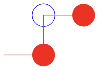
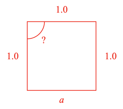
Side annotations, angle annotations and movable pads in an CollectionsPolyline are defined with the options objects COL_Line, COL_Angle and (OBJ_Polygon & OBJ_PolylinePadSingle) respectively.
The properties in this object can be used in the side, angle and movable pad object definitions to allow for customization of specific sides, angles and movable pads.
Each side, angle and movable pad has an 0 based index associated with it. The zero index pad is associated with the first point of the polyline. The zero index side is between the first and second point of the polyline, and the zero index angle is between the first, second and third point of the polyline.
By default, any properties defined for pad
will be applied to all pads of the polyline. To customize the first pad in
the polyline, an object property with name '0' can be used with a value
that includes the options object properties that should be customized.
Similary, for side and angle annotations, keys with the index name can be
used in their options objects to customize specific sides and angles.
The show and hide properties can be used to show and hide specific sides
and angles.
See OBJ_PulseWidthAnimationStep for pulse angle animation step options.
Type: {show: Array<number>?, hide: Array<number>?, _padIndex: OBJ_Polygon}
((COL_Angle | COL_Line | OBJ_PolylinePadSingle)?)
: Customizations of annotation or pad by index where
_index
should be an
object key name that is the index
(OBJ_Polygon)
// Hide pad 0, and make pad 2 blue and not filled
figure.add({
name: 'p',
make: 'collections.polyline',
points: [[0, 0], [2, 0], [2, 2], [-2, 1]],
pad: {
radius: 0.2, // OBJ_Polygon
color: [1, 0, 0, 1], // OBJ_Polygon
touchBorder: 0.1, // OBJ_Polygon
isMovable: true,
hide: [0],
2: { // Custom pad 2 properties
color: [0, 0, 1, 1], // Make blue
line: { width: 0.01 } // Use an outline instead of a fill
},
}
});
// Customization of side and angle annotations
figure.add({
name: 'p',
make: 'collections.polyline',
points: [[0, 0], [1, 0], [1, 1], [0, 1]],
close: true,
side: {
showLine: false,
label: {
text: null, // By default, sides are length values
location: 'negative',
},
0: { label: { text: 'a' } }, // Side 0 is 'a' instead of length
},
angle: {
label: {
text: '?',
offset: 0.05,
},
curve: {
radius: 0.25,
},
direction: 'negative',
show: [2], // Only show angle annotation for angle 2
},
});
TypeLabelOrientation
Orientation of the label.
'horizontal' | 'toLine' | 'awayLine' | 'upright'
Where:
'horizontal': Label will be horizontal'baseToLine': Label will have same angle as line with text base toward the line'baseAway': Label will have same angle as line with text base away from the line'upright': Label will have same angle as line with text being more upright than upside down.
Type:
("horizontal" | "baseAway" | "baseToLine" | "upright")
TypeLabelLocation
Tick location type:
'bottom' | 'left' | 'right' | 'left'
'bottom' and 'top' are only for x axes.
'left' and 'right' are only for y axes.
Type:
("bottom" | "left" | "right" | "left")
TypeLabelLocation
Label location relative to the line.
'top' | 'left' | 'bottom' | 'right' | 'start' | 'end' | 'positive' | 'negative'
'top' is in the positive y direction and 'right' is in the positive
x direction. 'bottom' and 'left' are the opposite sides respectively.
'positive' is on the side of the line that the line rotates toward when
rotating in the positive direction. 'negative' is the opposite side.
'start' is the start end of the line, while 'end' is the opposide end
of the line.
Type:
("top" | "left" | "bottom" | "right" | "start" | "end" | "outside" | "inside" | "positive" | "negative")
TypeLabelSubLocation
Label sub location relative to line.
'top' | 'left' | 'bottom' | 'right'
The label sub location is a fallback for when an invalid case is encountered
by the primary location. When the primary location is 'top' or 'bottom'
and the line is perfectly vertical, then the sub location would be used.
Similarly, if the primary location is 'left' or 'right' and the line is
perfectly horizontal, then the sub location would be used.
Type:
("top" | "left" | "bottom" | "right")
OBJ_ValidShapeHideThresholds
When shapes get too small, angle and side annotations can start to draw on each other. This object defines thresholds for when the angle and side annotations should be hidden.
Type: {minAngle: number??, maxAngle: number??, minSide: number??}
OBJ_ValidShape
Makes the sides and angles of a closed polyline consistent. Also reverses the point order if angles are on outside of shape instead of inside.
Floating point rounding errors will sometimes result in angles and side lengths being slightly larger or smaller than is possible. For instance, for a triangle, there may be a rare case where the three angles add up to 181ª instead of 180ª as a result of rounding the angle labels to no decimal places.
Making a shape consistent will go through all the side and angle labels and correct them, displaying a value without rounding error.
Currently, only 'triangle' is supported.
In addition, the angle and side annotations can be hidden if minimum or maximum thresholds of angle and side values are crossed. For example, for small triangles angle annotations may start to draw on top of each other being messy.
Type:
{shape: "triangle"?, hide: OBJ_ValidShapeHideThresholds?}
("triangle"?)
(OBJ_ValidShapeHideThresholds?)
SUB_PolylineUpdatePoints
'updatePoints' subscription published whenever the Collections Polyline
points are updated. No payload is passed to subscriber.
Type: []
OBJ_PolylineAngle
Type: {}
Extends COL_Angle, OBJ_PolylineCustomization
OBJ_PolylineSide
Type: {}
Extends COL_Line, OBJ_PolylineCustomization
OBJ_PolylinePadSingle
Collections Polyline pad addition options.
Each pad is associated with a point of the polyline.
Type:
{isMovable: boolean?, boundary: (OBJ_RangeBounds | OBJ_RectBounds | RangeBounds | RectBounds | "figure")?}
Extends OBJ_Polygon
((OBJ_RangeBounds | OBJ_RectBounds | RangeBounds | RectBounds | "figure")?)
: boundary the pad can move within
COL_Trace
CollectionsTrace options object that extends OBJ_Collection
options object (without parent).
A plot trace is a set of (x, y) points associated with an x and y axis.
The trace and can be drawn with either a set of
markers at each point, or a line between each pair of adjacent points.
The axes are used to plot the trace - the trace can only appear within the bounds of the axes, and the axes provide the mapping from axis value to draw space so the trace can be drawn. Points that lie outside the axis will not be draw, and lines between pairs of points where one is outside will be interpolated.
While FigureOne isn't designed to process very large numbers of points, some steps can be taken to improve performance when large numbers of points are being used (tens of thousands or more):
- Turn off corner interpolation between line segments in
line:{ line: { corner: 'none} }` - Use
xSampleDistanceandySampleDistanceto not draw points that are too close to each other - If using markers, use polygons with smaller numbers of sides, and use fills instead of outlines
Even using these methods, it can take up to a second to render a trace with hundreds of thousands of points (depending on the client device).
Type: any
Extends OBJ_Collection
(Array<TypeParsablePoint>)
: the x points of the trace
((COL_Axis | string)?)
: The x axis associated with the trace,
if this is a string, the trace must be part of a plot with an axis with the
same name. In plots, this will default to the string
'x'
.
((COL_Axis | string)?)
: The y axis associated with the trace,
if this is a string, the trace must be part of a plot with an axis with the
same name. In plots, this will default to the string
'y'
.
(OBJ_LineStyleSimple?)
: line style of the trace - if neither
line
nor
markers
is defined, then
line
will default to a solid line. If
line
is not defined, but
markers
is, then only markers will be used to represent
the line
((OBJ_Polygon | OBJ_Star)?)
: marker style of the trace
(TypeColor?)
: color of the trace
(string?)
: name of the trace used in plot legends
(number?)
: If x distance between points is less
than this value, then the later point will not be plotted. By default this is
1/4000th the range of the x axis
(number?)
: If y distance between points is less
than this value, then the later point will not be plotted. By default this is
1/4000th the range of the y axis
To test examples below, append them to the boilerplate.
CollectionsPlotLegend
FigureElementCollection representing an legend.
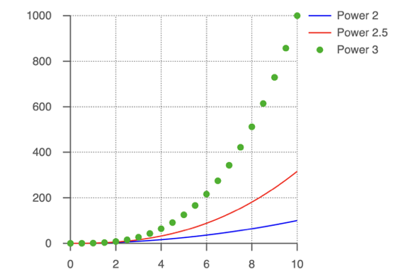
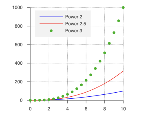
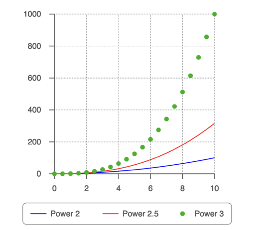
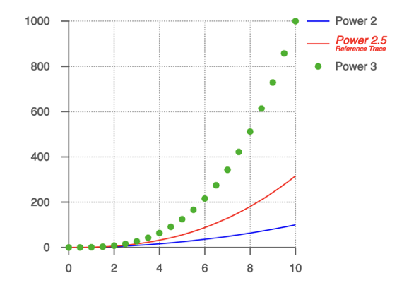
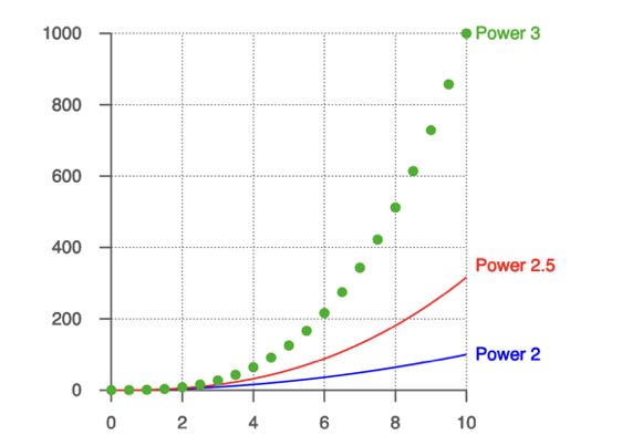
This object defines a legend in an CollectionsPlot.
The legend includes traces, trace names and a frame. Each can be customized using the COL_PlotLegend options object.
To test examples below, append them to the boilerplate.
All examples below also use this power function to generate the traces:
const pow = (pow = 2, start = 0, stop = 10, step = 0.05) => {
const xValues = Fig.range(start, stop, step);
return xValues.map(x => new Fig.Point(x, x ** pow));
}
Extends FigureElementCollection
// By default, the legend will appear in the top right corner
figure.add({
name: 'plot',
make: 'collections.plot',
trace: [
{ points: pow(2), name: 'Power 2' },
{ points: pow(2.5), name: 'Power 2.5' },
{
points: pow(3, 0, 10, 0.5),
name: 'Power 3',
markers: { radius: 0.03, sides: 10 },
},
],
legend: true,
});
// Change the line length, position and use a frame on the legend
figure.add({
name: 'plot',
make: 'collections.plot',
trace: [
{ points: pow(2), name: 'Power 2' },
{ points: pow(2.5), name: 'Power 2.5' },
{
points: pow(3, 0, 10, 0.5),
name: 'Power 3',
markers: { radius: 0.03, sides: 10 },
},
],
legend: {
length: 0.5,
frame: [0.95, 0.95, 0.95, 1],
position: [0.2, 1.8],
},
});
// Make a horizontal legend
figure.add({
name: 'plot',
make: 'collections.plot',
trace: [
{ points: pow(2), name: 'Power 2' },
{ points: pow(2.5), name: 'Power 2.5' },
{
points: pow(3, 0, 10, 0.5),
name: 'Power 3',
markers: { radius: 0.03, sides: 10 },
},
],
legend: {
offset: [0.9, 0],
position: [-0.3, -0.5],
frame: {
line: { width: 0.005 },
corner: { radius: 0.05, sides: 10 },
},
},
});
// Customize legend trace text
figure.add({
name: 'plot',
make: 'collections.plot',
trace: [
{ points: pow(2), name: 'Power 2' },
{ points: pow(2.5), name: 'Power 2.5' },
{
points: pow(3, 0, 10, 0.5),
name: 'Power 3',
markers: { radius: 0.03, sides: 10 },
},
],
legend: {
offset: [0, -0.2],
custom: {
1: {
font: { size: 0.1, style: 'italic', color: [1, 0, 0, 1] },
text: {
text: [
'Power 2.5',
{
text: 'Reference Trace',
font: { size: 0.06 },
lineSpace: 0.06,
},
],
justify: 'left',
},
},
},
},
});
// Customize legend
figure.add({
name: 'plot',
make: 'collections.plot',
trace: [
{ points: pow(2), name: 'Power 2' },
{ points: pow(2.5), name: 'Power 2.5' },
{
points: pow(3, 10, 0.5),
name: 'Power 3',
markers: { radius: 0.03, sides: 10 },
},
],
legend: {
fontColorIsLineColor: true,
length: 0,
custom: {
0: { position: [2, 0.2] },
1: { position: [2, 0.7] },
'Power 3': { position: [2, 2] },
}
},
});
COL_PlotLegend
CollectionsPlotLegend options object that extends OBJ_Collection
options object (without parent).
A legend consists of a number of trace samples and their corresponding names, and may have an encompassing frame with a border and fill.
Type: any
Extends OBJ_Collection
(TypeParsablePoint?)
: position of the first trace in the
legend
(number?)
: length of the line sample
(number?)
: space between the line and the text
((Array<TypeParsablePoint> | TypeParsablePoint)?)
: offset
between trace samples - can be used to space out a legend, or make it
horizontal
(OBJ_Font?)
: default font for trace sample text
(boolean?)
: set the trace sample text color to
the same as the line sample
((Array<number> | OBJ_PlotFrame)?)
: frame around the legend -
specifying just a color will create a solid fill rectangle of that color
(OBJ_PlotLegendCustom?)
: customizations to specific trace
samples
(Array<COL_Trace>?)
: the traces from the plot that this
legend will display. This is used by
CollectionsPlot
and should not be
used by the user.
OBJ_TranslationPath
Translation path options object
Type:
{style: ("curve" | "linear" | "curved"), angle: number?, magnitude: number?, offset: number?, controlPoint: (TypeParsablePoint | null)?, direction: ("positive" | "negative" | "up" | "down" | "left" | "right")?}
(("curve" | "linear" | "curved"))
(number?)
(number?)
(number?)
((TypeParsablePoint | null)?)
(("positive" | "negative" | "up" | "down" | "left" | "right")?)
OBJ_SpaceTransforms
Space Transforms
Type: {glToFigure: Transform, figureToGL: Transform, pixelToFigure: Transform, figureToPixel: Transform, pixelToGL: Transform, glToPixel: Transform, glToPixelMatrix: Type3DMatrix, figureToGLMatrix: Type3DMatrix, figureToPixelMatrix: Type3DMatrix}
OBJ_LineStyleSimple
Line style definition object.
Type:
{widthIs: ("mid" | "outside" | "inside" | "positive" | "negative" | number)?, width: number?, dash: TypeDash?, color: TypeColor?}
(("mid" | "outside" | "inside" | "positive" | "negative" | number)?)
: defines how the width is grown from the polyline's points. When using
number
, 0 is the equivalent of 'inside' and 1 is the equivalent of
'outside'.
(number?)
: line width
(TypeDash?)
: select solid or dashed line
(TypeColor?)
: line color
OBJ_AxisTicks
Axis Ticks and Grid options object for COL_Axis.
Type: {length: number?, offset: number?, width: number?, dash: TypeDash?, color: TypeColor?, location: TypeTickLocation?}
(number?)
: length of the ticks/grid (draw space)
(number?)
: offset of the ticks/grid (draw space) - use this
to center ticks around the axis or not (
-length / 2
)
(number?)
: width of ticks/grid (draw space)
(TypeDash?)
: dash style of ticks (draw space)
(TypeColor?)
: color of ticks/grid (defaults to plot color)
(TypeTickLocation?)
: location of tick which if defined
will overrides
offset
(
undefined
)
OBJ_AxisLabels
Axis label options object for the COL_Axis.
By default, labels are positioned with the first ticks defined in the
axis. Labels can also be positioned at custom values with values.
Labels will be values at the label positions, unless specified as a specific
string or number in the text property.
Different properties are defined in different spaces.
values, is defined in axis space, or the values along the axis.spaceandoffsetare defined in draw space and relate to dimensions in the space the axis is being drawn into.
Type:
{precision: number?, format: ("decimal" | "exp")?, space: number?, offset: TypeParsablePoint?, rotation: number?, xAlign: ("left" | "right" | "center")?, yAlign: ("bottom" | "baseline" | "middle" | "top")?, font: OBJ_Font?, hide: Array<number>?, valueOffset: OBJ_ValuesOffset?, fixed: boolean?, location: TypeLabelLocation?, text: Array<string>?}
(number?)
: Maximum number of decimal places to be shown
(number?)
: Fix the decimal places to the precision (all
labels have the same number of decimal places)
(("decimal" | "exp")?)
: 'exp'
will present numbers in
exponential form (
'decimal'
)
(number?)
: space between the ticks and the label
(("left" | "right" | "center")?)
: horizontal alignment of
labels (
'center'
for x axes,
'right'
for y axes)
(("bottom" | "baseline" | "middle" | "top")?)
: vertical
alignment of labels (
'top'
for x axes,
'middle'
for y axes)
(OBJ_Font?)
: specific font changes for labels
(OBJ_ValuesOffset?)
: offset the position of selected
values (useful to offset values in position near axis cross over points)
(TypeLabelLocation?)
: location of label (defaults to
'bottom'
for x axis and
'left'
for y axis)
(Array<string>?)
: use custom labels
To test examples below, append them to the boilerplate.
For more examples see OBJ_Axis.
(boolean?)
CollectionsTrace
FigureElementCollection representing a trace.
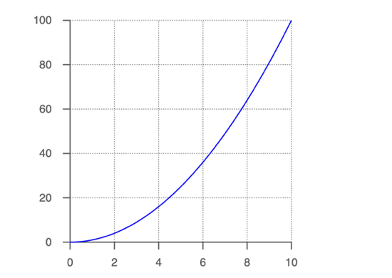
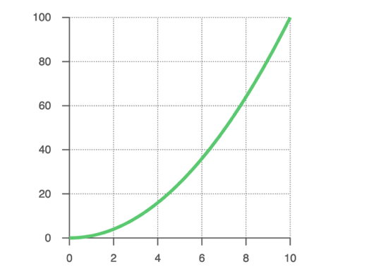
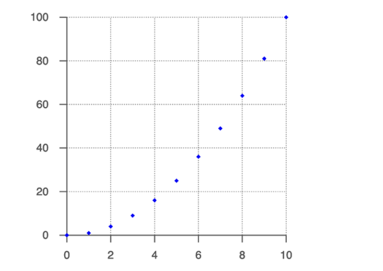
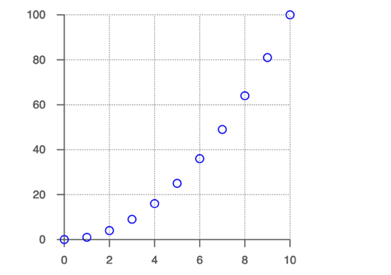
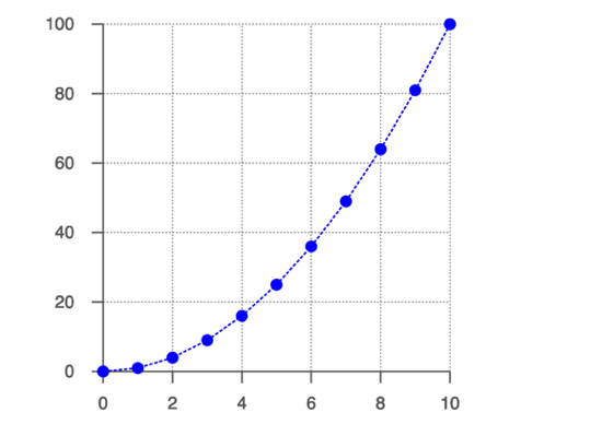
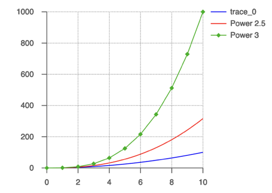
This object defines a trace in an CollectionsPlot.
The trace includes all the points of the trace, and the axes that it should be drawn against and is defined using the COL_PlotTrace options object.
To test examples below, append them to the boilerplate.
All examples below also use this power function to generate the traces:
const pow = (pow = 2, start = 0, stop = 10, step = 0.05) => {
const xValues = Fig.range(start, stop, step);
return xValues.map(x => new Fig.Point(x, x ** pow));
}
Extends FigureElementCollection
// When plotting a single trace, just the points are required. By default
// the line will be solid, and it will be plotted against the 'x' and 'y' axes.
figure.add({
name: 'plot',
make: 'collections.plot',
trace: pow(),
});
// Change the thickness and color of the line
figure.add({
name: 'plot',
make: 'collections.plot',
trace: {
points: pow(),
line: {
width: 0.03,
color: [0, 0.8, 0.4, 1],
}
},
});
// Default Markers
figure.add({
name: 'plot',
make: 'collections.plot',
trace: {
points: pow(2, 0, 10, 1),
markers: true,
},
});
// Custom Markers
figure.add({
name: 'plot',
make: 'collections.plot',
trace: {
points: pow(2, 0, 10, 1),
markers: {
radius: 0.035,
sides: 20,
line: { width: 0.01 },
},
},
});
// Line and markers
figure.add({
name: 'plot',
make: 'collections.plot',
trace: {
points: pow(2, 0, 10, 1),
line: { width: 0.01, dash: [0.02, 0.01] },
markers: {
radius: 0.035,
sides: 20,
},
},
});
// Use names in trace definitions to customize legend
figure.add({
name: 'plot',
make: 'collections.plot',
trace: [
pow(2),
{ points: pow(2.5), name: 'Power 2.5' },
{
points: pow(3, 0, 10, 1),
name: 'Power 3',
markers: { radius: 0.03 },
line: { width: 0.01 },
},
],
legend: true,
});
Update the trace with a new set of points.
(Array<TypeParsablePoint>)
TypeTickLocation
Tick location type:
'bottom' | 'left' | 'right' | 'left' | 'center'
'bottom', 'top' and 'center' are only for x axes.
'left', 'right' and 'center' are only for y axes.
Type:
("bottom" | "left" | "right" | "left" | "center")
OBJ_LabelsCallbackParams
Object passed to callback function that returns label strings for axis.
Type: {values: Array<number>, start: number, stop: number, step: number, z: number}
(number)
: start value of axis at current zoom/pan
(number)
: stop value of axis at current zoom/pan
(number)
: step value for current zoom
(number)
: zoom magnification
(number)
OBJ_AxisLineStyle
Simple line style.
Type: {width: number?, dash: TypeDash?, color: TypeColor?, arrowExt: number?, arrow: (OBJ_LineArrows | TypeArrowHead)?}
(number?)
(TypeDash?)
(TypeColor?)
((OBJ_LineArrows | TypeArrowHead)?)
(number?)
: extension to line length for arrow
OBJ_ValuesOffset
Type: {values: Array<number>, offset: TypeParsablePoint}
(TypeParsablePoint)
: position offset to apply to values
OBJ_AxisTitle
Axis title.
Type: any
(number?)
: title rotation
(("bottom" | "top" | "left" | "right")?)
: location of text
relative to axis
(TypeParsablePoint?)
: title offset from default location
OBJ_PlotLegendCustomTrace
Legend customization for a single trace sample in the legend.
Type:
{font: OBJ_Font?, length: number?, offset: TypeParsablePoint?, space: number?, fontColorIsLineColor: boolean?, text: (OBJ_FormattedText | "string")?, position: TypeParsablePoint?}
(OBJ_Font?)
: default font
(number?)
: length of the line sample
(TypeParsablePoint?)
: offset of this trace sample from
the last trace sample
(number?)
: space between line sample and text
(boolean?)
: use line color as font color
((OBJ_TextLines | "string")?)
: custom text
(TypeParsablePoint?)
: position of the trace sample
OBJ_PlotLegendCustom
Legend customization options object
Allows customization of specific trace samples in the legend.
_arrayIndexOrName represents a generic key that should actually
be the array index of the specific trace defined in COL_PlotLegend
or the name of the trace. See examples in CollectionsPlotLegend for use.
Type: {}
(OBJ_PlotLegendCustomTrace?)
OBJ_GestureArea
Gesture area extension. left and bottom should be negative numbers
if extending beyond the plot area.
Type: {left: number?, right: number?, top: number?, bottom: number?}
OBJ_PlotFrame
Plot frame.
Type: {line: OBJ_LineStyleSimple?, fill: (TypeColor | OBJ_Texture)?, corner: OBJ_CurvedCorner?, space: number?}
(OBJ_LineStyleSimple?)
: line detail
((TypeColor | OBJ_Texture)?)
: fill detail
(OBJ_CurvedCorner?)
: define if need curved corners
(number?)
: space between plot, labels and title and frame
boundary
OBJ_PlotZoomOptions
Type:
{axis: ("x" | "y" | "xy")?, wheelSensitivity: number?, pinchSensitivity: number?, value: (TypeParsablePoint | number)?, min: (null | number)?, max: (null | number)?}
(("x" | "y" | "xy")?)
: which axis to zoom (
xy
)
(number?)
: pinch zoom sensitivity
where >1 is more sensitive and <1 is less sensitive (
1
)
(number?)
: mouse wheel sensitivity
where >1 is more sensitive and <1 is less sensitive (
1
)
((TypeParsablePoint | number)?)
: fix value to zoom on - will
override pinch or mouse wheel zoom location
OBJ_PlotPanOptions
Type:
{axis: ("x" | "y" | "xy"), wheelSensitivity: number?, wheel: boolean?, momentum: boolean?, maxVelocity: number?}
(("x" | "y" | "xy")?)
: which axis to zoom (
xy
)
(number?)
: mouse wheel sensitivity
where >1 is more sensitive and <1 is less sensitive (
1
)
OBJ_PlotAxis
An axis definition for a plot is the same as that for an
CollectionsAxis with an additional property location which can be
used to conveniently set the axis position. Note, if position is set in
the axis definition, then it will override location.
Type: any
Extends COL_Axis
(OBJ_PlotAxis?)
OBJ_PlotTitle
Plot title.
OBJ_TextLines& { offset:TypeParsablePoint}
Use offset to adjust the location of the title.
Type: any
OBJ_PlotAreaLabelBuffer
Plot area label buffer where a positive value is more buffer
Type: {left: number?, right: number?, top: number?, bottom: number?}
OBJ_SurroundAnimationStep
Surround animation step.
Type: any
Extends OBJ_CustomAnimationStep
TypeColor
Defines a color
[number, number, number, number]
Color is defined as an RGBA array with values between 0 and 1. The alpha channel defines the transparency or opacity of the color where 1 is fully opaque and 0 is fully transparent.
OBJ_AddElement
Add element Object
Type: {path: string?, name: string?, make: string?, options: Object?, elements: Array<(OBJ_AddElement | FigureElement)>?, mods: {}?, scenario: string?, position: TypeParsablePoint?, transform: TypeParsableTransform?, color: TypeColor?, touch: (boolean | OBJ_Touch)?, move: (boolean | OBJ_ElementMove)?, dimColor: TypeColor?, defaultColor: TypeColor?, scenarios: OBJ_Scenarios?, scene: (Scene | OBJ_Scene)?, touchScale: number?}
(string?)
(string?)
(string?)
(Object?)
(Array<(OBJ_AddElement | FigureElement)>?)
({}?)
(string?)
(TypeParsablePoint?)
(TypeParsableTransform?)
(TypeColor?)
((boolean | OBJ_ElementMove)?)
(TypeColor?)
(TypeColor?)
(OBJ_Scenarios?)
(number?)
OBJ_FigureElementCollection
FigureElementCollection options object.
Type:
{transform: TypeParsableTransform?, position: TypeParsablePoint?, color: TypeColor?, parent: (FigureElement | null)?, border: (TypeBorder | "children" | "rect" | number)?, touchBorder: (TypeBorder | "border" | number | "rect")?, touch: (boolean | number | TypeParsablePoint)?, move: (boolean | OBJ_ElementMove)?, dimColor: TypeColor?, scenarios: OBJ_Scenarios?, scene: Scene?}
(TypeParsableTransform?)
(TypeColor?)
: default color
((FigureElement | null)?)
: parent of collection
((TypeBorder | "children" | "rect" | number)?)
((TypeBorder | "border" | number | "rect")?)
((boolean | number | TypeParsablePoint)?)
((boolean | OBJ_ElementMove)?)
(TypeColor?)
(OBJ_Scenarios?)
(Scene?)
OBJ_TriangleSideRotationAlignment
Type:
{side: ("s1" | "s2" | "s3")?, angle: number?}
(("s1" | "s2" | "s3")?)
: ('s1')
(number?)
: (0)
FigureCollections
Built in figure collections.
Provides advanced primitives the specific methods, animations and interactivity.
Create a FigureElementCollection.
((Transform | Point | OBJ_Collection)
= {})
(...Array<OBJ_Collection>)
Create a CollectionsLine.
Create a CollectionsAngle.
Create a CollectionsPolyline.
(...Array<COL_Polyline>)
Create a CollectionsRectangle.
(...Array<COL_Rectangle>)
Create a CollectionSlideNavigator
(...Array<COL_SlideNavigator>)
Create a CollectionsAixs.
Create a CollectionsAixs3.
Create a CollectionToggle.
(...Array<COL_Toggle>)
Create a CollectionSlider.
(...Array<COL_Slider>)
Create a CollectionSlider.
(...Array<COL_Button>)
Create a CollectionsTrace.
Create a CollectionsPlot.
Create a CollectionsLegend.
Create a Equation.
(EQN_Equation)
OBJ_ButtonColor
Button colors when clicked.
Type: {line: TypeColor?, fill: TypeColor?, label: TypeColor?}
OBJ_ButtonLabel
Collections button label options object.
A button can be annotated with a label using the text property and can be:
- text (
string,Array<string>) - an equation (
Equation,EQN_Equation)
In all cases, an actual Equation is created as the label. The
equation can have multiple forms, which can be set using the showForm
method.
If text: string, then an equation with a single form named base will
be created with a single element being the string text.
If text: Array<string>, then an equation with a form for each element
of the array is created. Each form is named '0', '1', '2'... corresponding
with the index of the array. Each form is has a single element, being the
text at that index.
Use text: Equation or EQN_Equation to create completely
custom equations with any forms desirable.
Type: {text: (null | string | Array<string> | Equation | EQN_Equation), font: OBJ_Font?, scale: number?, color: TypeColor?}
((null | string | Array<string> | Equation | EQN_Equation))
(OBJ_Font?)
: font to use
(number?)
: size of the label
(TypeColor?)
OBJ_ButtonColorState
Button state options object.
Type: {colorLine: TypeColor?, colorFill: TypeColor?, colorLabel: TypeColor?}
OBJ_ButtonState
Button state options object.
The label can either be the label text, or it can be the name of the form
of the equation label.
Type: {colorLine: TypeColor?, colorFill: TypeColor?, colorLabel: TypeColor?, label: string?}
OBJ_SliderBorder
Border of circle or bar of slider.
Type: {width: number?, color: TypeColor?}
OBJ_SliderMarker
Slider marker options.
Type:
{width: number?, style: ("polygon" | "rectangle")?}
(("polygon" | "rectangle")?)
(number?)
: width of 'rectangle'
OBJ_ToggleLabel
Collections toggle label options object.
A toggle switch can be annotated with a label using the text property and can be:
- text (
string,Array<string>) - an equation (
Equation,EQN_Equation)
In all cases, an actual Equation is created as the label. The
equation can have multiple forms, which can be set using the showForm
method.
If text: string, then an equation with a single form named base will
be created with a single element being the string text.
If text: Array<string>, then an equation with a form for each element
of the array is created. Each form is named '0', '1', '2'... corresponding
with the index of the array. Each form is has a single element, being the
text at that index.
Use text: Equation or EQN_Equation to create completely custom
equations with any forms desirable.
Type: {text: (null | string | Array<string> | Equation | EQN_Equation), offset: TypeParsablePoint?, location: TypeLabelSubLocation?, scale: number?, color: TypeColor?}
((null | string | Array<string> | Equation | EQN_Equation))
(TypeParsablePoint?)
: offset to default loation
(TypeLabelSubLocation?)
: location of label relative to
toggle
(number?)
: size of the label
(TypeColor?)
OBJ_ToggleBorder
Border of circle or bar of toggle.
Type: {width: number?, color: TypeColor?}
OBJ_LineMove
Line move options object.
The 'centerTranslateEndRotation' movement will move the line
when touched within the middleLength percentage of the line
and rotate it otherwise.
Type:
{type: ("translation" | "rotation" | "centerTranslateEndRotation" | "scale")?, middleLength: number?, includeLabelInTouchBoundary: boolean?}
(("translation" | "rotation" | "centerTranslateEndRotation" | "scale")?)
(number?)
: length of the middle section of line that
allows for translation movement in percent of total length (
0.333
)
(boolean?)
: true
to include the
line's label in the touch boundary for
'centerTranslateEndRotation'
('false`)
TypeHAlign
Horizontal Alignment
TypeHAlign = 'left' | 'right' | 'center' | number
Where number is a percentage of the width from the left. So
0 would be equivalent to 'left', 0.5 equivalent to
'center' and 1 equivalent to 'right'.
Type:
("left" | "right" | "center" | number)
TypeVAlign
Vertical Alignment
TypeHAlign = 'left' | 'right' | 'center' | 'baseline' | number
Where number is a percentage of the width from the left. So
0 would be equivalent to 'left', 0.5 equivalent to
'center' and 1 equivalent to 'right'.
Type:
("top" | "bottom" | "middle" | "baseline" | number)
OBJ_Scene
The Scene options object defines how the elements within the figure are viewed.
For 2D figures (style: '2D'), left, right, bottom, and top are
required to define the x-y expanse to view. Any elements or portions of
elements outside of this expanse will not be shown (be clipped).
For 3D figures, a camera, lighting and the near/far clipping planes also need definition.
Type:
{style: ("2D" | "orthographic" | "perspective")?, left: number?, right: number?, bottom: number?, top: number?, near: number?, far: number?, aspectRatio: number?, fieldOfView: number?, light: OBJ_Light?, camera: OBJ_Camera?}
Scene
Scene.
(OBJ_Scene)
scene definition options
((null | function (): void)
= null)
Set the pan and zoom of the scene.
Pan is applied to camera.position and camera.lookAt, while
zoom is applied to
camera.left/camera.bottom/camera.right/camera.top (for 2D and
orthographic) or camera.fov (for perspective)
The camera and projection variables are not changed by pan and zoom, but the the view and projection matrices are.
A pan in the positive direction will move the scene left and down.
A zoom greater than 1 will reduce the left/right/bottom/top or fov effectively magnifying the scene.
Set the pan of the scene.
Pan is applied to camera.position and camera.lookAt.
The camera is changed by pan and zoom, but the resulting view matrix is.
A pan in the positive direction will move the scene left and down.
(Point)
Set camera properties.
(OBJ_Camera)
Set projection properties.
(OBJ_Projection)
Set a 2D scene.
(OBJ_2DScene)
Set an orthographic scene.
(OBJ_OrthographicScene)
Set a perspective scene.
(OBJ_PerspectiveScene)
TypeRotationDirection
TypeRotationDirection = 0 | 1 | 2 | -1 | null
- 0: quickest direction
- 1: positive direction (CCW in 2D)
- -1: negative direction (CW in 2D)
- 2: not through zero
- null: returns numerical delta angle
Type:
(0 | 1 | 2 | -1 | null)
OBJ_LineDefinition
Line definition object.
Combinations that can be used are:
- p1, p2, ends
- p1, length, angle, ends (for 2D lines)
- p1, length, phi, theta, ends (for 3D lines)
- p1, length, direction, ends
Type:
{p1: TypeParsablePoint?, p2: TypeParsablePoint?, length: number?, theta: number?, angle: number?, phi: number?, direction: (TypeParsablePoint | number)?, ends: (0 | 1 | 2)?}
(TypeParsablePoint?)
: first point of line
(TypeParsablePoint?)
: second point of line
(number?)
: length of line
(number?)
: theta (elevation) angle of line in spherical
coordinates
(number?)
: phi (azimuth) angle of line in spherical coordinates
(number?)
: angle of line in 2D definition
((TypeParsablePoint | number)?)
: direction vector of line
from p1
((0 | 1 | 2)?)
BoundsIntersect
Bounds intersect result
Type: {intersect: (number | Point | null), reflection: (number | Point), distance: number}
BoundsPointIntersect
Point Bounds intersect result
Type: {intersect: (Point | null), reflection: Point, distance: number}
BoundsValueIntersect
Bounds value intersect result
Type: {intersect: (number | null), reflection: number, distance: number}
Bounds
Base class for all bounds.
Either a value or a Point can be bounded.
A Bounds must be able to:
- store a boundary
- check if a value or point is contained within the boundary
- clip a value or point to within the boundary
- find the intersect between the boundary and a value or point in some direction
Duplicate the bounds object
Returns true if a value or Point is within the bounds.
((number | TypeParsablePoint))
boolean:
Returns true if a value or Point is within the bounds.
((number | TypeParsablePoint))
(number
= 0)
BoundsIntersect:
TypeF1DefRangeBounds
Recorder state definition of a RangeBounds that represents the precision, min, and max bounds.
{
f1Type: 'rangeBounds',
state: [
number, number | null, number | null,
}
Type:
{f1Type: "rangeBounds", state: [number, (number | null), (number | null)]}
RangeBounds
A RangeBounds defines a bounds for a value or Point between some minimum and maximum value.
When using points, the minimum and maximum value is applied to each component of the point separately.
Extends Bounds
(OBJ_RangeBounds)
Returns true if a value or each x, y and z component of a Point
is within the max and min bounds (on bounds is considered within).
((number | TypeParsablePoint))
((number | TypeParsablePoint))
boolean:
Returns the max or min bound that is met by a value moving in the positive or negative direction.
The return object includes the intersect boundary, the distance to the boundary and the reflected direction.
If the value lies outside the bounds, it will first be clipped to the bounds.
(number)
((1 | -1)
= 1)
BoundsIntersect:
TypeF1DefRectBounds
Recorder state definition of a RectBounds that represents the precision, left, right, bottom, top, plane position, top direction and right direction of the rectangle
{
f1Type: 'rectBounds',
state: [
number, number, number, number, number,
[number, number, number],
[number, number, number],
[number, number, number],
}
Type:
{f1Type: "rectBounds", state: [number, number, number, number, number, [number, number, number], [number, number, number], [number, number, number]]}
RectBounds
A RectBounds defines a rectangular bounds for a Point.
Extends Bounds
(OBJ_RectBounds)
Return a bounds copy with all values rounded to a precision.
(number
            = 8)
RectBounds:
Return true if position is within the rectangular bounds.
If projectToPlane is false, then position must be on plane, otherwise
if true then point will be projected to the plane before checking if it
within the rectangle.
(TypeParsablePoint)
(boolean
            = true)
boolean:
Clip a position to the bounds rectangle. If the position is off plane, then it will first be projected to the plane.
(TypeParsablePoint)
Point:
Return the intersect between a position moving in some direction and
the four boundaries of the rectangle.
(TypeParsablePoint)
(TypeParsablePoint)
direction vector
BoundsIntersect:
TypeF1DefLineBounds
Recorder state definition of a LineBounds that represents the precision, first point, second point and number of ends.
{
f1Type: 'lineBounds',
state: [
number,
[number, number, number],
[number, number, number],
2 | 1 | 0,
}
Type:
{f1Type: "lineBounds", state: [number, [number, number, number], [number, number, number], (2 | 1 | 0)]}
LineBounds
A Line defines a line bounds for a Point.
Extends Bounds
(OBJ_LineBounds)
Check if a position is within a line
(TypeParsablePoint)
boolean:
Clip a position to a line. The point will be projected to the line before clipping.
(TypeParsablePoint)
Point:
Return the intersect between a position moving in some direction and
the ends of the line boundary.
The position and direction vector will first be projected onto the line before finding the intersect.
(TypeParsablePoint)
(TypeParsablePoint)
direction vector
BoundsIntersect:
getBounds
Get bounds from a parsable bounds.
(TypeParsableBounds)
(Bounds | RectBounds | LineBounds | RangeBounds)
OBJ_SurfaceGrid
Surface grid options object.
Two components must be a fixed [min, max, step].
One component must be a function that takes in two components (x, y), (x, z), or (y, z) and outputs the third (z, y or x repsectively).
Type: {x: (function (number, number): number | [number, number, number]), y: (function (number, number): number | [number, number, number]), z: (function (number, number): number | [number, number, number])}
surfaceGrid
Create a matrix of points that define a surface.
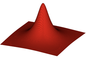
Start with a grid of points in two components (x, y), (x, z), or (y, z), and define the third component (z, y or x repsectively) based on the first two.
Resulting matrix can be used to create a 3D surface.
(OBJ_SurfaceGrid?)
const { Figure, surfaceGrid } = Fig;
// Orthographic scene with camera oriented so z is up
const figure = new Figure({
scene: {
style: 'orthographic',
camera: { up: [0, 0, 1], position: [1, 0.5, 0.5] },
},
});
// Use surfaceGrid to generate a 3D surface from an xy grid
const points = surfaceGrid({
x: [-0.8, 0.8, 0.02],
y: [-0.8, 0.8, 0.02],
z: (x, y) => 1 / ((x * 5) ** 2 + (y * 5) ** 2 + 1),
});
figure.add([
{
make: 'surface',
points,
color: [1, 0, 0, 1],
normals: 'curve',
},
{
make: 'surface',
points,
lines: true,
color: [0, 0, 0, 1],
position: [0, 0, 0.0001],
},
{ make: 'cameraControl', axis: [0, 0, 1] },
]);
OBJ_ZoomOptions
Zoom options.
Type: {min: (null | number)?, max: (null | number)?, wheelSensitivity: number?, pinchSensitivity: number?, position: (null | TypeParsablePoint)?}
(number?)
: pinch zoom sensitivity where values
greater than 1 are more sensitive resulting in faster zoom changes (
1
)
(number?)
: mouse wheel zoom sensitivity where
values greater than 1 are more sensitive resulting in faster zoom changes
(
1
)
((null | TypeParsablePoint)?)
: zoom around a fixed point (instead of the
mouse of pinch location) - leave undefined or use
null
to instead zoom
around mouse or pinch location (
null
)
OBJ_ManualZoom
Manual zoom setting.
Type: {mag: number?, position: TypeParsablePoint?, offset: TypeParsablePoint?}
(TypeParsablePoint)
: use this pan offset
OBJ_ZoomValues
Zoom values
Type: {mag: number, position: Point, distance: number, angle: number}
OBJ_CurrentZoom
Current zoom values
Type: {delta: number, mag: number, offset: Point, last: OBJ_ZoomValues, current: OBJ_ZoomValues}
(number)
: zoom magnification
(Point)
: pan offset
(OBJ_ZoomValues)
: last zoom values
(OBJ_ZoomValues)
: current zoom values
(number)
OBJ_PanOptions
Pan options.
Type: {left: (null | number)?, right: (null | number)?, bottom: (null | number)?, top: (null | number)?, wheelSensitivity: number?, wheel: boolean?, momentum: boolean?, maxVelocity: number?}
(number?)
: mouse wheel pan sensitivity for mouse
wheel panning where values greater than 1 are more sensitive resulting in
faster panning (
1
)
(boolean?)
: enable mouse wheel panning - only possible if
zoom gesture is disabled.
(boolean?)
: enable pan momentum for drag panning. NB,
mouse wheel panning mamemntum cannot be controlled and will be browser
dependent. (
true
)
(number?)
OBJ_ZoomInstant
Instantaneous zoom metrics.
Type: {mag: number, position: Point, normPosition: Point, angle: number, distance: number}
(number?)
: zoom magnification
(Point?)
: position around which zoom is happening
(Point?)
: position around which zoom is happening
normalized to the gesture rectangle where (0, 0) is the bottom left corner
and (1, 1) is the top right corner
(number?)
: (pinch zoom only) pinch angle delta to start of
pinch
(number?)
: (pinch zoom only) distance between pinch points
OBJ_Zoom
Current zoom.
Type: {last: OBJ_ZoomInstant, current: OBJ_ZoomInstant, mag: number, offset: Point}
(OBJ_ZoomInstant)
: last zoom metrics
(OBJ_ZoomInstant)
: current zoom metrics
(number)
: current zoom magnification
(number)
: pan offset needed to keep the zoom position at a
fixed location
OBJ_Projection
Type:
{style: ("orthographic" | "perspective" | "2D")?, left: number?, right: number?, bottom: number?, top: number?, aspectRatio: number?, fieldOfView: number?, near: number?, far: number?}
OBJ_Camera
Type: {position: TypeParsablePoint?, lookAt: TypeParsablePoint?, up: TypeParsablePoint?}
OBJ_Light
Type: {directional: TypeParsablePoint?, ambient: number?, point: TypeParsablePoint?}
OBJ_2DScene
Type: {left: number?, right: number?, bottom: number?, top: number?}
OBJ_OrthographicScene
Type: {left: number?, right: number?, bottom: number?, top: number?, near: number?, far: number?}
OBJ_PerspectiveScene
Type: {aspectRatio: number?, fieldOfView: number?, near: number?, far: number?}
Misc Geometry Creation
OBJ_PolygonPoints
Type:
{center: TypeParsablePoint?, radius: number?, sides: number?, rotation: number?, direction: (1 | -1)?, tris: (2 | 3)?, transform: (Type3DMatrix | TypeParsableTransform)?, close: boolean?}
(TypeParsablePoint?)
: center position of the polygon
((1 | -1)?)
: angular direction of corners - 1 is CCW in the
XY plane (
1
)
(
[0,, 0, 0]
)
((Type3DMatrix | TypeParsableTransform)?)
: transform
to apply to polygon
((2 | 3)?)
: if defined, return an array of numbers representing
the interlaced x/y/z components of points that define triangles that can draw
the polygon.
2
returns just x/y components and
3
returns x/y/z
components.
(boolean?)
OBJ_PolygonLinePoints
Type: any
Extends OBJ_PolygonPoints
(number?)
: distance from center to inside polygon
corner
OBJ_ConePoints
Cone options object.
By default, a cone with its base at the origin and its tip along the x axis will be created.
Type:
{sides: number?, radius: number?, normals: ("curve" | "flat")?, line: TypeParsableLine?, length: number?, rotation: number?, transform: TypeParsableTransform?, lines: boolean?}
(number?)
: radius of cone base
(("curve" | "flat")?)
: flat
normals will make light
shading across a face cone constant.
curve
will gradiate the shading. Use
curve
to make a surface look more round with fewer number of sides.
(
flat
)
(TypeParsableLine?)
: line that can position and
orient the cone. First point of line is cone base center, and second point
is cone tip.
(TypeParsableTransform?)
: transform to apply to all
points of cube
(boolean?)
: if
true
then points representing
the edes of the faces will be returned. If
false
, then points
representing two triangles per face and an
associated normal for each point will be returned.
OBJ_CubePoints
Cube options object.
By default, a cube will be constructed around the origin, with the xyz axes being normal to the cube faces.
Type: {side: number?, center: TypeParsablePoint?, transform: TypeParsableTransform?, lines: boolean?}
(TypeParsableTransform?)
: transform to apply to all
points of cube
(boolean?)
: if
true
then points representing
the 12 edges of the cube will be returned. If
false
, then points
representing two triangles per face (12 triangles, 36 points) and an
associated normal for each point will be returned. (
false
)
OBJ_CylinderPoints
Cylinder options object.
By default, a cylinder along the x axis will be created.
Type:
{sides: number?, radius: number?, normals: ("curve" | "flat")?, line: TypeParsableLine?, length: number?, ends: (boolean | 1 | 2)?, transform: TypeParsableTransform?}
(("curve" | "flat")?)
: flat
normals will make
shading (from light source) across a face cone constant.
curve
will gradiate the shading. Use
curve
to make a surface look more
round with fewer number of sides. (
flat
)
(TypeParsableLine?)
: line that can position and
orient the cylinder. First point of line is cylinder base center, and second
point is the top center.
((boolean | 1 | 2)?)
: true
fills both ends of the cylinder.
false
does not fill ends.
1
fills only the first end.
2
fills only the
the second end. (
true
)
(TypeParsableTransform?)
: transform to apply to all
points of cube
(boolean?)
: if
true
then points representing
the edes of the faces will be returned. If
false
, then points
representing two triangles per face and an
associated normal for each point will be returned.
OBJ_Line3Arrow
Arrow definition object for a 3D line.
Type:
{ends: ("start" | "end" | "all")?, width: number?, length: number?}
OBJ_Line3Points
3D line options object.
A 3D line is a cylinder with optional arrows on the end. Unlike a 2D line, the arrow profiles can only be simple triangles.
Type:
{p1: TypeParsablePoint?, p2: TypeParsablePoint?, width: number?, arrow: (OBJ_Line3Arrow | boolean)?, sides: number?, normals: ("curve" | "flat")?, transform: TypeParsableTransform?, lines: boolean?, rotation: number?}
(number?)
: width of line
((OBJ_Line3Arrow | boolean)?)
: define to use arrows at one or
both ends of the line
(("curve" | "flat")?)
: flat
normals will make light
shading across a line face constant.
curve
will gradiate the shading. Use
curve
to make a surface look more round with fewer number of sides.
(
curve
)
(number?)
: rotation of line around its axis - this is
only noticable for small numbers of sides (
0
)
(TypeParsableTransform?)
: transform to apply to line
(boolean?)
: if
true
then points representing
the edes of the faces will be returned. If
false
, then points
representing two triangles per face and an
associated normal for each point will be returned.
OBJ_PrismPoints
Prism options object.
A prism base is defined in the XY plane, and it's length extends
into +z. Use transform to orient it in any other way.
Triangles will be created for the ends if the base is convex. If the base
is not convex, use baseTriangles to define the triangles.
Type: {base: Array<TypeParsablePoint>?, baseTriangles: Array<TypeParsablePoint>?, length: number?, transform: TypeParsableTransform?, lines: boolean?}
(number?)
: base border points defined in the XY plane - the
points should be defined in the counter-clock-wise direction.
(Array<TypeParsablePoint>)
: triangles in the XY plane
that create the base fill. If the base is convex, then the triangles can be
auto-generated and this property left undefined.
(number?)
: length of the prism
(TypeParsableTransform?)
: transform to apply to all
points of prism
(boolean?)
: if
true
then points representing
the edges of the prism will be returned. If
false
, then points
representing triangle bases and associated normals will be returned.
(
false
)
OBJ_RevolvePoints
Options object for revolve.
Revolve (or radially sweep) a profile in the XY plane around the x axis to form a 3D surface.
Type:
{sides: number?, profile: Array<TypeParsablePoint>?, normals: ("flat" | "curveProfile" | "curveRadial" | "curve")?, axis: TypeParsablePoint?, rotation: number?, position: TypeParsablePoint?, transform: TypeParsableTransform?, lines: boolean?}
(Array<TypeParsablePoint>)
: XY plane profile to be radially
swept around the x axis
(number?)
: number of sides in the radial sweep
(("flat" | "curveRows" | "curveRadial" | "curve")?)
: flat
normals will make shading (from a light source) across a face of the
object a constant color.
curveProfile
will gradiate the shading along the
profile.
curveRadial
will gradiate the shading around the radial sweep.
curve
will gradiate the shading both around the radial sweep and along the
profile. Use
curve
,
curveProfile
, or
curveRadial
to make a surface
look more round with fewer number of sides.
(number?)
: by default the profile will start in the XY
plane and sweep around the x axis following the right hand rule. Use
rotation
to start the sweep at some angle where 0º is in the XY for +y and
90º is in the XZ plane for +z. initial angle of the revolve rotation
(TypeParsablePoint?)
: orient the shape so its axis is along
this vector
(TypeParsablePoint?)
: offset the final vertices such that
the original (0, 0) point in the profile moves to position (this step
happens after the rotation)
(TypeParsableTransform?)
: apply a final transform to
shape
(boolean?)
: if
true
then points representing
the edes of the faces will be returned. If
false
, then points
representing two triangles per face and an
associated normal for each point will be returned.
OBJ_SpherePoints
Sphere options object.
By default, a sphere with its base at the origin will be created.
Type:
{sides: number?, radius: number?, normals: ("curve" | "flat")?, center: TypeParsablePoint?, transform: TypeParsableTransform?}
(("curve" | "flat")?)
: flat
normals will make light
shading across a face cone constant.
curve
will gradiate the shading. Use
curve
to make a surface look more round with fewer number of sides.
(
flat
)
(TypeParsableTransform?)
: transform to apply to all
points of cube
(boolean?)
: if
true
then points representing
the edes of the faces will be returned. If
false
, then points
representing two triangles per face and an
associated normal for each point will be returned.
OBJ_SurfacePoints
Options object for defining a 3D surface.
Type:
{points: Array<Array<TypeParsablePoint>>?, normals: ("curveColumns" | "curveRows" | "curve" | "flat")?, closeColumns: boolean?, closeRows: boolean?, transform: TypeParsableTransform?, lines: boolean?, invertNormals: boolean?}
(Array<Array<TypeParsablePoint>>?)
: A grid of points that
define a 3D surface
(("curveColumns" | "curveRows" | "curve" | "flat")?)
: flat
normals will make shading (from a light source) across a face of the
object a constant color.
curveRows
will gradiate the shading along the
rows of the grid.
curveColumns
will gradiate the shading along the columns
of the grid.
curve
will gradiate the shading along both rows and columns.
Use
curve
,
curveRows
, or
curveColumns
to make a surface
look more round with fewer number of sides.
(boolean?)
: Set to
true
if first row and last row are
the same, and normals is
'curveRows'
or
'curve'
to get correct normal
calculations (
false
)
(boolean?)
: Set to
true
if first row and last
column are the same, and normals is
'curveColumns'
or
'curve'
to get
correct normal calculations (
false
)
(TypeParsableTransform?)
: apply a final transform to
shape
(boolean?)
: if
true
then points representing
the edes of the faces will be returned. If
false
, then points
representing two triangles per face and an
associated normal for each point will be returned.
Misc Text
FigureElementPrimitive2DText
FigureElementPrimitive that handles drawing text on a 2D canvas.
Extends FigureElementPrimitive
(DrawContext2D)
(any)
OBJ_TextAdjustments
Define the width, descent or ascent of a text element. This can be used if the estimated width, descent or ascent is not what is desired.
Type: {width: number?, descent: number?, ascent: number?}
OBJ_SetText
Options object for setting new text in FigureElementPrimitiveGLText and FigureElementPrimitive2DText elements.
Type:
{text: (string | Array<string>)?, location: (TypeParsablePoint | Array<TypeParsablePoint>)?, font: OBJ_Font?, xAlign: ("left" | "center" | "right")?, yAlign: ("top" | "bottom" | "middle" | "alphabetic" | "baseline")?, adjustments: OBJ_TextAdjustments?, color: TypeColor?}
(string?)
: new text to use
(OBJ_Font?)
: define if font needs to be changed
(("left" | "center" | "right")?)
: xAlignment of text
(("top" | "bottom" | "middle" | "alphabetic" | "baseline")?)
: y alignment of text
(OBJ_TextAdjustments?)
: adjustments to the calculated
borders of the text
(TypeColor?)
: text color (will be overriden by a font color
if it is specified)
((TypeParsablePoint | Array<TypeParsablePoint>)?)
FigureElementPrimitiveGLText
FigureElementPrimitive that handles drawing text in WebGL.
WebGL text is rendered using a texture atlas of fonts - an image with all the glyphs, and a map of the locations, ascent, descent and width of each glyph.
Extends FigureElementPrimitive
Debug method - will replace the drawn text with the texture atlas so it can be reviewed.
Recreate texture atlas.
This is useful if a font has changed after an atlas has been auto-generated. Recreating the atlas will use the new version of the font.
Change the text in the primitive.
((string | OBJ_SetText))
Get the font of the text.
FigureFont:
TypeText
TypeText = 'gl' | '2d'
'gl': bitmapped text drawn in webgl from a autogenerated atlas. Use when
text size changes rarely, or text needs to be behind other shapes.
'2d': text drawn on a '2d' html canvas. Text will always be ontop of the webgl canvas. Use when text must be displayed a large dynamic range of scales, or text needs to be always on top.
Type:
("gl" | "2d")
OBJ_Outline
Outline options.
By default the glyphs will not be filled, with the outline the same color as the font.
Glyphs can be filled with the fill property, but both fill and outline
will be the same color unless the color property is used to override the
outline's color.
Type: {width: number?, fill: boolean?, color: TypeColor?}
OBJ_Underline
Underline options.
An underline is defined as a horizontal line with some width with a bottom
edge descent below the text baseline.
If descent is negative, the line can be moved into a strike through
position, or placed above the text.
Type: {width: number?, descent: number?, color: TypeColor?}
OBJ_GlyphModifiers
Texture atlas font individual glyph ascent, descent and width modifiers.
Type: {w: number?, d: number?, a: number?}
TypeFontWeight
Font weight definition.
'normal' | 'bold' | 'lighter' | 'bolder' | '100' | '200' | '300' | '400' | '500' | '600' | '700' | '800' | '900'
Type:
("normal" | "bold" | "lighter" | "bolder" | "100" | "200" | "300" | "400" | "500" | "600" | "700" | "800" | "900")
Misc Animation
AnimationStep
Animation step base class. All animation steps extend this class.
(OBJ_AnimationStep
= {})
(number)
: in seconds
(number)
: delay before animation starts in seconds
(string)
: animation name identifier
(boolean?)
: true
to remove the animation from the
animation manager when it is finished (
true
)
(("animating" | "waitingToStart" | "idle" | "finished"))
Get remaining duration of the animation.
(number)
define this if you want remaining duration from a
custom time
Start animation
(AnimationStartTime
= null)
ElementAnimationStep
Animation Step tied to an element
Default values for the animation step will then come from this element.
Extends AnimationStep
(OBJ_ElementAnimationStep
= {})
OBJ_PositionAnimationStep
PositionAnimationStep options object
Type: any
Extends OBJ_ElementAnimationStep
(TypeParsablePoint?)
: start position - if undefined then
current position is used
((null | TypeParsablePoint | number)?)
: velocity of
position overrides
duration
-
null
to use
duration
(
null
)
((number | null)?)
: maximum duration to clip animation
to where
null
is unlimited (
null
)
OBJ_RotationAnimationStep
RotationAnimationStep step options object.
The RotationAnimationStep animates the rotation value of a the first rotation component in a Transform.
To rotate from a start rotation to a target rotation use the
start, delta and/or target properties.
If start is not defined, the current rotation angle (when the animation
is started) will be used as start.
Either target or delta (from start) can be used to define the target.
The animation can either move to the target with a duration, or the
duration can be determined by a velocity.
Rotation animation targets can also be created with velocity, start and
duration. In this case, the rotation angles will grow with velocity. If
duration is null, then rotation duration will continue indefinitely until
the animation is cancelled.
Type: any
Extends OBJ_ElementAnimationStep
(number?)
: start rotation - current
rotation used if undefined
(number?)
: target rotation
((null | number)?)
: velocity of
rotation can either define the
duration
of a rotation if
target
or
delta
is defined, or can define the
target
of a rotation if
duration
is defined. If
duration
is null, then velocity determines the change in
rotation over time (
null
)
((number | null)?)
: maximum duration to clip animation
to where
null
is unlimited (
null
)
OBJ_ElementAnimationStep
ElementAnimationStep options object
Type: any
Extends OBJ_AnimationStep
(FigureElement?)
(("linear" | "easeinout" | "easein" | "easeout" | AnimationProgression)?)
: how the animation progresses - defaults to
linear
for color, opacity and
custom animations and
easeinout
for others
OBJ_ScenarioVelocity
Transform, color and visbility scenario definition
translation will overwirte position, and translation,position, rotation and scale overwrite the first equivalent transforms in
transform
Type: {position: (TypeParsablePoint | number)?, translation: (TypeParsablePoint | number)?, rotation: number?, scale: (TypeParsablePoint | number)?, transform: TypeParsableTransform?, color: number?, opacity: number?}
(TypeParsablePoint?)
(TypeParsablePoint?)
((TypeParsablePoint | number)?)
(number?)
(TypeParsableTransform?)
(TypeColor?)
(number?)
OBJ_AnimationBuilder
Animation builder options object
Type: any
Extends OBJ_SerialAnimationStep
(FigureElement?)
OBJ_AnimationStep
Animation Step options object
Type: {onFinish: function (boolean): void??, completeOnCancel: boolean??, removeOnFinish: boolean?, name: string?, duration: number?, delay: number?, precision: number?, timeKeeper: (TimeKeeper | null)?}
(string?)
: animation name identifier (a random string)
(boolean?)
: true
to remove the animation from the
animation manager when it is finished (
true
)
(TimeKeepr?)
: animations need to be tied to a time
reference. If this is not supplied, then the default browser time reference
performance.now will be used and methods with
TypeWhen
parameters
will allow only
'now'
and
'nextFrame'
and not
'lastFrame'
,
'syncNow'
.
When the animation step is created from an element in a figure (using
element.animations
or
element.animations.new()
), then the
animation step will automatically inherit the figure's TimeKeeper.
(function (boolean): void??)
OBJ_AnimationStart
Start animation options object.
Type: {name: string?, startTime: AnimationStartTime}
((null | string)?)
: name of animation to start - f null, then
all animations associated with this animation manager will start (
null
)
(AnimationStartTime)
: when to
start the animation
OBJ_SerialAnimationStep
Serial animation step options object
Type: any
Extends OBJ_AnimationStep
(Array<AnimationStep>?)
: animation steps to execute in series
OBJ_ParallelAnimationStep
Parallel animation step options object
Type: any
Extends OBJ_AnimationStep
(Array<AnimationStep>)
: animation steps to perform in parallel
OBJ_ScaleAnimationStep
ScaleAnimationStep options object
Type: any
Extends OBJ_ElementAnimationStep
((TypeParsablePoint | number)?)
((TypeParsablePoint | number)?)
((TypeParsablePoint | number)?)
((null | TypeParsablePoint | number)?)
: velocity of scale
overrides
duration
-
null
to use
duration
(
null
)
((number | null)?)
: maximum duration to clip animation
to where
null
is unlimited (
null
)
OBJ_CustomAnimationStep
CustomAnimationStep options object
Type: any
Extends OBJ_AnimationStep
((string | function (int): void))
: function to run each
animation frame
(("linear" | "easeinout" | "easein" | "easeout" | AnimationProgression)?)
OBJ_TransformAnimationStep
TransformAnimationStep options object
Type: any
Extends OBJ_ElementAnimationStep
(TypeParsableTransform?)
(TypeParsableTransform?)
(TypeParsableTransform?)
((null | TypeParsableTransform)?)
: velocity of
transform overrides
duration
-
null
to use
duration
(
null
)
((0 | 1 | -1 | 2)?)
: where
0
is quickest direction,
1
is positive of CCW direction,
-1
is negative of CW direction and
2
is
whichever direction doesn't pass through angle 0 (
0
).
(("0to360" | "-180to180" | null)?)
((number | null)?)
: maximum duration to clip animation
to where
null
is unlimited (
null
)
OBJ_ScenarioAnimationStep
ScenarioAnimationStep options object
Type: any
Extends OBJ_ElementAnimationStep
((string | OBJ_Scenario)?)
((string | OBJ_Scenario)?)
((null | string | OBJ_ScenarioVelocity)?)
: velocity
will override duration with a calculated duration based on
the
start
,
target
and
velocity
. If
null
is used
then
duration
will not be overriden. Any scenario velocity elements that
are undefined will default to 1 (
null
)
((number | null)?)
: maximum duration to clip animation
to where
null
is unlimited (
null
)
(number?)
: value considered 0 to stop
animation - this is useful when numbers get very small and rounding problems
with javascripts floating point implementation arise
((0 | 1 | -1 | 2)?)
: where
0
is quickest direction,
1
is positive of CCW direction,
-1
is negative of CW direction and
2
is
whichever direction doesn't pass through angle 0.
(("0to360" | "-180to180" | null)?)
(("linear" | "easeinout" | "easein" | "easeout" | AnimationProgression)?)
: (
'easeinout'
)
OBJ_TriggerAnimationStep
TriggernAnimationStep options object
Type: any
Extends OBJ_AnimationStep
((string | function (any): number | void))
: if desired, return
a number from
callback
to update the duration of the trigger animation
step. Doing so will make any previous calculations of remaining animation
time incorrect. Make sure to initialize this step with a non-zero duration
for this to work.
(any?)
: payload to pass to callback (
null
)
(FigureElement)
: FigureElement
to associate with
callback - if the
callback
is a string then this element's
FunctionMap
will be searched for the corresponding function
OBJ_Pulse
Pulse options object
Pulsing can be useful to highlight a figure element to a user, without changing its underlying properties.
When an element is pulsed, it will be scaled, translated or rotated from
a start value (1 for scale, 0 for rotation and translation),
to a maximum value (scale, translate or rotate),
to a min value, and then back to the start value. An element can
be pulsed through this cycle frequency times per second, over some
duration.
The pulse does not change the FigureElement.transform property, and only changes the draw transform.
By default, a scale or rotation pulse will scale or rotate around the the
center of the rectangle encompassing the border of the element. centerOn
can be used to define a different FigureElement or point to center
on. If centering on a FigureElement, xAlign and yAlign can be
used to center on a point aligned within it. For instance, xAlign: 'left'
will center on a point on the left edte of the FigureElement.
The pulse can also draw multiple copies of the element with pulse transforms
distributed between the min and maximum pulse values. This is particularly
useful for shapes with outlines that have a regular spacing from a center
point (such as regular polygons) as it will look like the thickness of the
outlines are becomming thicker.
Type:
{duration: number?, frequency: number?, scale: number?, rotation: number?, translation: number?, angle: number?, min: number?, centerOn: (null | FigureElement | TypeParsablePoint | string | "this")?, x: ("left" | "center" | "right" | "origin" | number)?, y: ("bottom" | "middle" | "top" | "origin" | number)?, space: ("figure" | "gl" | "local" | "draw")?, done: function (any): void??, num: number?, when: TypeWhen?, done: (string | function (): (void | null)), progression: (string | function (number): number)?}
(number?)
: pulse frequency in Hz - a frequency of zero
will set the frequency so just one cycle will be performed in the duration
(
0
)
(number?)
: maximum rotation value to pulse to
(number?)
: minimum value to pulse to
((null | FigureElement | TypeParsablePoint | string | "this")?)
: center
of scale or rotation pulse.
null
is point
[0, 0]
,
string
or
FigureElement
are elements to centerOn, and
'this'
is the calling
element (
'this'
)
will be the default
centerOn
.
(("left" | "center" | "right" | "location" | number)?)
: if
centerOn
is a
FigureElement
then this property can be used to
horizontally align the pulse center with the element.
'location'
is the
(0, 0) draw space coordinate of the element.
number
defines the percent
width from the left of the element (
'center'
)
(("bottom" | "middle" | "top" | "location" | number)?)
: if
centerOn
is a
FigureElement
then this property can be used to
vertically align the pulse center with the element.
'location'
is the
(0, 0) draw space coordinate of the element.
number
defines the percent
width from the left of the element (
'center'
)
(("figure" | "gl" | "local" | "draw" | "pixel")?)
: if
centerOn
is a point, use this to define the space the point is in
(
'figure'
)
((null | string | function (): void)?)
: callback when pulse is
finished. If
string
then the element's
FunctionMap
fnMap
will be
used (
null
)
(("sinusoid" | "triangle")?)
: function that defines
how the scale should progress over time (
sinusoid
)
(("left" | "center" | "right" | "origin" | number)?)
(("bottom" | "middle" | "top" | "origin" | number)?)
// For all examples below, use this to add an element to the figure
const p = figure.add({
make: 'polygon',
radius: 0.3,
line: { width: 0.05, },
});
// Scale pulse
p.pulse({
duration: 1,
scale: 1.3
});
// Rotation pulse
p.pulse({
duration: 1,
rotation: 0.15,
frequency: 4,
});
// Translation pulse
p.pulse({
duration: 1,
translation: 0.02,
min: -0.02,
frequency: 4,
});
// Thick pulse
p.pulse({
duration: 1,
scale: 1.1,
min: 0.9,
num: 7,
});
OBJ_PulseAnimationStep
PulseAnimationStep options object
Type: any
Extends OBJ_ElementAnimationStep
(number?)
: pulse frequency in Hz - a frequency of zero
will set the frequency so just one cycle will be performed in the duration
(
0
)
(number?)
: maximum rotation value to pulse to
(number?)
: minimum value to pulse to
((null | FigureElement | TypeParsablePoint)?)
: center
of scale or rotation pulse. By default, the element calling the pulse
will be the default
centerOn
.
(("left" | "center" | "right" | "location" | number)?)
: if
centerOn
is a
FigureElement
then this property can be used to
horizontally align the pulse center with the element.
'location'
is the
(0, 0) draw space coordinate of the element.
number
defines the percent
width from the left of the element (
'center'
)
(("bottom" | "middle" | "top" | "location" | number)?)
: if
centerOn
is a
FigureElement
then this property can be used to
vertically align the pulse center with the element.
'location'
is the
(0, 0) draw space coordinate of the element.
number
defines the percent
width from the left of the element (
'center'
)
(("figure" | "gl" | "local" | "draw" | "pixel")?)
: if
centerOn
is a point, use this to define the space the point is in
(
'figure'
)
((null | string | function (): void)?)
: callback when pulse is
finished. If
string
then the element's
FunctionMap
fnMap
will be
used (
null
)
OBJ_ColorAnimationStep
ColorAnimationStep options object
Type: any
Extends OBJ_ElementAnimationStep
OBJ_OpacityAnimationStep
OpacityAnimationStep options object
Type: any
Extends OBJ_ElementAnimationStep
OBJ_ScenariosAnimationStep
ScenarioAnimationStep options object
Type: any
Extends OBJ_ElementAnimationStep
(string?)
((null | string | OBJ_ScenarioVelocity)?)
: velocity
will override duration with a calculated duration based on
the
start
,
target
and
velocity
. If
null
is used
then
duration
will not be overriden. Any scenario velocity elements that
are undefined will default to 1 (
null
)
((number | null)?)
: maximum duration to clip animation
to where
null
is unlimited (
null
)
(number?)
: value considered 0 to stop
animation - this is useful when numbers get very small and rounding problems
with javascripts floating point implementation arise
((0 | 1 | -1 | 2)?)
: where
0
is quickest direction,
1
is positive of CCW direction,
-1
is negative of CW direction and
2
is
whichever direction doesn't pass through angle 0.
(("0to360" | "-180to180" | null)?)
(("linear" | "easeinout" | "easein" | "easeout" | AnimationProgression)?)
: (
'easeinout'
)
AnimationProgression
Animation progression function.
As the animation time progresses, a percentage of the total animation duration will be passed to this function.
This function then calculates and returns the percent progress of the animation.
This function can be used to make non-linear progressions of an animation. For instance, it could be used to create a progression that is slowed at the start or end of the animation.
Type: function (number): number
(number)
percentage of duration
number:
percent of animation complete
TypeWhen
'nextFrame' | 'prevFrame' | 'syncNow' | 'now'
'syncNow' is a synchronized 'now' time. The
first time 'syncNow' is used, the current time will be stored and used
for all subsequent calls to 'syncNow'. 'syncNow' is reset every
time a new animation frame is drawn, or 100ms after a first syncNow call
has been made after a reset.
'now' is the instantaneous time
'nextFrame' will be the time of the next animation frame
'prevFrame' is the time of the last animation frame
Type:
("now" | "nextFrame" | "prevFrame" | "syncNow")
AnimationStartTime
Animation start time options.
TypeWhen | number | null
When multiple animations need to be started, it is often desirable to synchronise their start times.
'nextFrame' will start the animation on the
next animation frame. Starting several animations with nextFrame
will ensure they are all synchronized to that frame time.
Similarly 'prevFrame' starts the animation on the last animation
frame.
'syncNow' will start an animation at a synchronized 'now' time. The
first time 'syncNow' is used, the current time will be stored and used
for all subsequent calls to 'syncNow'. 'syncNow' is reset every
time a new animation frame is drawn.
Alternately, 'now' can be used which will use the current time as
the animation start time. As javascript is single threaded, using 'now
on multiple animations will result in them all having slightly different
start times.
A custom time can be used if a number is defined.
null will result in 'nextFrame' being used
Misc Equation
EquationFunctions
Equation Functions.
Contains methods for all equation functions.
Equation container function
(EQN_Container)
Equation container function
(EQN_Offset)
Equation bracket function
(EQN_Bracket)
Equation annotate function
(EQN_Annotate)
Equation fraction function
(EQN_Fraction)
Equation super-sub script function
(EQN_SuperscriptSubscript)
Equation superscript function
(EQN_Superscript)
Equation subscript function
(EQN_Subscript)
Equation touch box function
(EQN_TouchBox)
Equation matrix function
(EQN_Matrix)
Equation matrix function
(EQN_Lines)
Equation integral function
(EQN_Integral)
Equation product of function
(EQN_ProdOf)
Equation top comment of function
(...any)
(EQN_Comment)
Equation bottom comment of function
(...any)
(EQN_Comment)
Equation strike of function
(EQN_Strike)
Equation top strike of function
(...any)
(EQN_Strike)
Equation bottom strike of function
(...any)
(EQN_Strike)
EQN_Annotation
Annotation options object.
An annotation's layout is defined by its position and alignement. For instance, an annotation at the top right of the content:
AAAA
AAAA
CCCCCCCC
CCCCCCCC
CCCCCCCC
CCCCCCCC
has a position relative to the content:
xPosition:'right'yPosition:'top'
and an alignment relative to the annotation:
xAlign:'left'yAlign:'bottom'
In comparison, if yAlign were equal to 'top', then it would result in:
CCCCCCCCAAAA
CCCCCCCCAAAA
CCCCCCCC
CCCCCCCC
Type:
{xPosition: ("left" | "center" | "right" | number), yPosition: ("bottom" | "baseline" | "middle" | "top" | number), xAlign: ("left" | "center" | "right" | number), yAlign: ("bottom" | "baseline" | "middle" | "top" | number), offset: Point, scale: number, content: TypeEquationPhrase, inSize: boolean, fullContentBounds: boolean, reference: string?}
(TypeEquationPhrase)
(("left" | "center" | "right" | number)?)
: where number is
the percentage width of the content (
'center'
)
(("bottom" | "baseline" | "middle" | "top" | number)?)
: where number is the percentage height of the content (
'top'
)
(("left" | "center" | "right" | number)?)
: where number is
the percentage width of the annotation (
'center'
)
(("bottom" | "baseline" | "middle" | "top" | number)?)
: where
number is the percentage width of the annotation (
'bottom'
)
(string?)
: calling getBounds on a glyph can return a
suggested position, alignment and offset of an annotation with some name. If
this name is defined here, then
xPosition
,
yPosition
,
xAlign
,
yAlign
and
offset
will be overwritten with the glyph's suggestion.
figure.add({
make: 'equation',
forms: {
form1: {
annotate: {
content: 'a',
annotation: {
content: 'b',
xPosition: 'left',
yPosition: 'top',
xAlign: 'right',
yAlign: 'bottom',
scale: 0.5,
},
},
},
},
});
figure.add({
make: 'equation',
forms: {
form1: {
annotate: {
content: 'a',
annotations: [
{
content: 'b',
xPosition: 'left',
yPosition: 'bottom',
xAlign: 'right',
yAlign: 'top',
scale: 0.5,
},
{
content: 'c',
offset: [0, 0.05],
scale: 0.5,
},
],
},
},
},
});
EQN_EncompassGlyph
Encompass glyph options object.
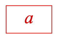
A glyph can encompass (surround or overlay) an equation phrase (content). The glyph can also be annotated.
gggggggggggggg
gggCCCCCCCCggg
gggCCCCCCCCggg
gggCCCCCCCCggg
gggCCCCCCCCggg
gggggggggggggg
Type: {symbol: string?, annotation: EQN_Annotation?, annotations: Array<EQN_Annotation>?, space: number, topSpace: number?, rightSpace: number?, bottomSpace: number?, leftSpace: number?}
(string)
(Array<EQN_Annotation>?)
: use for one or more
annotations
(number?)
: default space the glyph should extend beyond the
top, right, left and bottom sides of the content (
0
)
(number?)
: space the glyph extends beyond the content top
(number?)
: space the glyph extends beyond the content
right
(number?)
: space the glyph extends beyond the content
bottom
(number?)
: space the glyph extends beyond the content
left
// surrounding content with a box glyph
figure.add({
make: 'equation',
elements: {
box: { symbol: 'box', lineWidth: 0.005 },
},
forms: {
form1: {
annotate: {
content: 'a',
glyphs: {
encompass: {
symbol: 'box',
space: 0.1, // e.g. only, this will be overwritten by next props
topSpace: 0.1,
rightSpace: 0.1,
bottomSpace: 0.1,
leftSpace: 0.1,
},
},
},
},
},
});
EQN_LeftRightGlyph
Left/Right glyph options object.
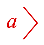
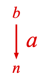
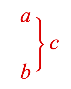
A glyph can be to the left or right of an equation phrase (content). The glyph can also be annotated.
ggg CCCCCCCC ggg
ggg CCCCCCCC ggg
ggg CCCCCCCC ggg
ggg CCCCCCCC ggg
Type: {symbol: string?, annotation: EQN_Annotation?, annotations: Array<EQN_Annotation>?, space: number?, overhang: number?, topSpace: number?, bottomSpace: number?, minContentHeight: number?, minContentDescent: number?, minContentAscent: number?, descent: number?, height: number?, yOffset: number?, annotationsOverContent: boolean?}
(string)
(Array<EQN_Annotation>?)
: use for one or more
annotations
(number?)
: force min content height for auto
glyph scaling
(number?)
: force min content descent for auto
glyph scaling
(number?)
: force min content ascent for auto
scaling
(number?)
: force descent of glyph
(boolean?)
: true
means only glyph is
separated from content by
space
and not annotations (false`)
figure.add({
make: 'equation',
elements: {
rb: { symbol: 'angleBracket', side: 'right', width: 0.1 },
},
forms: {
form1: {
annotate: {
content: 'a',
glyphs: {
right: {
symbol: 'rb',
space: 0.05,
overhang: 0.1,
},
},
},
},
},
});
figure.add({
make: 'equation',
elements: {
arrow: { symbol: 'arrow', direction: 'down' },
},
forms: {
form1: {
annotate: {
content: 'a',
glyphs: {
left: {
symbol: 'arrow',
space: 0.05,
overhang: 0.1,
annotations: [
{
content: 'b',
xPosition: 'center',
yPosition: 'top',
xAlign: 'center',
yAlign: 'bottom',
scale: 0.7,
offset: [0, 0.05],
},
{
content: 'n',
xPosition: 'center',
yPosition: 'bottom',
xAlign: 'center',
yAlign: 'top',
scale: 0.7,
offset: [0, -0.05],
},
],
},
},
},
},
},
});
figure.add({
make: 'equation',
elements: {
brace: { symbol: 'brace', side: 'right', width: 0.05 },
},
forms: {
form1: {
annotate: {
content: 'c',
glyphs: {
left: {
symbol: 'brace',
space: 0.05,
overhang: 0.2,
annotations: [
{
content: 'a',
xPosition: 'left',
yPosition: 'top',
xAlign: 'right',
yAlign: 'middle',
offset: [-0.05, 0],
},
{
content: 'b',
xPosition: 'left',
yPosition: 'bottom',
xAlign: 'right',
yAlign: 'middle',
offset: [-0.05, 0],
},
],
},
},
},
},
},
});
EQN_TopBottomGlyph
Top/Bottom glyph options object.
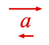
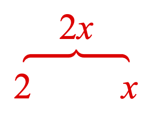
A glyph can be to the top or bottom of an equation phrase (content). The glyph can also be annotated.
gggggggg
gggggggg
CCCCCCCC
CCCCCCCC
CCCCCCCC
CCCCCCCC
gggggggg
gggggggg
Type: {symbol: string?, annotation: EQN_Annotation?, annotations: Array<EQN_Annotation>?, space: number?, overhang: number?, width: number?, leftSpace: number?, rightSpace: number?, xOffset: number?, annotationsOverContent: boolean?}
(string)
(Array<EQN_Annotation>?)
: use for one or more
annotations
(number?)
: force width of glyph
(number?)
: amount glyph extends beyond content left
(number?)
: amount glyph extends beyond content right
(boolean?)
: true
means only glyph is
separated from content by
space
and not annotations (false`)
figure.add({
make: 'equation',
elements: {
rarrow: { symbol: 'arrow', direction: 'right' },
larrow: { symbol: 'arrow', direction: 'left' },
},
forms: {
form1: {
annotate: {
content: 'a',
glyphs: {
top: {
symbol: 'rarrow',
space: 0.05,
overhang: 0.1,
},
bottom: {
symbol: 'larrow',
space: 0.05,
overhang: 0.02,
},
},
},
},
},
});
figure.add({
make: 'equation',
elements: {
brace: { symbol: 'brace', side: 'top' },
},
forms: {
form1: {
annotate: {
content: ['2_1', 'x_1'],
glyphs: {
bottom: {
symbol: 'brace',
space: 0.05,
overhang: 0.2,
annotations: [
{
content: '2_2',
xPosition: 'left',
yPosition: 'bottom',
xAlign: 'center',
yAlign: 'baseline',
offset: [0, -0.2],
},
{
content: 'x_2',
xPosition: 'right',
yPosition: 'bottom',
xAlign: 'center',
yAlign: 'baseline',
offset: [0, -0.2],
},
],
},
},
},
},
},
});
EQN_LineGlyph
A glyph can be a line EQN_LineSymbol between some content and an annotation.
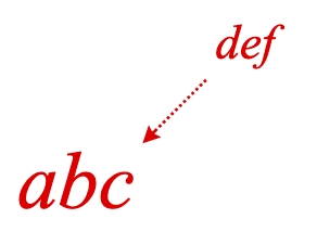
aaaaa
aaaaa
g
g
g
CCCCCCCCC
CCCCCCCCC
CCCCCCCCC
CCCCCCCCC
Type: {symbol: string, content: EQN_LineGlyphAlign?, annotation: EQN_LineGlyphAlign?, annotationIndex: number?}
(string)
(EQN_LineGlyphAlign?)
: alignment and spacing to content
(EQN_LineGlyphAlign?)
: alignment and spacing to annotation
(number?)
: annotation index to draw line to
figure.add({
name: 'eqn',
make: 'equation',
elements: {
l: {
symbol: 'line',
width: 0.005,
dash: [0.005, 0.005],
arrow: { start: 'barb' },
},
},
forms: {
0: {
annotate: {
content: 'abc',
annotation: {
content: 'def',
xPosition: 'right',
yPosition: 'top',
xAlign: 'left',
yAlign: 'bottom',
scale: 0.6,
offset: [0.2, 0.2],
},
glyphs: {
line: {
annotationIndex: 0,
symbol: 'l',
content: {
xAlign: 'right',
yAlign: 'top',
space: 0.02,
},
annotation: {
xAlign: 'left',
yAlign: 'bottom',
space: 0.02,
},
},
},
},
},
},
});
EQN_Glyphs
Object defining all the glyphs annotating some content.
Multiple glyphs are ok, but only one per position.
Type: {left: EQN_LeftRightGlyph?, right: EQN_LeftRightGlyph?, top: EQN_TopBottomGlyph?, bottom: EQN_TopBottomGlyph?, encompass: EQN_EncompassGlyph?, line: EQN_LineGlyph?}
(EQN_EncompassGlyph?)
(EQN_TopBottomGlyph?)
(EQN_LeftRightGlyph?)
(EQN_TopBottomGlyph?)
(EQN_LeftRightGlyph?)
(EQN_LineGlyph?)
EQN_EquationGoToForm
Options object for Equation#goToForm.
Often, goToForm is called to animate from a shown form to a desired form.
Therefore there will be some equation elements that:
- Are currently shown, but need to be hidden as they are not in the desired form
- Are currently shown, are in the desired form, and need to be moved to the correct layout position for the desired form
- Are currently hidden and need to be shown in the desired form
The order that elements are shown, hidden and moved is defined by the
animate property:
'move': Dissolve out elements to hide, move existing elements to new, dissolve in elements that need to be shown'dissolveInThenMove': Dissolve out the elements to hide, dissolve in the elements that need to be shown in the correct locations of the form, then move existing elements to their correct locations'dissolve': Dissolve out the entire current form, and then dissolve in the entire new form'moveFrom': Shows the desired form at the position defined in the formRestart property of EQN_Equation, then moves it to the current location'pulse': Same as'dissolve', but once finished will pulse the element defined in the pulse object in the formRestart property of EQN_Equation
If a form is already animating, then the ifAnimating property will define
the behavior of the animation:
cancelGoTo: true,skipToTarget: true: Current animation will skip to the end, and current goTo call will be cancelledcancelGoTo: true,skipToTarget: false: Current animation will stop in its current state, and current goTo call will be cancelledcancelGoTo: false,skipToTarget: true: Current animation will skip to the end, and current goTo call will then be executedcancelGoTo: false,skipToTarget: false: Current animation will stop in its current state, and current goTo call will be executed
Type:
{name: string?, index: number?, animate: ("move" | "dissolve" | "moveFrom" | "pulse" | "dissolveInThenMove")?, delay: number?, dissolveOutTime: number?, duration: number??, dissolveInTime: number?, blankTime: number?, prioritizeFormDuration: boolean?, fromWhere: (string | null)?, ifAnimating: {cancelGoTo: boolean?, skipToTarget: boolean?}?, callback: (string | function (): void)??}
(string?)
: form name to goto
(number?)
: form index to goto (can be used instead of name)
(("move" | "dissolve" | "moveFrom" | "pulse" | "dissolveInThenMove")?)
: default:
"dissolve"
(number?)
: Default: 0.4 of duration, or 0.4s if
no duration
(number?)
: time between dissolve out and dissolve in
when animating with
dissolve
or
pulse
. Default: 0.2 of duration, or 0.2s
if no duration
(number?)
: Default: 0.4 of duration, or 0.4s if
no duration
(boolean?)
: use duration from the form
definition
EQN_FormObjectDefinition
. Default:
true
(("fromPrev" | "fromNext")?)
: prioritze
fromPrev
or
fromNext
duration from the form definition.
EQN_FormObjectDefinition
Default:
null
((string | function (): void)??)
EquationLabel
Equation label
(FigureCollections)
(TypeLabelOptions
= {})
OBJ_NextFormAnimationStep
NextFormAnimationStep options object.
OBJ_TriggerAnimationStep & EQN_EquationGoToForm
Duration will be automatically calculated (unless duration is set to 0).
To specify it exactly, the duration, dissolveOutTime, dissolveInTime
and blankTime must all be specified (or at least the ones that will be used
in the form change).
Type: any
Extends OBJ_TriggerAnimationStep, EQN_EquationGoToForm
OBJ_GoToFormAnimationStep
GoToFormAnimationStep options object.
OBJ_TriggerAnimationStep & EQN_EquationGoToForm & { start?: 'string', target?: 'string'}
Duration will be automatically calculated (unless duration is set to 0).
To specify it exactly, the duration, dissolveOutTime, dissolveInTime
and blankTime must all be specified (or at least the ones that will be used
in the form change).
The form property of EQN_EquationGoToForm is not used. Use target
instead.
Type: any
Extends OBJ_TriggerAnimationStep, EQN_EquationGoToForm
(string?)
: form to start from. If undefined, then current
form will be used
(string?)
: form to go to. If undefined, then current
form will be used
NextFormAnimationStep
Next form animation step
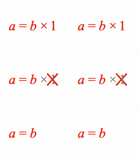
Animation step that animates to the next equation form in a formSeries. Equivalent to a triggering a Equation.nextForm call.
This animation step is only available in Equation.
Extends TriggerAnimationStep
(OBJ_NextFormAnimationStep)
// Example showing both ways to access GoToForm animation step
figure.add({
name: 'eqn',
make: 'equation',
elements: { times: ' \u00D7', equals: ' = ' },
forms: {
0: ['a', 'equals', 'b', 'times', ' ', '_1'],
1: ['a', 'equals', 'b', 'times', { strike: [[' ', '_1'], 'strike'] }],
2: ['a', 'equals', 'b'],
},
formSeries: ['0', '1', '2'],
});
const e = figure.getElement('eqn');
e.showForm('0');
e.animations.new()
.delay(2)
.inParallel([
e.animations.nextForm({ animate: 'move', duration: 1 }),
e._times.animations.dim({ duration: 1 }),
e.__1.animations.dim({ duration: 1 }),
])
.delay(1)
.nextForm({ animate: 'move', duration: 1 })
.start();
GoToFormAnimationStep
GoToForm form animation step

Animation step that animates moving between equation forms. Equivalent to a triggering a Equation.goToForm call.
This animation step is only available in Equation.
Extends TriggerAnimationStep
(OBJ_GoToFormAnimationStep)
// Example showing both ways to access GoToForm animation step
figure.add({
name: 'eqn',
make: 'equation',
elements: { times: ' \u00D7', equals: ' = ' },
forms: {
0: ['a', 'equals', 'b', 'times', ' ', '_1'],
1: ['a', 'equals', 'b', 'times', { strike: [[' ', '_1'], 'strike'] }],
2: ['a', 'equals', 'b'],
},
});
const e = figure.getElement('eqn');
e.showForm('0');
e.animations.new()
.delay(2)
.inParallel([
e.animations.goToForm({ target: '1', animate: 'move' }),
e._times.animations.dim({ duration: 1 }),
e.__1.animations.dim({ duration: 1 }),
])
.delay(1)
.goToForm({ target: '2', animate: 'move' })
.start();
EQN_TranslationStyles
Object where keys are element names and values are tranlation definition objects.
[elementName: string]: TypeEquationElement
Type: {}
(EQN_TranslationStyle?)
EQN_Line
Single equation line definition
Overrides default values of baselineSpace and space from
EQN_Lines.
Use justify to define a specific element of the line to align the other
lines with.
Type: {content: TypeEquationPhrase, baselineSpace: (null | number)?, space: number?, justify: string?, offset: number?}
(TypeEquationPhrase)
: Array of equation
phrases or equation line objects
(string?)
: when
EQN_Lines
.justify
is
'element'
,
use this property to define which element of the line to justify with. If
no element is specified, then left justification will be used.
((number | null)?)
: default space between baseline of
previous line and ascent of this line. If not
null
then will override
space
(
null
).
EQN_LineGlyphAlign
Options object that aligns a line glyph with either the content or annotation.
Type:
{xAlign: ("left" | "center" | "right" | number | string)?, yAlign: ("bottom" | "baseline" | "middle" | "top" | number | string)?, space: 0?}
EQN_UpdateElementText
Object that defines new text for a selection of equation elements.
Each key in the object is the name of the equation element whose text is to be updated.
Type: {}
((string | FigureElement)?)
Misc Morphing
polyline
Creates triangles to the width of a polyline.
A polyline is defined by a series of points.
The polyline can either be converted directly to triangles that create
its width (num undefined), or split into num equal segments first.
simple polylines are rectangles formed between two points in a polyline
or segmented polyline. When there are bends in the line, gaps will form on
the outside border. These gaps will become more visible as the line gets
thicker.
When simple = false, each corner has an additional two triangles to fill
in the gaps.
The final number of vertices depends on simple, num and close. Each
line segment as 6 vertices. Each corner fill has 6 vertices. If num is
undefined or null then the total number of line segments will be
points.length + 1.
This method is useful for morphing between lines, but is of limited use. If
the line segments gradient change quadrants, then the line thicknesses will
change during morphing. Especially for thick lines, it will often be better
to use polylineToShapes.
(OBJ_MorphPolyline)
OBJ_MorphPolyline
Options object for polyline in morph tools.
Type: {points: Array<TypeParsablePoint>, num: number?, close: boolean?, width: number?, simple: boolean?}
(Array<TypeParsablePoint>)
: points that define the polyline
((number | null)?)
: split the polyline into
num
equal
segments. Use
null
or leave undefined to not split the polyline
(number?)
: width of the polyline
getPolygonCorners
Calculate vertices of a polygon
(OBJ_GetPolygonCorners)
Array<Point>:
Array of vertices
tuples
OBJ_GetPolygonCorners
Options object to calculate vertices of a polygon
Type:
{radius: number?, sides: number?, position: TypeParsablePoint?, rotation: number?, direction: (1 | -1)?}
((1 | -1)?)
: 1 is CCW, -1 is CW (
1
)
squareFill
Create a square fill from two triangles
(TypeParsablePoint)
(number
= 0.01)
Array<number>:
array of interlaced x and y components of 6 vertices
(12 numbers total)
hexFill
Create a hexagon fill from four triangles (12 vertices)
(TypeParsablePoint)
(number
= 0.01)
Array<number>:
array of interlaced x and y components of 12 vertices
(24 numbers total)
polygonFill
Create a polygon fill with n sides from n-2 triangles - (3 * (n-2) vertices)
Array<number>:
array of interlaced x and y components of vertices
makeColors
Create an array of num copies of the same color
Array<number>:
color copies juxtaposed in single array
Misc SlideNavigator
COL_SlideNavigatorButton
CollectionsSlideNavigator Button.
Type: any
Extends COL_Rectangle, OBJ_Arrow
(("arrow" | "rectangle"))
COL_SlideNavigatorEqnDefaults
CollectionsSlideNavigator equation animation defaults
Type:
{duration: number?, animate: ("move" | "dissolve" | "instant")?}
(number?)
(("move" | "dissolve" | "instant")?)
OBJ_AnimationDefinition
An animation definition object defines an animation in a json like object.
One key of the object defines the animation to use, while the remaining keys are the properties of the animation.
The value of the key (with the exception of the delay key) that defines
the animation is a TypeElementPath defining which elements to apply
the animation to. When using delay, the value will be a number in seconds.
The remaining keys in the object then come from the definition objects of the associated animation.
The possible key names that define animations are:
delay: delay where value isnumberin secondsin: dissolve in with OBJ_ElementAnimationStep options where duration is dissolve in timeout: dissolve out with OBJ_ElementAnimationStep options where duration is dissolve out timerotation: OBJ_RotationAnimationStepposition: OBJ_PositionAnimationStepscale: OBJ_ScaleAnimationStepscenario: OBJ_ScenarioAnimationStepscenarios: OBJ_ScenariosAnimationSteppulseWidth: OBJ_PulseWidthAnimationSteplength: OBJ_LengthAnimationSteppulseAngle: OBJ_PulseAngleAnimationSteppulse: OBJ_PulseAnimationStepdim: dim animation step with OBJ_ElementAnimationStep options where duration is dim durationundim: dim animation step with OBJ_ElementAnimationStep options where duration is undim durationtrigger: OBJ_TriggerAnimationStepgoToForm: OBJ_TriggerAnimationStep
Several animation steps will automatically set their final targets just
before steadyStateCommon is set. This means, if the slide is navigated to
from a slide that doesn't trigger the transition, then these targets will
still be set. In many cases, this reduces doubling up desired steady state
targets when defining a slide. However, if the target should not be
automatically set, then use final: false in the animation steps's options
to disable this behavor. The animations that automatically set targets are:
inoutscenariodimundimrotationpositionscale
If a transition definition contains in or out animation steps, then
before the transition starts, the elements that will dissolve in are
automatically hidden, and the elements that will dissolve out are
automatically shown. If this behavior is not wanted, then for out steps
use show: false in the animation step definition, and for in steps use
show: true.
Type: Object
A zoom pan can be defined as: 1) what coordinate is in the middle of the screen (C) 2) what the zoom factor is
A pan zoom in a scene then:
- Pans camera so C is in middle of screen
- Zooms
If a point is zoomed on, then it stays in its relative position in the zoomed scene space, meaning C keeps changing.
Therefore to find C:
- Find relative position of point in scene
- using the zoom factor find the center point in the zoomed scene
A gesture primitive is a rectangle within an associated scene.
The rectangle has a center point.
To define a zoomed area of the rectangle, two points are needed:
- point of the rectangle that will be the new center point of the screen
- zoom magnification
A gesture primitive has an associated scene.
The gesture rectangle covers a portion of space within the scene Any zoom and pan combination in a scene can be represented by: center position zoom magnification