2D Shape Primitives API Reference
Contents
- OBJ_FigurePrimitive
- OBJ_Generic
- OBJ_Polyline
- OBJ_Polygon
- OBJ_Star
- OBJ_Rectangle
- OBJ_Ellipse
- OBJ_Arc
- OBJ_Triangle
- OBJ_Line
- OBJ_Grid
- OBJ_Arrow
OBJ_FigurePrimitive
Options object for any FigureElementPrimitive.
These properties are available when defining any FigureElementPrimitive.
Properties
- name: string
- position: TypeParsablePoint
position overrides
transformtranslation - transform: TypeParsableTransform
transform to apply to element
- color: TypeColor = is passed as the
'u_color' uniform to the fragment shader
color to apply to element
- touch: boolean | OBJ_Touch = false
true,numberorTypeParsablePointwill set the element as touchable. Ifnumber, then element touch volume is the scaled actual volume in x, y, and z. For example, if2, then the touchable volume is twice the actual volume. IfTypeParsablePointthen the x, y, and z scales can be set independantly - move: boolean | OBJ_ElementMove
setting this to anything but
falsewill set the element as movable. UseOBJ_ElementMoveto customize the movement options - dimColor: TypeColor
RGBA is used when vertex colors are from a uniform, otherwise just the alpha channel is used.
- defaultColor: TypeColor
- scenarios: OBJ_Scenarios
Define position/transform/rotation/scale/color scenarios tied to the element
- scene: Scene
Give the element a custom scene that is independant of the figure scene. For example, use this to create a 3D object in a 2D figure.
OBJ_Generic

Options object for a FigureElementPrimitive of a generic shape
points will define either triangles or lines which combine
to make the shape.
drawType defines what sort of triangles or lines the points make.
The most useful, common and generic drawType is 'TRIANGLES'
which can be used to create any shape.
The shape's points can be duplicated using the copy property
to conveniently create multiple copies (like grids) of shapes.
The shape is colored with either color or texture.
When shapes move, or are touched, borders are needed to bound their movement, and figure out if a touch happened within the shape. Shapes that do not move, or are not interactive, do not need borders.
A shape can have several kinds of borders. "Draw borders" (drawBorder and
drawBorderBuffer) are sets of points that define reference
borders for a shape. The shapes higher level borders border and
touchBorder may then use these draw borders to define how a shape will
interact with a figure's bounds, or where a shape can be touched.
drawBorder and drawBorderBuffer are each point arrays
that define the outer limits of the shape. For non-contigous shapes
(like islands of shapes), an array of point arrays can be used.
Both borders can be anything, but typically a drawBorder would define the
border of the visible shape, and a drawBorderBuffer would define some
extra space, or buffer, around the visible shape (particulaly useful for
defining the touchBorder later).
border is used for checking if the shape is within some bounds. When
shapes are moved, if their bounds are limited, this border will define when
the shape is at a limit. The border property can be:
draw: usedrawBorderpointsbuffer: usedrawBorderBufferpointsrect: use a rectangle boundingdrawBordernumber: use a rectangle that isnumberlarger than the rectangle boundingdrawBorderArray<TypeParsablePoint>: a custom contiguous borderArray<Array<TypeParsablePoint>>: a custom border of several contiguous portions
touchBorder is used for checking if a shape is touched. The touchBorder
property can be:
draw: usedrawBorderpointsbuffer: usedrawBorderBufferpointsborder: use same asborderrect: use a rectangle boundingbordernumber: use a rectangle that isnumberlarger than the rectangle boundingborderArray<TypeParsablePoint>: a custom contiguous borderArray<Array<TypeParsablePoint>>: a custom border of several contiguous portions
Properties
- points: Array<TypeParsablePoint>
- drawType: TypeGLPrimitive = 'TRIANGLES'
- copy: Array<CPY_Step | string> | CPY_Step = []
use
drawTypeas'TRIANGLES'when using copy - texture: OBJ_Texture
override
colorwith a texture if defined - drawBorder: TypeParsableBorder
- drawBorderBuffer: TypeParsableBorder
- border: TypeParsableBuffer | TypeParsableBorder | 'buffer' | 'draw' | 'rect' = 'draw'
defines border of primitive. Use
drawto use thedrawBorderof the element. Use 'buffer' to use thedrawBorderBufferproperty of the element. Use'rect'for the bounding rectangle ofdrawBorder. UseTypeParsableBufferfor the bounding rectangle ofdrawBorder. UseTypeParsableBorderfor a custom border. - touchBorder: TypeParsableBorder | 'rect' | 'border' | 'buffer' | 'draw' = 'border'
defines touch border of the primitive. Use
borderto use the same border asborder. Usedrawto use thedrawBorderof the element. Use 'buffer' to use thedrawBorderBufferproperty of the element. Use'rect'for the bounding rectangle ofdrawBorderBuffer. UseTypeParsableBufferfor the bounding rectangle ofdrawBorderBuffer. UseTypeParsableBorderfor a custom border. - pulse: OBJ_PulseScale | number = number
set default scale pulse options (
OBJ_PulseScale) or pulse scale directly
Square and triangle
figure.add({
name: 'squareAndTri',
make: 'generic',
points: [
[-1, 0.5], [-1, -0.5], [0, 0.5],
[0, 0.5], [-1, -0.5], [0, -0.5],
[0, -0.5], [1, 0.5], [1, -0.5],
],
});
rhombus with larger touch borders
figure.add({
name: 'rhombus',
make: 'generic',
points: [
[-0.5, -0.5], [0, 0.5], [1, 0.5],
[-0.5, -0.5], [1, 0.5], [0.5, -0.5],
],
border: [[
[-1, -1], [-0.5, 1], [1.5, 1], [1, -1],
]],
mods: {
isMovable: true,
move: {
bounds: 'figure',
},
},
});
Grid of triangles
figure.add({
name: 'gridOfTris',
make: 'generic',
points: [
[-1, -1], [-0.7, -1], [-1, -0.7],
],
copy: [
{ along: 'x', num: 5, step: 0.4 },
{ along: 'y', num: 5, step: 0.4 },
],
});
To test examples, append them to the boilerplate
OBJ_Polyline
Extends OBJ_Generic
Polyline shape options object that extends OBJ_Generic (without
drawType) and OBJ_FigurePrimitive

A polyline is a series of lines that are connected end to end. It is defined by a series of points which are the ends and corners of the polyline.
The series of points is a zero width ideal polyline, and so to see it we must
give it some width. This width can either be grown on one side of the
ideal polyline or grown on both sides of it equally using widthIs.
A polyline can have a "positive" or "negative" side, and an "inside" or "outside".
If a line is defined from p1 to p2, then the positive side is the side where the line moves if it is rotated around p1 in the positive (counter clockwise) direction. Thus the order of the points that define the line defines which side is positive and negative. A polyline is made up of many lines end to end, and thus itself will have a positive and negative side dependent on the order of points.
Similarly we can define a line's side as either inside or outside. Each corner in the polyline will have an angle on the negative side of the line and a explementary angle on the positive side of the line. The inside side of the line is the same as the negative side if the sum of all the negative side angles is smaller than the sum of all positive side angles.
Both positive/negative and inside/outside are provided to define a line's side as different situations make different side definitions more intuitive. For instance, a closed, simple polygon has an obvious "inside" and "outside", but how the points are ordered would define if the "inside" is "positive" or "negative". In comparison, it would be more intuitive to use "positive" or "negative" for a polyline that has an overall trend in a single direction.
Therefore, the polyline width can be grown on either the 'positive',
'negative', 'inside', or 'outside' side of the line or around the
middle of the line with 'mid'. In addition, a number between 0 and 1 can
be used where 0 is the same as 'positive', 1 the same as 'negative'
and 0.5 the same as 'mid'.
Each point, or line connection, creates a corner that will have an inside angle (<180º) and an outside angle (>180º or reflex angle).
Growing width on an outside corner can be challenging. As the corner becomes
sharper, the outside width joins at a point further and further from the
ideal corner. Eventually trucating the corner makes more visual sense
and therefore, a minimum angle (minAutoCornerAngle) is used to
specify when the corner should be drawn, and when it should be truncated.
By default, the border of the polyline is the line itself (border =
'line'). The border can also just be the points on the positive side of
the line, or the negative side of the line. This is useful for capturing
the hole shape of a closed polyline within a border. The border can also
be the encompassing rectangle of the polyline (border = 'rect') or
defined as a custom set of points.
The touch border can either be the same as the border ('border'), the
encompassing rect ('rect'), a custom set of points, or the same as the
line but with some buffer that effectively increases the width on both sides
of the line.
Properties
- points: Array<TypeParsablePoint>
- width: number = 0.01
- close: boolean = false
close the polyline on itself
- simple: boolean = false
simple and minimum computation polyline. Good for large numbers of points that need to be updated every animation frame.
widthIs,dash,arrowand all corner and line primitive properties are not available when a polyline is simple. - widthIs: 'mid' | 'outside' | 'inside' | 'positive' | 'negative' | number = "mid"
defines how the width is grown from the polyline's points. Only
"mid"is fully compatible with all options incornerStyleanddash. - drawBorder: 'line' | 'positive' | 'negative' | TypeParsableBorder = 'line'
override OBJ_Generic
drawBorderwith'line'to make the drawBorder just the line itself,'positive'to make the drawBorder the positive side of the line, and'negative'to make the drawBorder the negative side of the line. Use array definition for custom drawBorder - drawBorderBuffer: number | TypeParsableBorder = 0
override OBJ_Generic
drawBorderBufferwithnumberto make the drawBorderBuffer the same as the line with additionalnumberthickness on either side - cornerStyle: 'auto' | 'none' | 'radius' | 'fill' = "auto"
-
"auto": sharp corners sharp when angle is less thanminAutoCornerAngle,"none": no corners,"radius": curved corners,"fill": fills the gapes between the line ends - cornerSize: number = 0.01
only used when
cornerStyle=radius - cornerSides: number = 10
number of sides in curve - only used when
cornerStyle=radius - cornersOnly: boolean = false
draw only the corners with size
cornerSize - cornerLength: number = 0.1
use only with
cornersOnly=true- length of corner to draw - minAutoCornerAngle: number = π/7
see
cornerStyle=auto - dash: TypeDash
leave empty for solid line - use array of numbers for dash line where first number is length of line, second number is length of gap and then the pattern repeats - can use more than one dash length and gap - e.g. [0.1, 0.01, 0.02, 0.01] produces a lines with a long dash, short gap, short dash, short gap and then repeats.
- arrow: OBJ_LineArrows | TypeArrowHead
either an object defining custom arrows or a string representing the name of an arrow head style can be used. If a string is used, then the line will have an arrow at both ends. Arrows are only available for
close: false,widthIs: 'mid'andlinePrimitives: false - linePrimitives: boolean = false
Use WebGL line primitives instead of triangle primitives to draw the line
- lineNum: number = 2
Number of line primitives to use when
linePrimitivs:true
Line
figure.add(
{
name: 'p',
make: 'polyline',
points: [[-0.5, -0.5], [-0.1, 0.5], [0.3, -0.2], [0.5, 0.5]],
width: 0.05,
},
);
Square with rounded corners and dot-dash line
figure.add(
{
name: 'p',
make: 'polyline',
points: [[-0.5, -0.5], [0.5, -0.5], [0.5, 0.5], [-0.5, 0.5]],
width: 0.05,
dash: [0.17, 0.05, 0.05, 0.05],
close: true,
cornerStyle: 'radius',
cornerSize: 0.1,
},
);
Corners only of a triangle
figure.add(
{
name: 'p',
make: 'polyline',
points: [[-0.5, -0.5], [0.5, -0.5], [0, 0.5]],
width: 0.05,
close: true,
cornersOnly: true,
cornerLength: 0.2,
},
);
Zig zag with arrows
figure.add({
name: 'arrowedLine',
make: 'polyline',
points: [[0, 0], [1, 0], [0, 0.7], [1, 0.7]],
width: 0.05,
cornerStyle: 'fill',
arrow: {
scale: 0.7,
start: {
head: 'triangle',
reverse: true,
},
end: 'barb',
},
});
To test examples, append them to the boilerplate
OBJ_Polygon
Extends OBJ_Generic
Polygon or partial polygon shape options object that extends
OBJ_Generic (without drawType)

Properties
- sides: number = 4
- radius: number = 1
- rotation: number = 0
shape rotation during vertex definition (different to a rotation step in a trasform)
- offset: TypeParsablePoint = [0, 0]
shape center offset from origin during vertex definition (different to a translation step in a transform)
- sidesToDraw: number = all sides
number of sides to draw
- angleToDraw: number = 2π
same as
sidesToDrawbut using angle for the definition - direction: -1 | 1 = [0, 0]
direction to draw polygon where 1 is counter clockwise and -1 is clockwise (
1) center. This is different to position or transform as these translate the vertices on each draw. - line: OBJ_LineStyleSimple
line style options
- drawBorderBuffer: number | TypeParsableBorder = 0
override the OBJ_Generic
drawBorderBufferwithnumberto make the drawBorderBuffer a polygon that is wider bynumber
Simple filled hexagon
figure.add({
name: 'hexagon',
make: 'polygon',
sides: 6,
radius: 0.5,
});
Circle from dashed line
const circ = figure.primitives.polygon({
sides: 100,
radius: 0.5,
line: {
width: 0.03,
dash: [0.1, 0.03 ],
},
});
figure.elements.add('circle', circ);
Half octagon rotated
figure.add({
name: 'halfOctagon',
make: 'polygon',
sides: 8,
radius: 0.5,
angleToDraw: Math.PI,
line: {
width: 0.03,
},
direction: -1,
rotation: Math.PI / 2,
});
To test examples, append them to the boilerplate
OBJ_Star
Extends OBJ_Generic
Star options object that extends OBJ_Generic (without
drawType) and OBJ_FigurePrimitive

Properties
- sides: number = 4
- radius: number = 1
- innerRadius: number = radius / 2
- rotation: number = 0
shape rotation during vertex definition (different to a rotation step in a trasform)
- offset: TypeParsablePoint = [0, 0]
shape center offset from origin during vertex definition (different to a translation step in a transform)
- line: OBJ_LineStyleSimple
line style options
- drawBorderBuffer: number | TypeParsableBorder = 0
override the OBJ_Generic
drawBorderBufferwithnumberto make the drawBorderBuffer a polygon that isnumberthicker than the radius
Simple 5 pointed star
figure.add({
name: 's',
make: 'star',
radius: 0.5,
sides: 5,
});
7 pointed dashed line star
figure.add({
name: 's',
make: 'star',
radius: 0.5,
innerRadius: 0.3,
sides: 7,
line: {
width: 0.02,
dash: [0.05, 0.01],
},
});
Star surrounded by stars
figure.add({
name: 's',
make: 'star',
radius: 0.1,
sides: 5,
rotation: -Math.PI / 2,
// line: { width: 0.01 },
copy: [
{
to: [0.6, 0],
original: false,
},
{
along: 'rotation',
num: 16,
step: Math.PI * 2 / 16,
start: 1,
},
{
to: new Fig.Transform().scale(3, 3).rotate(Math.PI / 2),
start: 0,
end: 1,
},
],
});
To test examples, append them to the boilerplate
OBJ_Rectangle
Extends OBJ_Generic
Rectangle shape options object that extends OBJ_Generic (without `drawType) and OBJ_FigurePrimitive

Properties
- width: number = 1
- height: number = 1
- yAlign: 'bottom' | 'middle' | 'top' | number = 'middle'
- xAlign: 'left' | 'center' | 'right' | number = 'center'
- corner: OBJ_CurvedCorner
define for rounded corners
- line: OBJ_LineStyleSimple
line style options
- drawBorderBuffer: number | TypeParsableBorder = 0
override the OBJ_Generic
drawBorderBufferwithnumberto make the drawBorderBuffer a rectangle that isnumberwider and higher on each side - offset: TypeParsablePoint
Filled rectangle
figure.add({
name: 'r',
make: 'rectangle',
width: 1,
height: 0.5,
});
Corners with radius and dashed line
figure.add({
name: 'r',
make: 'rectangle',
width: 0.5,
height: 0.5,
line: {
width: 0.02,
dash: [0.05, 0.03]
},
corner: {
radius: 0.1,
sides: 10,
},
});
Rectangle copies rotated
figure.add({
name: 'r',
make: 'rectangle',
width: 0.5,
height: 0.5,
line: {
width: 0.01,
},
copy: {
along: 'rotation',
num: 3,
step: Math.PI / 2 / 3
},
});
To test examples, append them to the boilerplate
OBJ_Ellipse
Extends OBJ_Generic
Ellipse shape options object that extends OBJ_Generic (without
drawType) and OBJ_FigurePrimitive
Properties
- width: number = 1
- height: number = 1
- yAlign: 'bottom' | 'middle' | 'top' | number = 'middle'
- xAlign: 'left' | 'center' | 'right' | number = 'center'
- sides: number = 20
number of sides to draw ellipse with
- line: OBJ_LineStyleSimple
line style options
- drawBorderBuffer: number | TypeParsableBorder = 0
override the OBJ_Generic
drawBorderBufferwithnumberto make the drawBorderBuffer a ellipse that isnumberthicker around its border
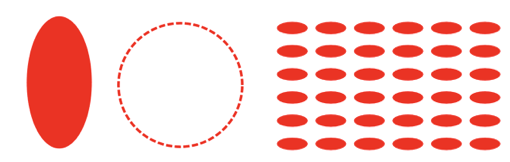
Filled ellipse
figure.add({
name: 'e',
make: 'ellipse',
height: 1,
width: 0.5,
sides: 100,
});
Dashed line circle
figure.add({
name: 'e',
make: 'ellipse',
height: 1,
width: 1,
sides: 100,
line: {
width: 0.02,
dash: [0.05, 0.02],
},
});
Ellipse grid
figure.add({
name: 'e',
make: 'ellipse',
height: 0.08,
width: 0.2,
sides: 20,
copy: [
{ along: 'x', step: 0.25, num: 5 },
{ along: 'y', step: 0.15, num: 5 },
]
});
To test examples, append them to the boilerplate
OBJ_Arc
Extends OBJ_Generic
Arc shape options object that extends OBJ_Generic (without
drawType) and OBJ_FigurePrimitive

Properties
- radius: number
- sides: number = 20
- startAngle: number = 0
- angle: number = 1
- line: OBJ_LineStyleSimple
line style options
- drawBorderBuffer: number | TypeParsableBorder = 0
override the OBJ_Generic
drawBorderBufferwithnumberto make the drawBorderBuffer a ellipse that isnumberthicker around its border
Simple fill
figure.add({
make: 'arc',
angle: Math.PI * 2 / 3,
radius: 1,
});
Fill to center
figure.add({
make: 'arc',
angle: Math.PI * 2 / 3,
startAngle: Math.PI / 3,
radius: 1,
fillCenter: true,
});
Arc line
figure.add({
make: 'arc',
angle: Math.PI / 3,
radius: 1,
line: { width: 0.05, widthIs: 'inside' },
});
Arc dashed line
figure.add({
make: 'arc',
angle: Math.PI * 3 / 2,
radius: 1,
sides: 100,
line: { width: 0.05, dash: [0.3, 0.1, 0.1, 0.1] },
});
To test examples, append them to the boilerplate
OBJ_Triangle
Extends OBJ_Generic
Triangle shape options object that extends OBJ_Generic (without
drawType) and OBJ_FigurePrimitive

The most generic way to define a triangle is with three points (points
property). When using points, all the other properties that can also
define a triangle are ignored: width, height, top,
SSS, ASA, AAS, SAS, direction, rotation, xAlign and yAlign.
The other ways to define a triangle are (in order of highest override preference to lowest if more than one is defined in the object):
ASAor Angle-Side-AngleSASor Side-Angle-SideAASor Angle-Angle-SideSSSor Side-Side-Sidewidth,heightandtoplocation
All these methods also use direction to define the triangles, and
rotation, xAlign and yAlign to position the triangles. Each corner
and side of the triangle is indexed, and can be used for positioning.
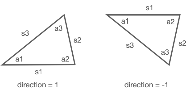
A triangle starts with an angle (a1) at (0, 0) and base side extending along the x axis to a second angle a2. The base side is side 1 (s1).
Angles a1 and a2 extend the triangle above s1 if direction is 1, and
below s1 when direction is -1.
s2, a3, and s3 are then the consecutive sides and angles.
Triangles can be defined with a combination of side length and angle using
ASA, SAS, AAS and SSS, where the first side or angle is s1 or a1
respectively, and the subsequent sides and angles progress consecutively.
For instance, ASA defines the angle a1, then side length s1, then angle
a2. SSS defines the side lenghts s1, s2 then s3. All these combinations of
three properties are sufficient to define a unique triangle completely.
When defining the triangle with width, height and top, the base side
s1 is the width, and the top point is either aligned with the left,
center or right of the base at some height above s1.
When defined, a triangle's a1 corner will be at (0, 0), and s1 will be along
the x axis. Next, a rotation can be applied to the triangle. A rotation
can either be a number rotating it relative to its definition, or relative
to one of its sides: s1, s2 or s3.
Finally, the triangle can be positioned (in draw space) using xAlign and
yAlign. An xAlign of 'left' will position the triangle so that it's
left most point will be at (0, 0). Similarly, a yAlign of 'top' will
position the triangle so its top most point is at (0, 0). Triangles
can also be aligned by angles (corners) and side mid points. For instance, an
xAlign of 'a2', will position the a2 corner at x = 0. Similarly a
yAlign of 's3' will position the triangle vertically such that the mid
point of s3 is at y = 0. 'centroid' is relative to the geometric center of
the triangle.
Once a triangle is defined and positioned in draw space, it can then be
copied (copy) if more than one triangle is desired.
The triangle(s) can then be positioned (position) or transformed
(transform) in the FigureElementPrimitive local space.
Triangles can either be a solid fill, texture fill or outline. When line
is not defined, the triangle will be filled.
Properties
- points: Array<Point>
defining points will take precedence over all other ways to define a triangle.
- width: number
- height: number
- top: 'left' | 'right' | 'center' = center
- SSS: [number, number, number]
- ASA: [number, number, number]
- AAS: [number, number, number]
- SAS: [number, number, number]
- direction: 1 | -1
- rotation: number | 's1' | 's2' | 's3' | OBJ_TriangleSideRotationAlignment
- xAlign: 'left' | 'center' | 'right' | number | 'a1' | 'a2' | 'a3' | 's1' | 's2' | 's3' | 'centroid' | 'points' = 'centroid'
- yAlign: 'bottom' | 'middle' | 'top' | number | 'a1' | 'a2' | 'a3' | 's1'| 's2' | 's3' | 'centroid' | 'points' = 'centroid'
- line: OBJ_LineStyleSimple
line style options - do not use any corner options
Right angle triangle
figure.add({
name: 't',
make: 'triangle',
width: 0.5,
height: 1,
top: 'right',
});
30-60-90 triangle with dashed line
const t = figure.primitives.triangle({
ASA: [Math.PI / 2, 1, Math.PI / 6],
line: {
width: 0.02,
dash: [0.12, 0.04],
},
});
figure.elements.add('t', t);
Star from 4 equilateral triangles
figure.add({
name: 'star',
make: 'triangle',
SSS: [1, 1, 1],
xAlign: 'centroid',
yAlign: 'centroid',
copy: {
along: 'rotation',
num: 3,
step: Math.PI / 6,
},
});
To test examples, append them to the boilerplate
OBJ_Line
Extends OBJ_Generic
Line definition options object that extends OBJ_Generic (without
drawType) and OBJ_FigurePrimitive
A line can either be defined as two points p1 and p2, or
a single point p1, a length and an angle.
The line has some width that will be filled on both sides
of the line points evenly ('mid'), or on one side only.
The line's 'positive' side is the side to which it rotates toward
when rotating in the positive angle direction around p1.
Similarly the line's 'negative' side is the opposite.
The line can be solid or dashed using the dash property.
The line can have arrows at one or both ends using the arrow property.
Properties
- p1: TypeParsablePoint
start point of line
- p2: TypeParsablePoint
end point of line
- length: number
length of line from
p1 - angle: number
angle of line from
p1 - width: number = 0.01
- widthIs: 'mid' | 'positive' | 'negative' | number = "mid"
defines how the width is grown from the polyline's points. Only
"mid"is fully compatible with all options inarrow. - dash: TypeDash
leave empty for solid line - use array of numbers for dash line where first number is length of line, second number is length of gap and then the pattern repeats - can use more than one dash length and gap - e.g. [0.1, 0.01, 0.02, 0.01] produces a lines with a long dash, short gap, short dash, short gap and then repeats.
- arrow: OBJ_LineArrows | TypeArrowHead
either an object defining custom arrows or a string representing the name of an arrow head style can be used. If a string is used, then the line will have an arrow at both ends. Arrows are only available for
widthIs: 'mid'andlinePrimitives: false - linePrimitives: boolean = false
Use WebGL line primitives instead of triangle primitives to draw the line
- lineNum: number = 2
Number of line primitives to use when
linePrimitivs:true - drawBorderBuffer: number | TypeParsableBorder = 0
override OBJ_Generic
drawBorderBufferwithnumberto make the drawBorderBuffer the same as the line with additionalnumberthickness on each side and the ends
Simple line defined by two points
figure.add({
name: 'l',
make: 'line',
p1: [0, 0],
p2: [0, 1],
width: 0.02,
});
Dashed line defined by a point, a length and an angle
figure.add({
name: 'l',
make: 'line',
p1: [0, 0],
length: 1,
angle: Math.PI / 2,
width: 0.03,
dash: [0.1, 0.02, 0.03, 0.02],
});
Line with two different arrows on ends
figure.add({
name: 'l',
make: 'line',
p1: [0, 0],
p2: [0, 1],
width: 0.03,
arrow: {
start: 'rectangle',
end: 'barb',
},
});
To test examples, append them to the boilerplate
OBJ_Grid
Extends OBJ_Generic
Grid shape options object that extends OBJ_Generic (without
drawType) and OBJ_FigurePrimitive
A grid is a rectangle divided into a series of vertical and horizontal lines.
The rectangle is defined by bounds.
xNum and yNum can be used to defined a number of equally spaced lines
in the rectangle (including the edges).
Alternatively xStep and yStep can be used to define the spacing between
lines from the bottom left corner.
The line width and style is defined with line.
Properties
- bounds: TypeParsableRect
rectangle definition
- step: number
distance between grid lines
- xStep: number
distance between vertical lines in grid from left - use this instead of
xNum. This will overridestep. - yStep: number
distance between horizontal lines in grid from bottom - use this instead of
yNum. This will overridestep. - num: number
number of grid lines. This will override
step. - xNum: number
number of vertical lines in grid including top and bottom lines - overrides
numandxStep. - yNum: number
number of horizontal lines in grid including left and right lines - overrides
numandyStep. - line: OBJ_LineStyle
line style options - do not use any corner options
- drawBorderBuffer: number | TypeParsableBorder = 0
override OBJ_Generic
drawBorderBufferwithnumberto make the drawBorderBuffer the same as the grid outline with additionalnumberbuffer each side
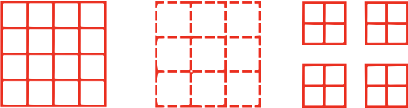
Grid defined by xStep and yStep
figure.add({
name: 'g',
make: 'grid',
bounds: [-0.5, -0.5, 1, 1],
xStep: 0.25,
yStep: 0.25,
line: {
width: 0.03,
},
});
Grid defined by xNum and yNum with dashed lines
const grid = figure.primitives.grid({
bounds: [-0.5, -0.5, 1, 1],
xNum: 4,
yNum: 4,
line: {
width: 0.03,
dash: [0.1, 0.02],
},
});
figure.elements.add('g', grid);
Grid of grids
figure.add({
name: 'g',
make: 'grid',
bounds: [-0.7, -0.7, 0.6, 0.6],
xNum: 4,
yNum: 4,
line: {
width: 0.03,
},
copy: [
{ along: 'x', num: 1, step: 0.8},
{ along: 'y', num: 1, step: 0.8},
],
});
To test examples, append them to the boilerplate
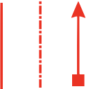
OBJ_Arrow
Extends OBJ_Generic
Arrow options object that extends OBJ_Generic (without
drawType) and OBJ_FigurePrimitive
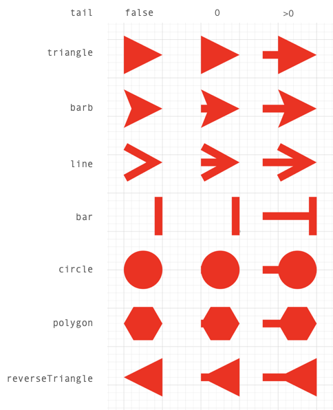
An arrow has a head, tail, length and width. The head defines the head
style of the arrow. The length, width (or radius for polygon and circle
head styles) define the size of the arrow and tail defines wether it has a
tail and how long it is.
All properties have default values that can be scaled with the scale
property. So a scale of 2 will double the size of the default arrow.
An arrow can be aligned and oriented with align and angle. align
positions the tip, start, tail or middle part of the arrow at (0, 0) in
draw space. This part of the arrow will therefore be at the position
or translation of the transform. angle then gives the arrow some drawn
rotation.
Alignment definitions are:
tip: arrow tipstart: opposite side oftipmid: mid points betweenstartandtip- useful for polygon, circle and bar arrows without tails when the head should be on a point, not next to ittail: the end of the tail when a tail exists, or where a tail would start if it doesn't exist.
Setting the tail property to false will draw only the arrow head,
true will draw a tail of length 0, and a tail with a custom length
can be defined with a number. A tail length of 0 will only extend a tail
to the boundaries of the head. A positive tail, will extend it beyond the
boundaries.
For arrow heads that use length and width properties, the length is the
dimension along the line. It includes both the head and the tail, so an arrow
with length 1 and tailLength 0.4 will have a head length of 0.6.
For polygon and circle arrows, only radius and tail are used to
determine the dimension of the arrow (length and width are ignored).
Properties
- head: TypeArrowHead = 'triangle'
head style
- scale: number
scale the default dimensions of the arrow
- length: number
dimension of the arrow head along the line
- width: number
dimension of the arrow head along the line width
- rotation: number
rotation of the polygon when
head = 'polygon' - sides: number
number of sides in polygon or circle arrow head
- radius: number
radius of polygon or circle arrow head
- barb: number
barb length (along the length of the line) of the barb arrow head
- tailWidth: number
width of the line that joins the arrow - if defined this will create minimum dimensions for the arrow
- tail: boolean | number
trueincludes a tail in the arrow of withtailWidth. Anumbergives the tail a length where 0 will not extend the tail beyond the boundaries of the head - align: 'tip' | 'start' | 'mid' | 'tail' = 'tip'
define which part of the arrow is aligned at (0, 0) in draw space
- angle: number = 0
angle the arrow is drawn at
Triangle arrow with tail
figure.add({
name: 'a',
make: 'arrow',
head: 'triangle',
tail: 0.15,
length: 0.5,
});
Barb arrow with 0 tail
figure.add({
name: 'a',
make: 'arrow',
head: 'barb',
angle: Math.PI / 2,
tail: 0,
});
Create a vector map with arrows by copying an original arrow by a
// transforms defining the position, rotation and scale of the arrows
// Create transforms to apply to each arrow
const r = Fig.range(0, Math.PI / 2, Math.PI / 18);
const x = [0, 1, 2, 0, 1, 2, 0, 1, 2];
const y = [0, 0, 0, 1, 1, 1, 2, 2, 2];
const s = [0.5, 0.8, 0.4, 0.6, 0.8, 0.6, 0.5, 0.8, 0.6];
const transforms = [];
for (let i = 0; i < 9; i += 1) {
transforms.push(new Fig.Transform().scale(s[i], s[i]).rotate(r[i]).translate(x[i], y[i]));
}
// Create arrow and copy to transforms
figure.add({
name: 'a',
make: 'arrow',
head: 'barb',
align: 'mid',
length: 0.7,
copy: {
to: transforms,
original: false,
},
});
name of figure element